Branding & Art Direction
Train The
TRNR Way.
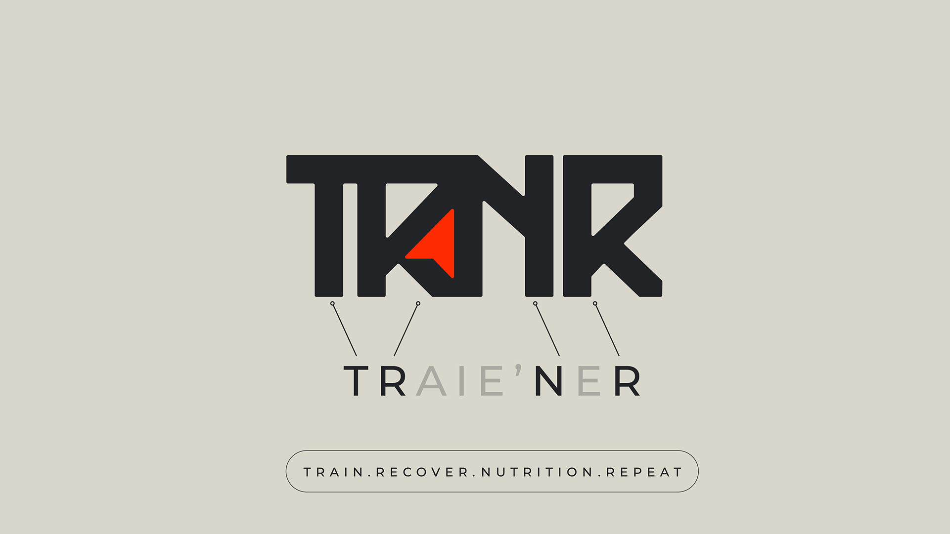
TRNR is an athletic performance brand built for people who treat training as a discipline, not a hobby. The name is an anagram of TRAINER, compressed into a four-letter system that doubles as the brand's operating philosophy.
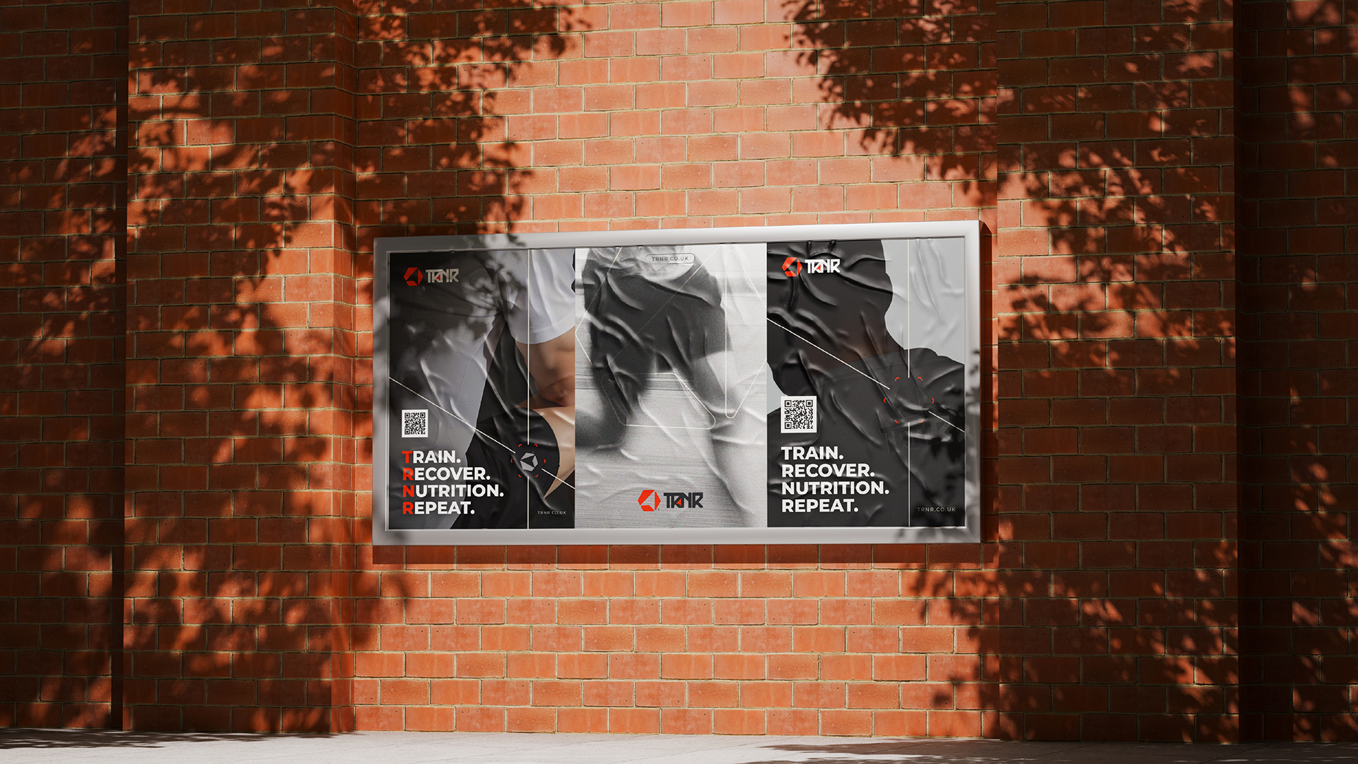
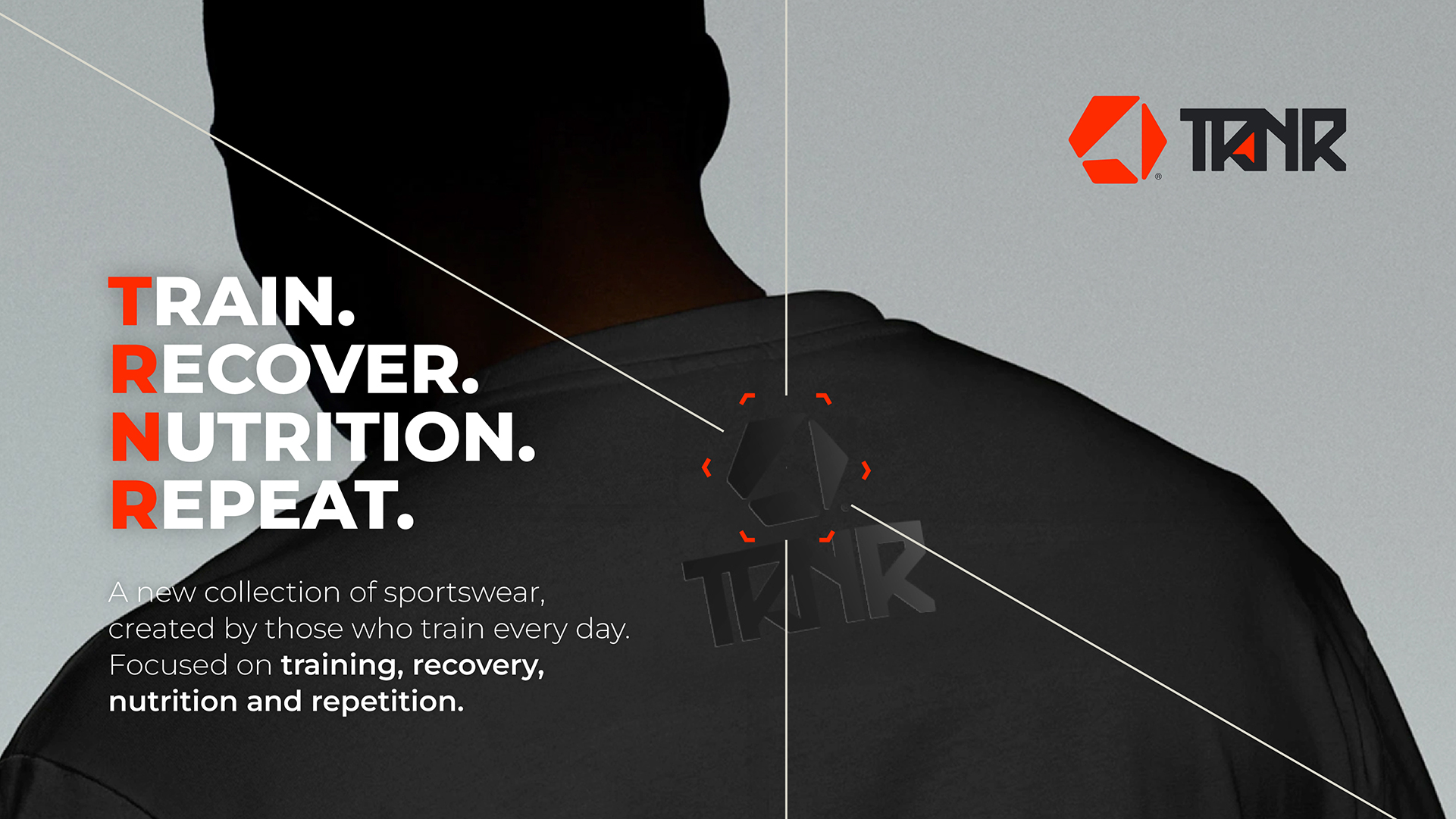
Every part of the identity is engineered around four pillars: Train, Recover, Nutrition, Repeat. The result is a hard-edged, high-performance brand that looks as relentless as the athletes it is built for.
01. The Name
Four Pillars,
One System
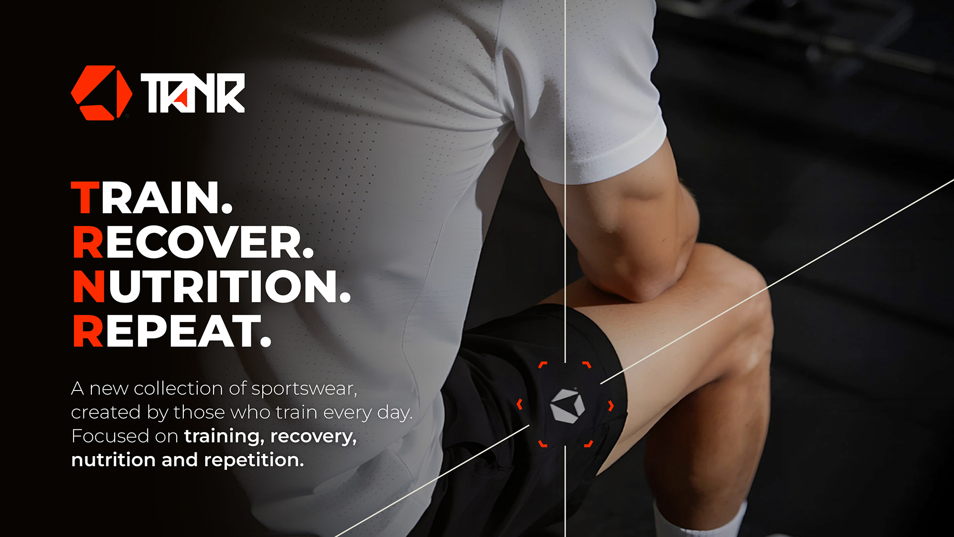
TRNR reads as both a name and an instruction. Drop the vowels from TRAINER and you are left with a four-letter mnemonic that maps directly onto the brand's daily ritual: Train. Recover. Nutrition. Repeat.
This anagram became the conceptual spine of the entire system, informing the messaging, the campaign architecture and the way every product is named and sequenced.
02. Logomark & Monogram
A Mark Built
For Motion
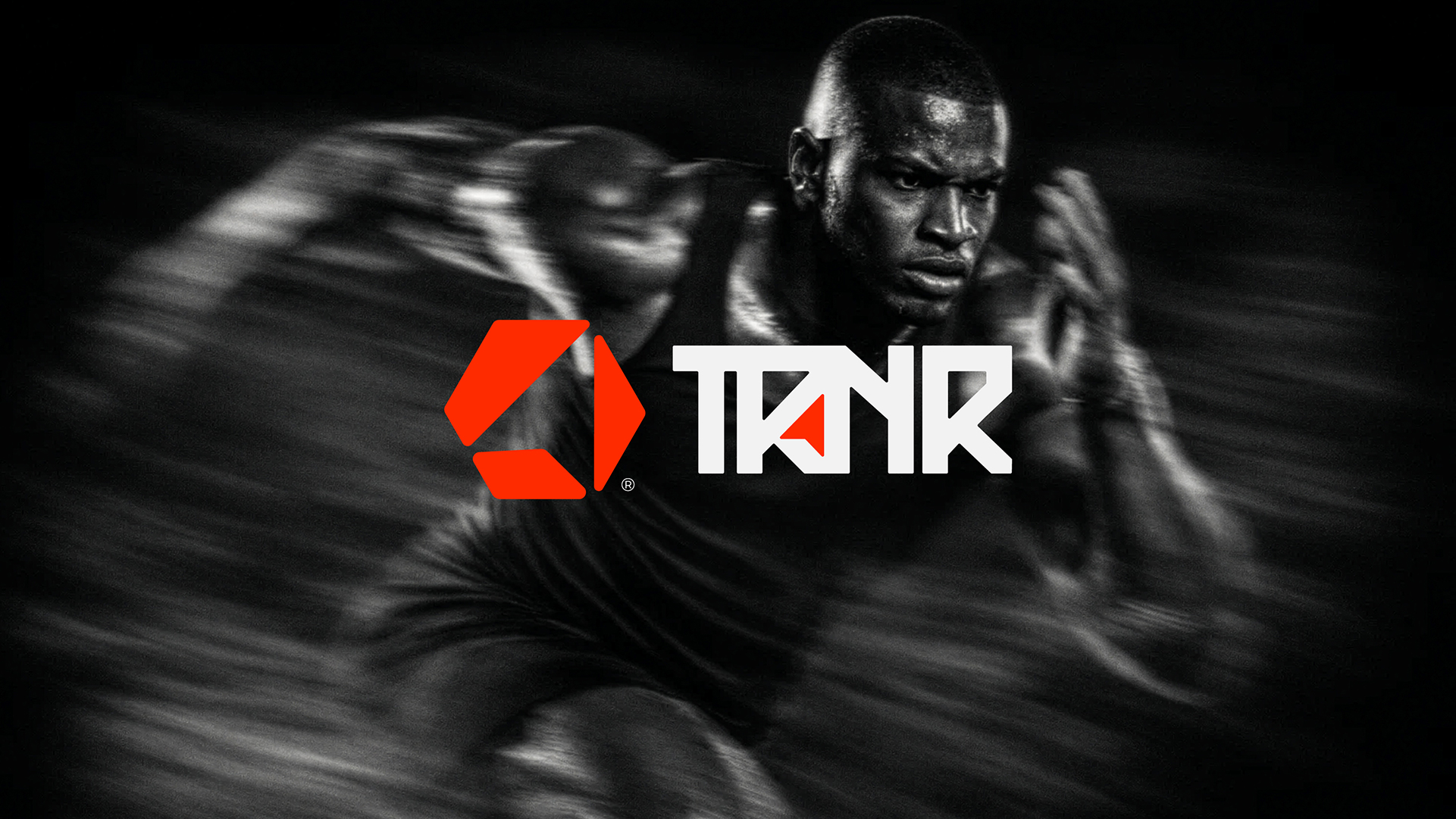
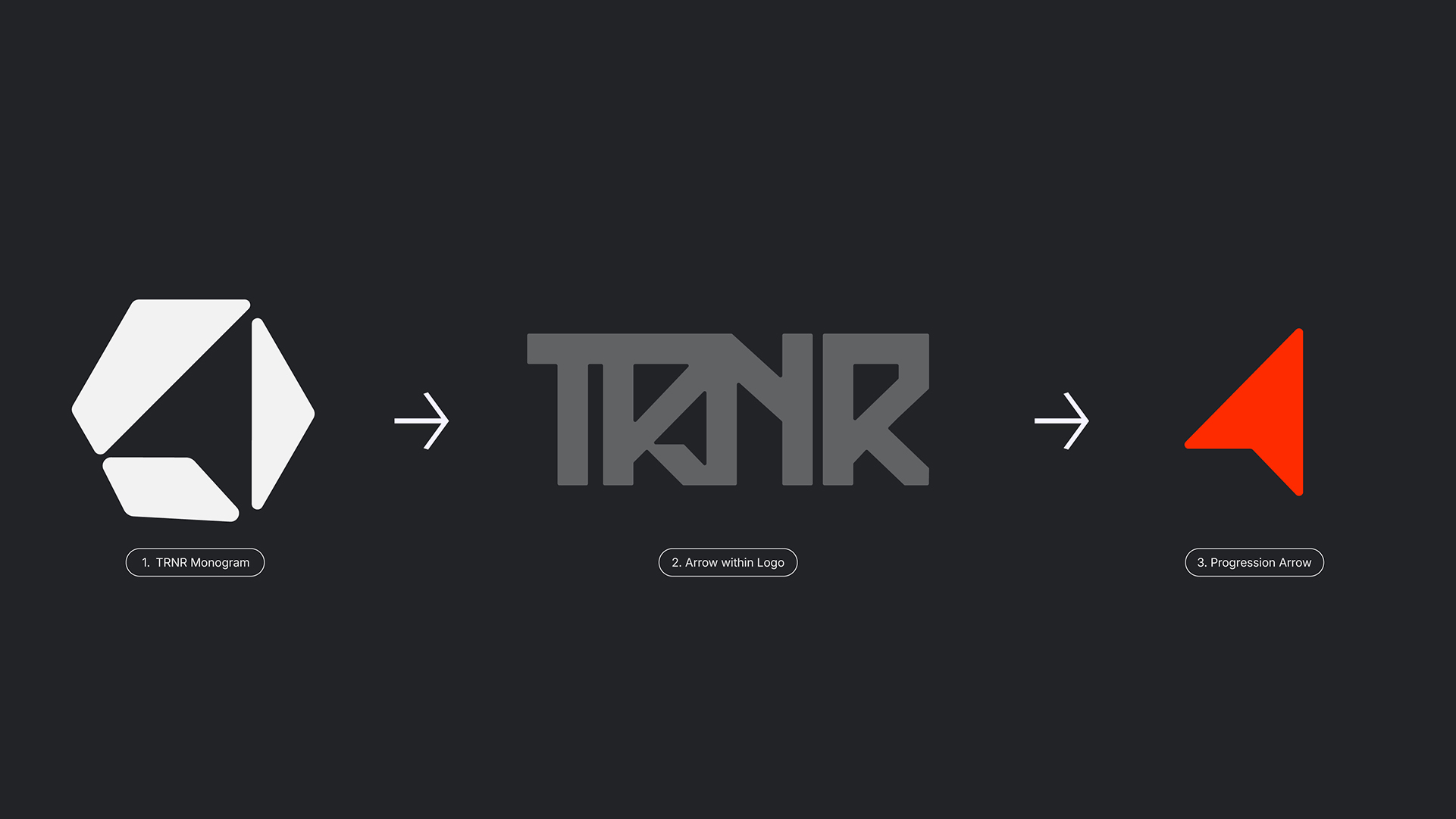
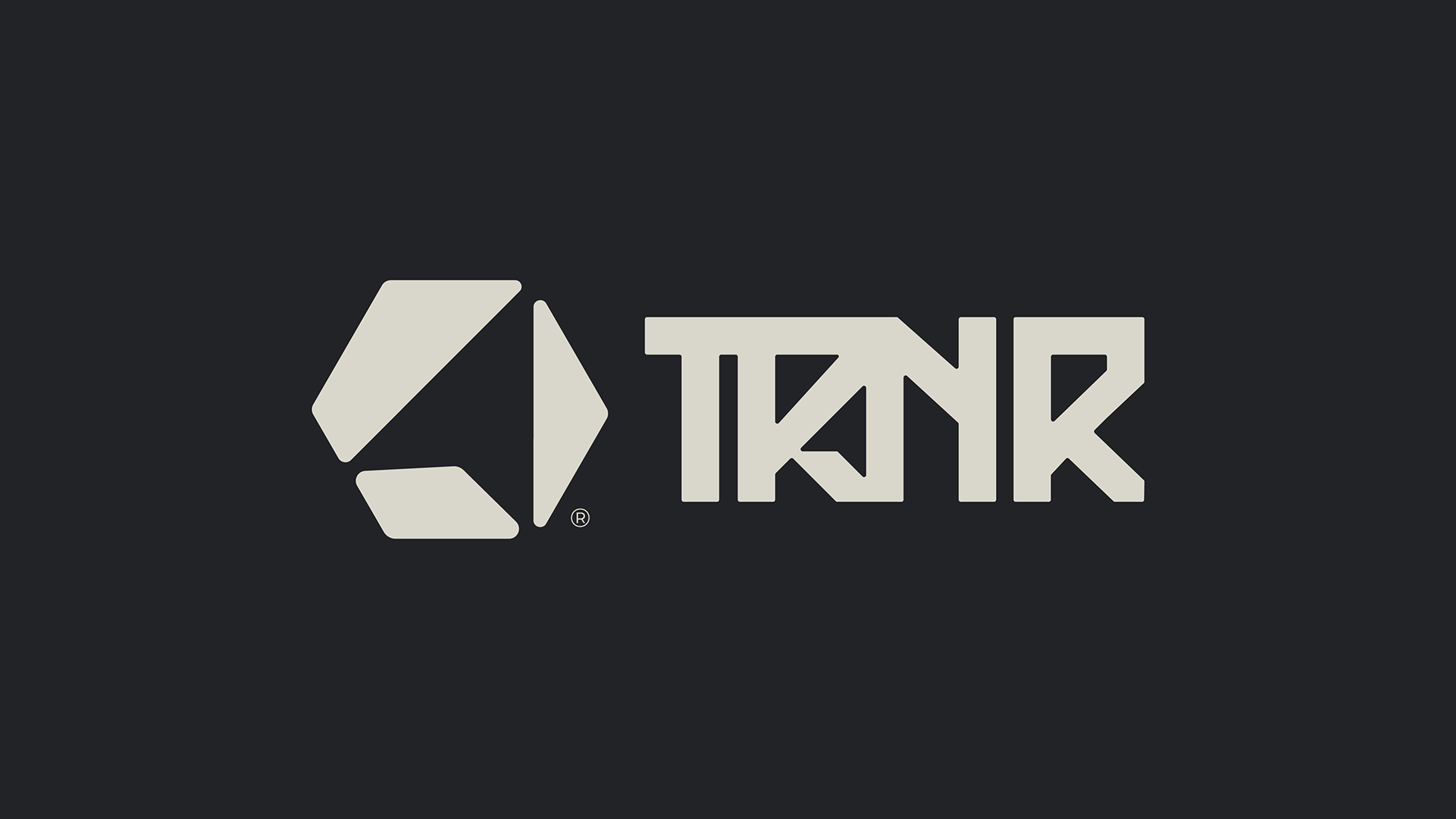
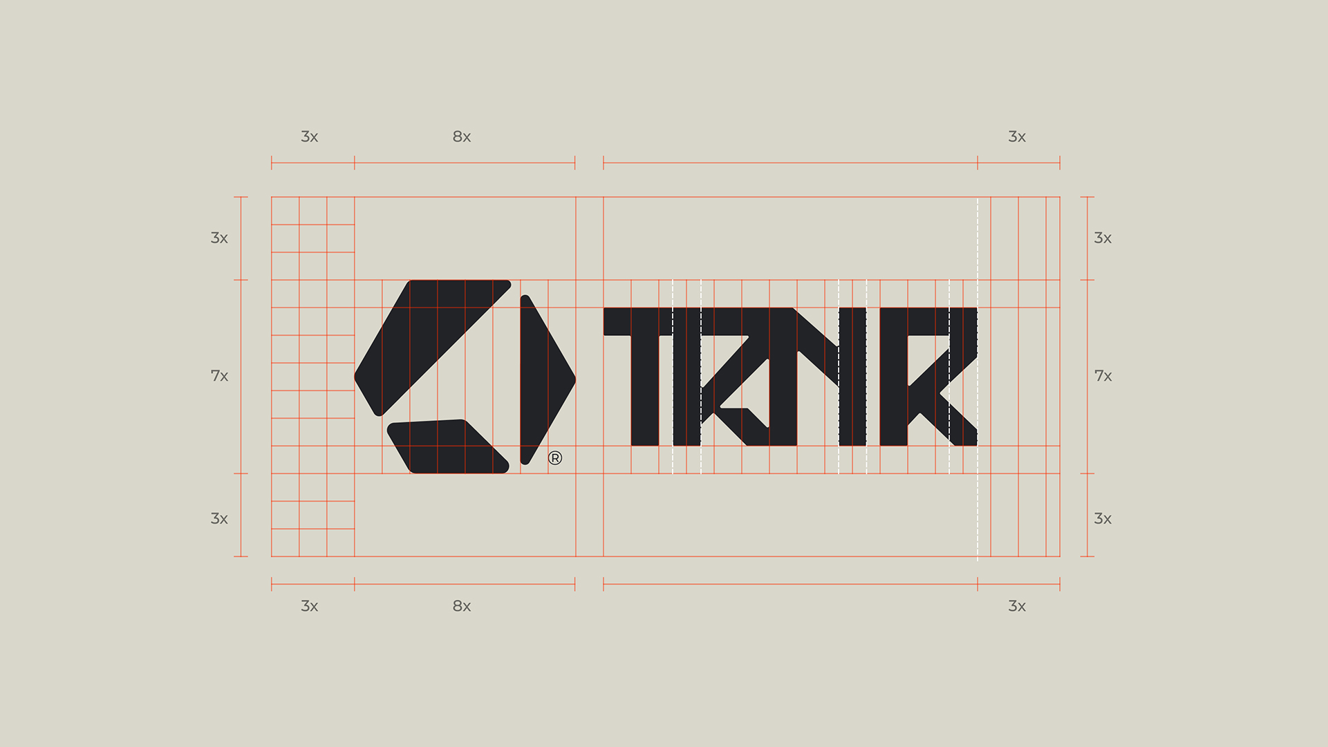
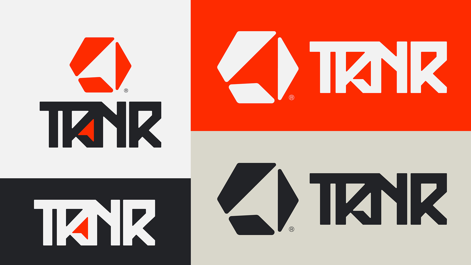
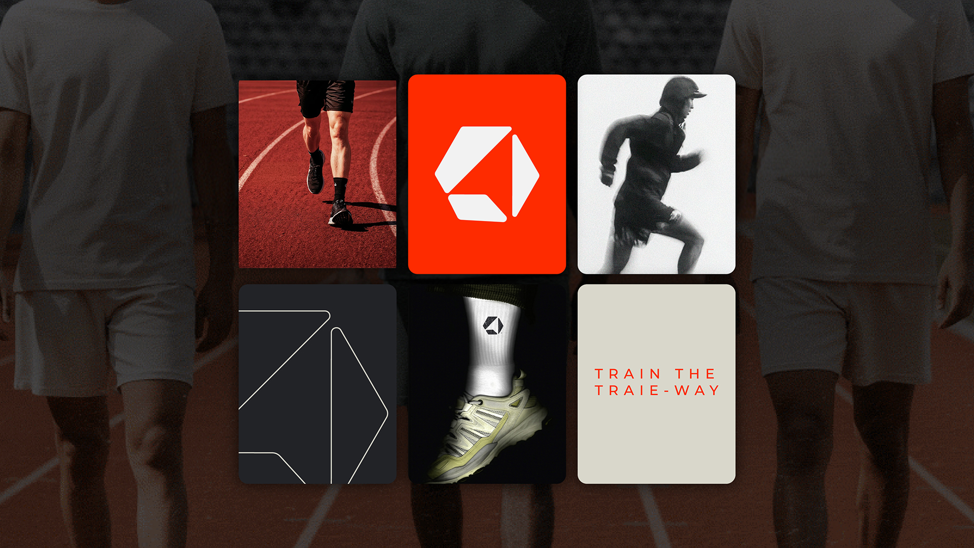
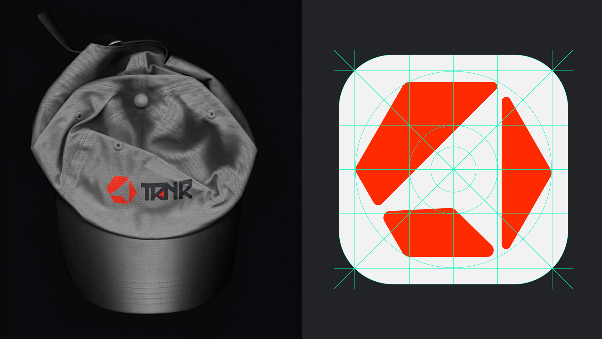
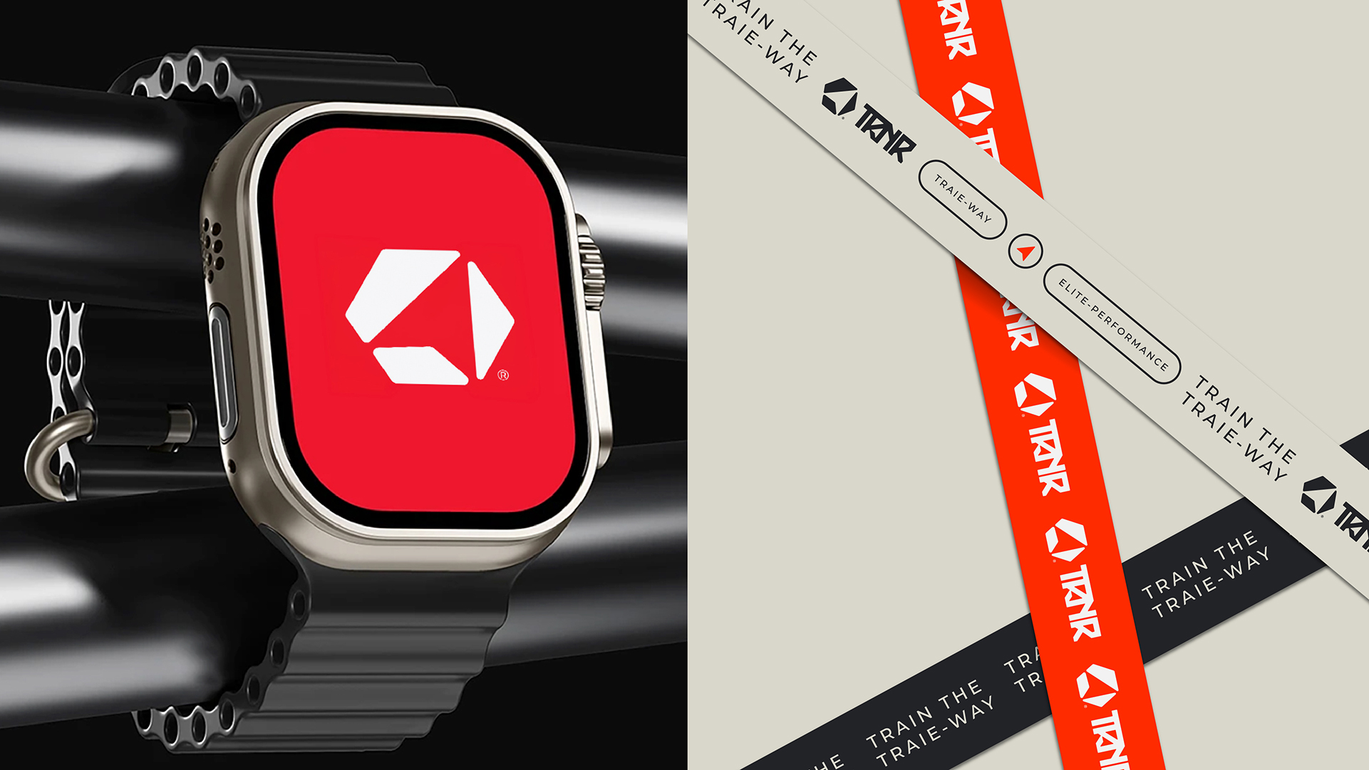
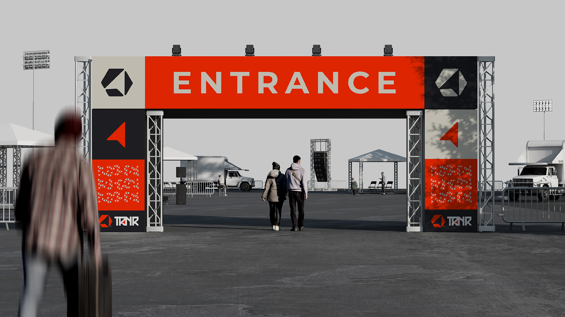
The TRNR monogram is a hexagonal mark with a forward-leaning arrow locked inside it, a progression symbol that signals speed, direction and momentum.
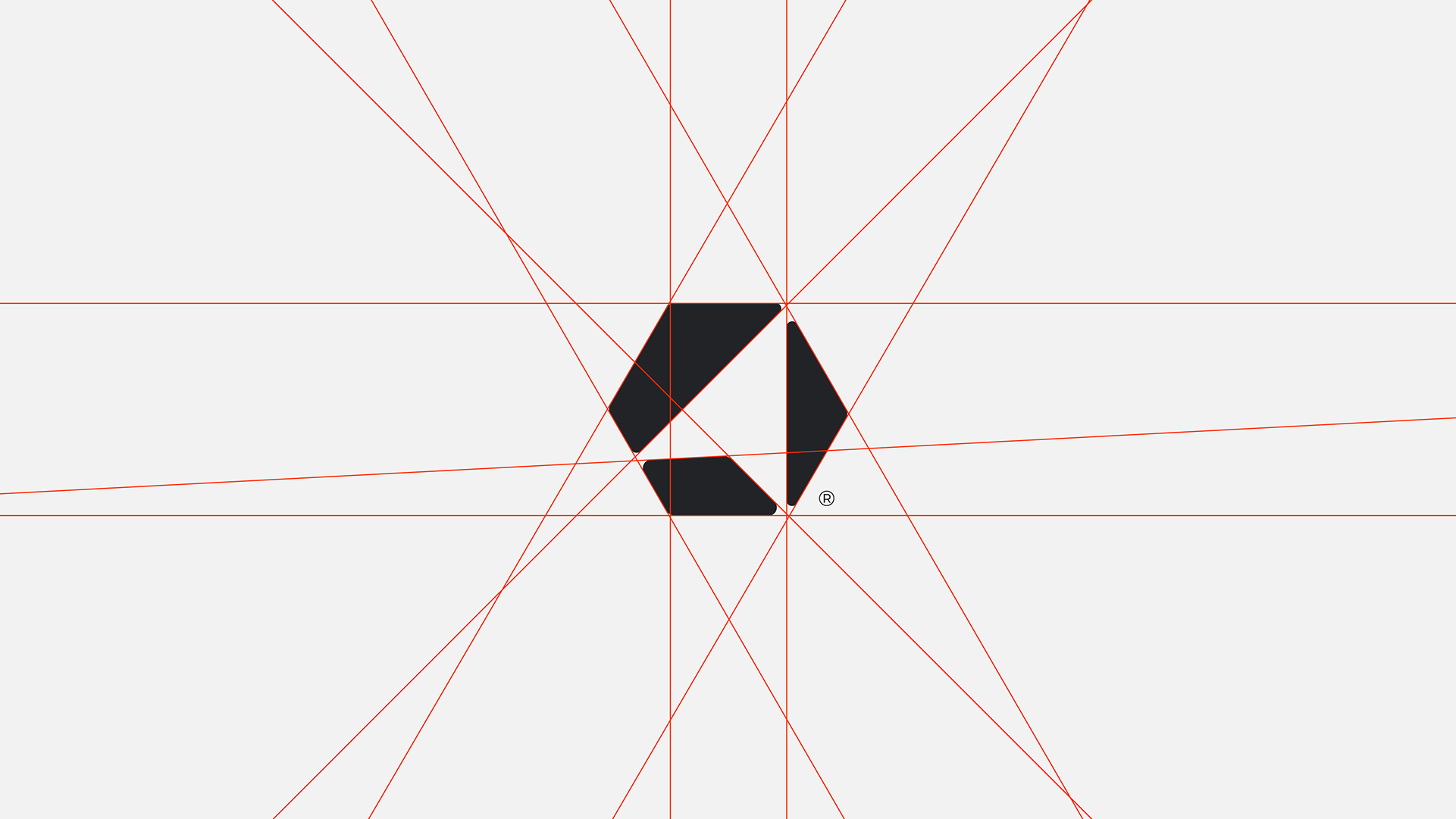
The custom wordmark carries the same angular, engineered logic, drawn on a strict proportional grid so it holds up from an app icon to a stadium banner.
03. Colour & Pattern
Charcoal, Off-White
& Signal Red
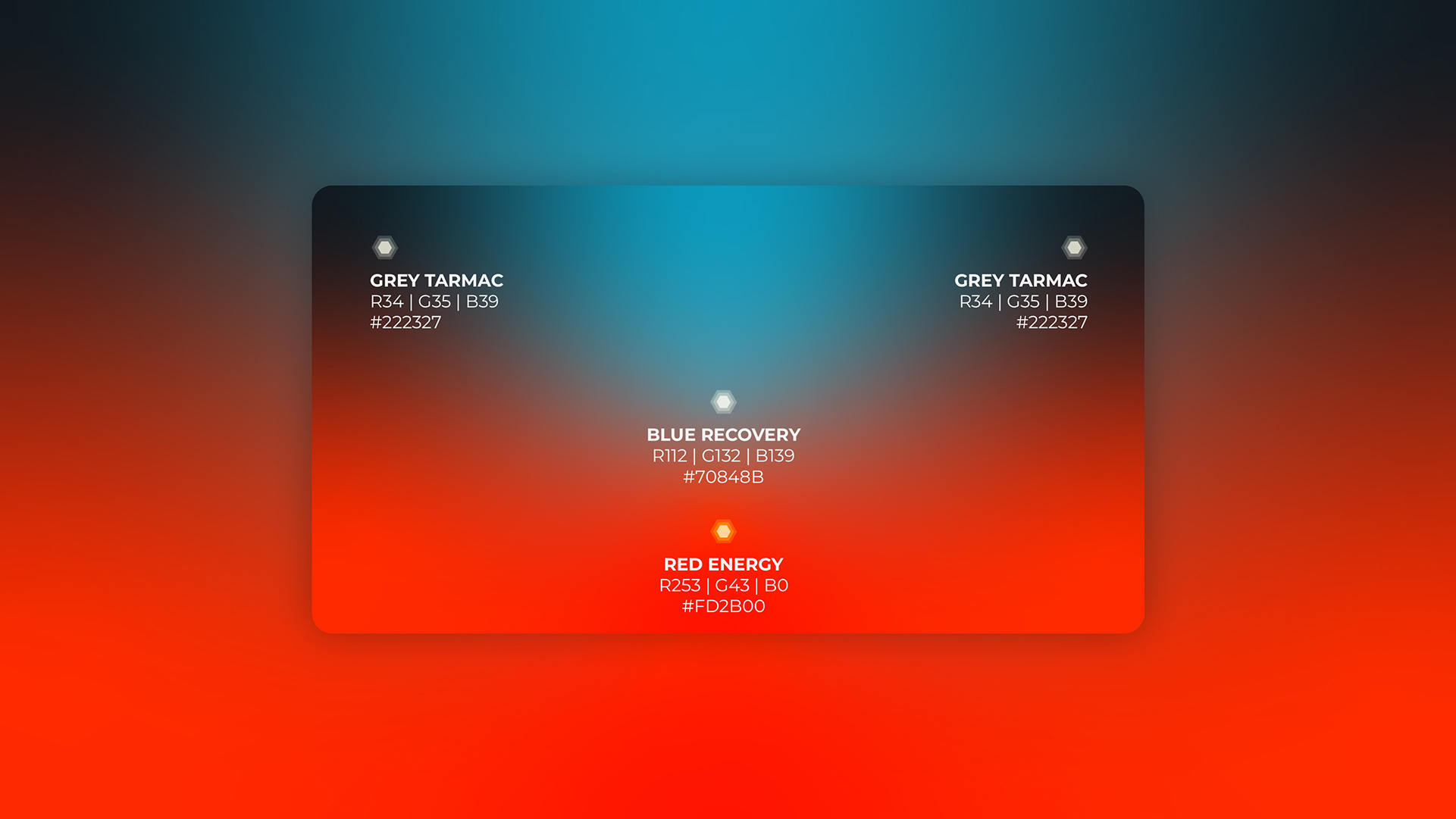
The palette runs on deep obsidian charcoal and clean off-white, cut through with a single charge of signal red that does all the shouting.
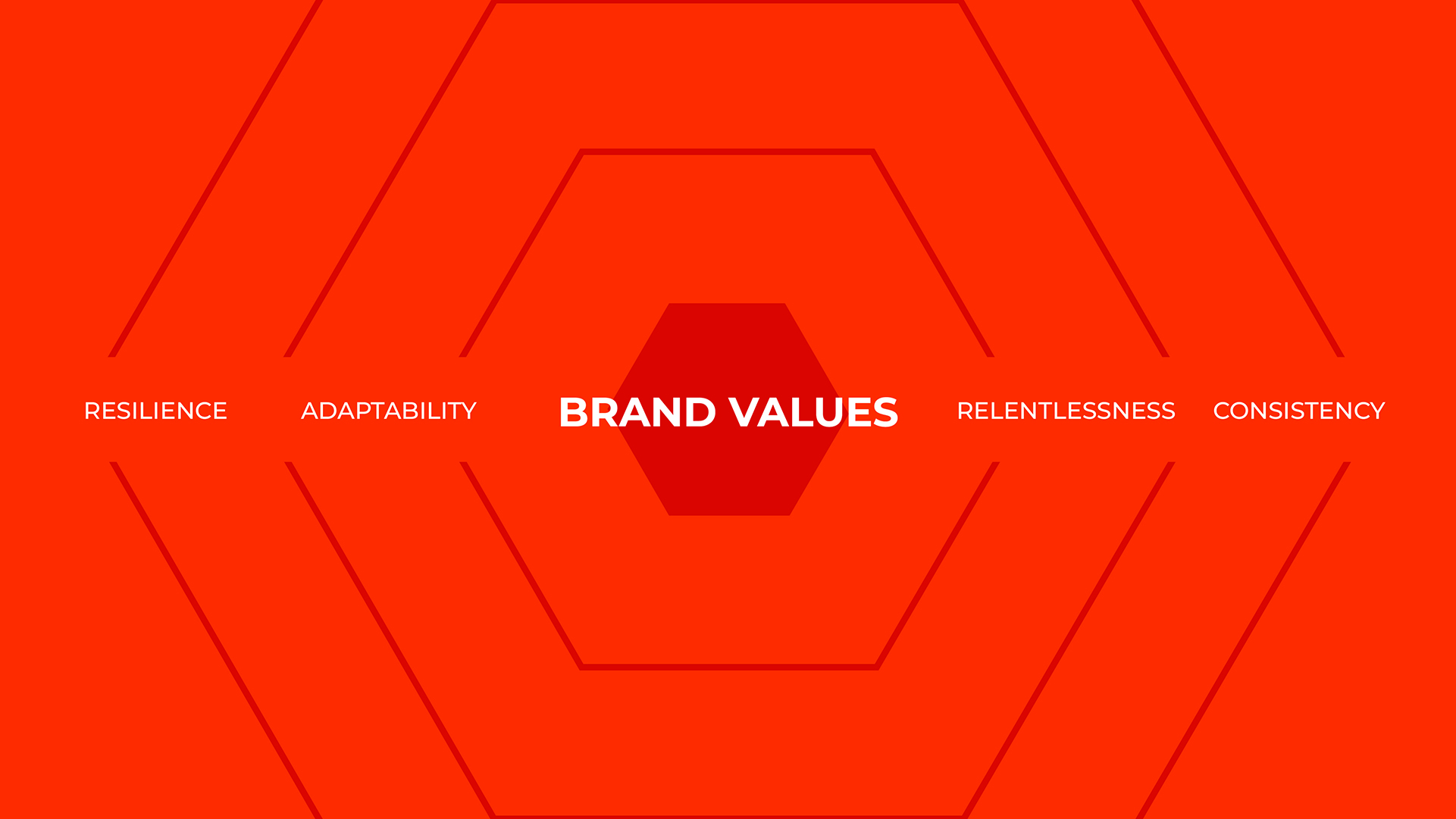
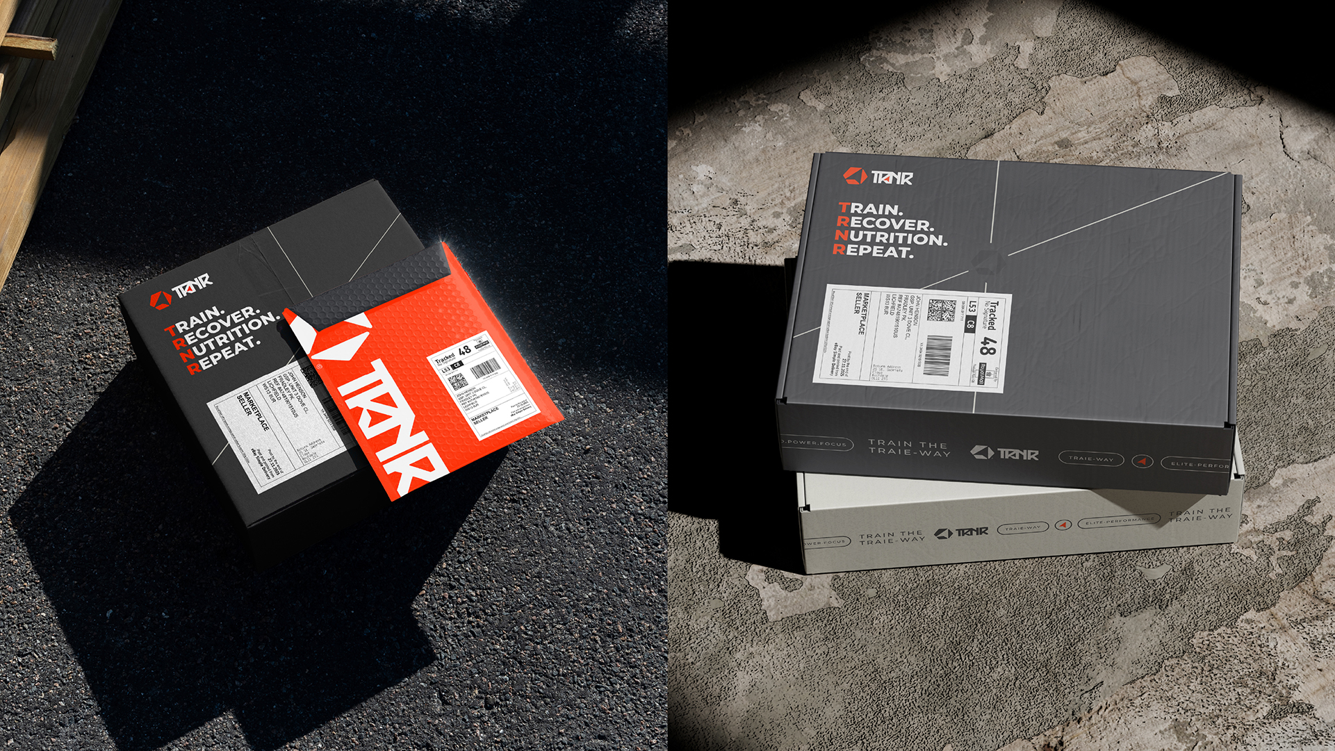
A hexagonal pattern, derived directly from the monogram, scales across packaging, apparel and environments to give the brand a recognisable texture from across a room.

04. Typography
Montserrat,
In Motion
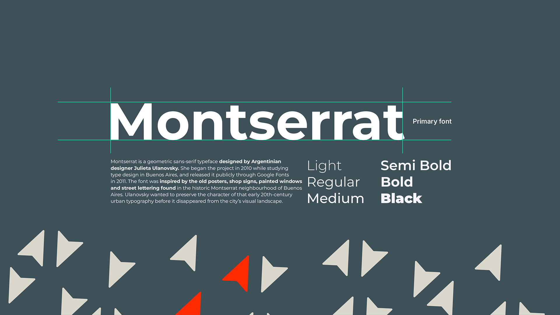
Montserrat anchors the system as the primary typeface, a geometric sans-serif that reads clean and confident across every weight from Light to Black.
Set tight and uppercase, it gives the brand the blunt, athletic voice of a performance label without tipping into shouting.


05. Art Direction
Speed. Power.
Focus.
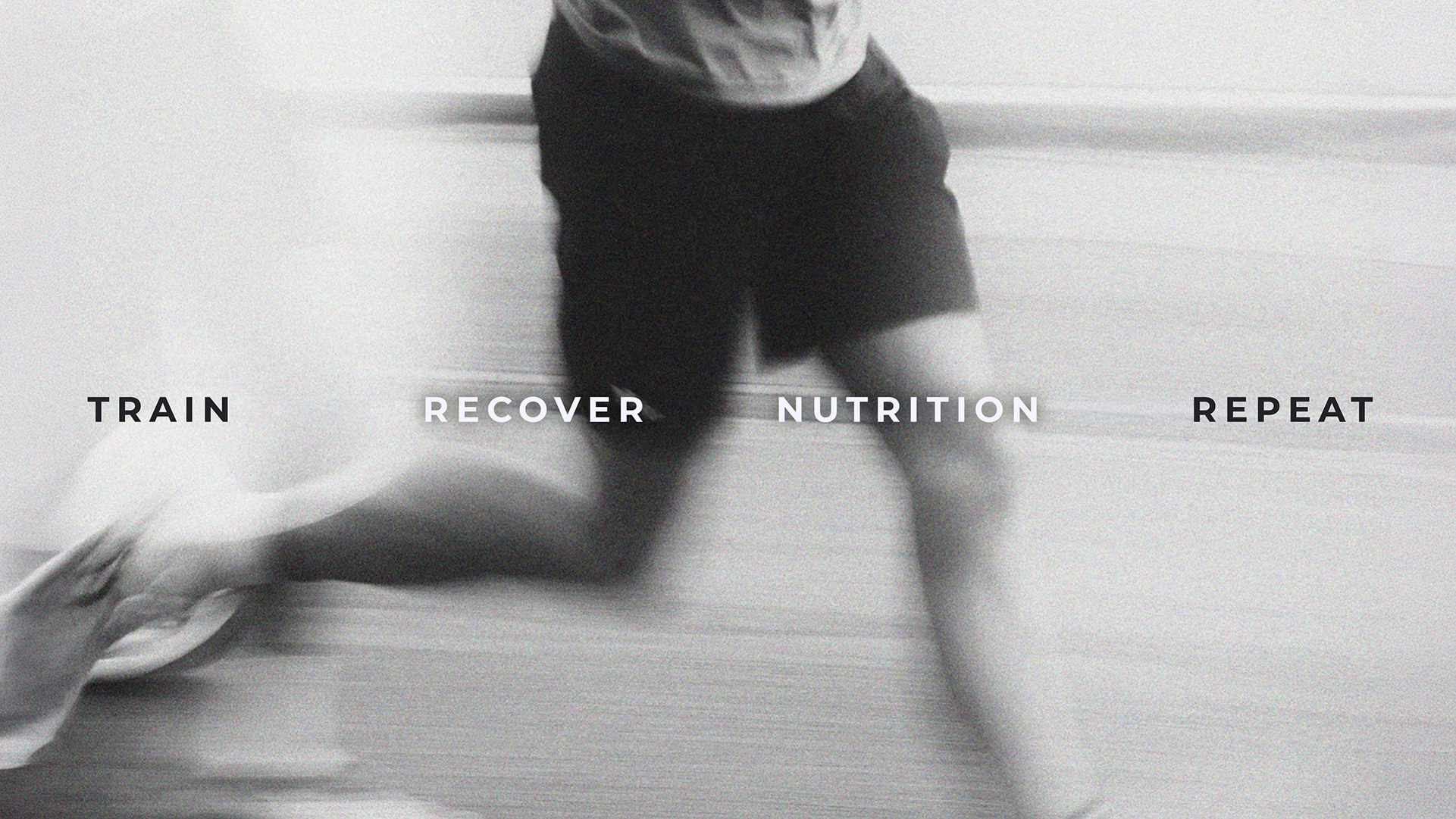
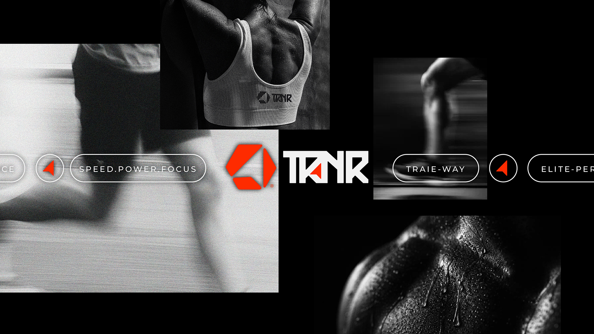
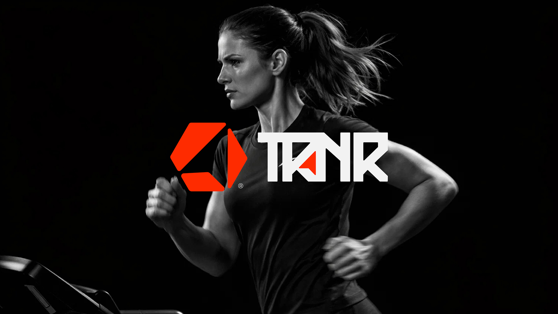
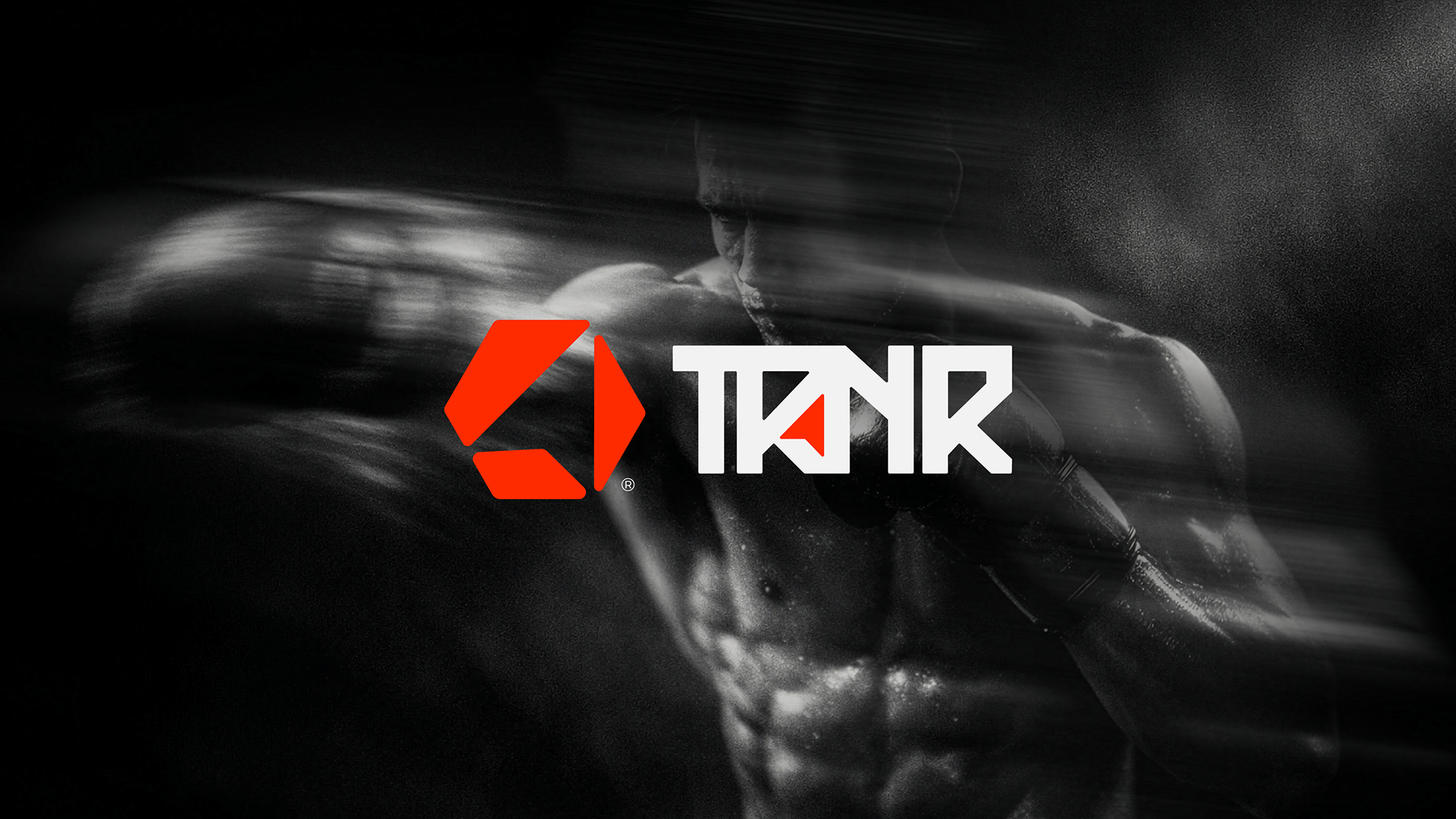
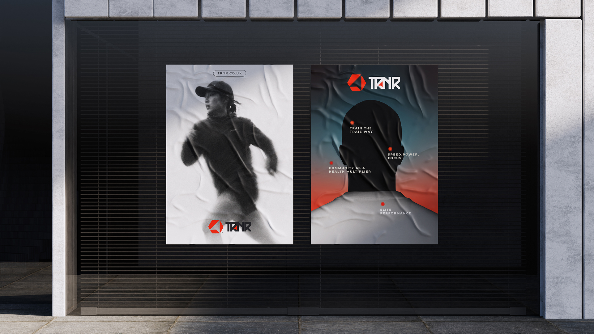
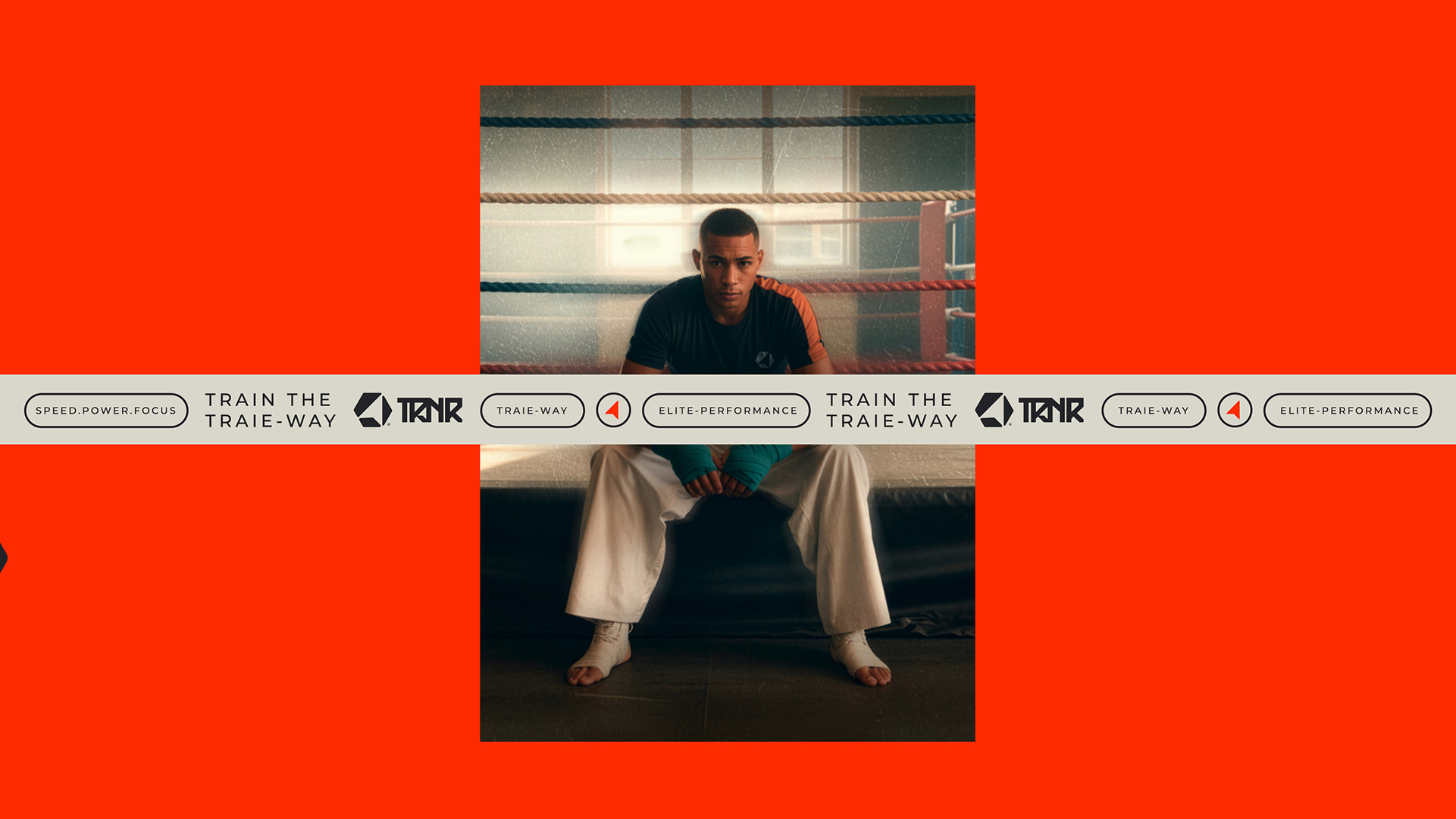
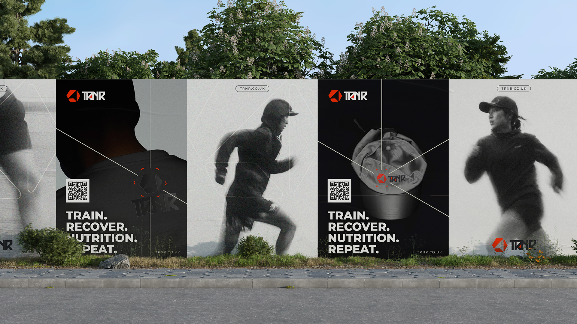
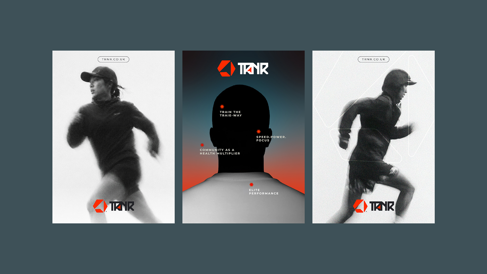
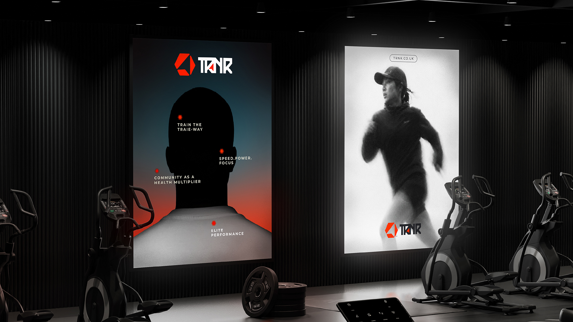
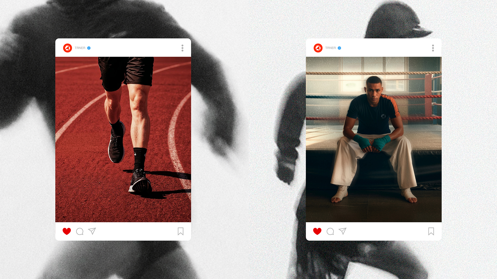
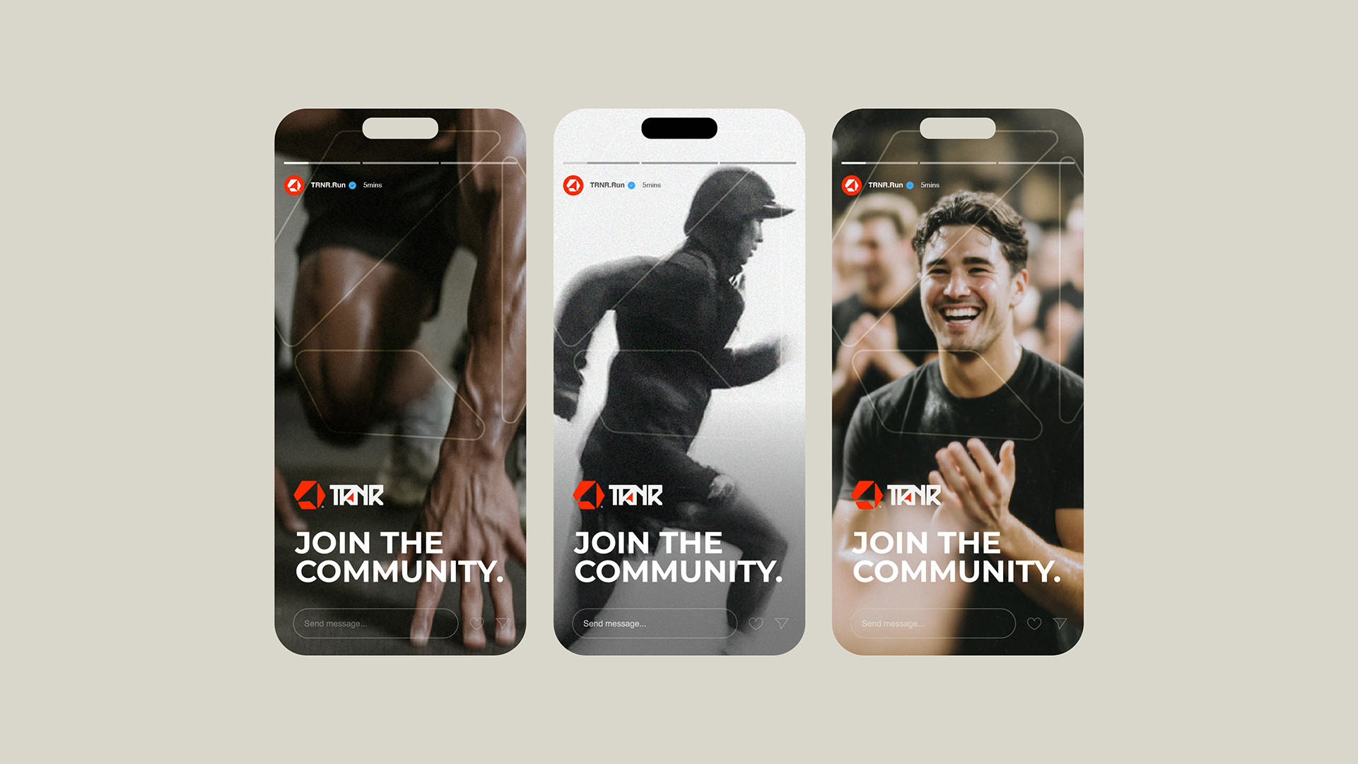
The photographic direction is built on high-contrast, motion-blurred athleticism: real effort, real sweat, shot under hard light against deep black.
Layered with the pattern, the wordmark and the four pillars, it gives every campaign asset a sense of controlled intensity.
06. Applications
Built To
Be Worn
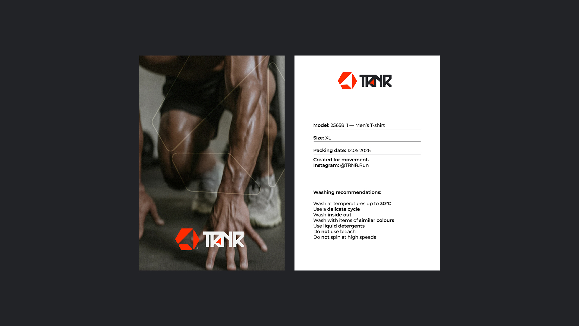
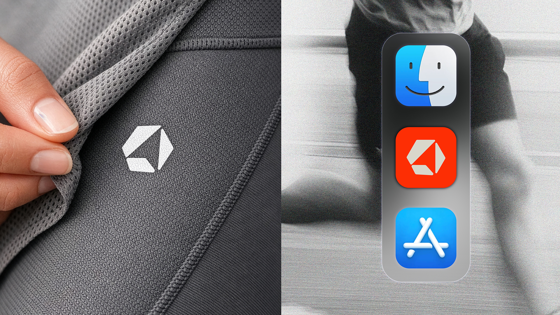
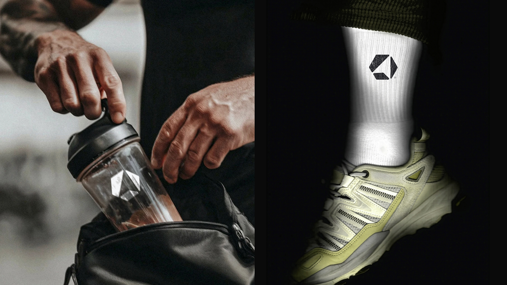
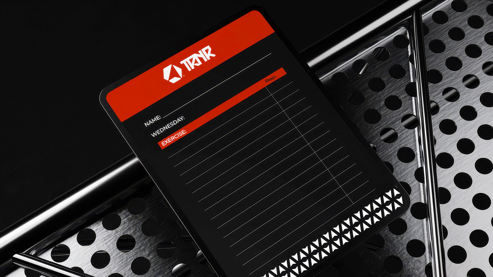
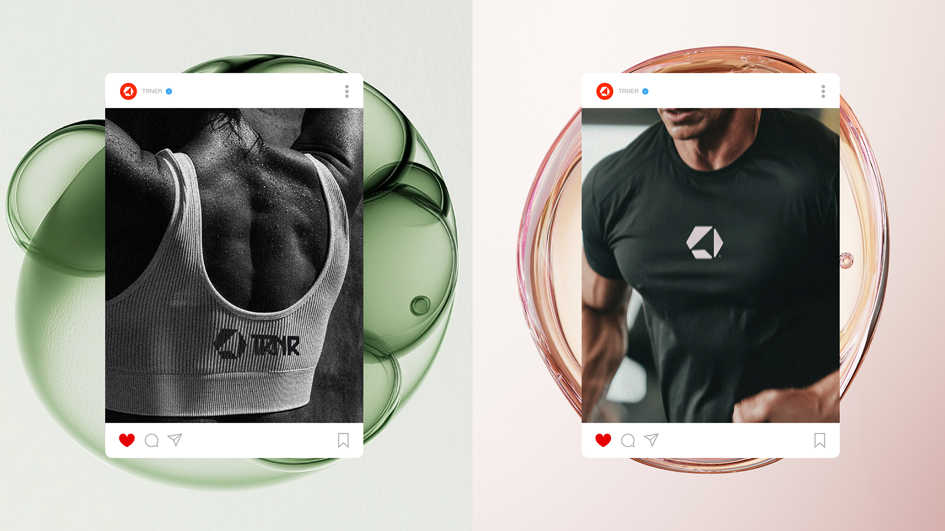
From embroidered caps and care labels to bottles, socks, smartwatch faces and packaging, the system was stress-tested across the products an athlete actually touches.
Every application keeps the same discipline: one mark, one pattern, one charge of red.
07. Digital & Social
Join The
Community
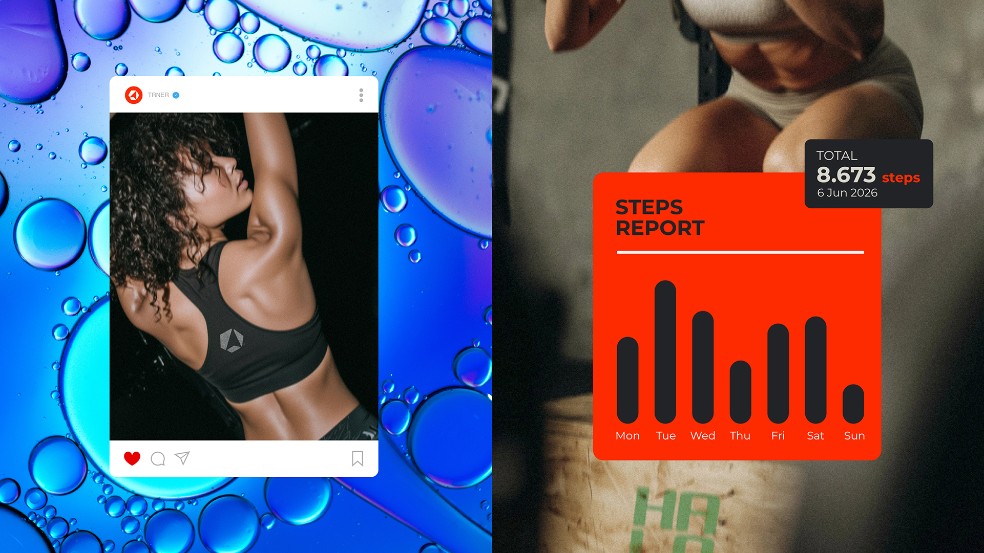
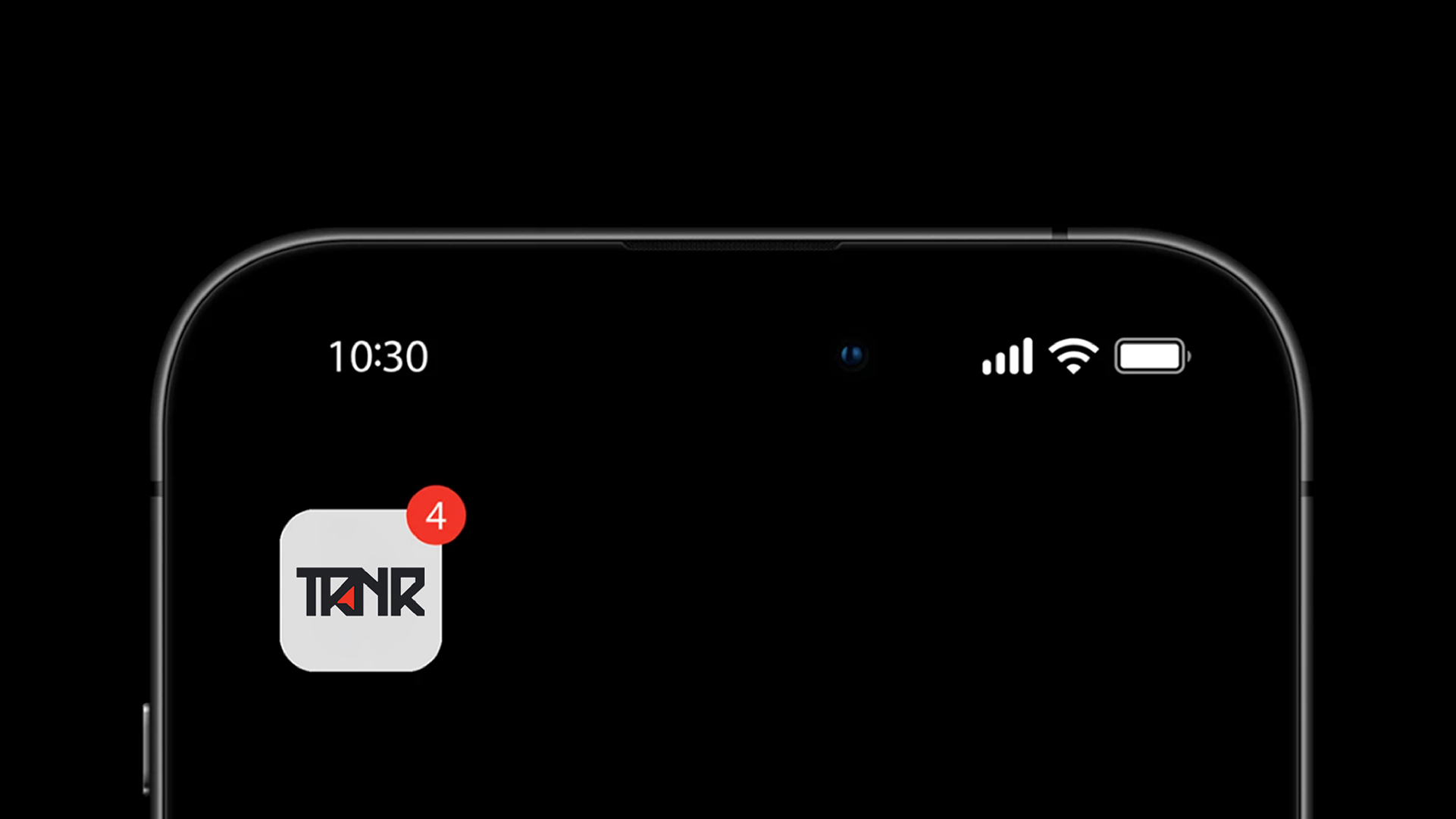
The TRNR app turns the four pillars into a daily product, tracking training, recovery, nutrition and progress in one branded interface.
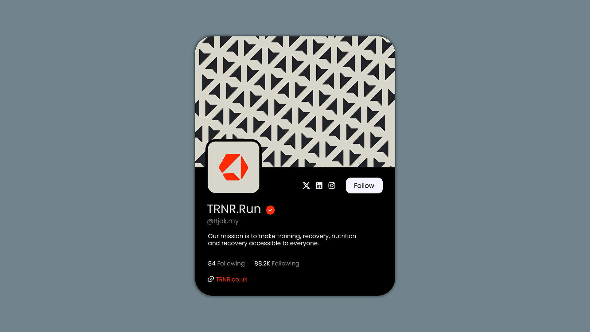
Across social, the brand leans into community as a health multiplier, with content built to be shared, repeated and trained against.
08. Outcome
TRNR landed as a complete, confident performance brand: a name that teaches its own philosophy, a mark engineered for motion and a system that holds from a care label to a stadium wall.
Train, recover, nutrition, repeat is more than a tagline. It is the structure of the brand itself, giving TRNR a clear, ownable position in a category crowded with noise.
The outcome is a label that feels built by people who train every day, for people who do the same. Elite performance, by design.