
Branding, Strategy & Web Design
A Brand Identity
Built on Being
the Black Sheep.
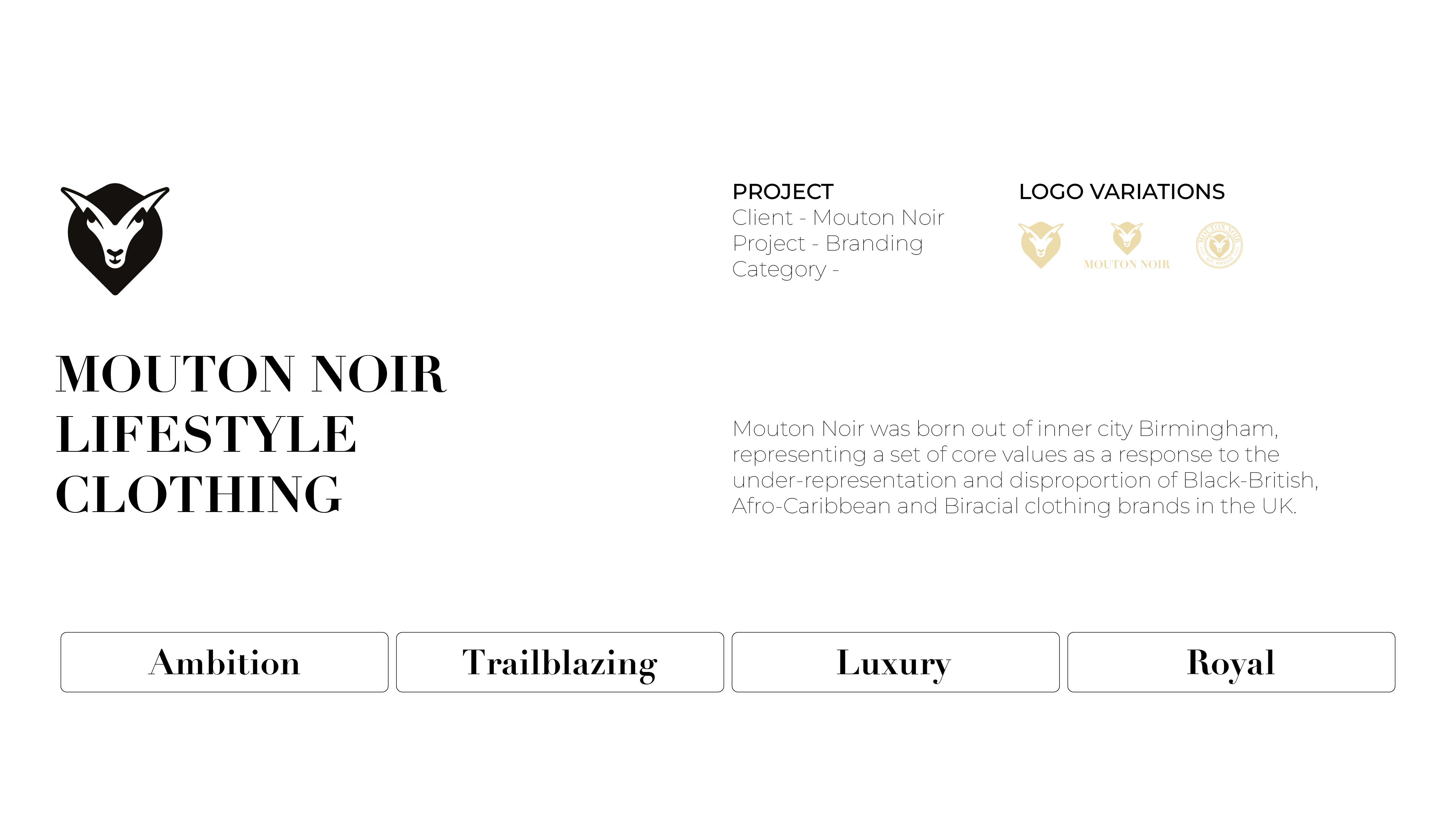
Mouton Noir is a Birmingham-born lifestyle clothing brand defined by premium streetwear sensibilities and a commitment to cultural representation. Translating to "Black Sheep," the name embodies the brand's stance of being an individual, a rejection of conformity and following the "norm".
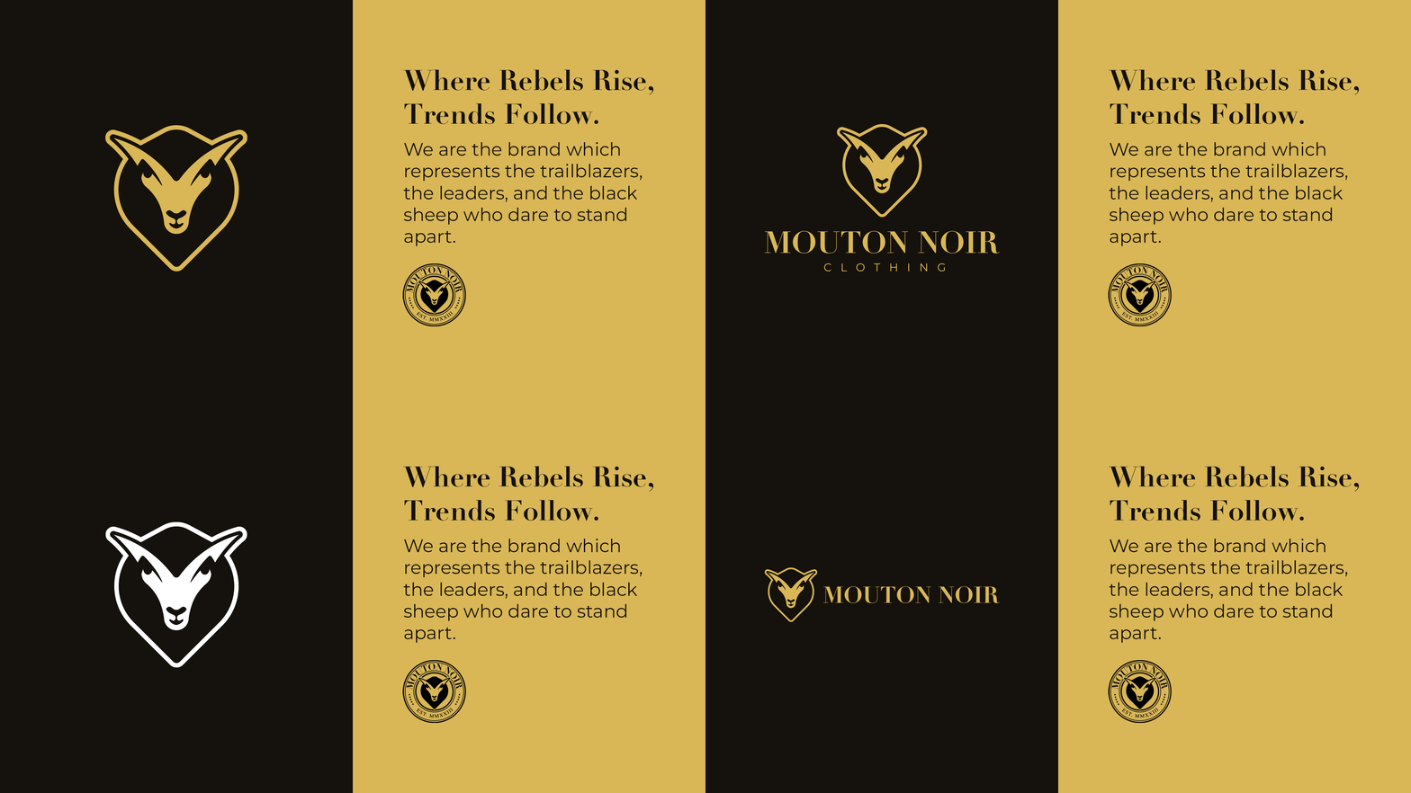
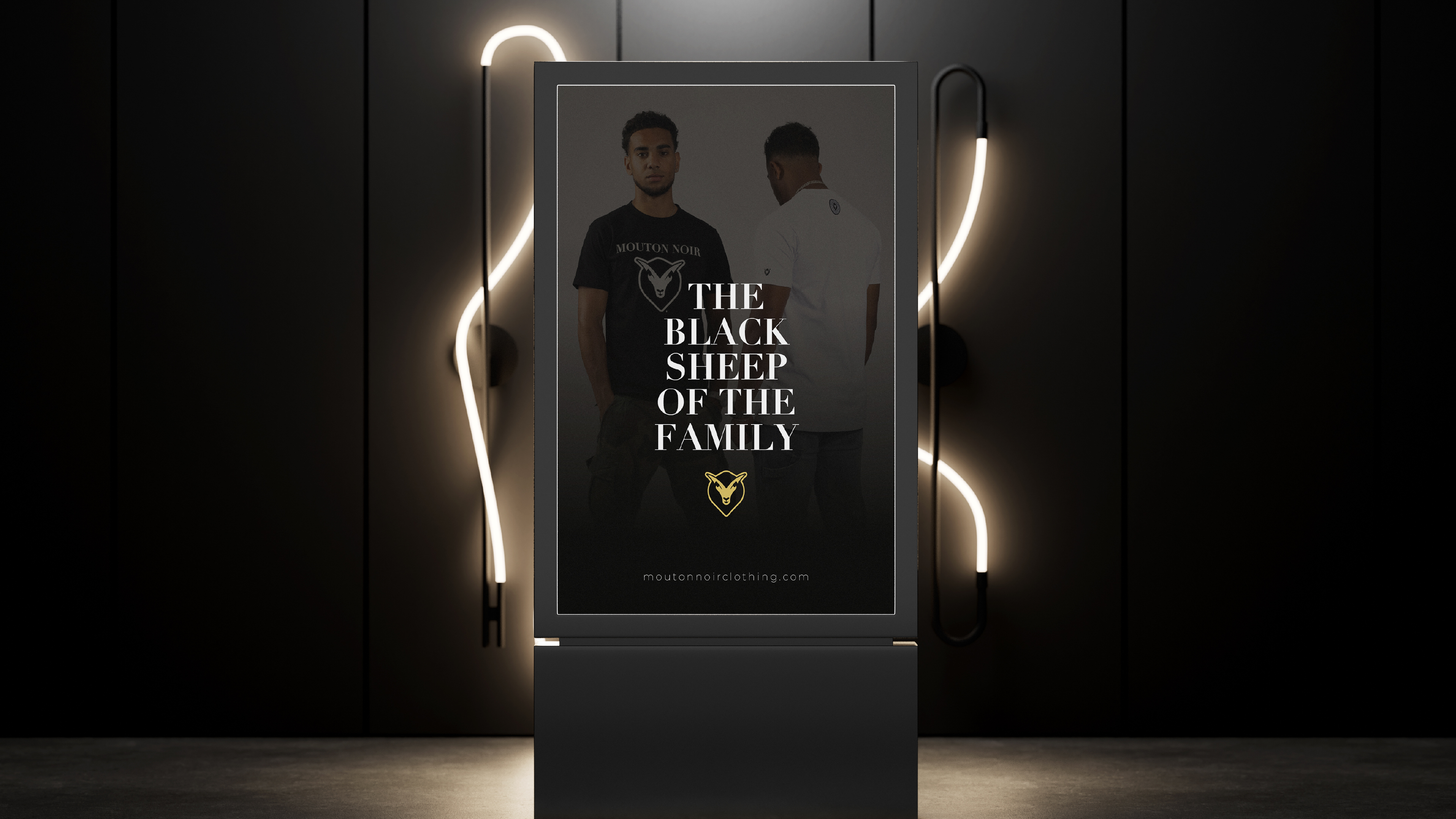
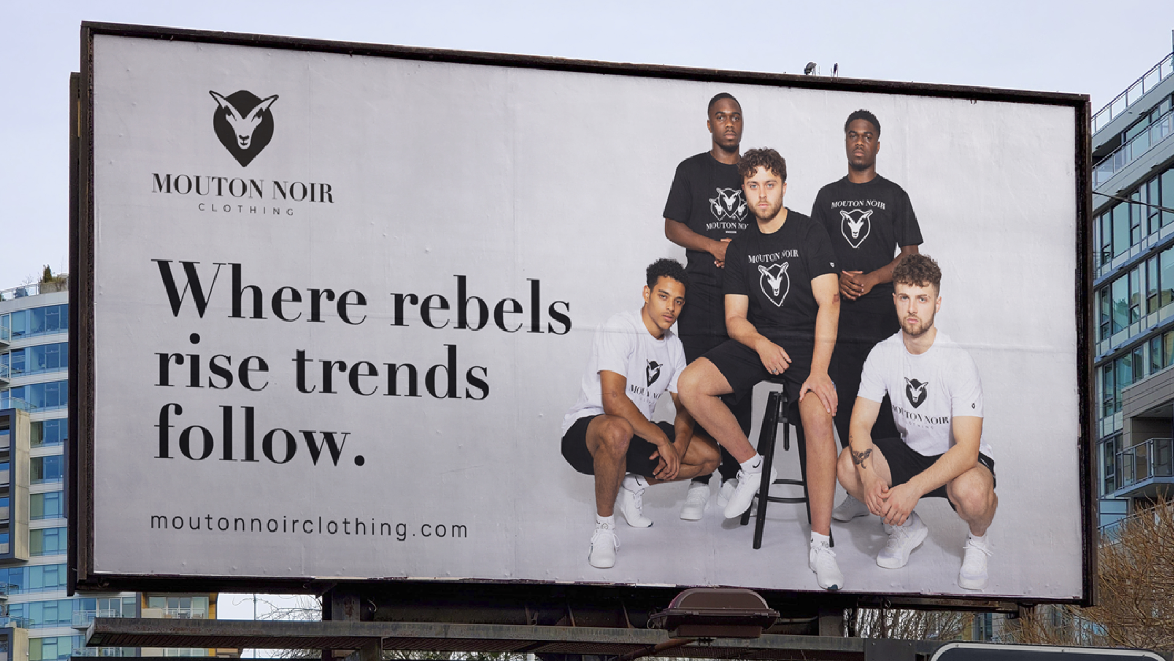
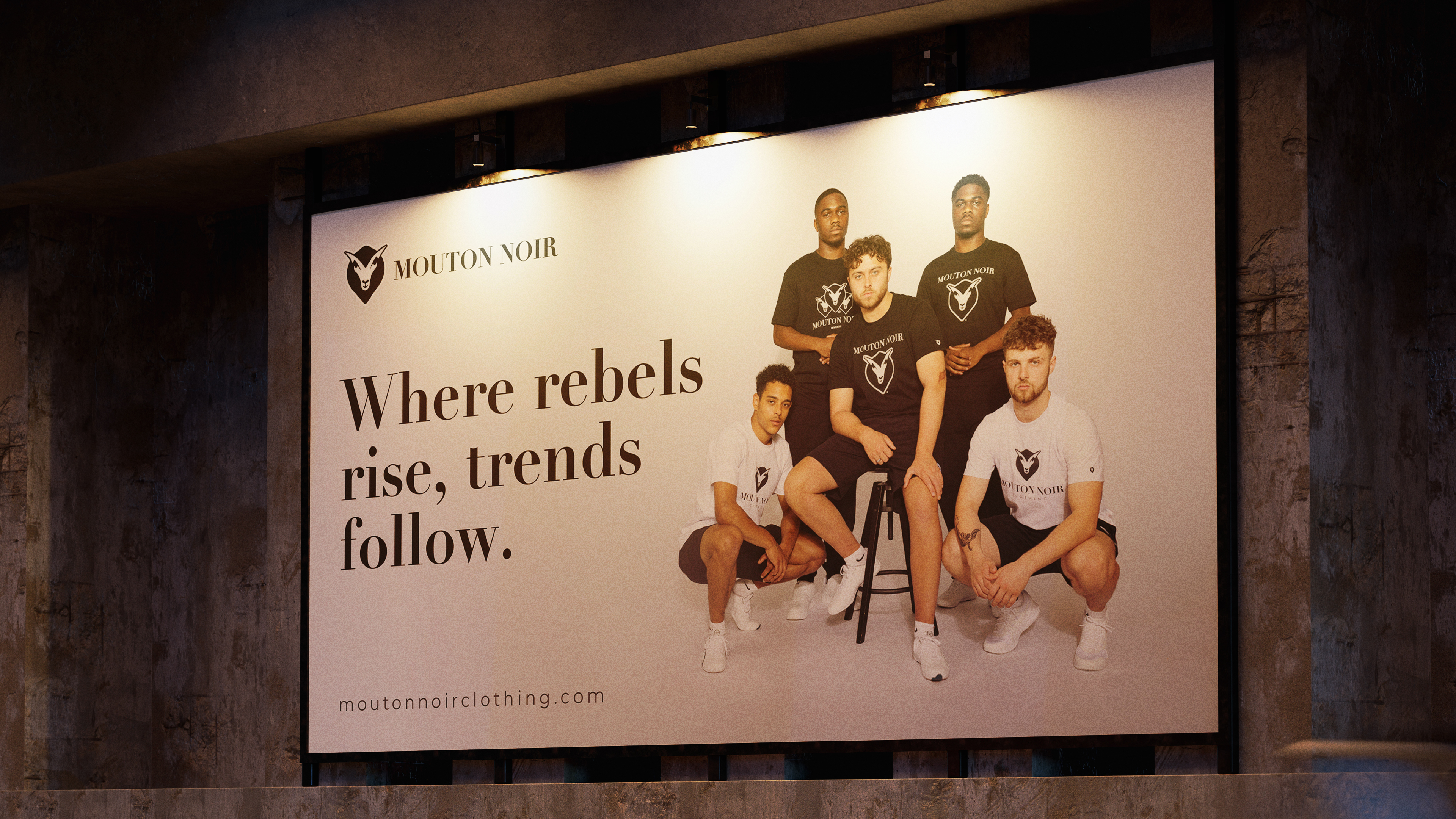
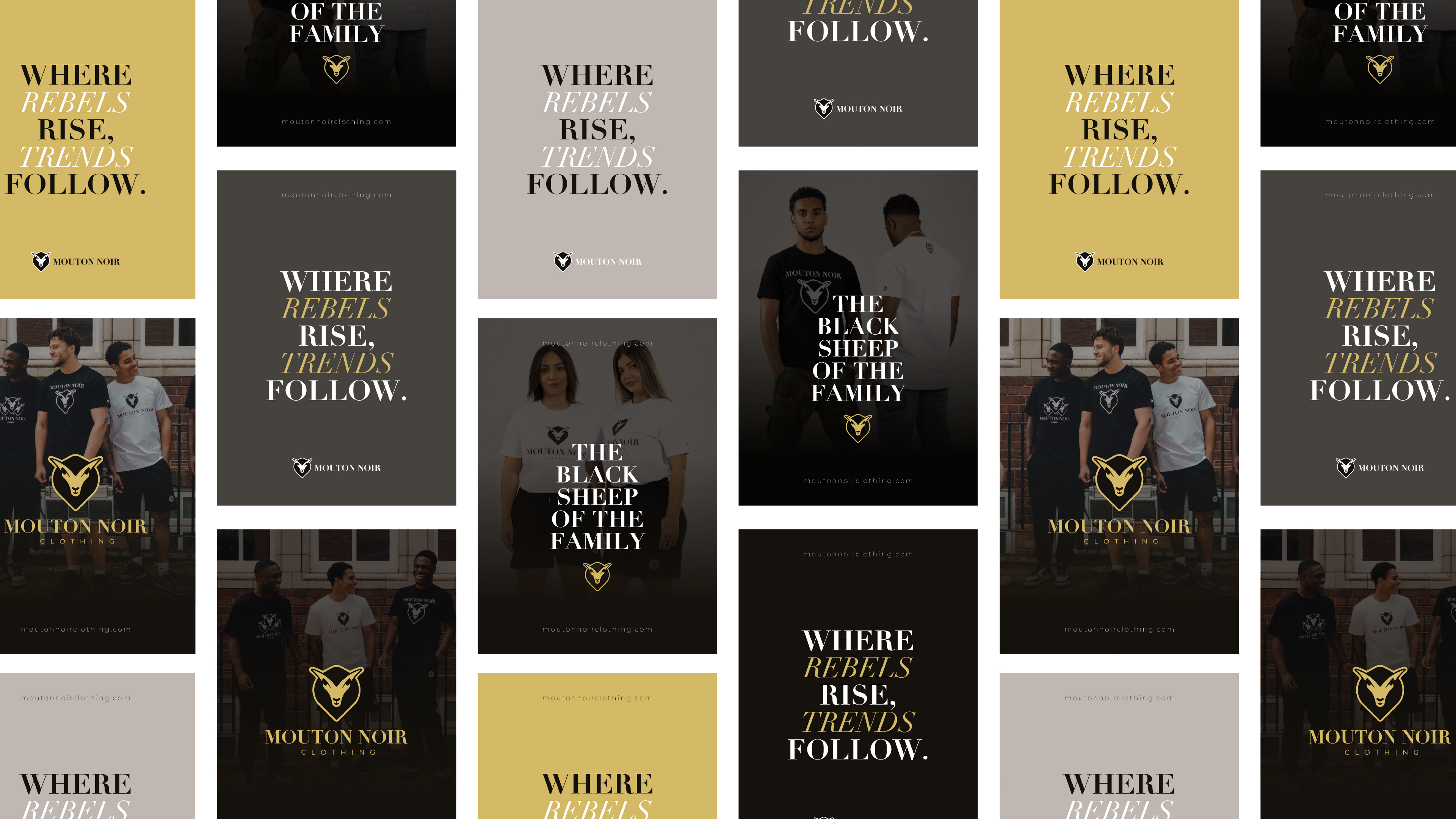
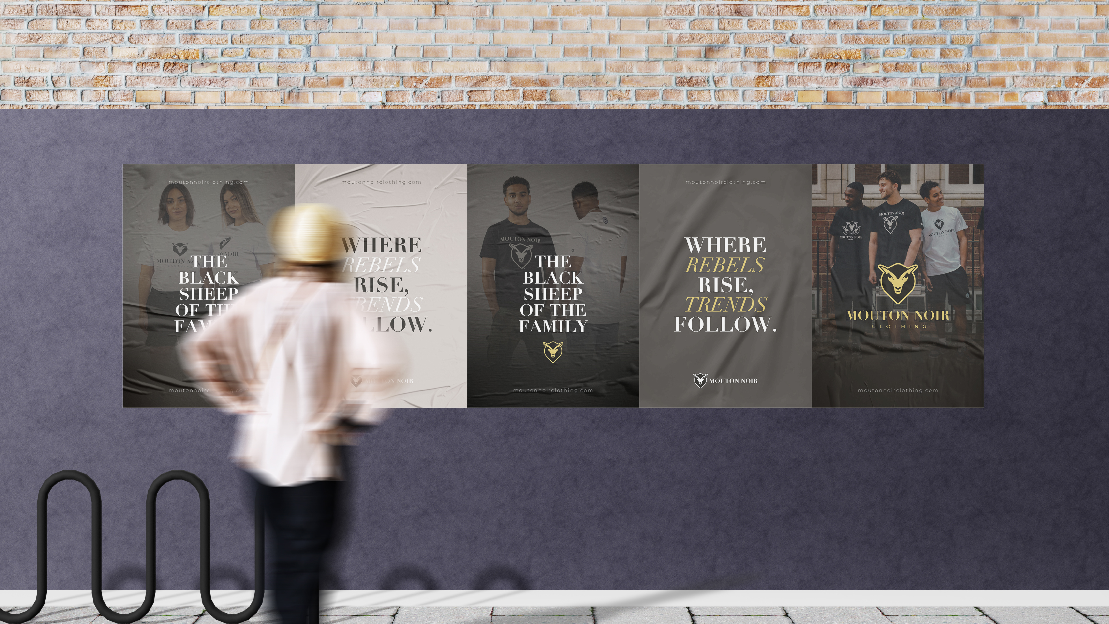
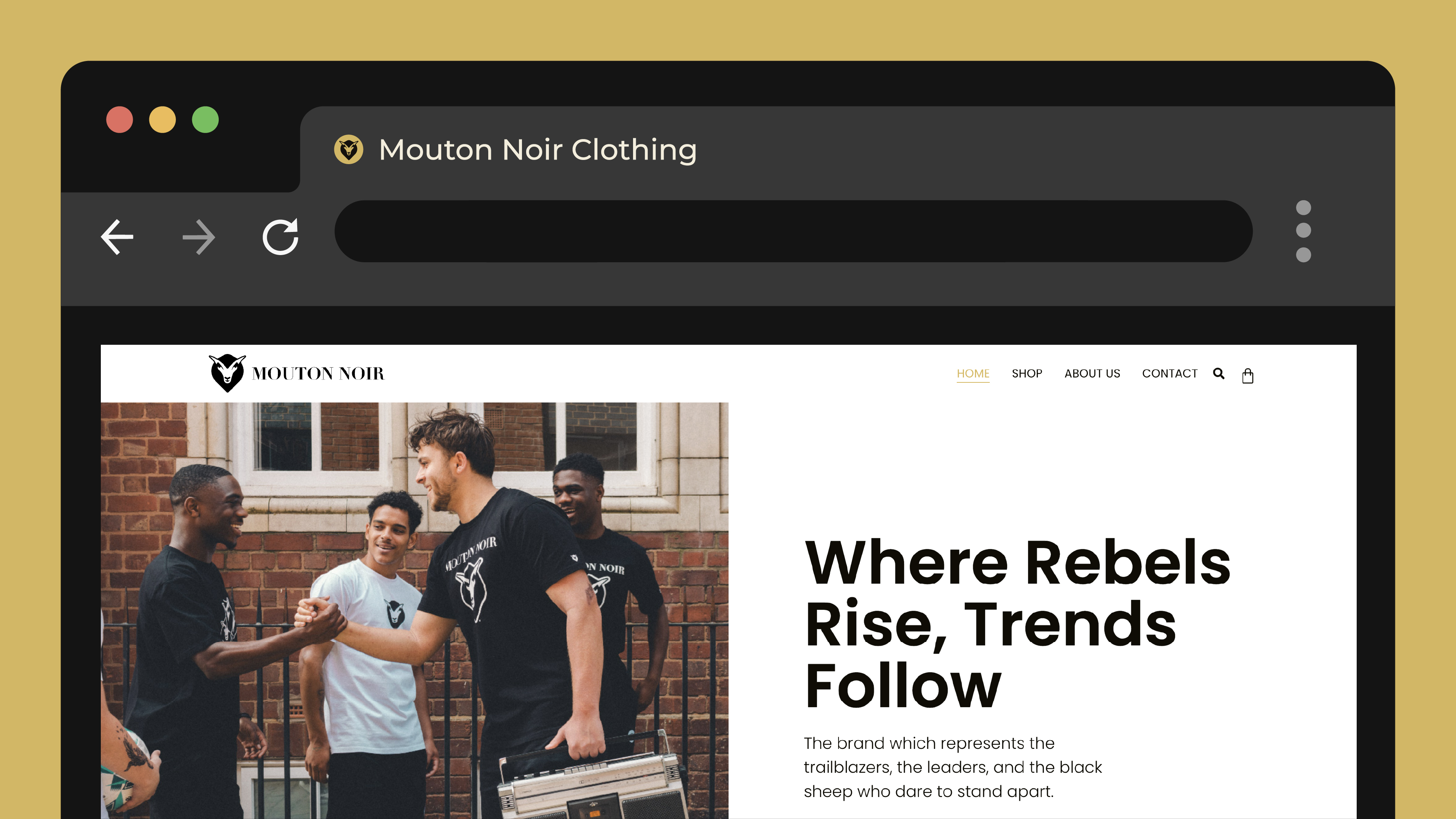
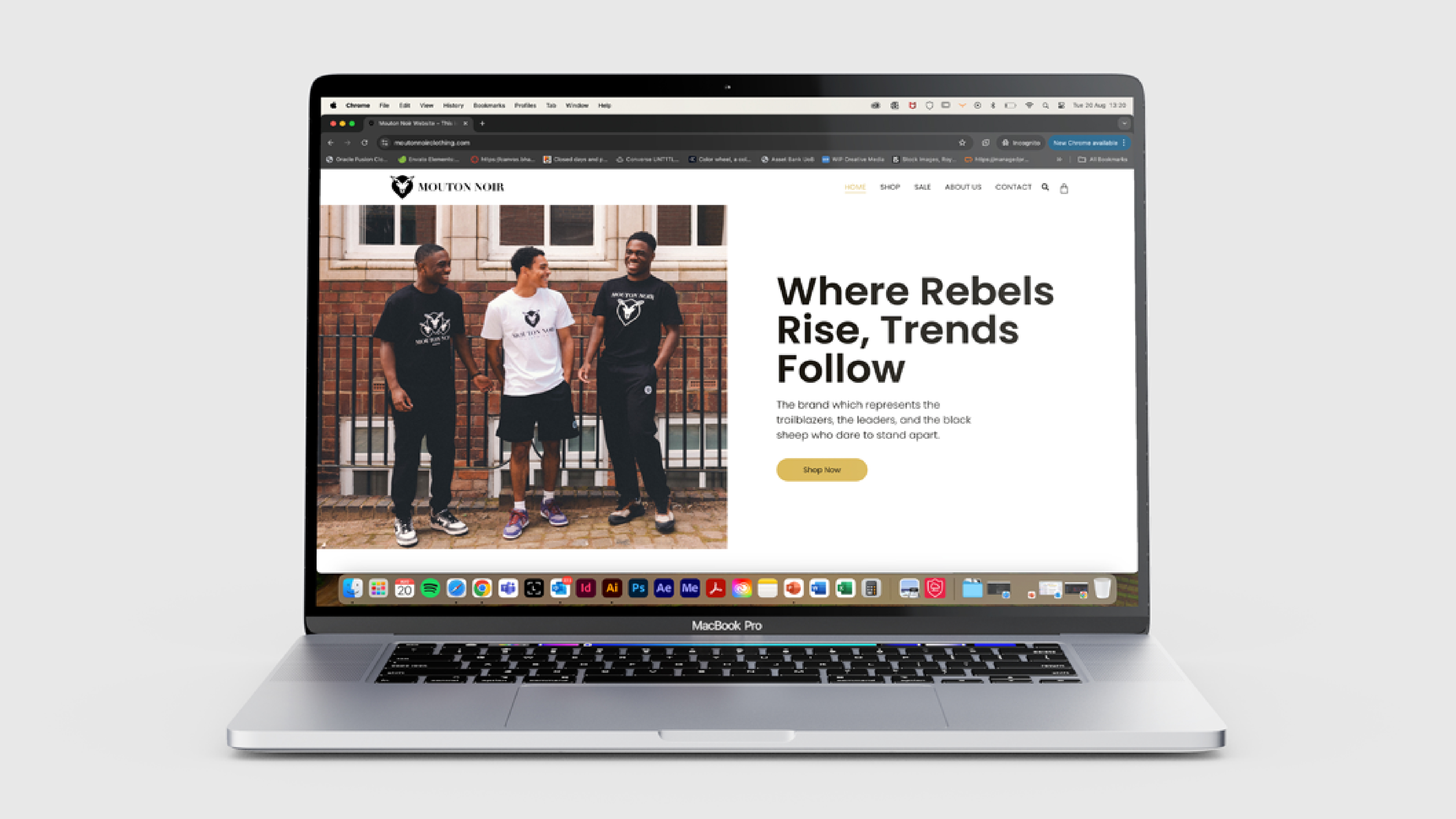
The ethos is encapsulated in statements like "Where Rebels Rise, Trends Follow", not as a slogan but as a worldview. It positions Mouton Noir as a cultural leader rather than a commercial follower.
Core Objectives:
- Build a bold, timeless logo system
- Establish luxury-inflected streetwear positioning
- Translate the identity digitally for e-commerce
- Communicate community and cultural roots
01. Building the
Identity System.
A. Logomark & Wordmark
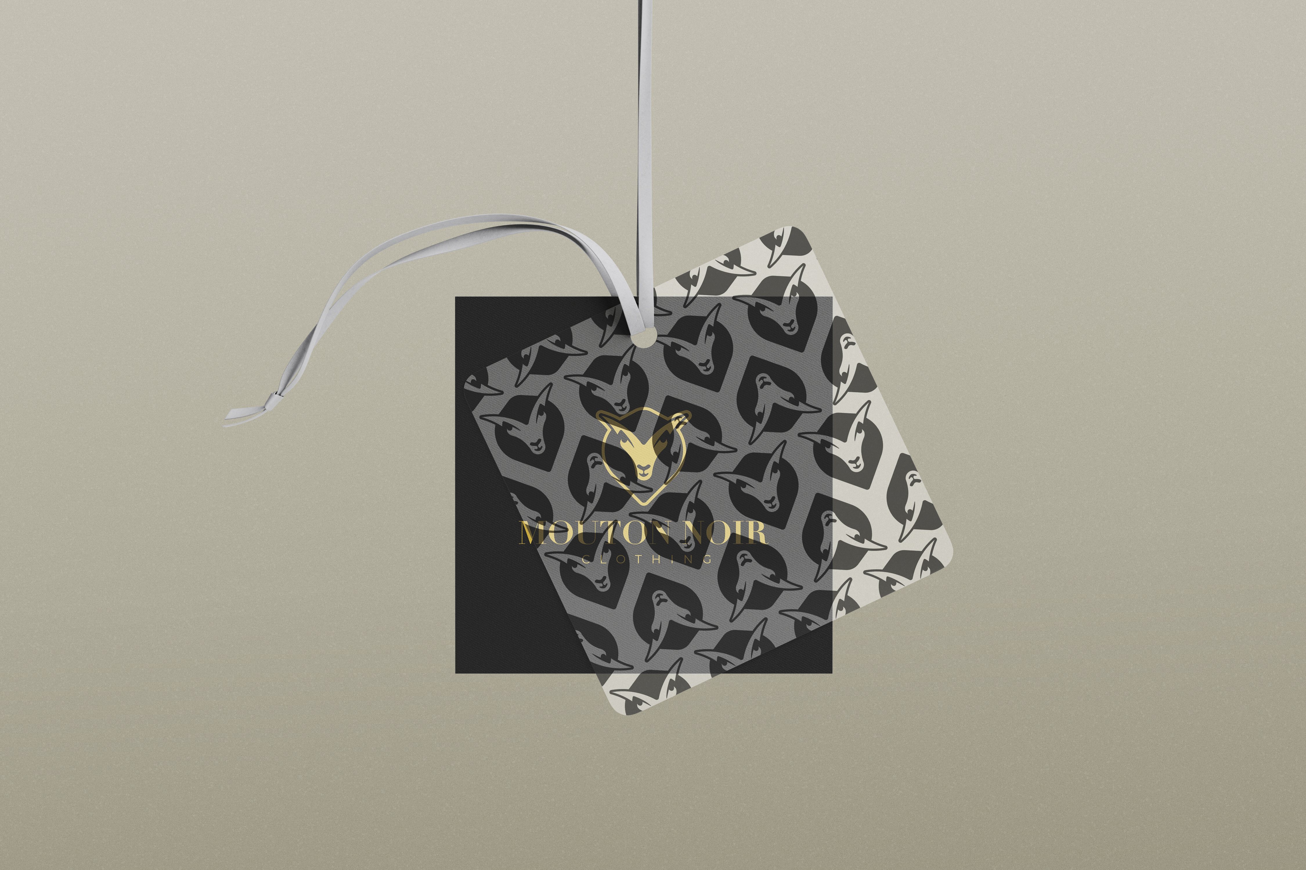
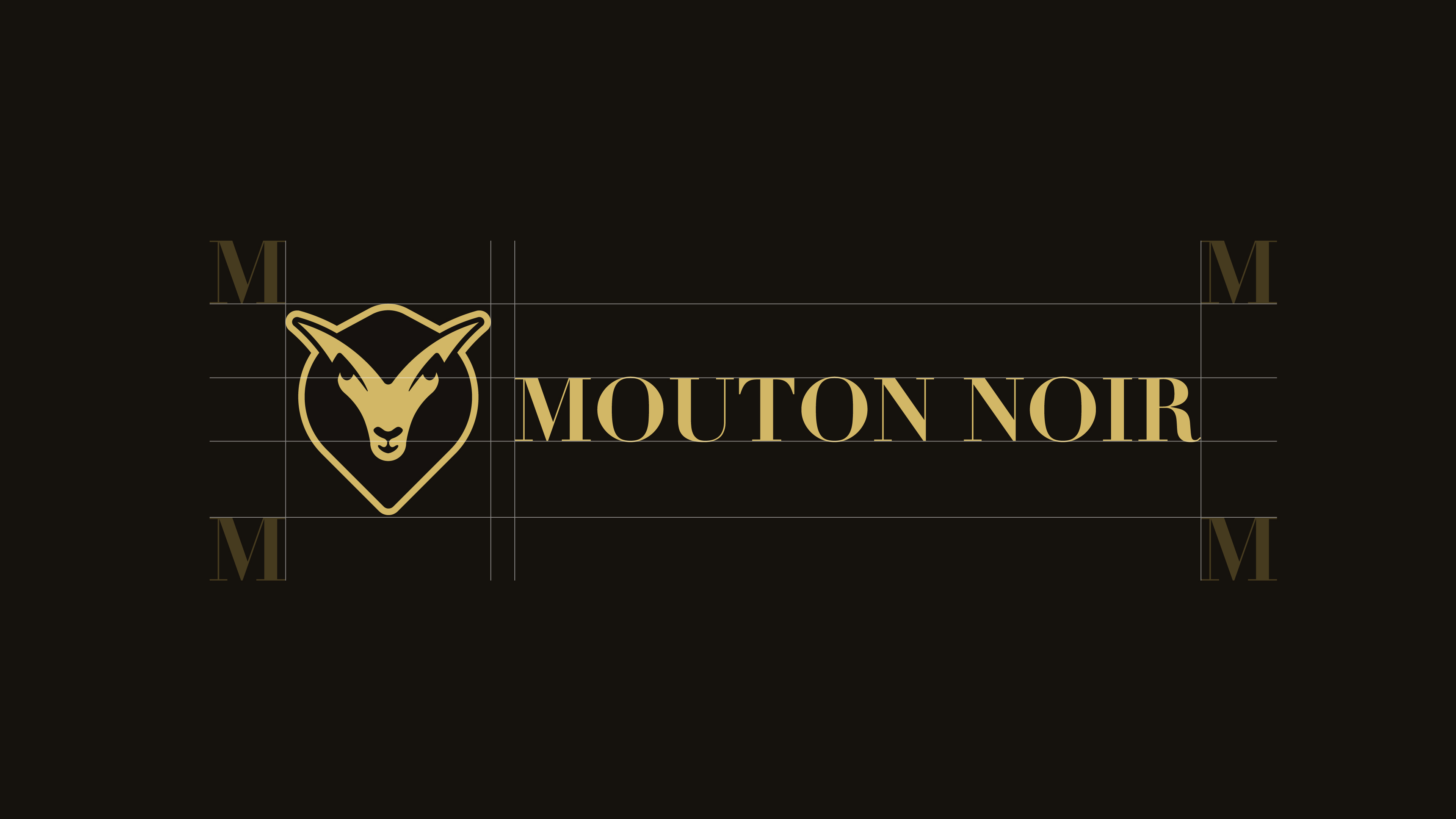
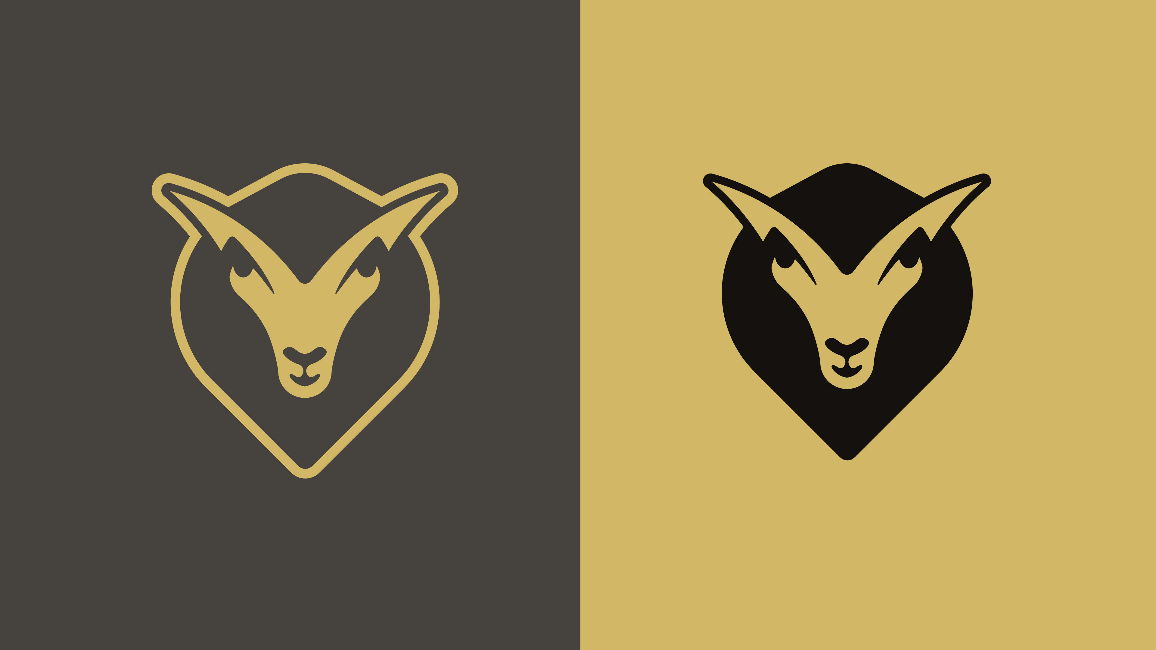
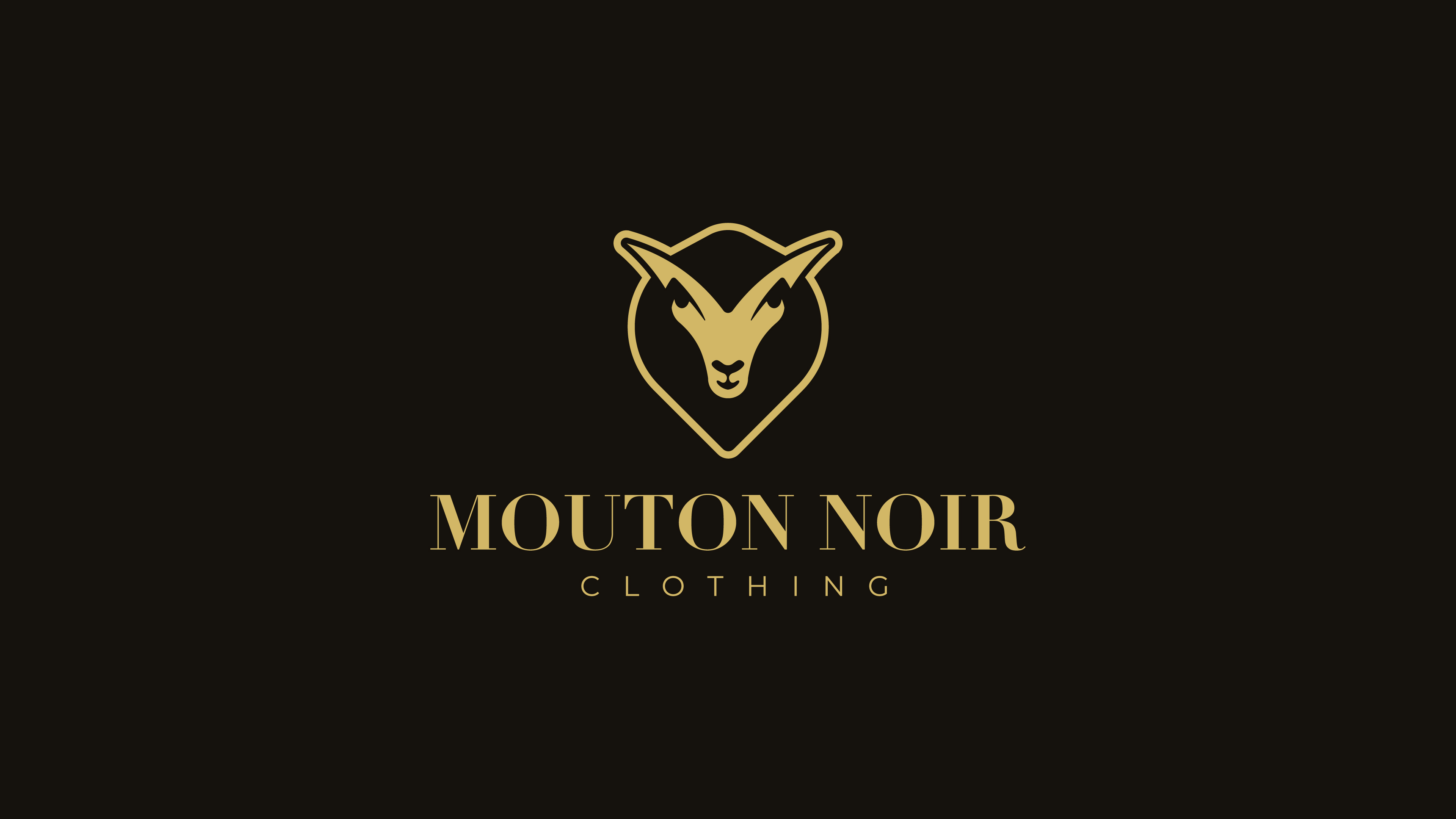
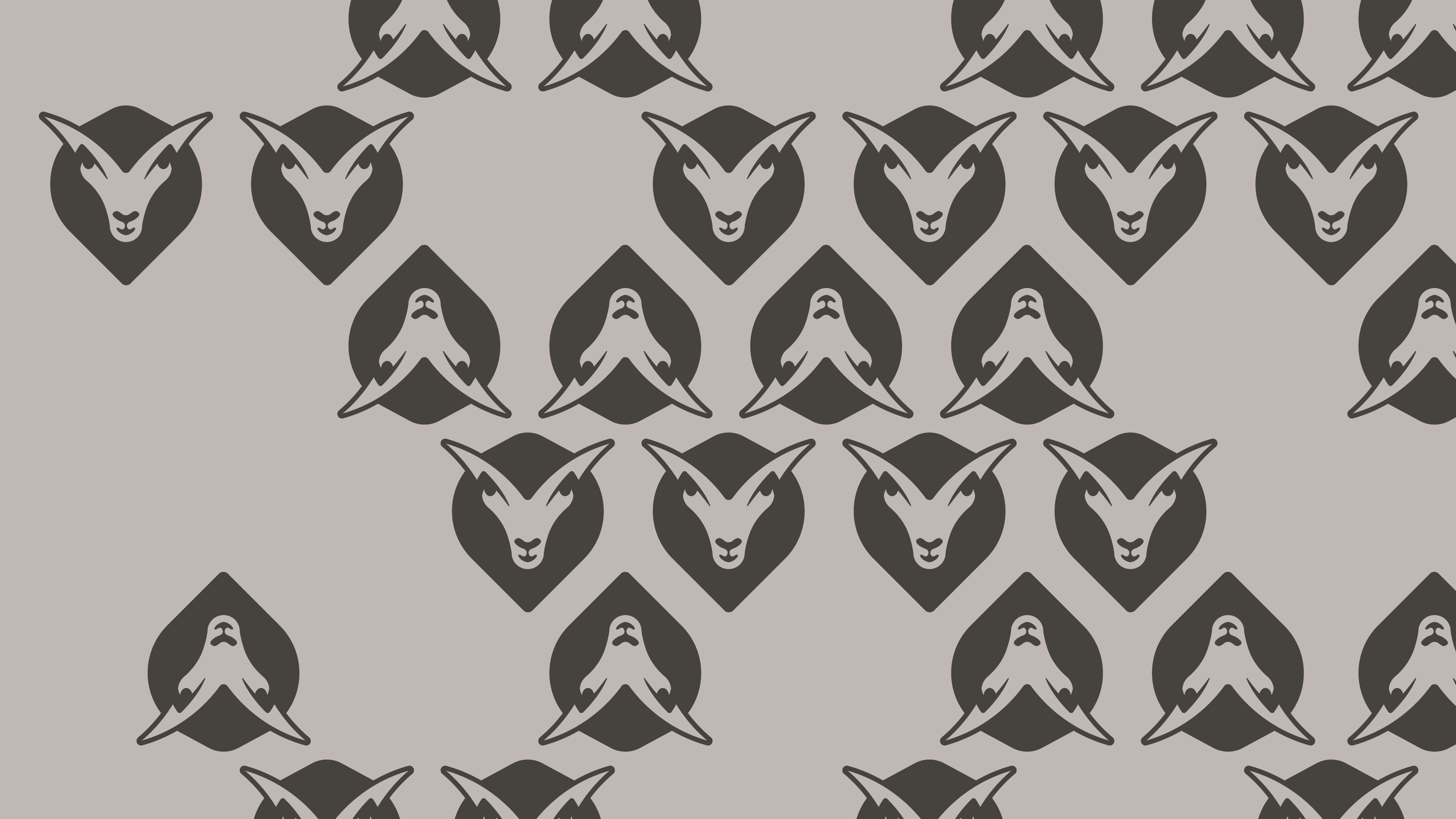
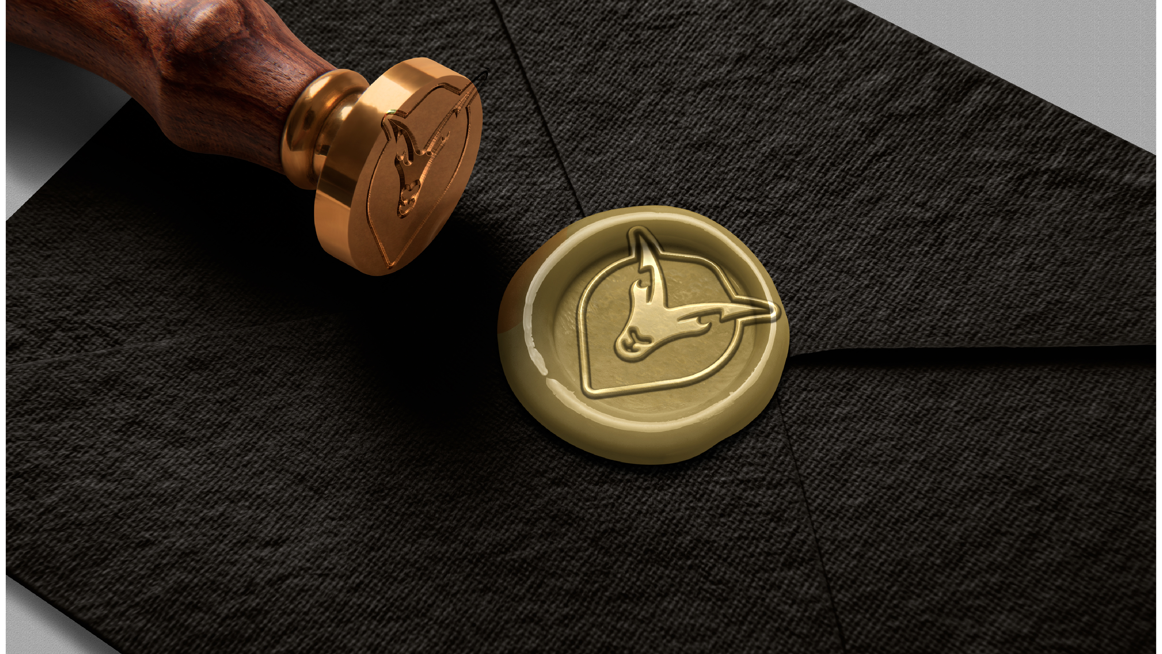
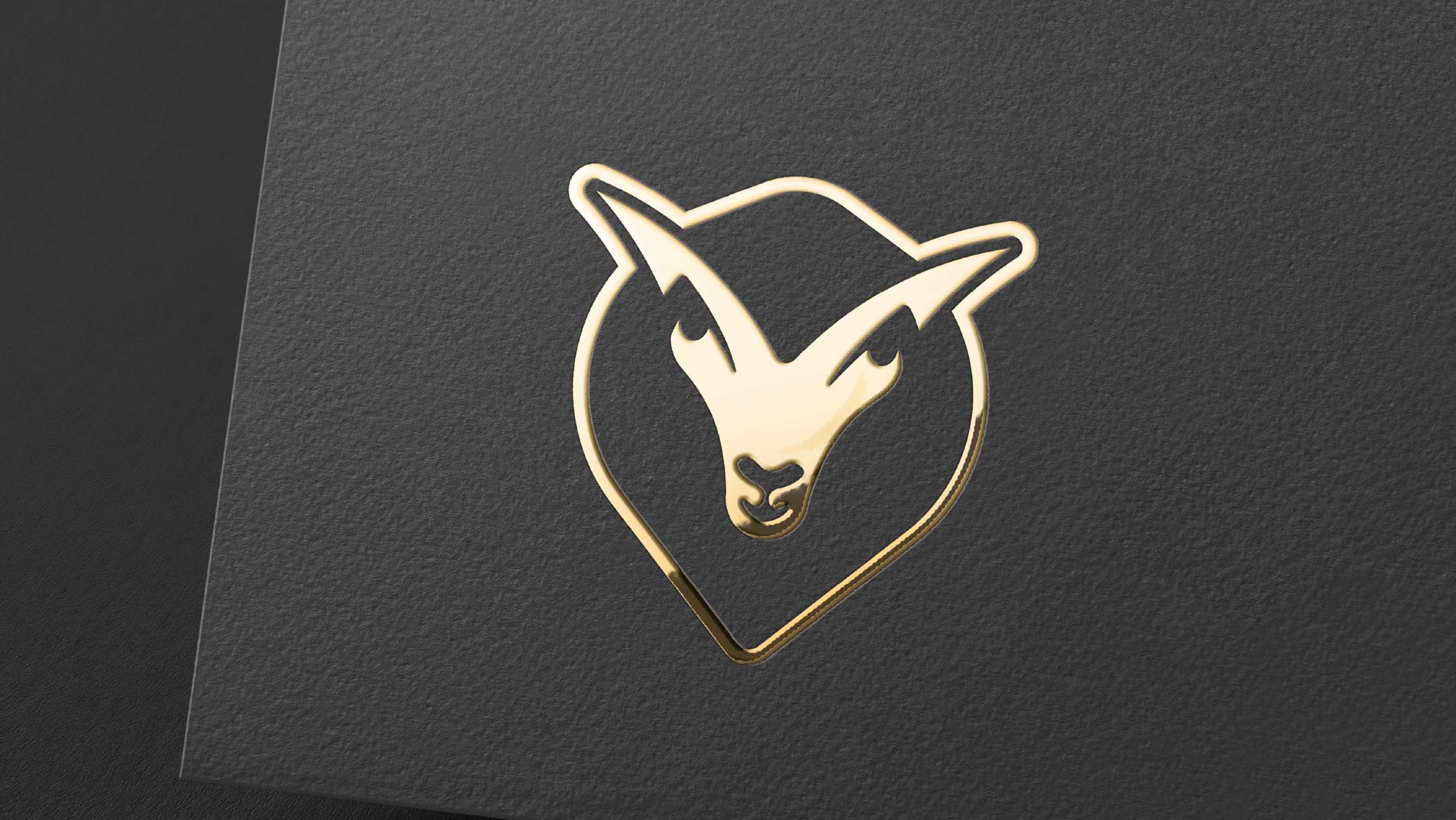
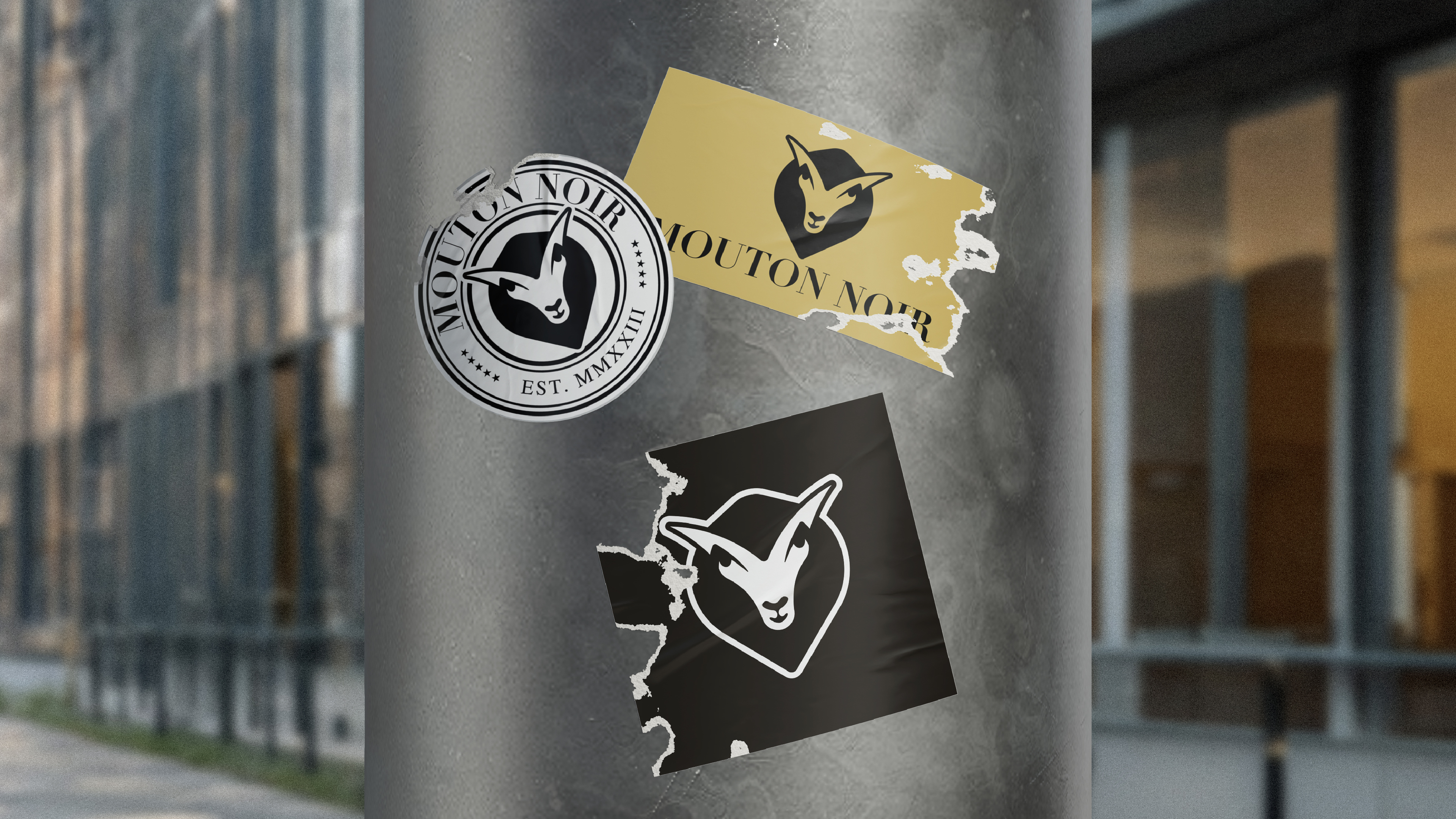
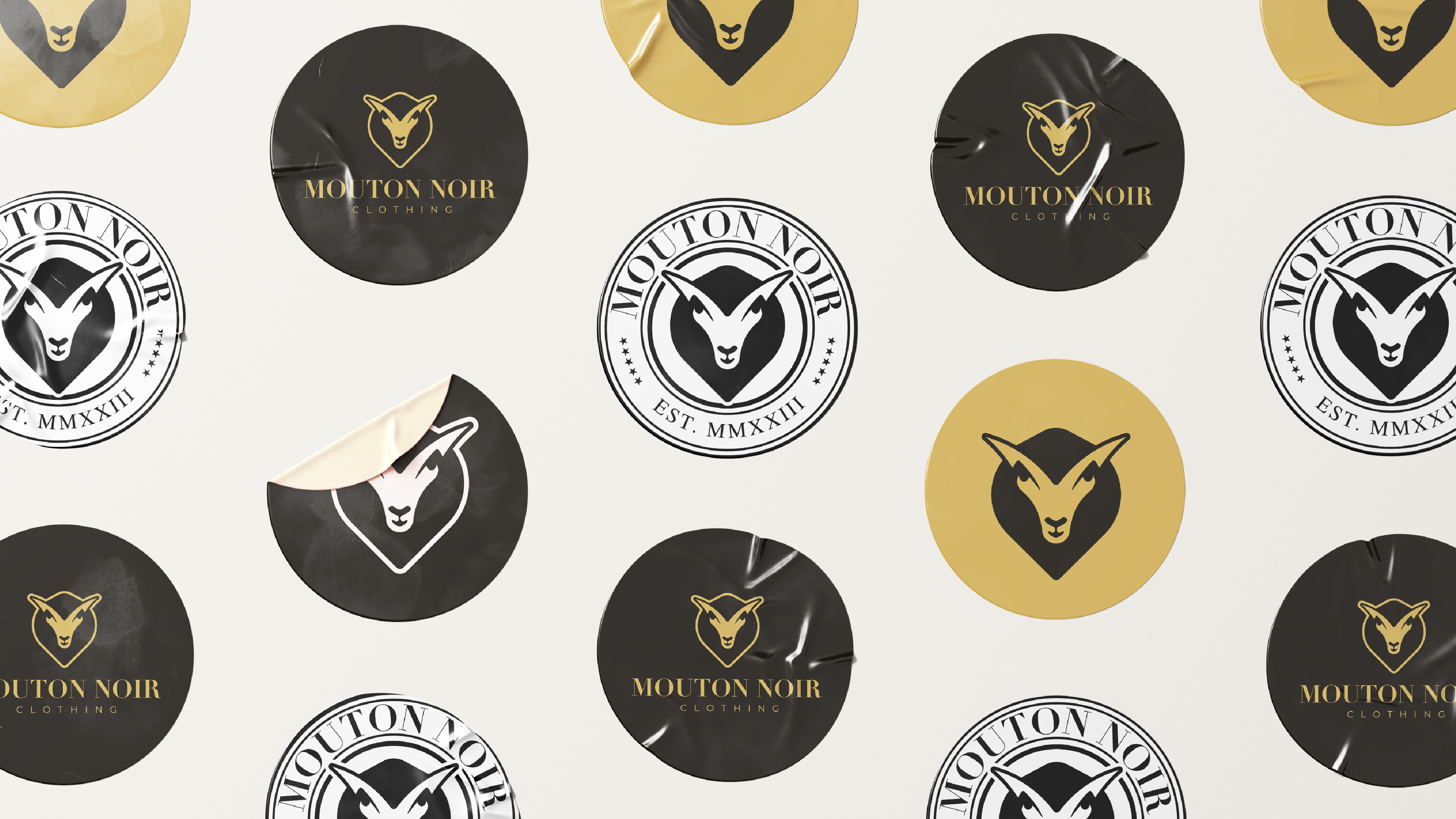
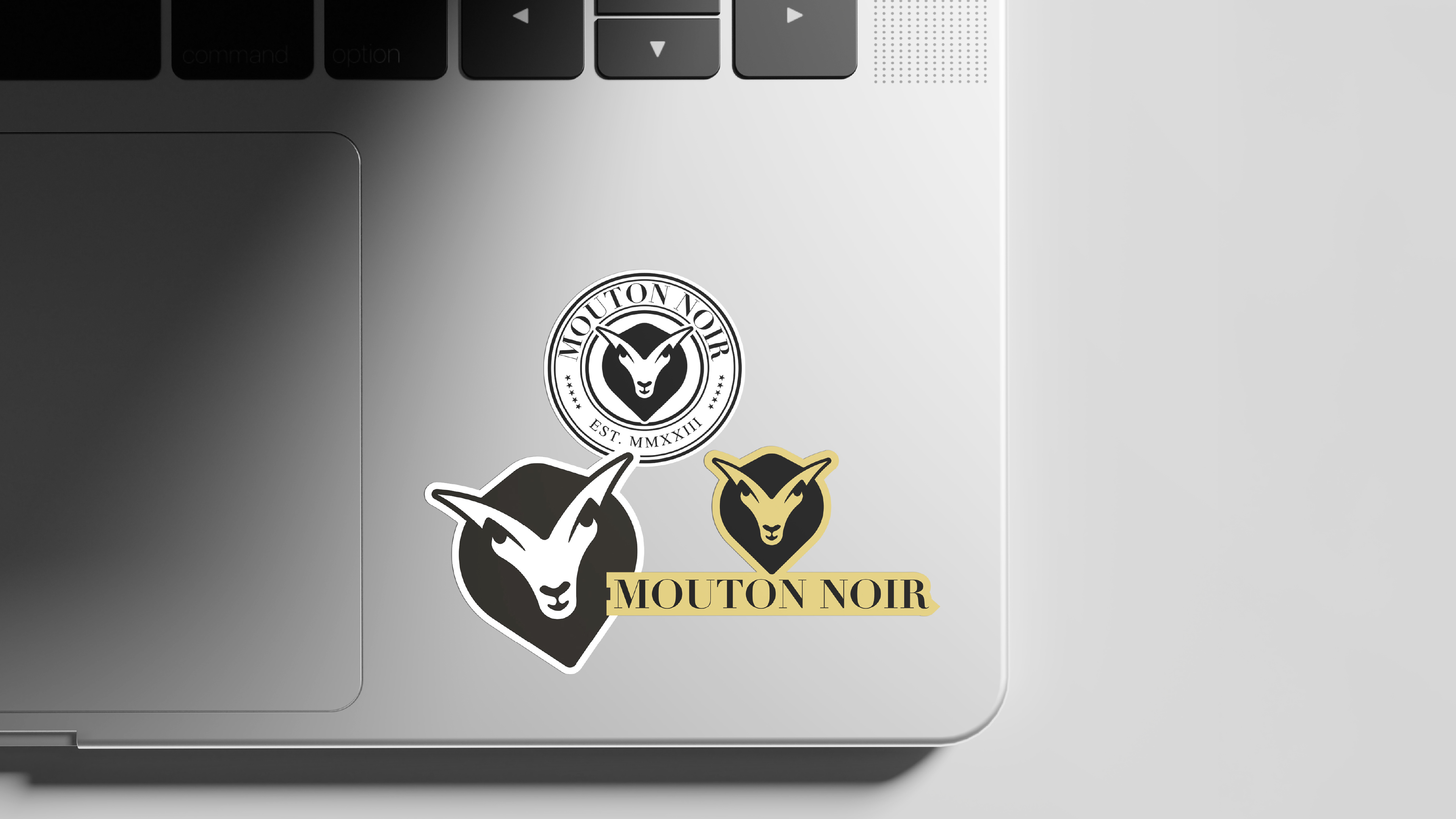
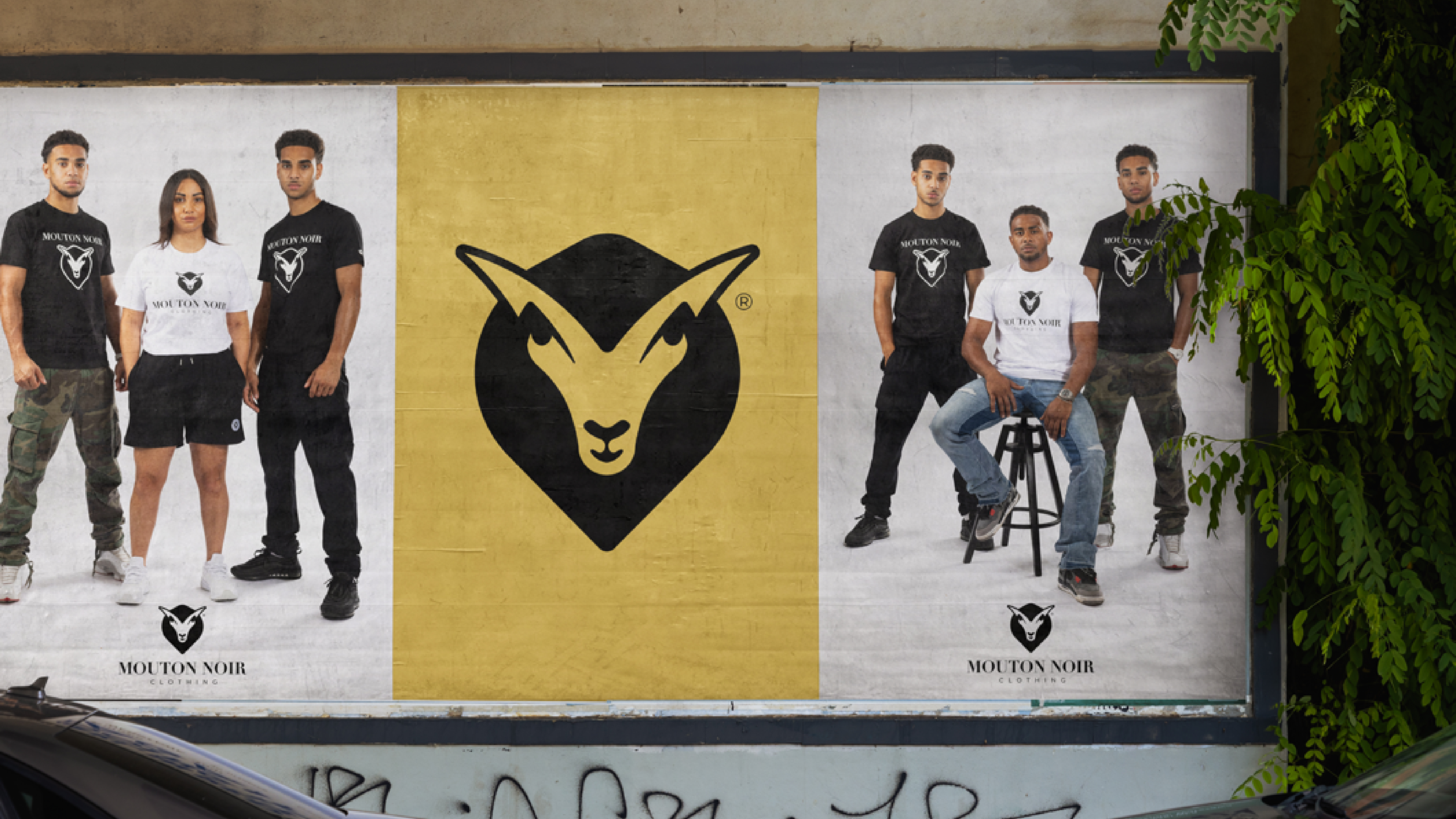
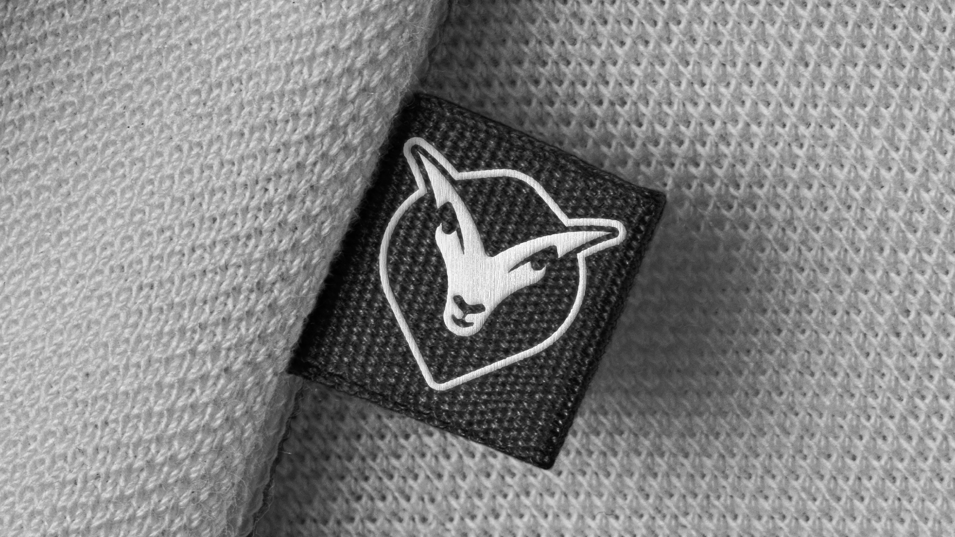
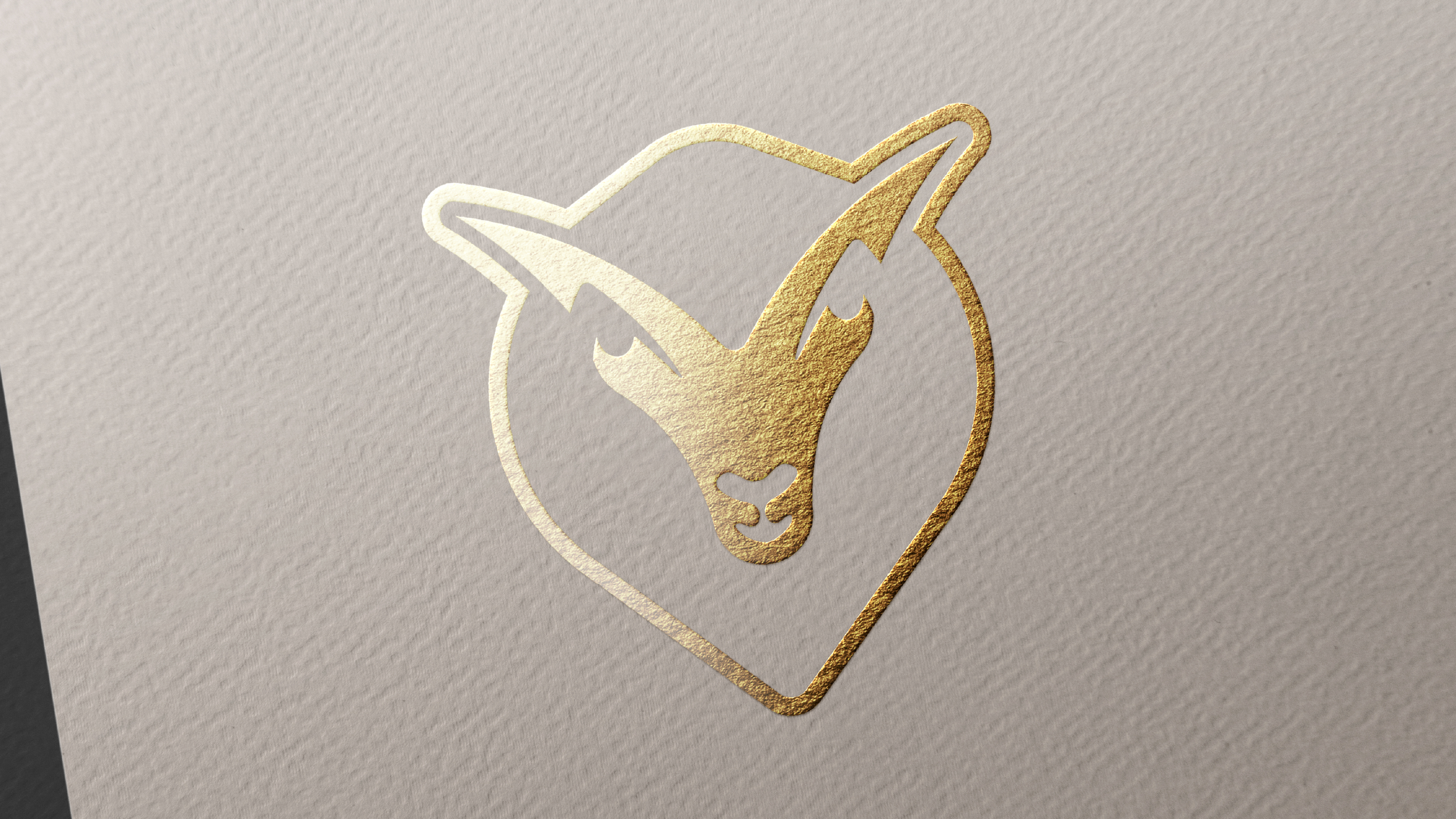
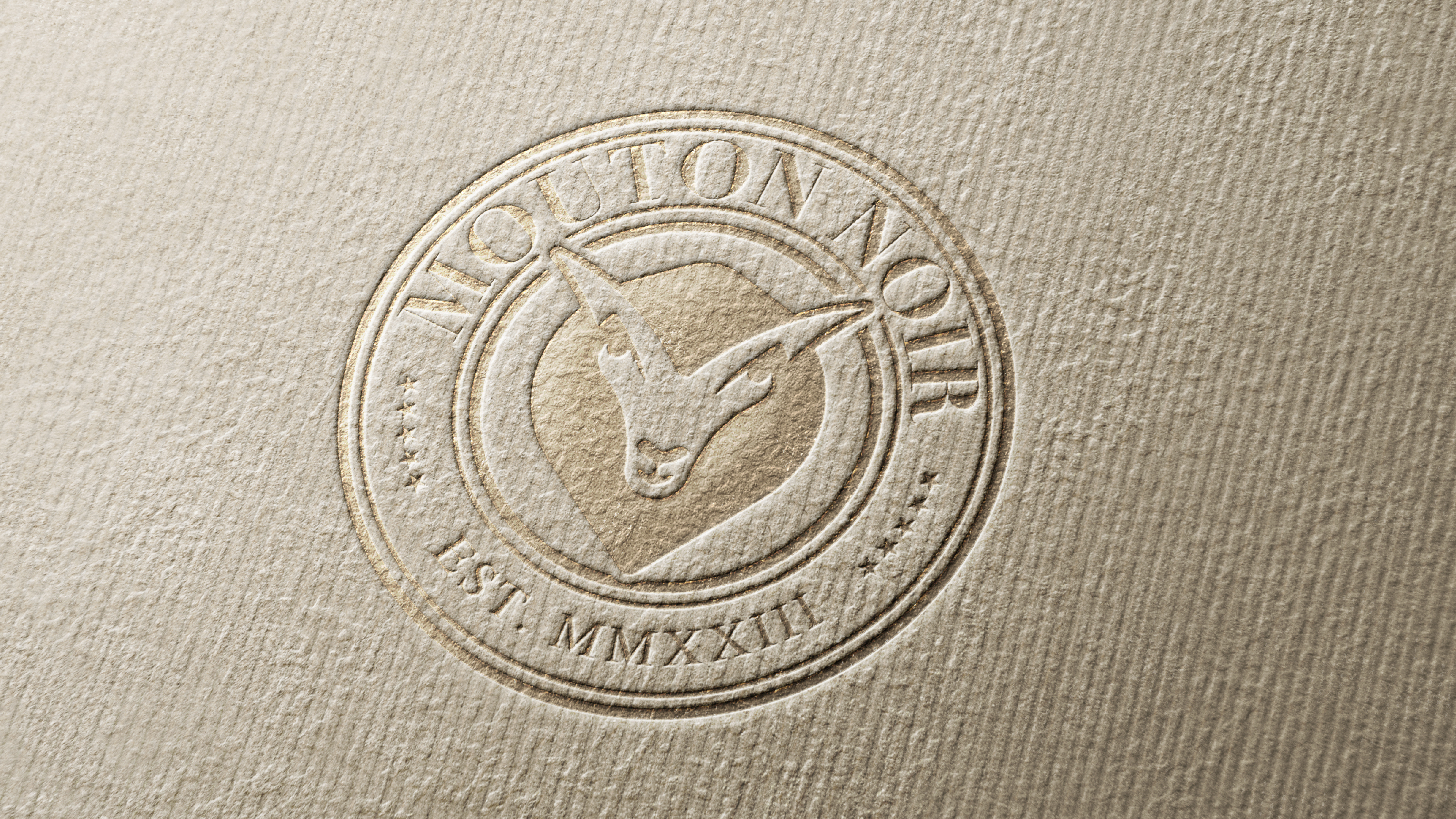
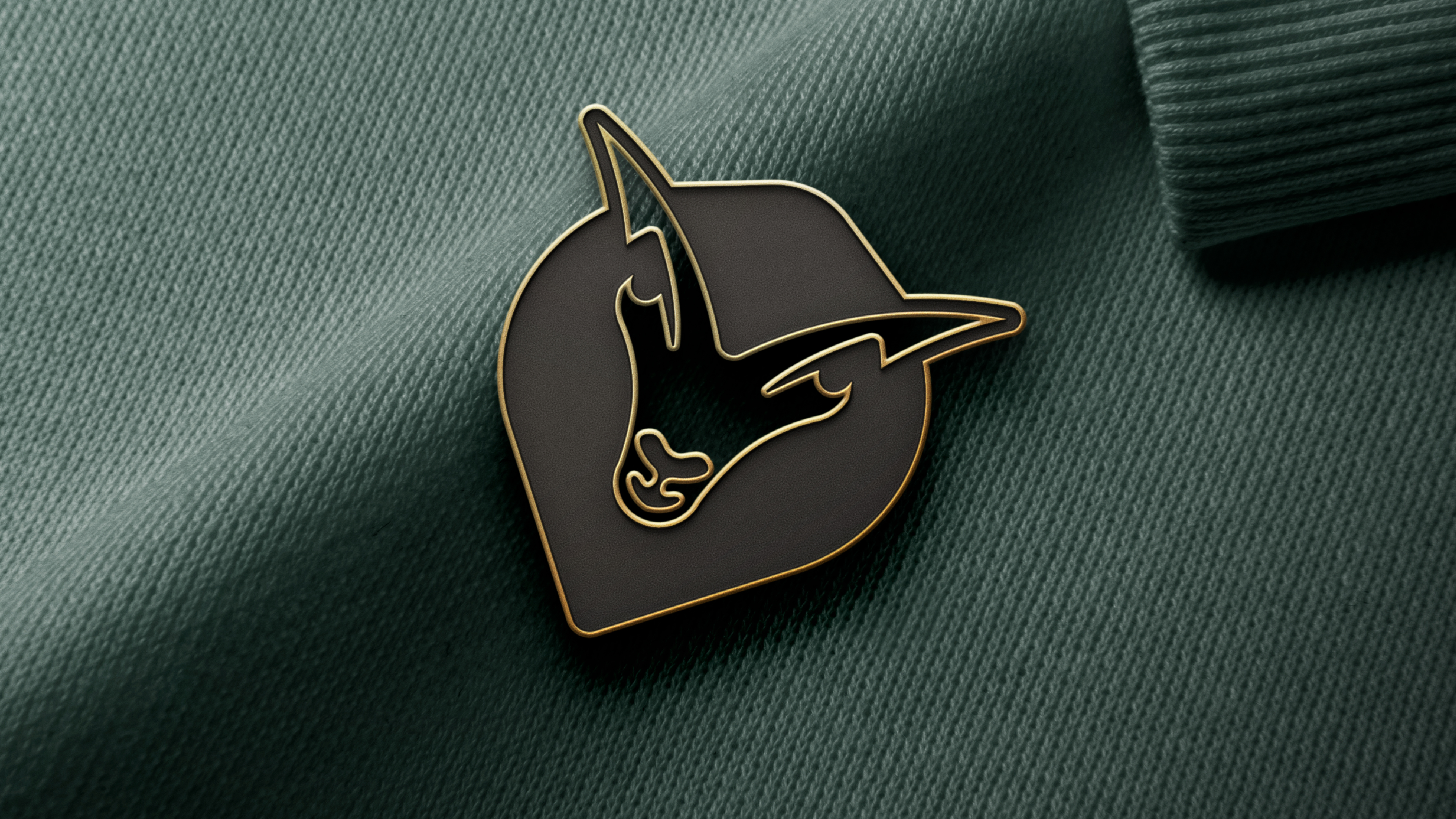
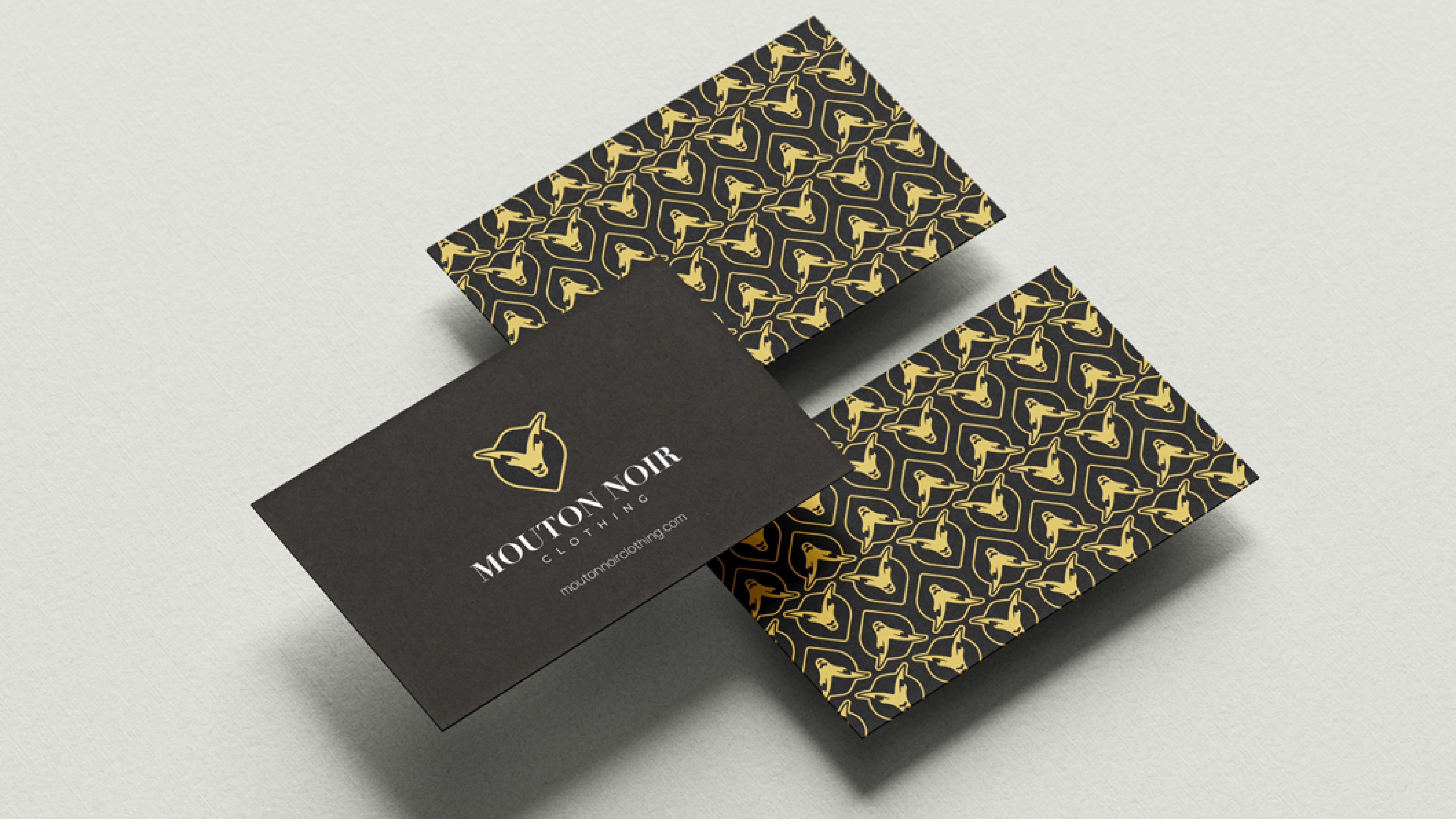
The brand centres around a stylised ram/sheep emblem, a visual manifestation of the "black sheep" archetype. The mark is angular, assertive, and iconic, designed for high visibility on garments, stickers, pins, and patches.
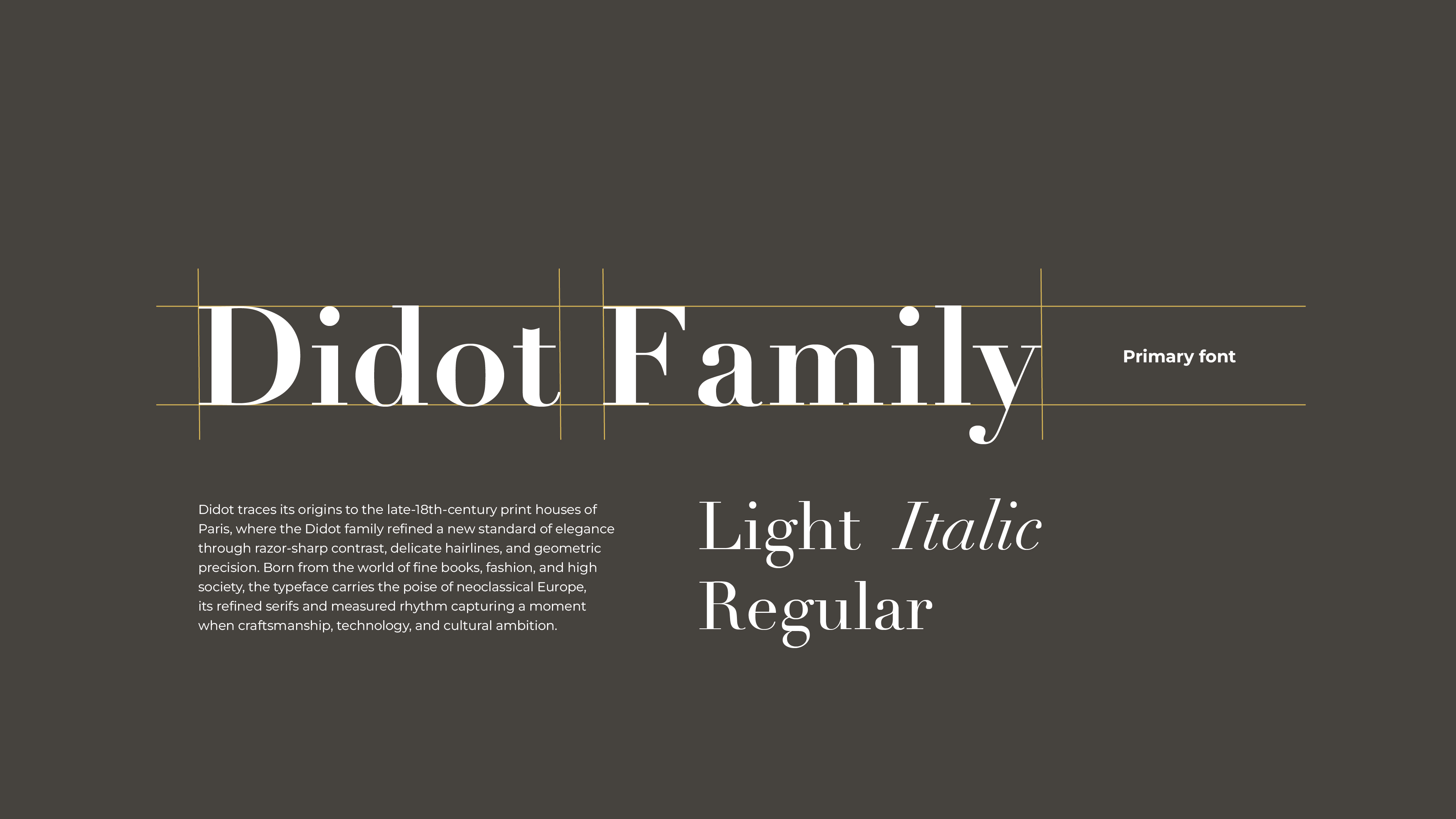
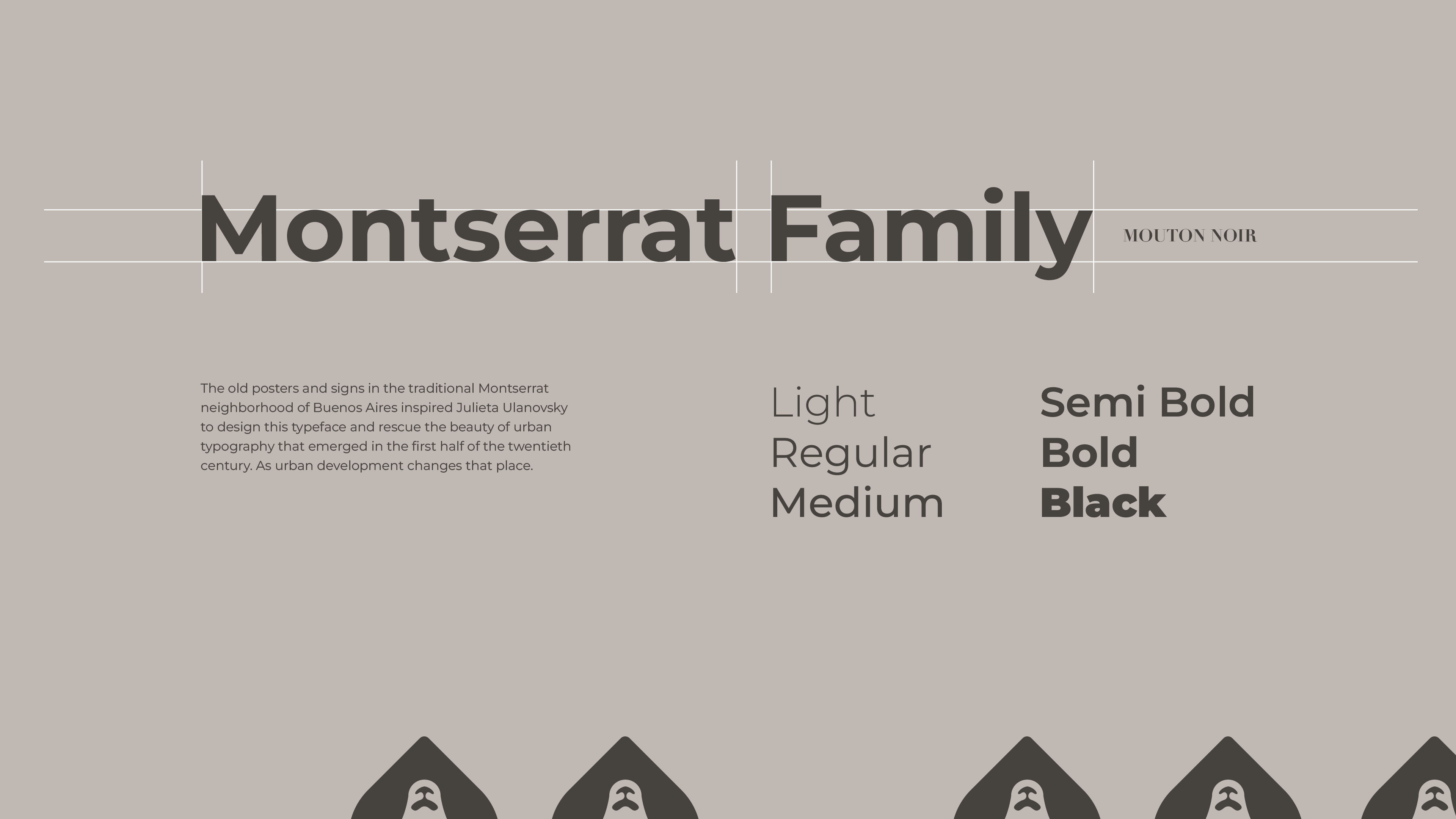
The wordmark pairs clean sans-serif typography with heritage serif accents (Montserrat + Didot families) signalling duality: urban modernity + fashion refinement.
B. Colour System
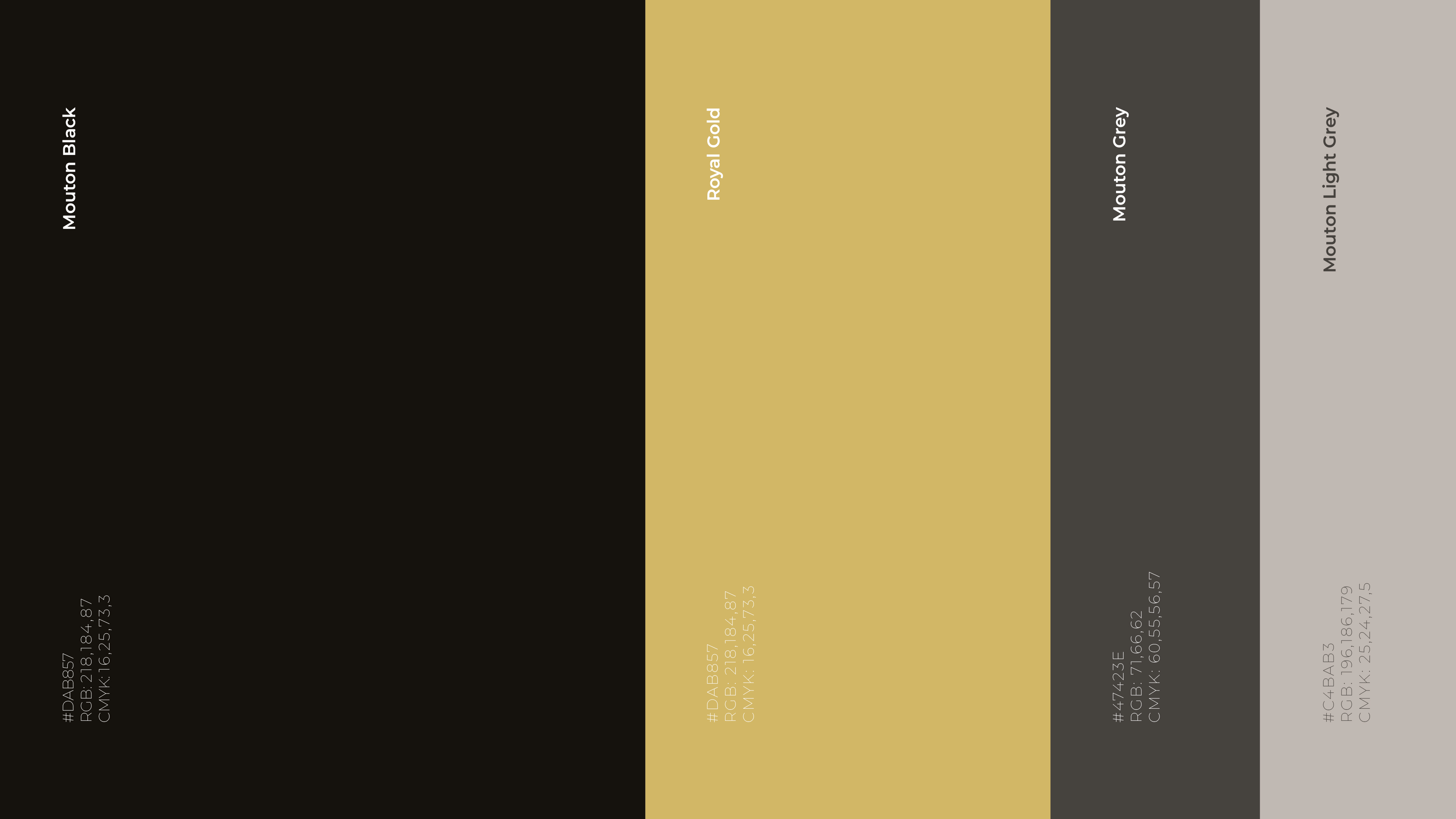
The palette is restrained yet powerful highlighting the values of
gold as a symbol of ambition, luxury, and cultural pride:
- Mouton Black (primary)
- Royal Gold (accent)
- Neutrals & greys (support)
C. Typography
Typography plays a crucial role in elevating simplicity:
- Montserrat: functional, contemporary, utilitarian
- Didot: elegant, editorial, fashion-aligned
This pairing creates immediate design tension, raw vs. refined, a recurring brand principle.
02. Approach &
Design Philosophy.
Three guiding principles shaped the identity:
1. Disruption through elegance: Understatement is a power move in a loud category.
2. Culture as currency: British cultural influence is not referenced, it is centred.
3. Luxury without pretension: Editorial fashion cues enhance product desirability while staying grounded in streetwear authenticity.
This produced a brand that is relevant, confident, and community first, not trend-chasing but trend-setting.
03. Digital
Translation.
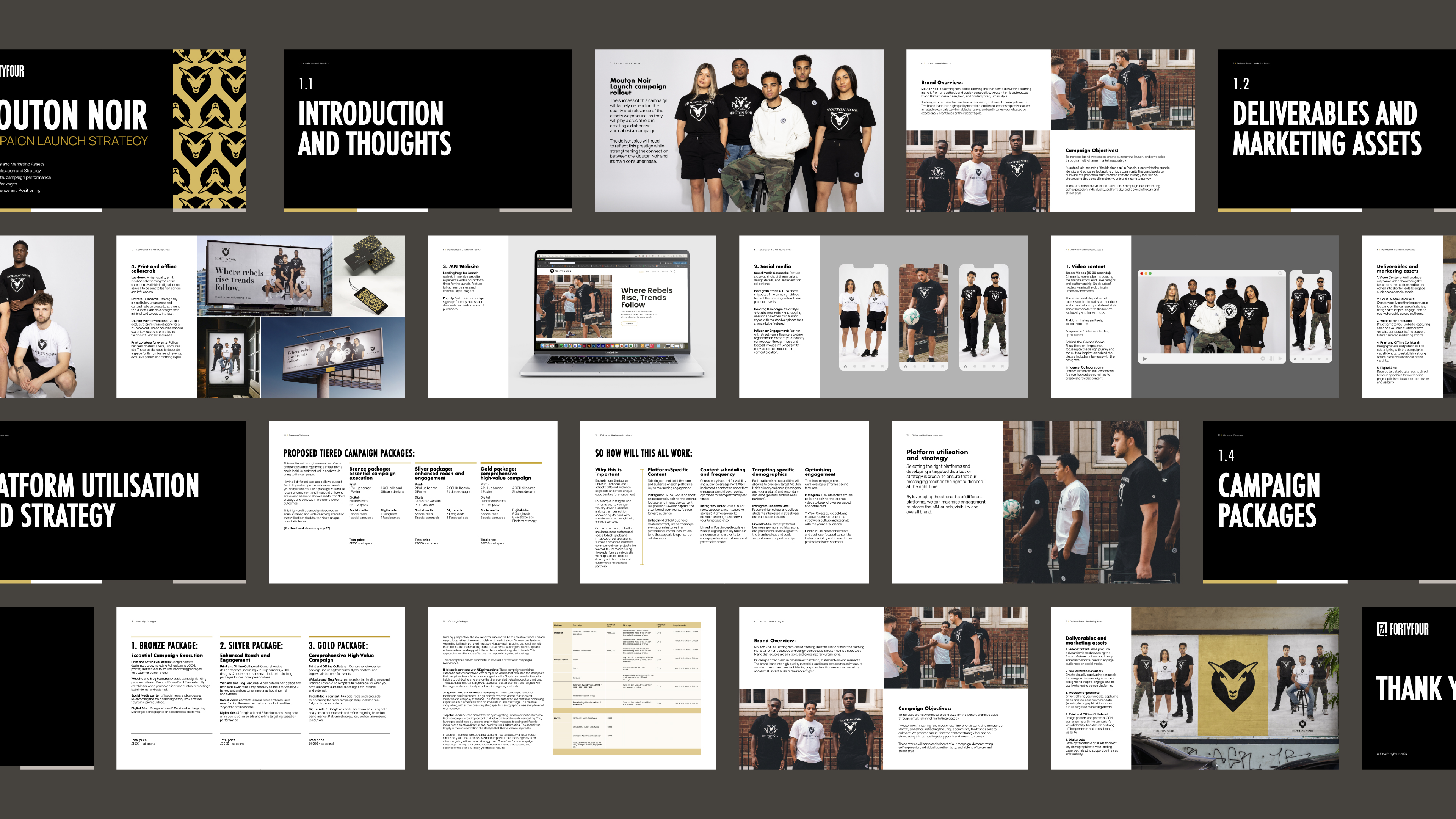
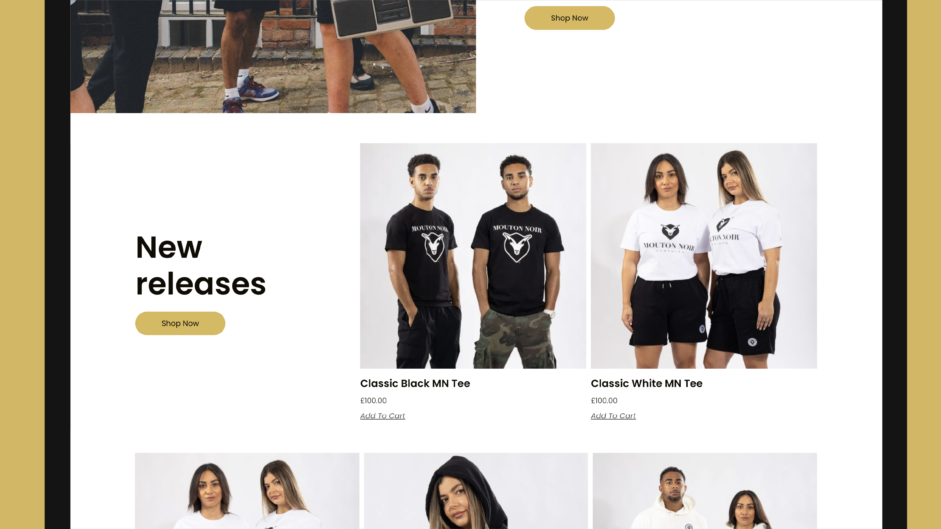
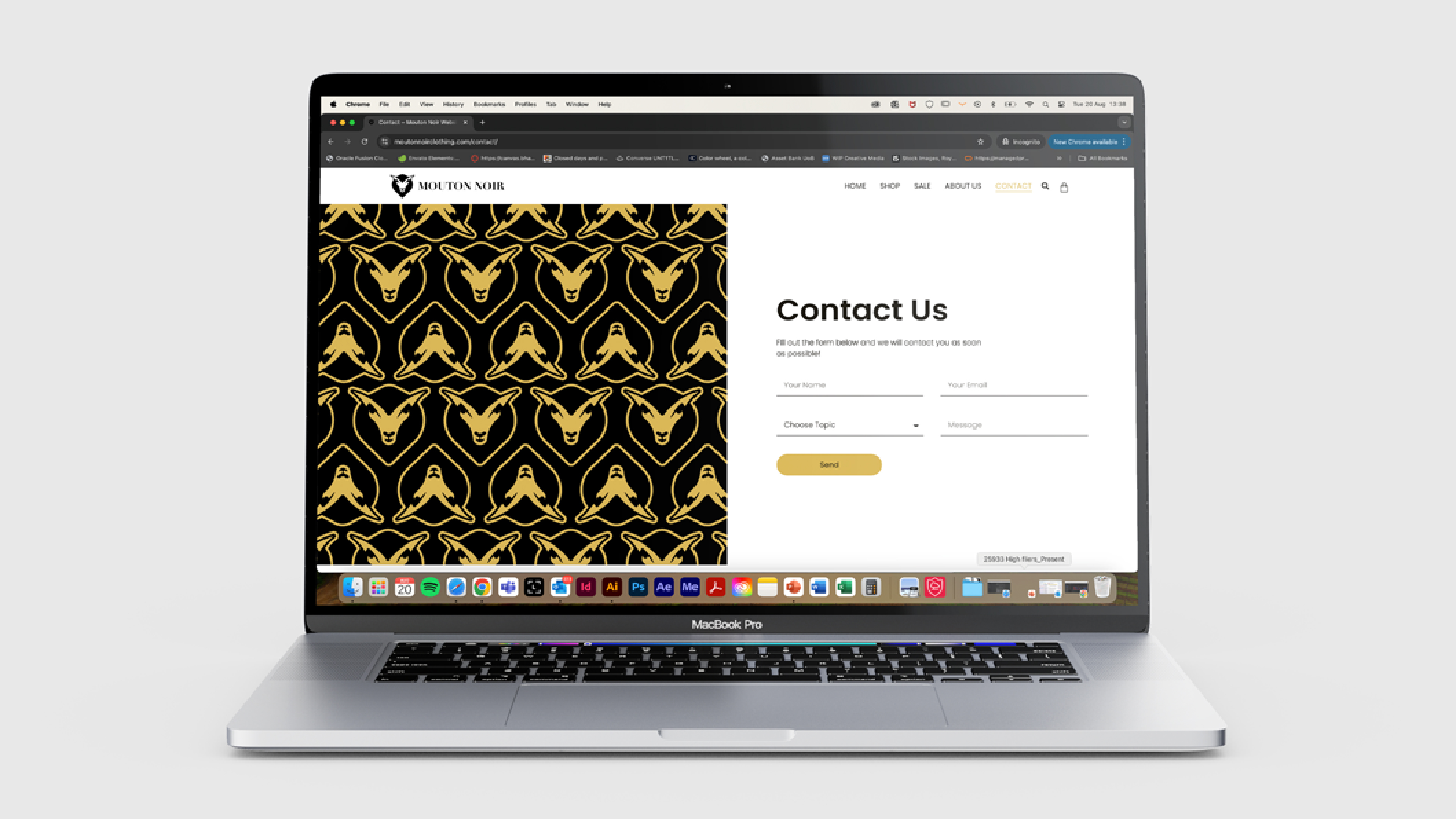
From a digital perspective, the Mouton Noir website embodies a luxury streetwear e-commerce environment:
- Large hero imagery
- High-contrast monochrome palette
- Gold accents for hierarchy
- Minimal nav + drop-down filtering
- Clean CTAs (Shop / Sale / New Releases)
- Editorial lifestyle photography
The result is a storefront that feels both high-fashion and functionally street, balancing ambition with usability.
04. Outcome.
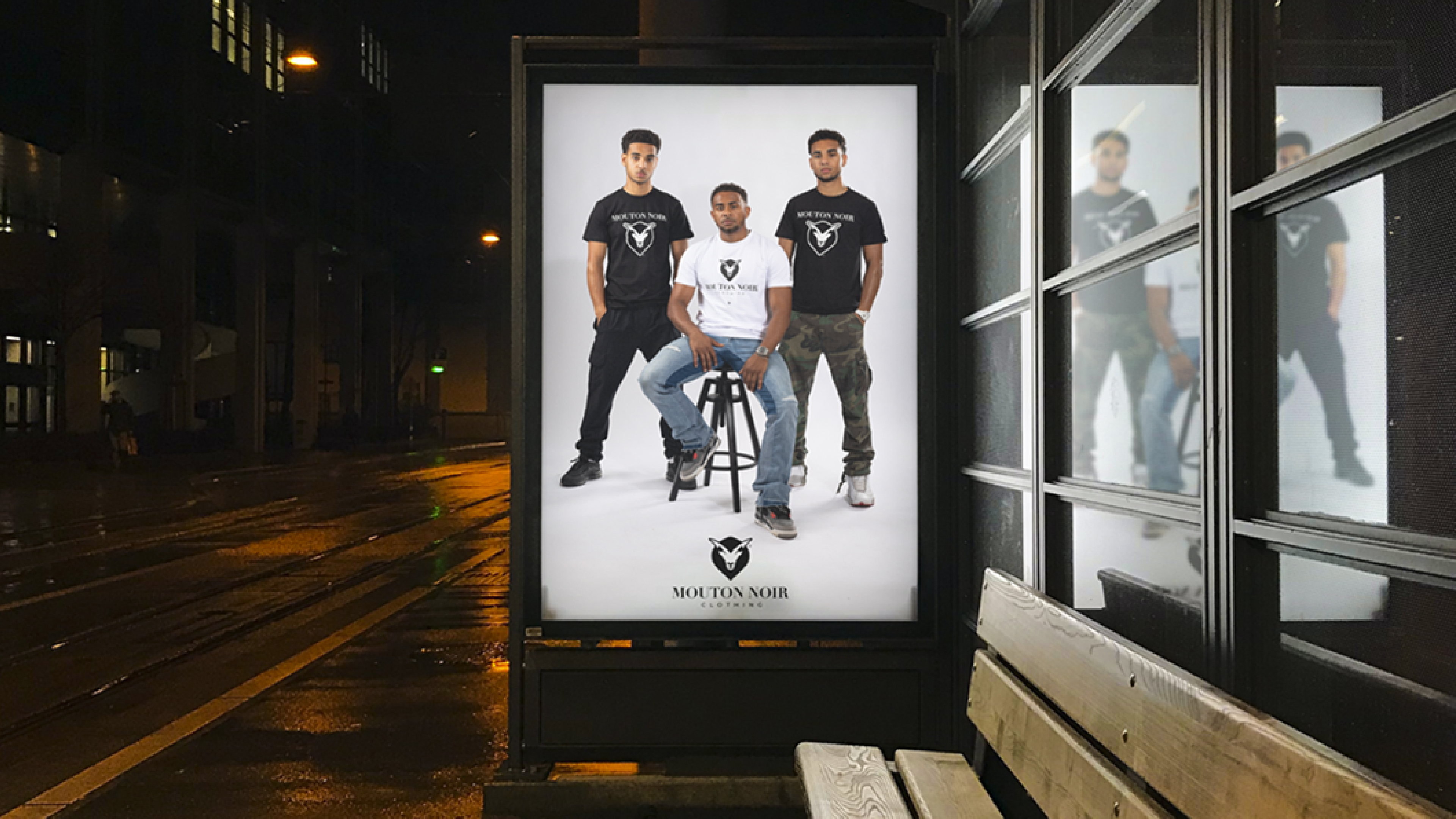
Mouton Noir emerges as a modern clothing brand with visual and cultural depth. Its identity is built to scale. From product labels to campaigns to international retail, grounded in individuality, representation, and refinement.
The brand is positioned at the intersection of:
- Luxury: restraint, polish, minimalism
- Streetwear: attitude, culture, rebellion
- Community: British representation, Birmingham roots