Brand Identity & Art Direction
Hope
Street
Kitchen.
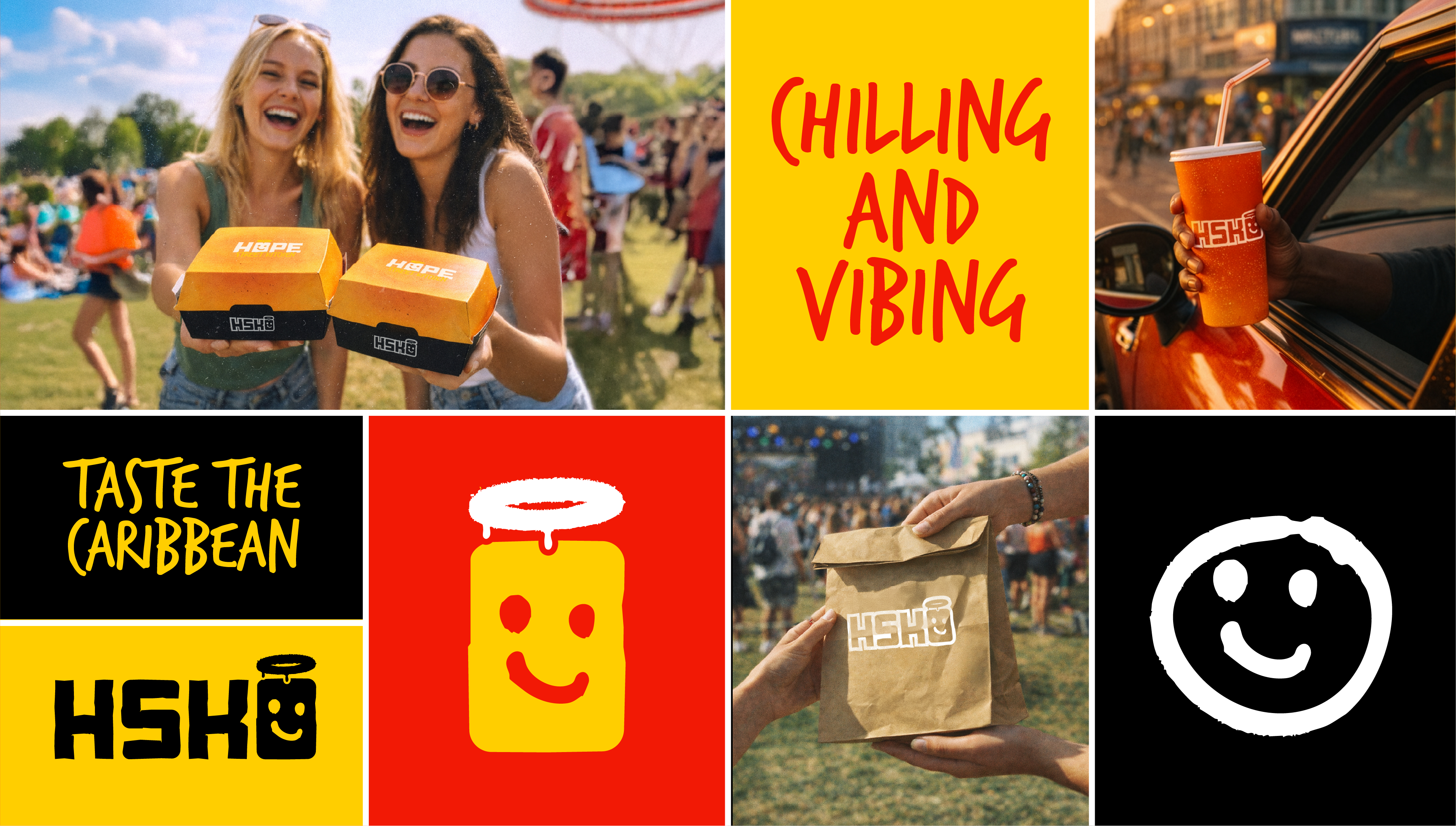
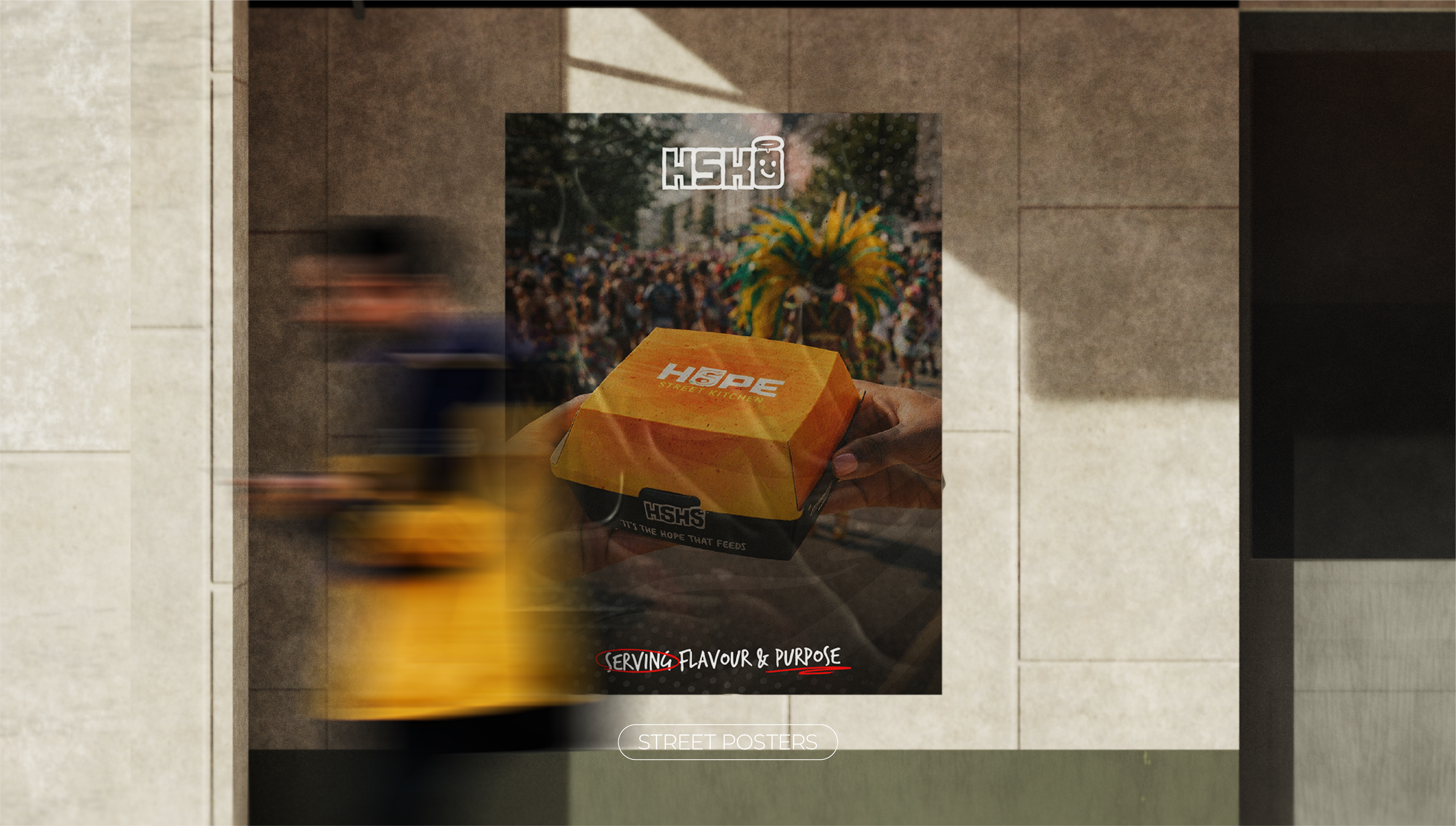
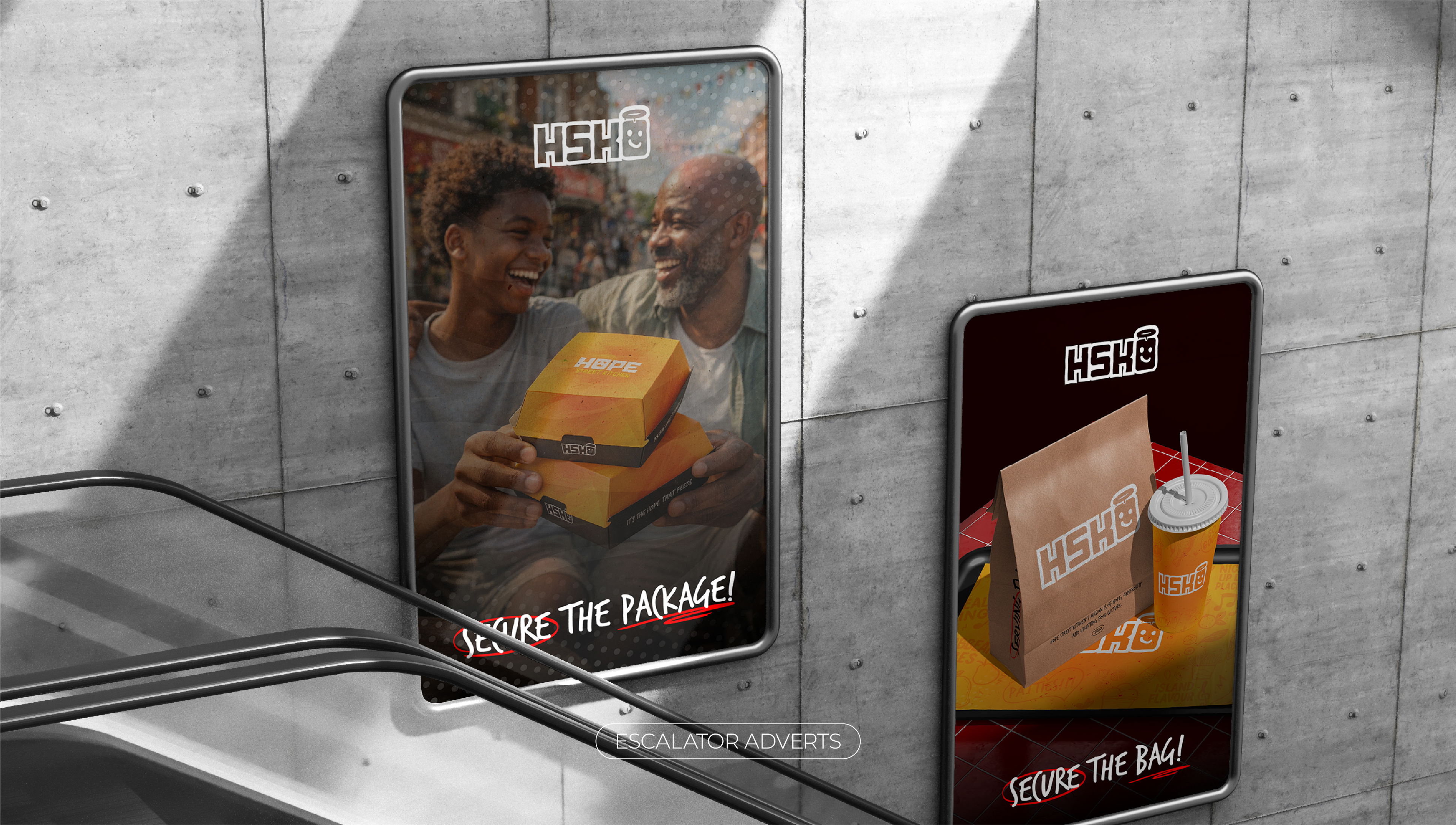
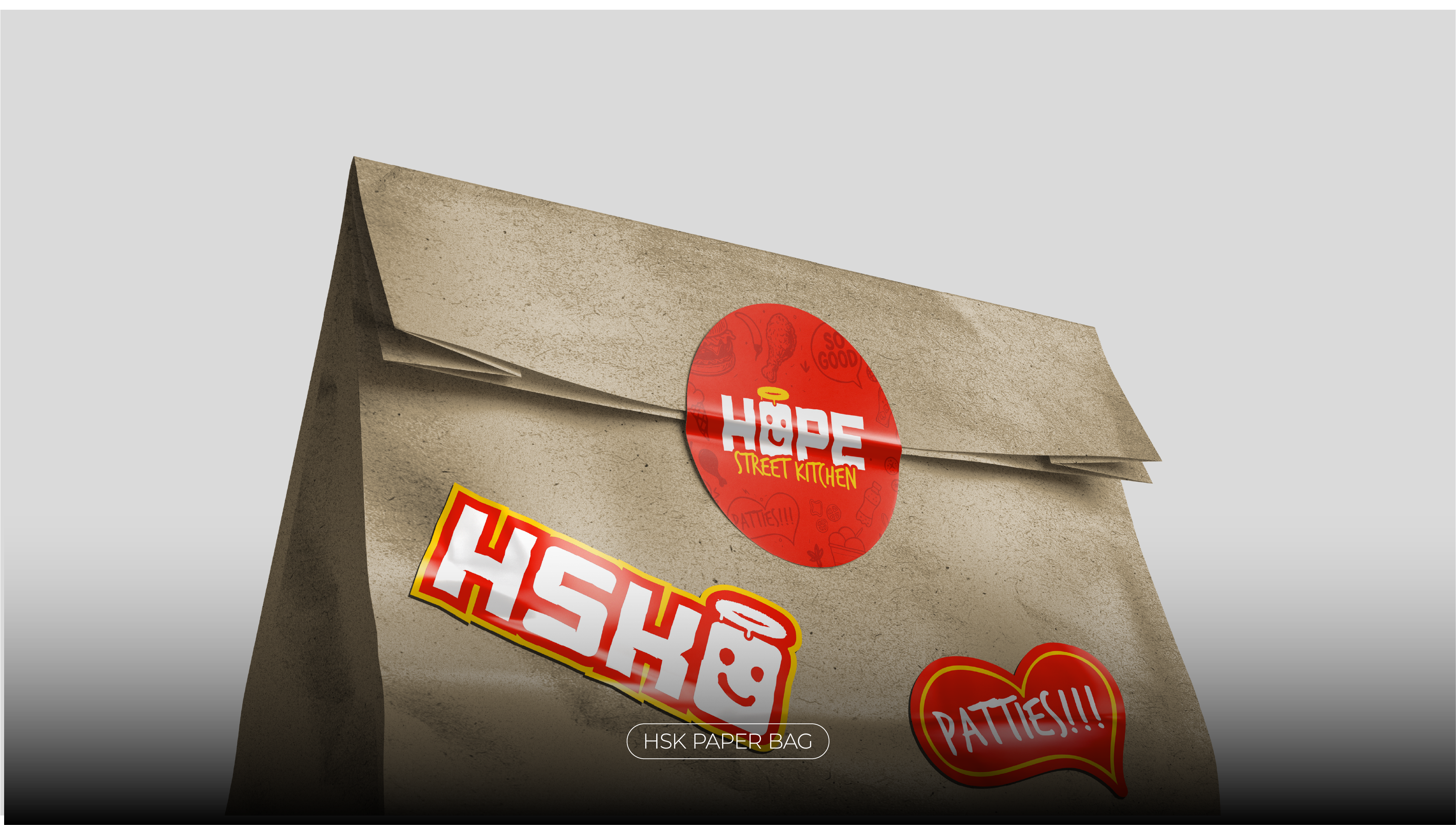
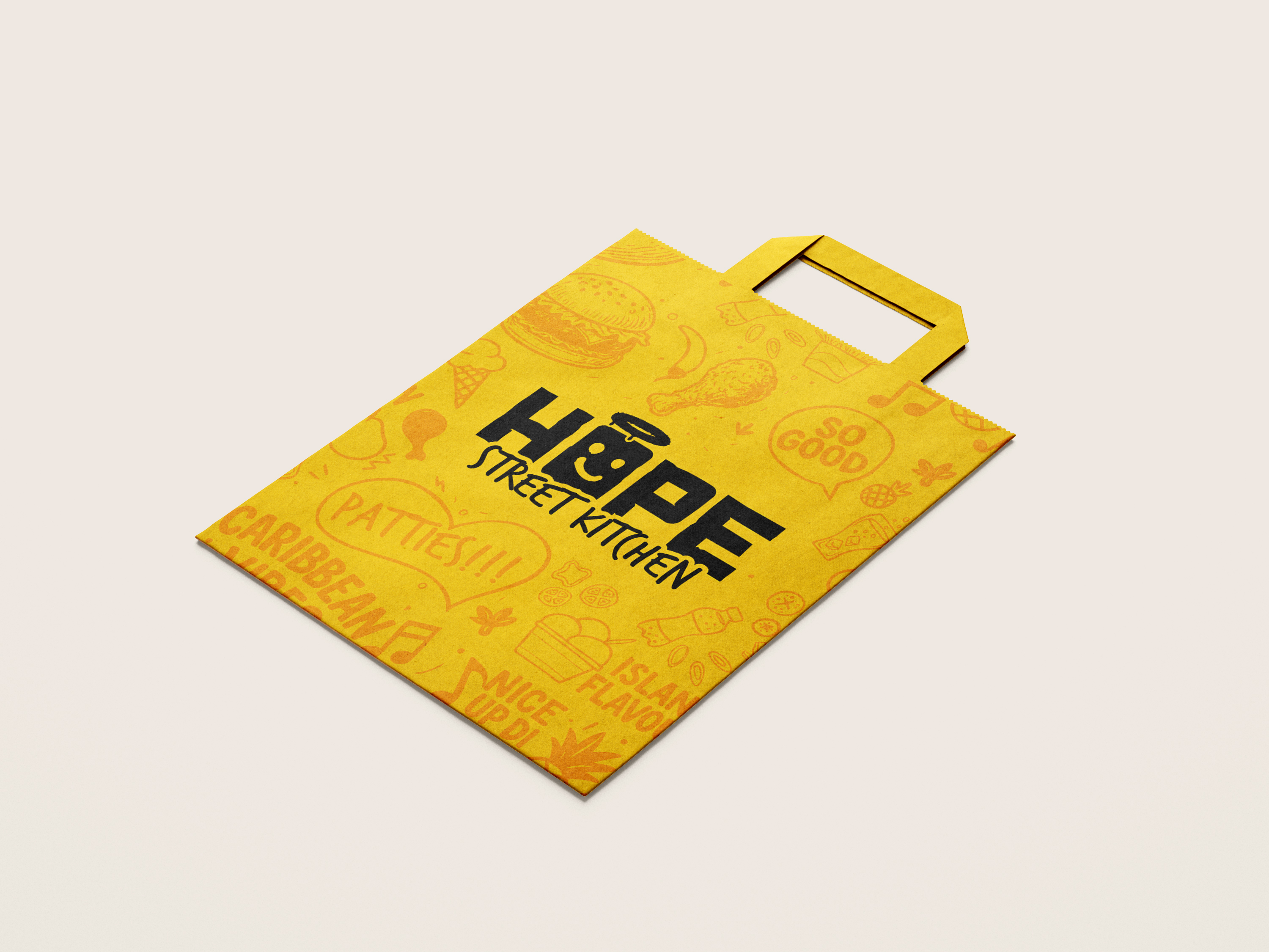
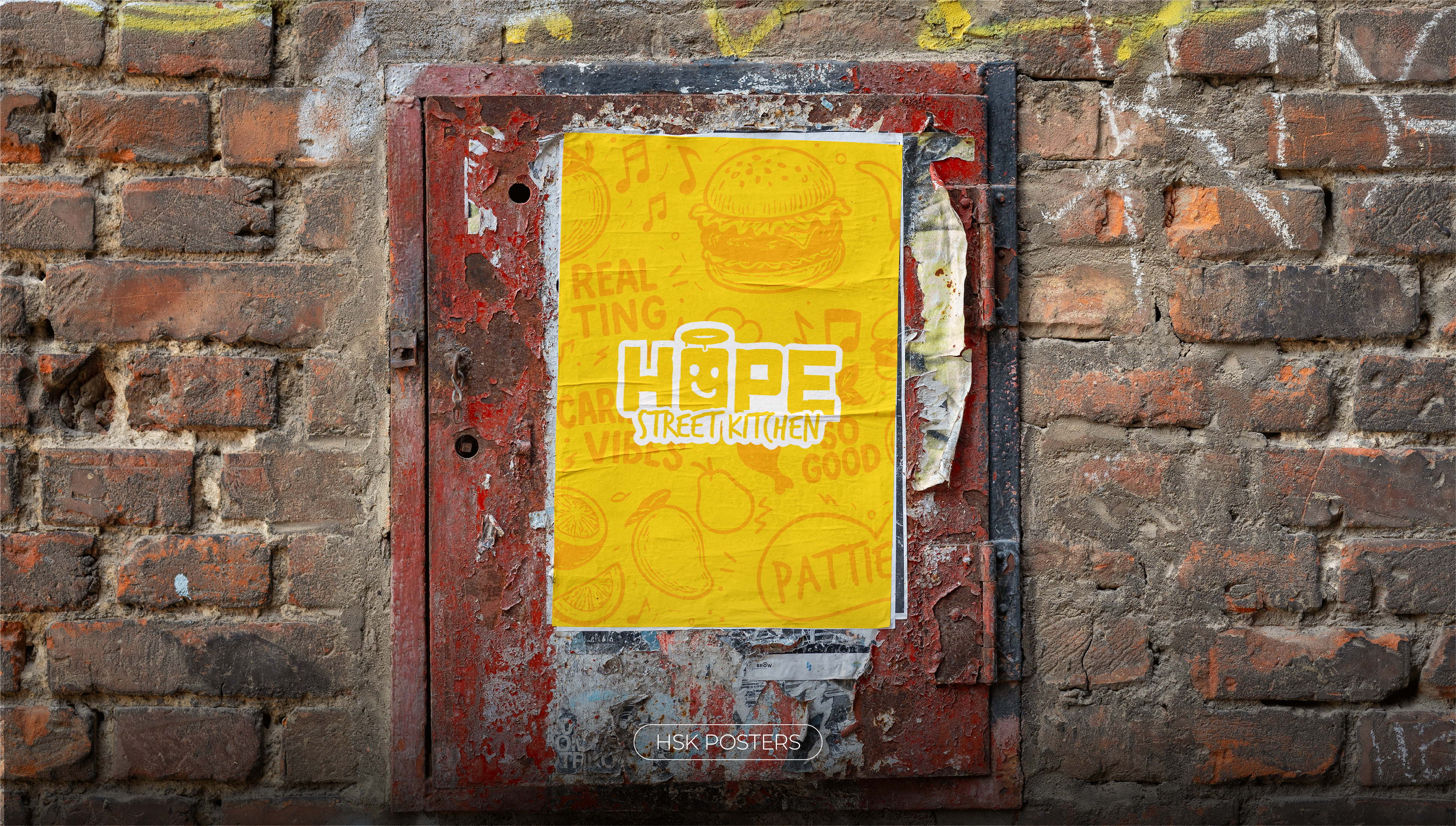
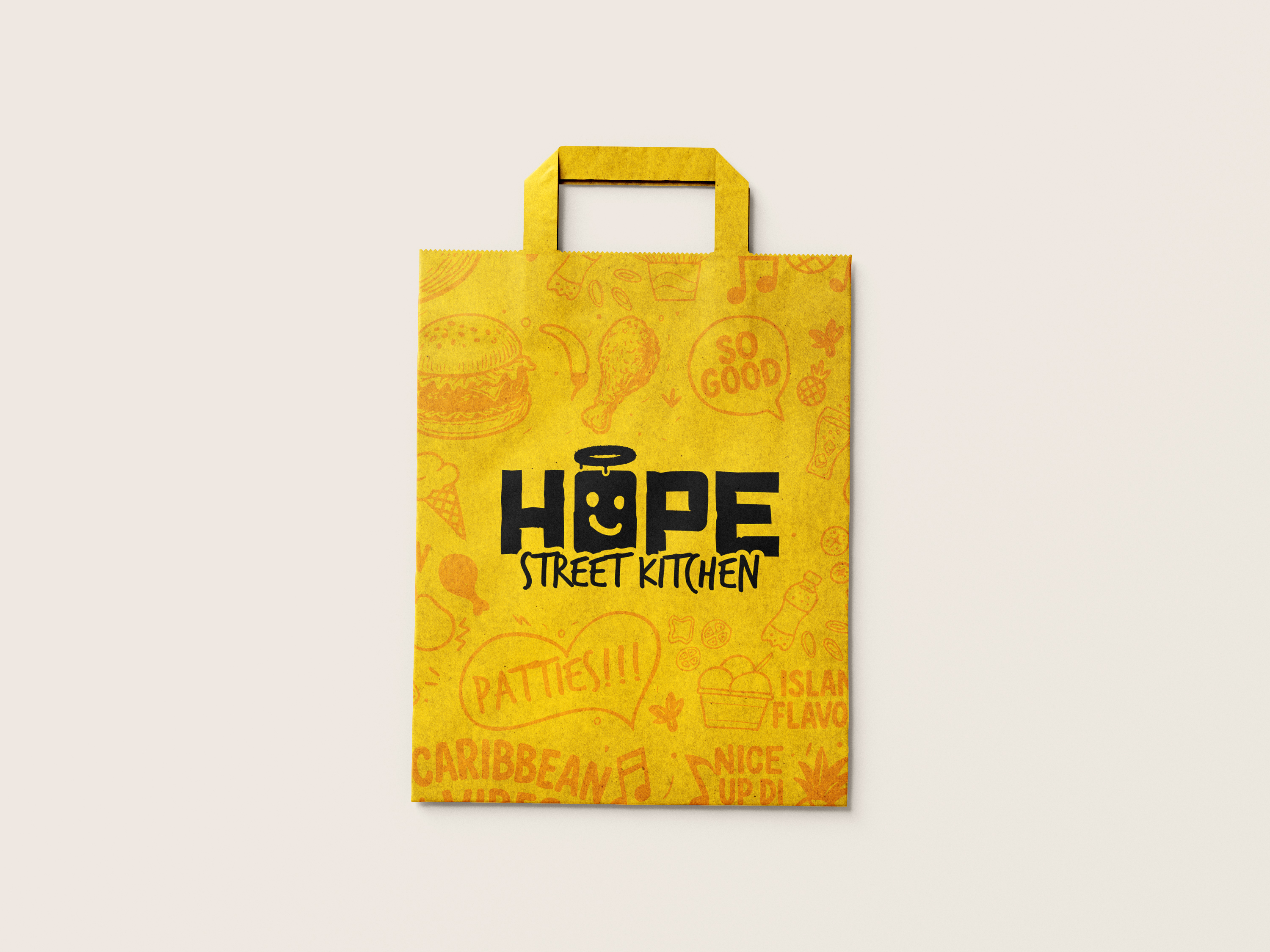
Hope Street Kitchen is a Caribbean street food brand built on the belief that food is community. We developed a complete brand identity, from a handcrafted logo system and street-inspired typography to packaging, vehicle branding, and a full out-of-home campaign.
Rooted in the motto Serving Flavour & Purpose, the brand carries a spirit of generosity, culture, and bold self-expression, delivered across every touchpoint from paper bags to billboard posters.
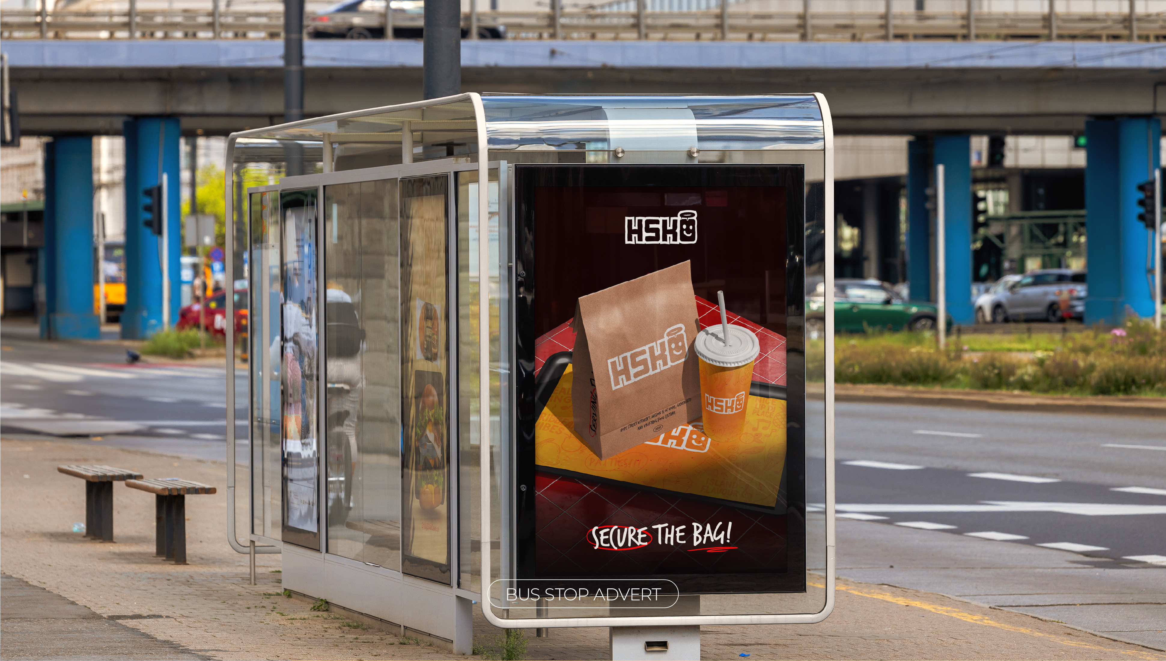
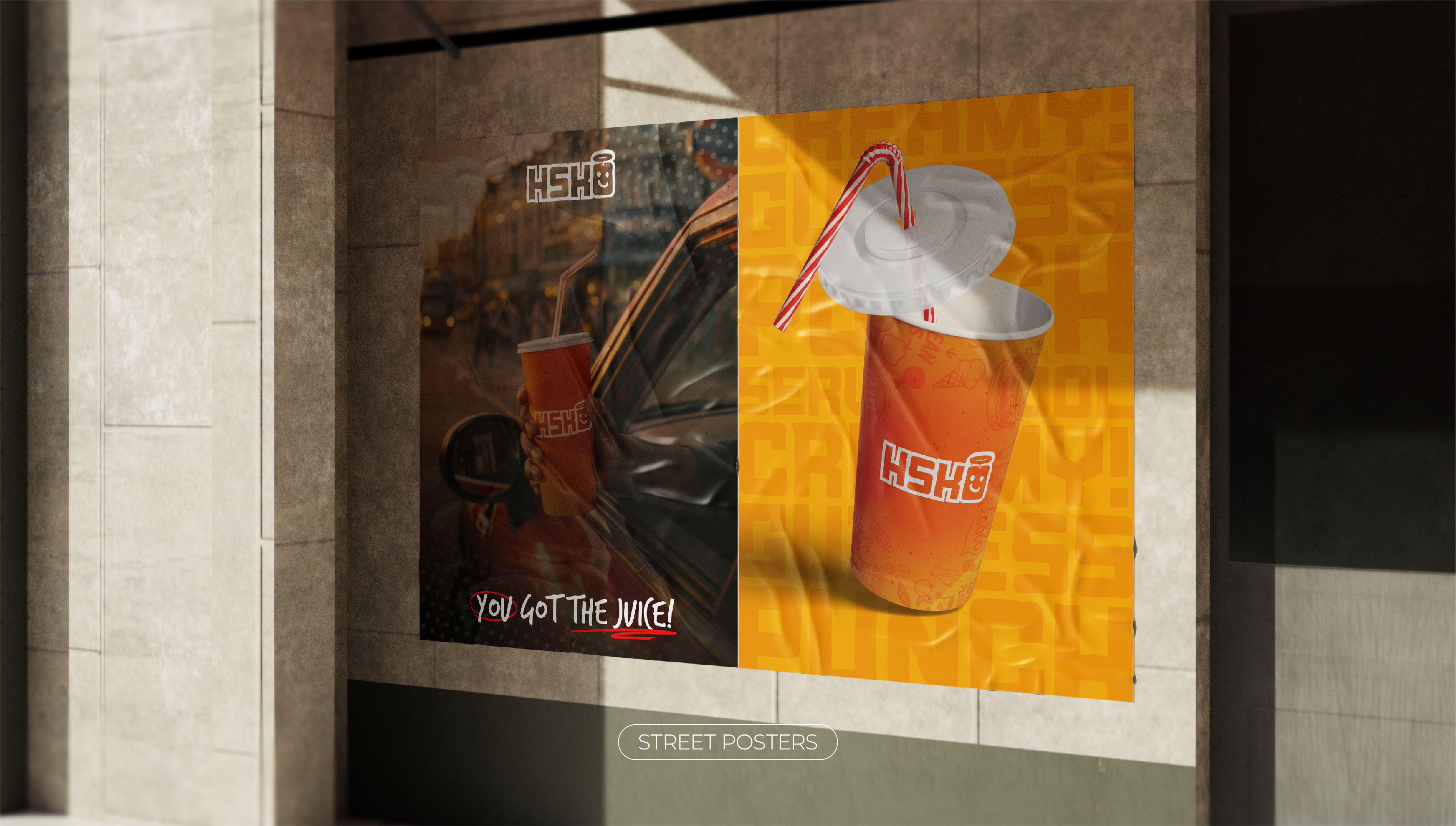
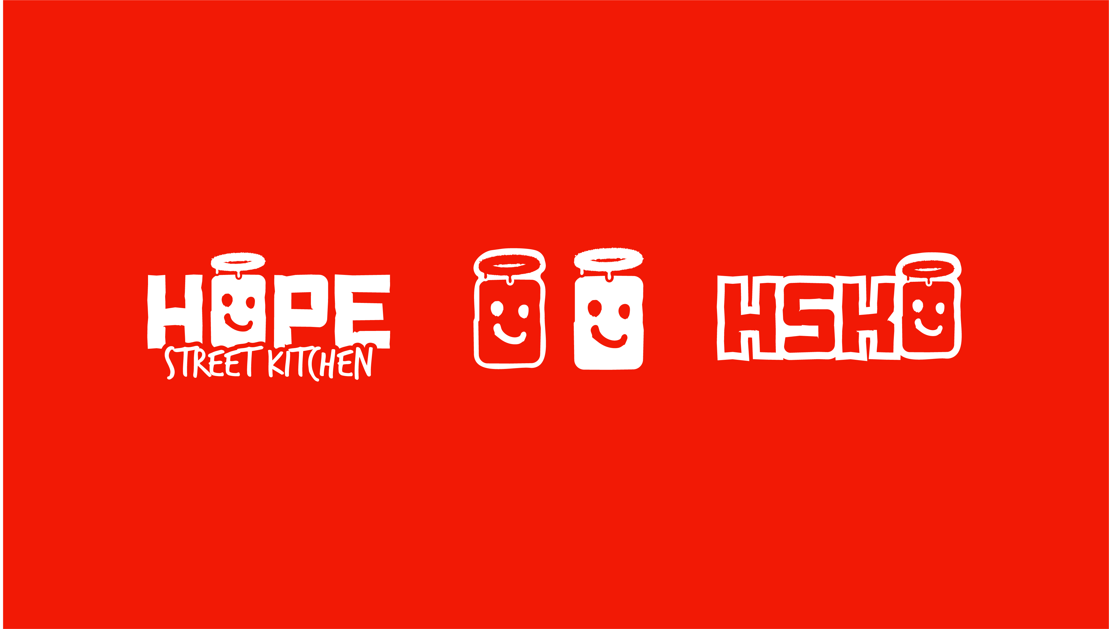
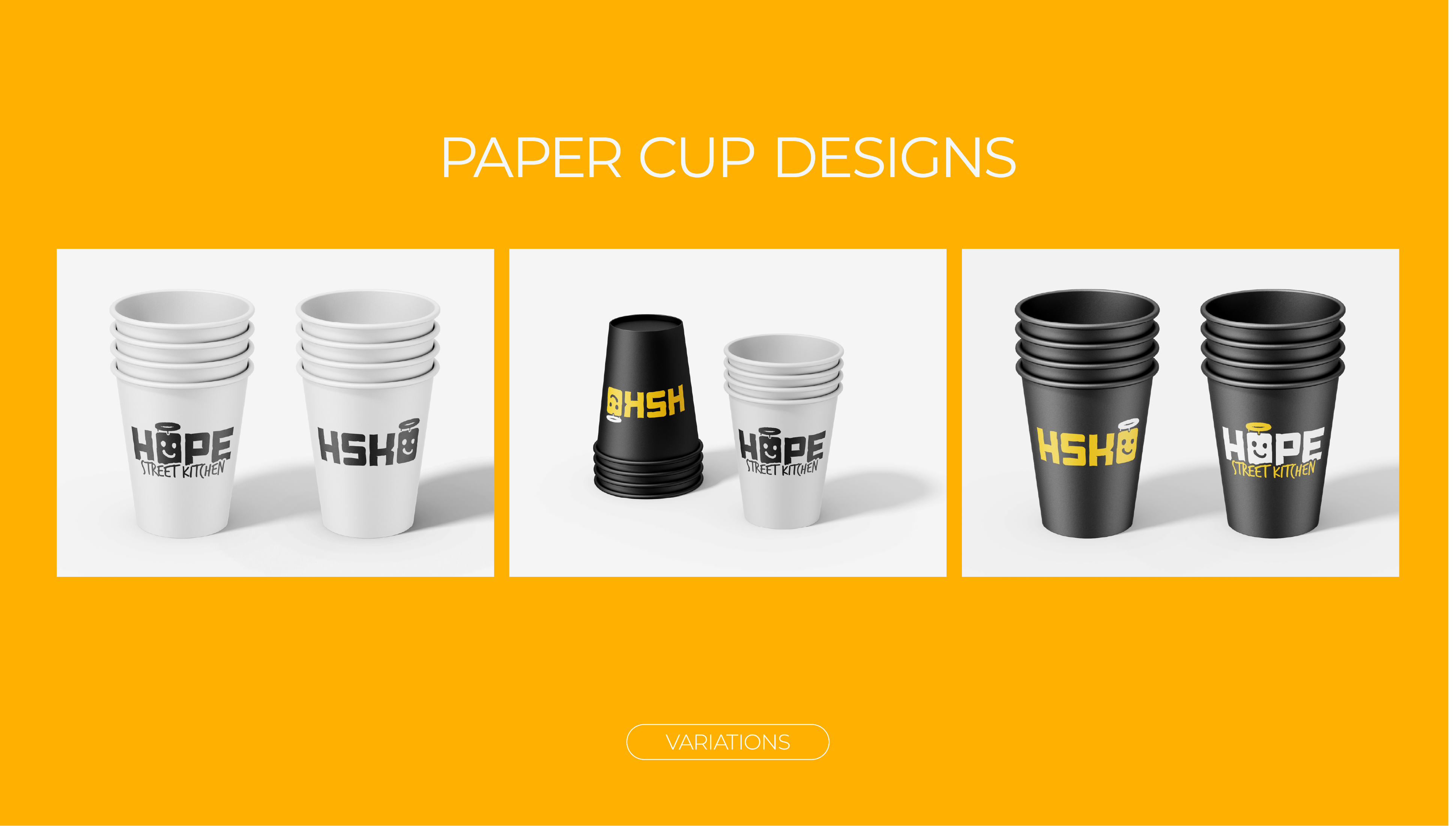
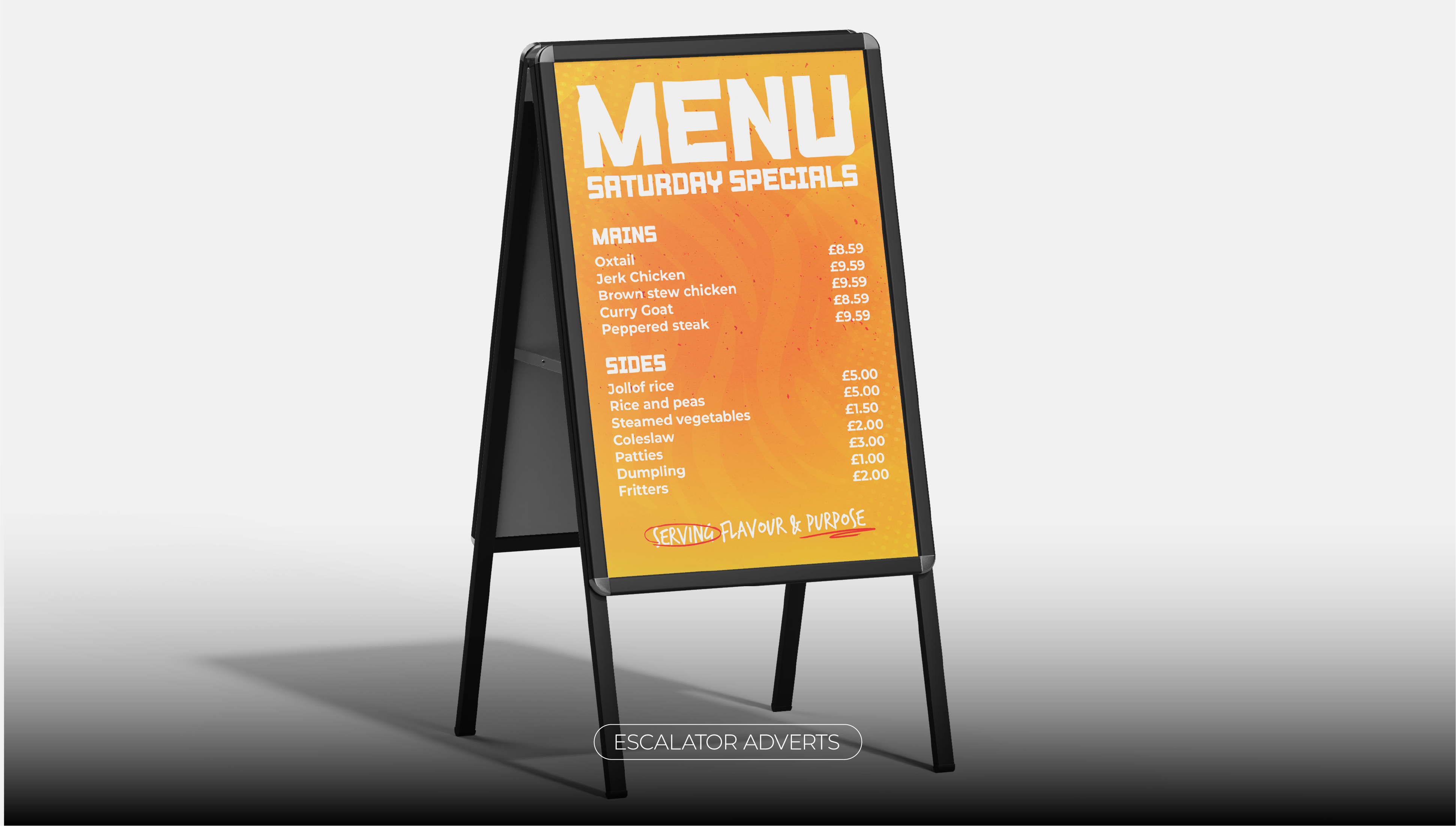
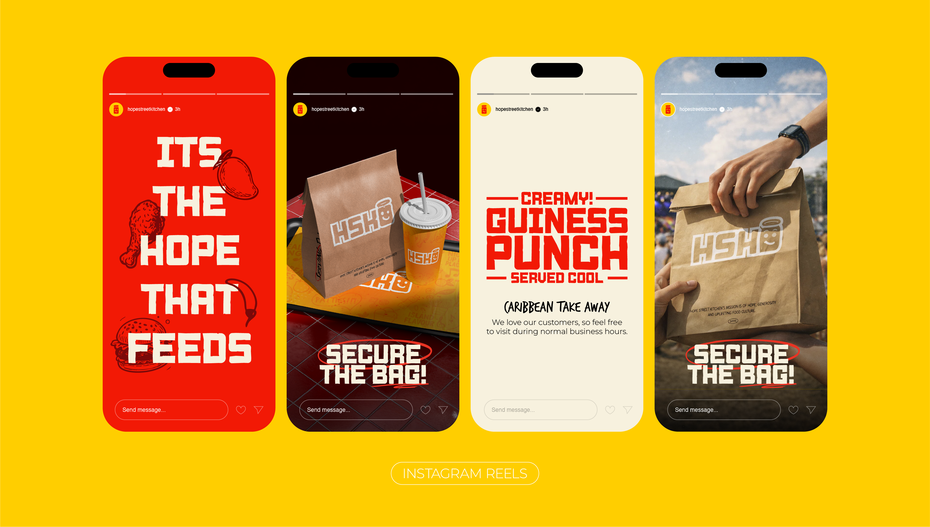
01. Brand Identity
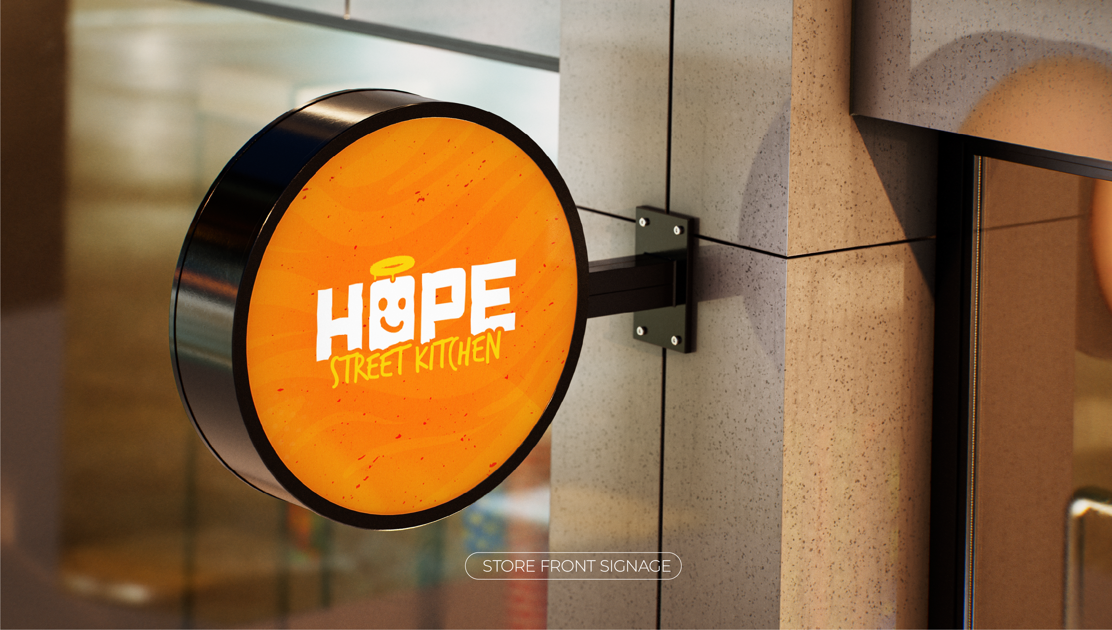
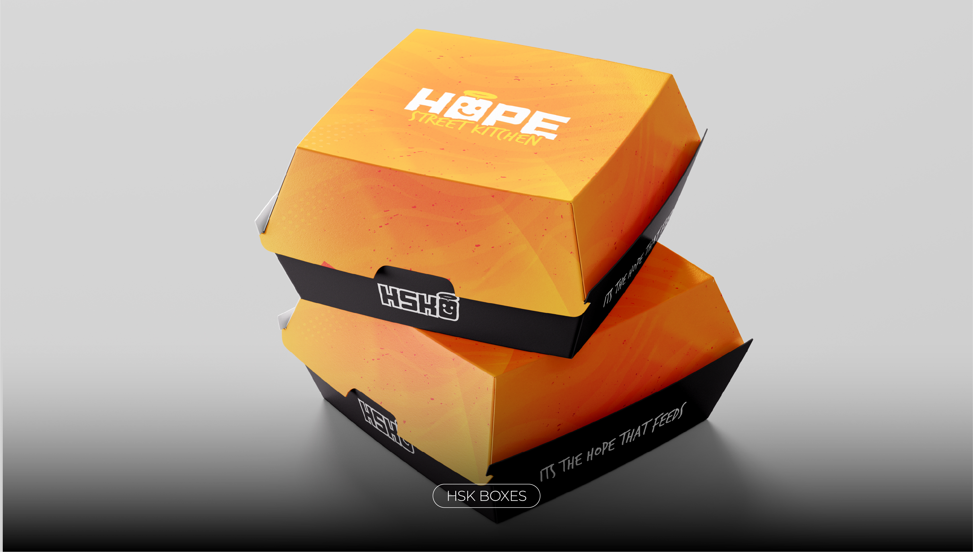
Logo System
& Brand Marks
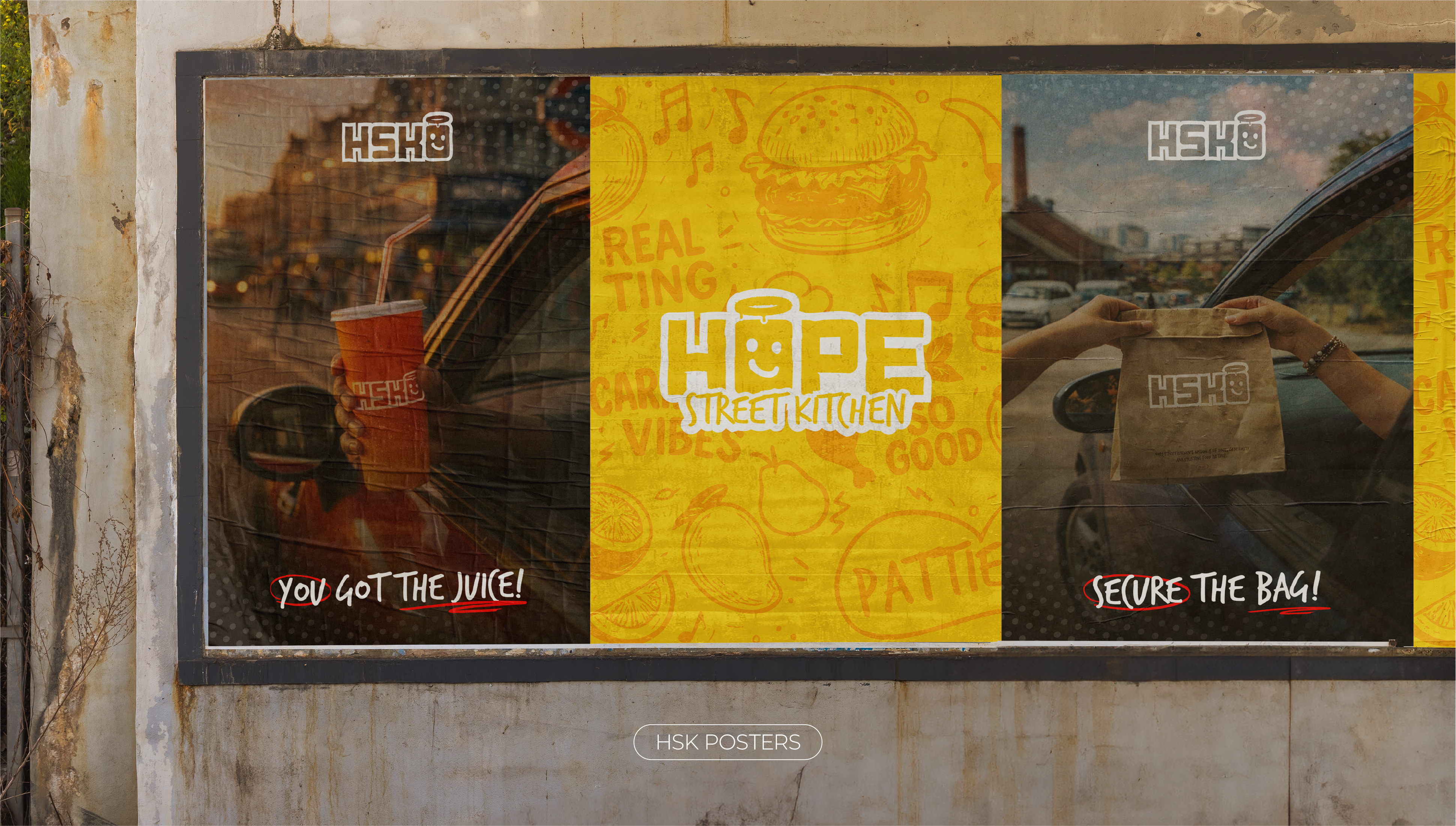
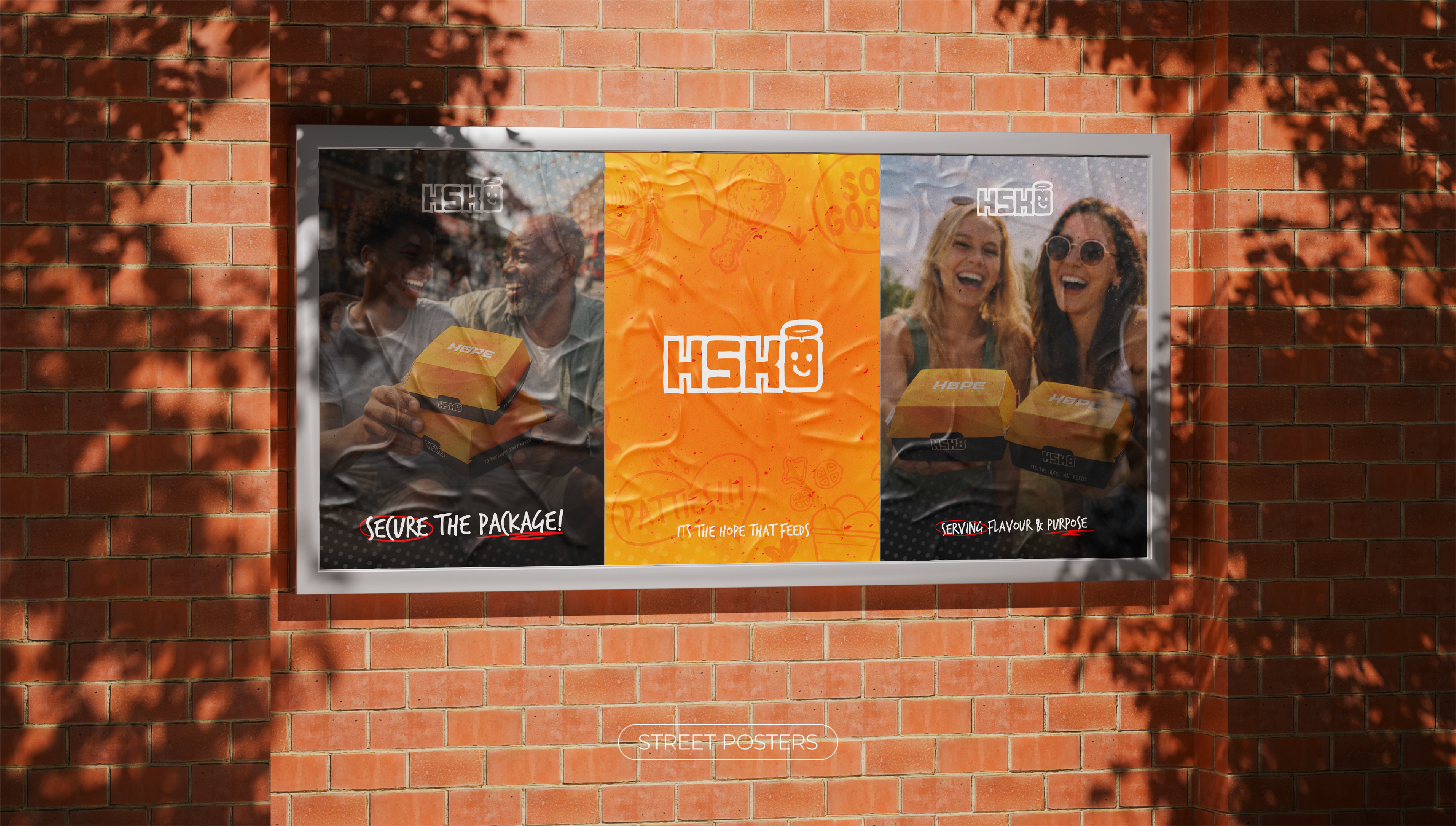
Caribbean food culture is loud, joyful, and communal, yet its representation in street food often falls into stereotypes or over designed tropes. Hope Street Kitchen repositions the category with restraint and swagger: graphic, confident, and unmistakably modern.
Rather than romanticising "heritage" or leaning on predictable visual cues, the brand draws from the energy of street culture, festival signage, and informal retail, places where food, music, and community converge. The result is an identity that feels welcoming without pandering, modern without dilution.
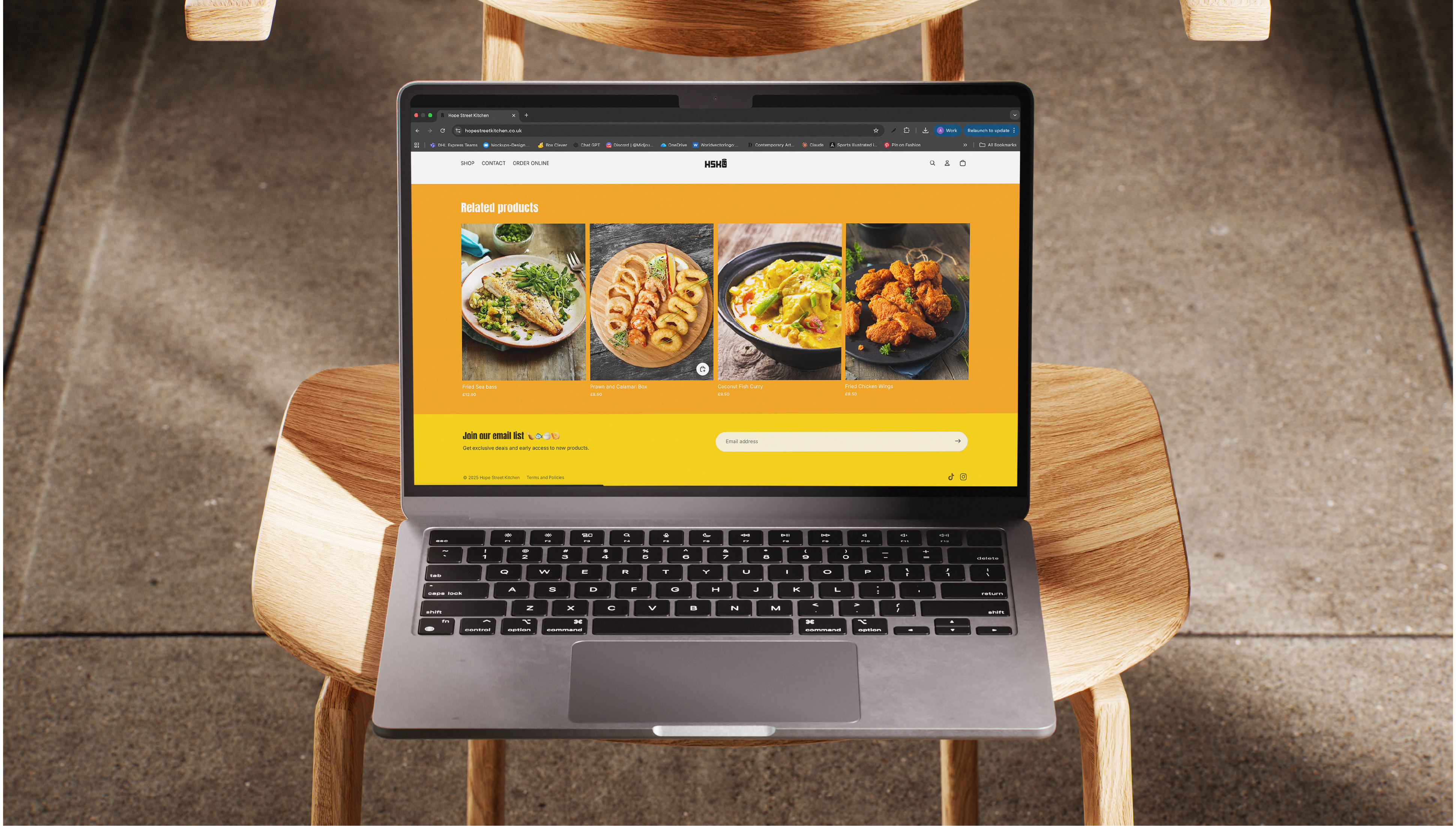
The strategic intent was to build a flexible identity system that could scale from food truck to storefront to e-commerce, with a clear visual voice that could survive tight environments, small-format signage, and rapid social content.
Hope Street Kitchen sits at the intersection of:
- Street food culture
- Caribbean culinary tradition
- Festival & social energy


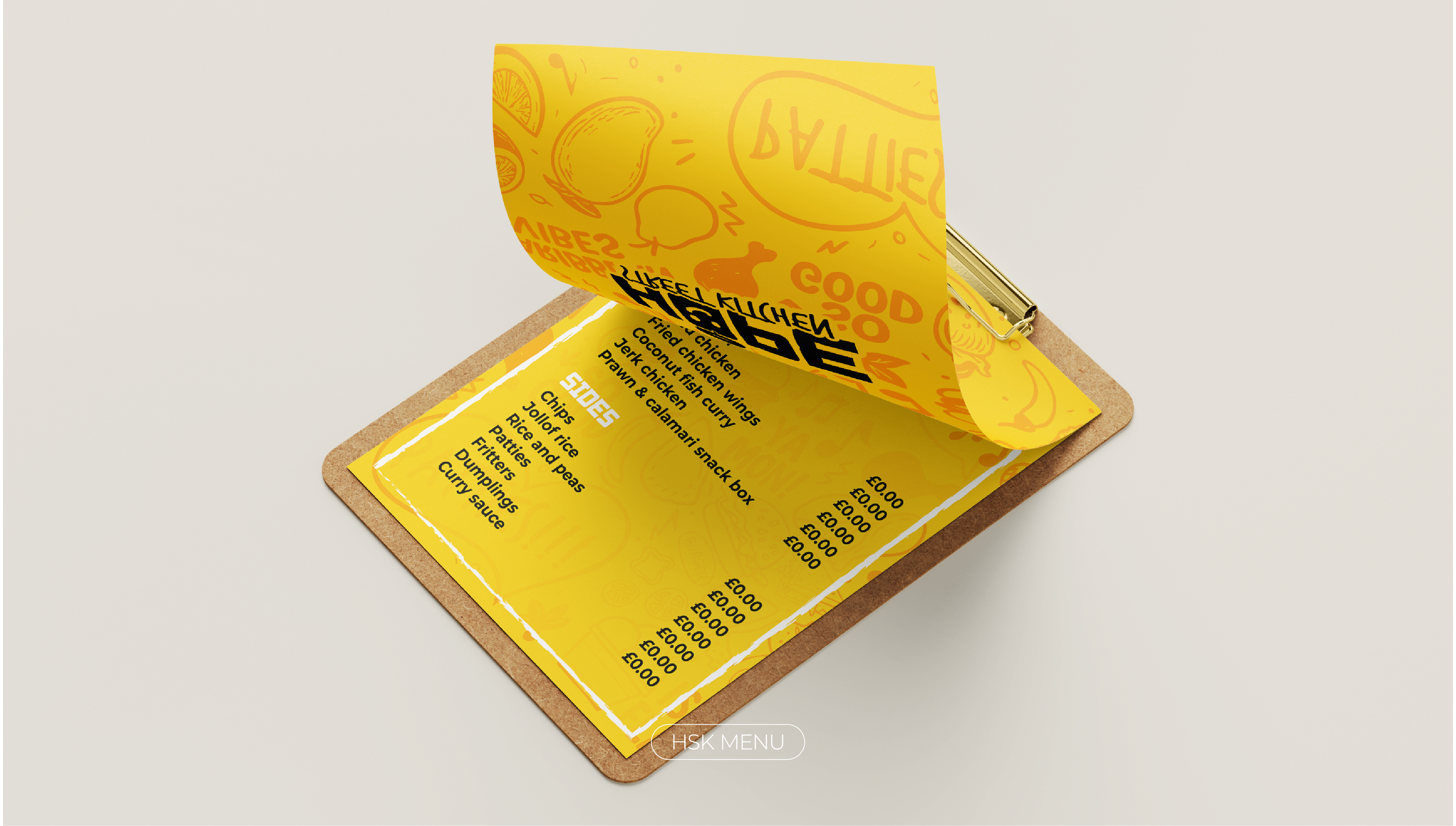
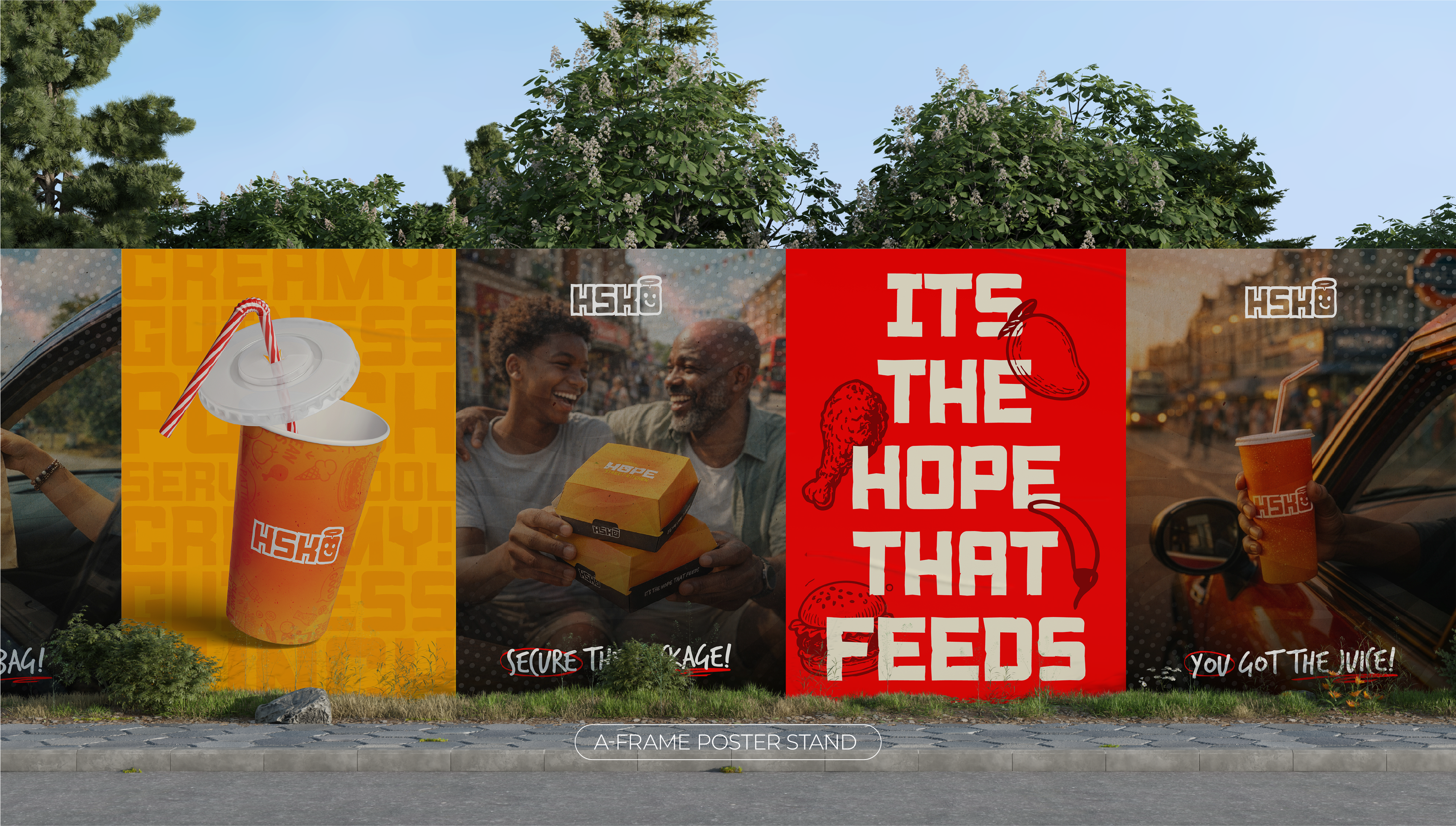
02. Brand System
Colour, Type
& Tone
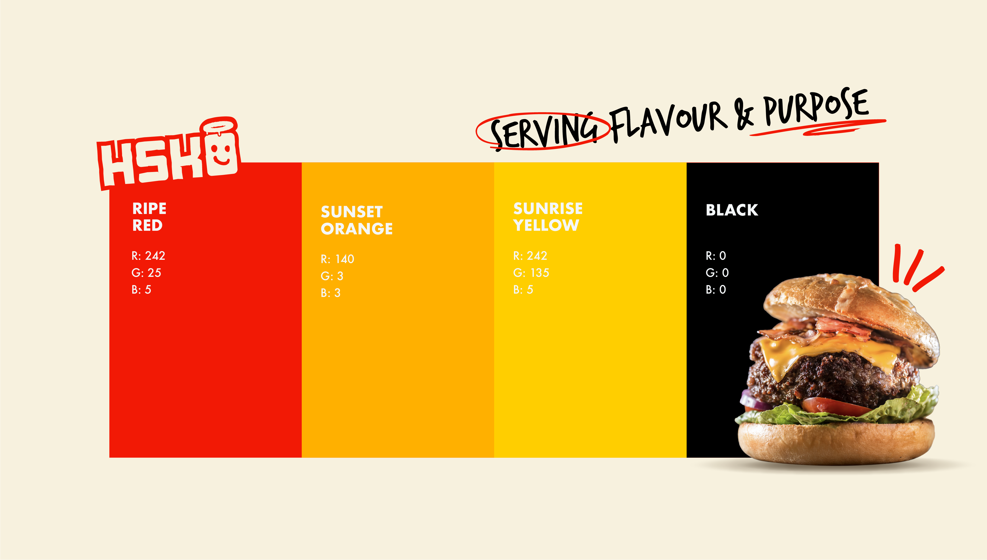
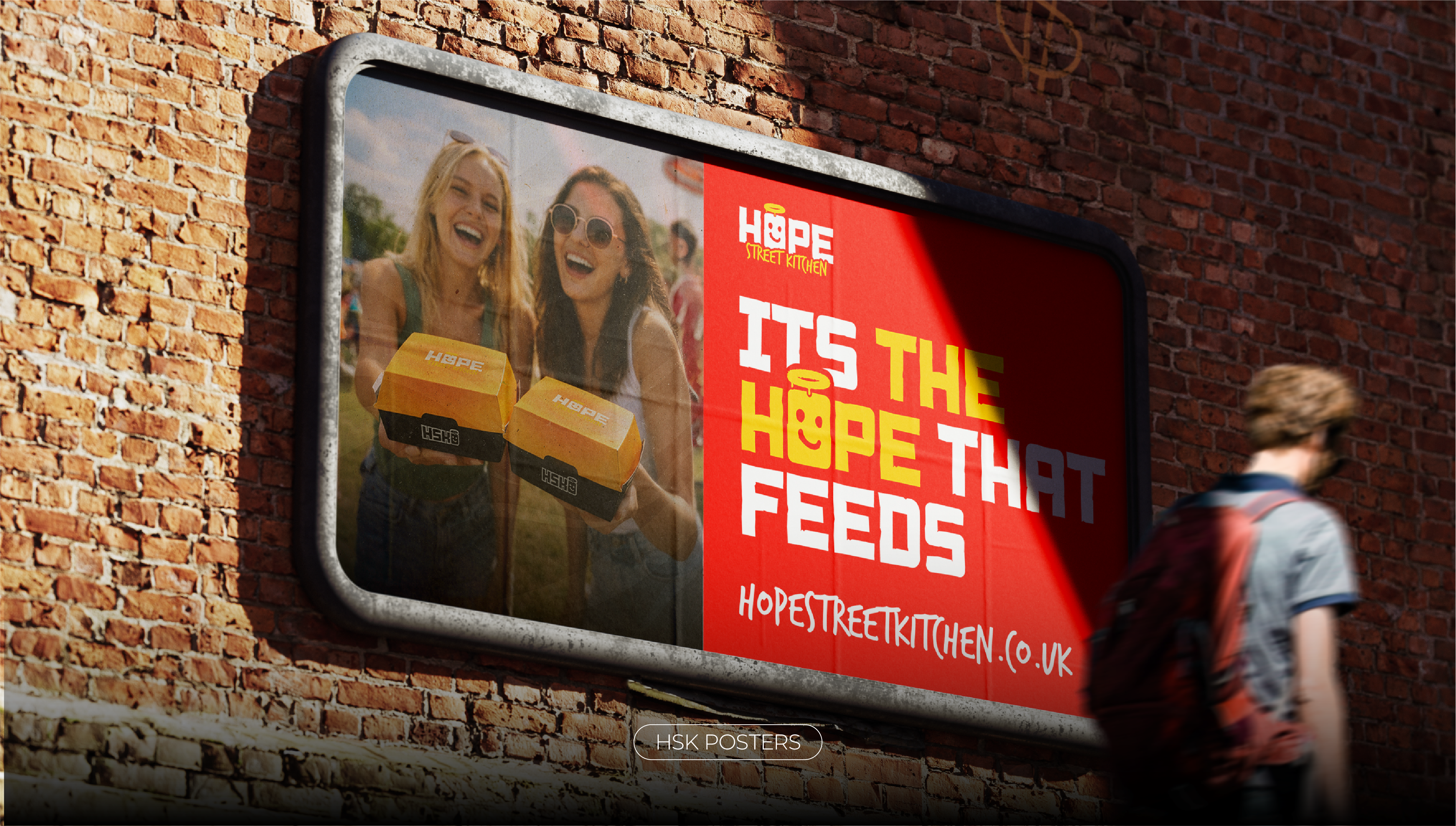
The brand palette draws from the vivid, warm tones of Caribbean food culture: Ripe Red, Sunset Orange, Sunrise Yellow, and Black. Together they create an identity that is bold, joyful, and unmistakably energetic.
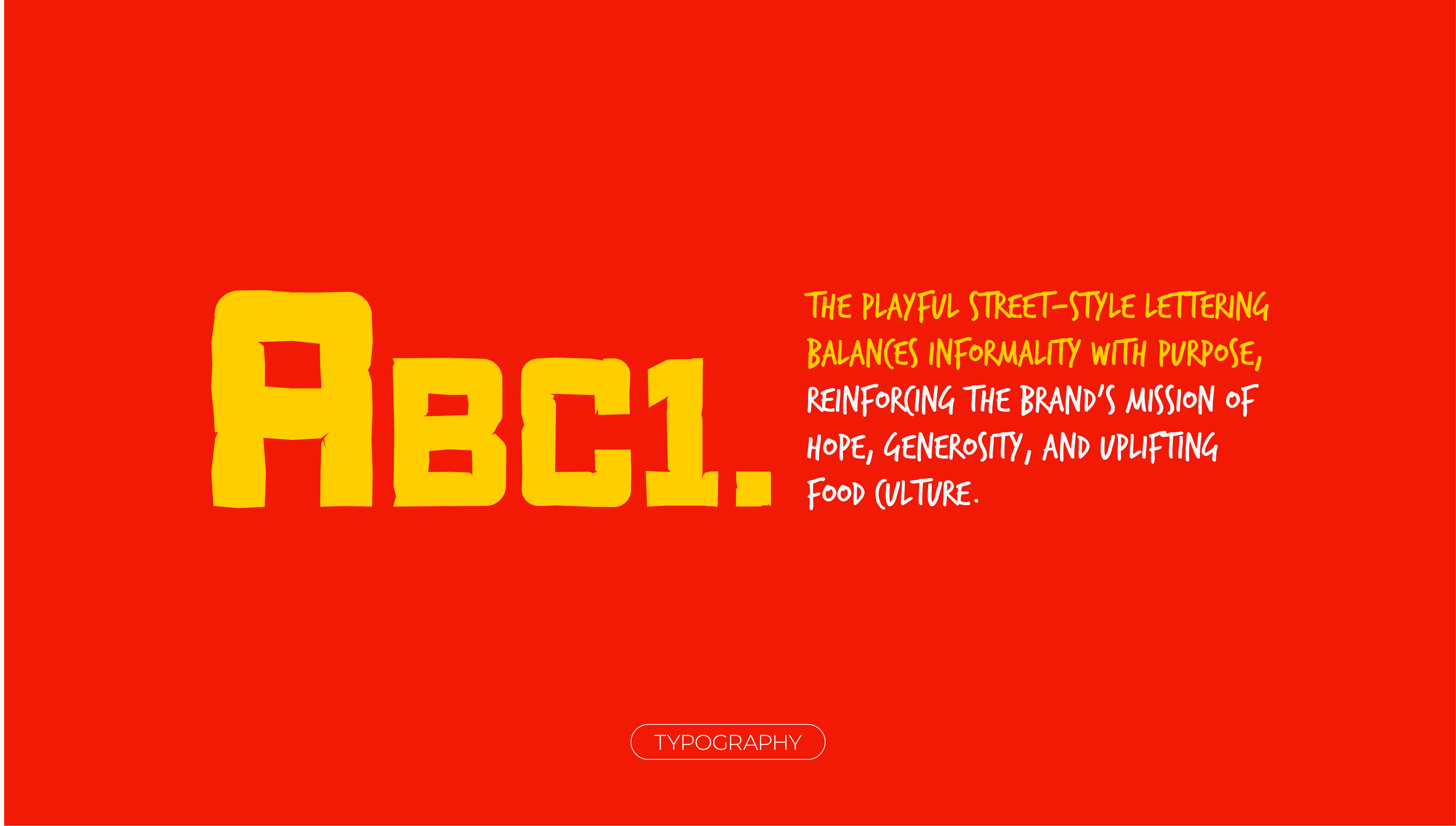
Typography is anchored in a playful, street-style lettering that balances informality with purpose, reinforcing the brand's mission of hope, generosity, and uplifting food culture across every application.

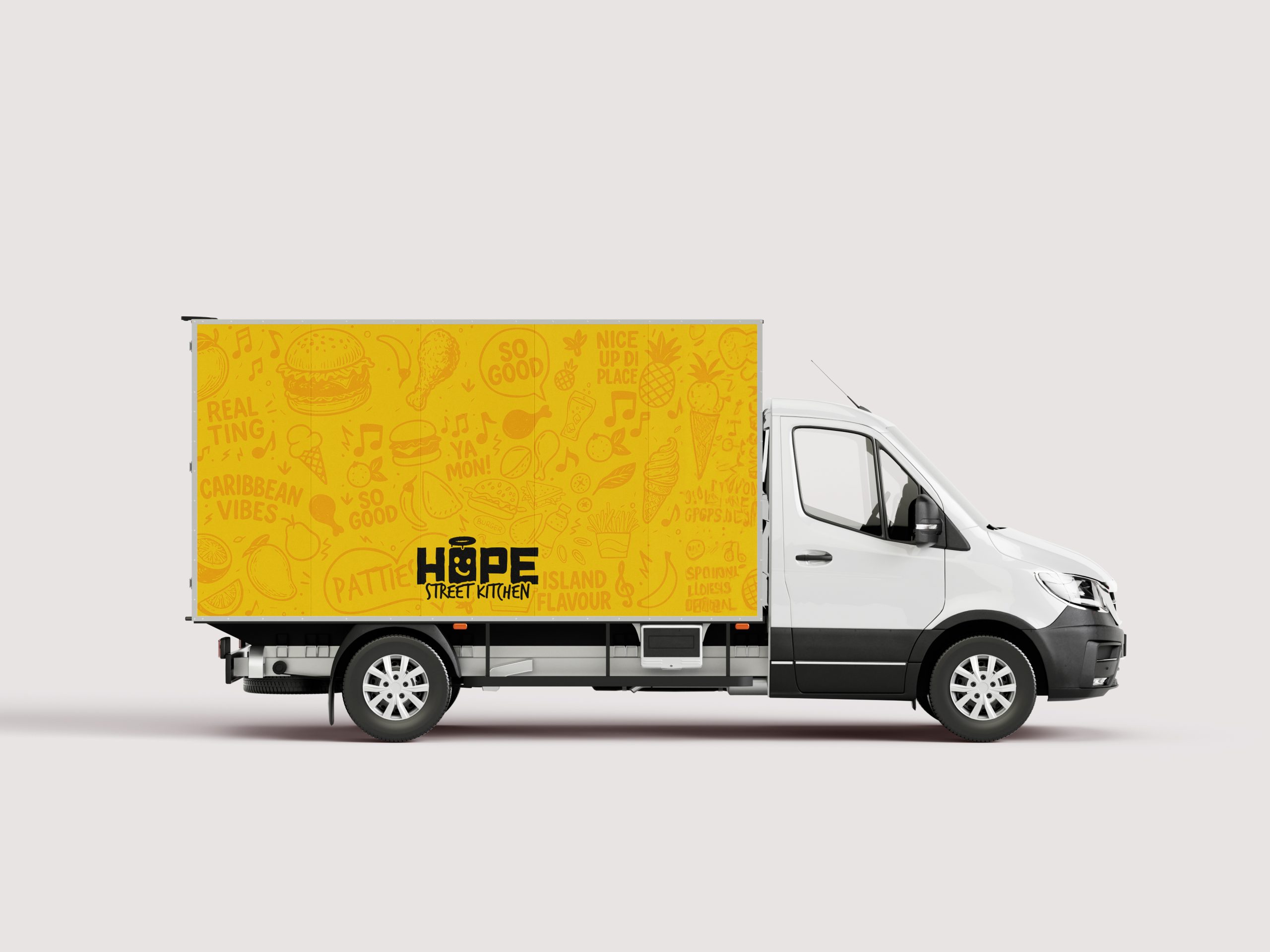
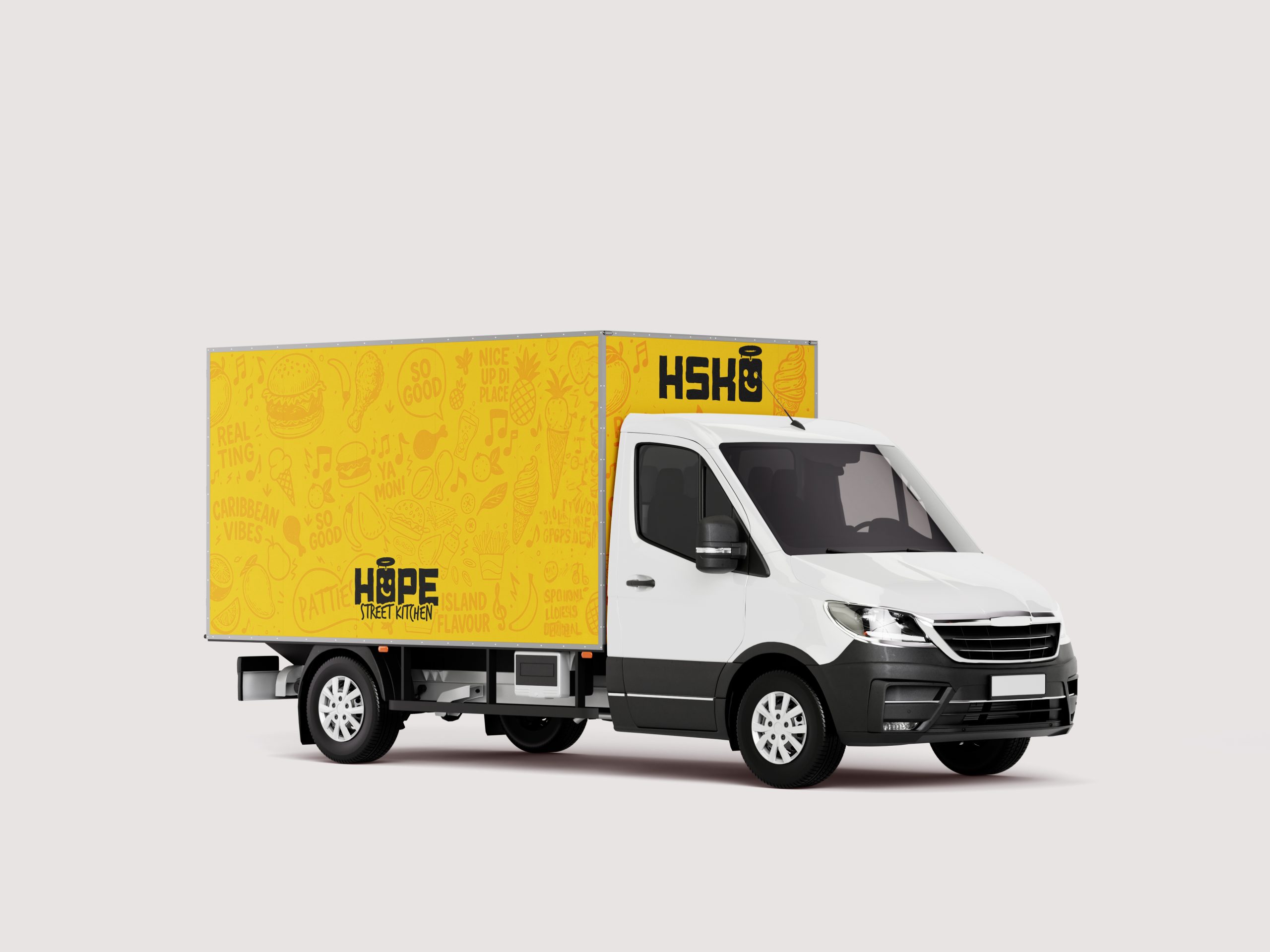
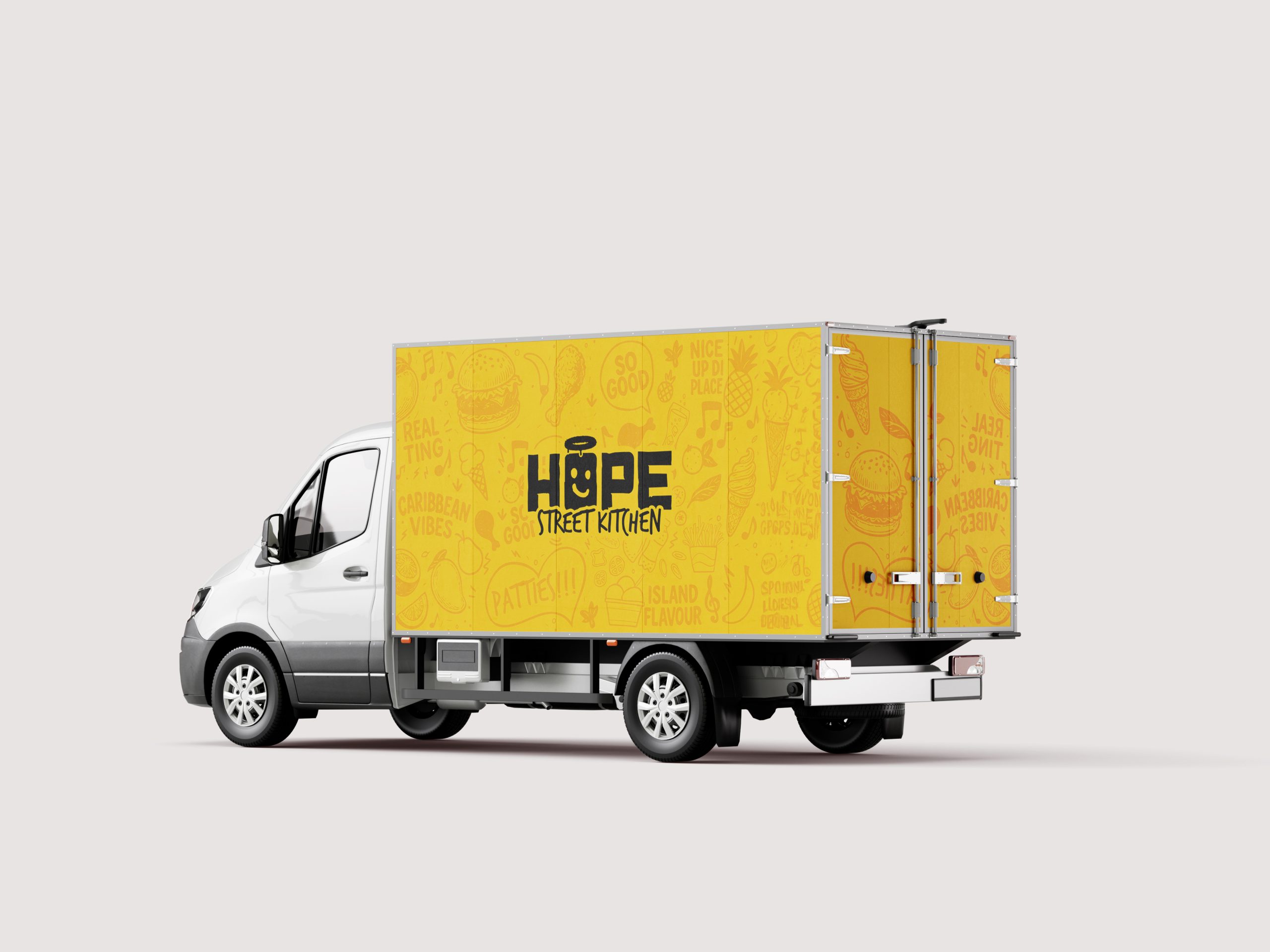
03. Vehicle Branding
The Renault
Master Design
The Renault Master delivery vehicle becomes a rolling billboard for the brand. Wrapped in the brand's signature Sunrise Yellow with the illustrated doodle pattern, the truck carries the Hope Street Kitchen identity into the streets as a moving, living piece of brand communication.
Three livery variations were developed to explore different applications of the logo and doodle system across the vehicle's panel.
04. Approach
Design Philosophy
& Result
Hope Street Kitchen arrives as a modern Caribbean food brand with a visual system that feels both fun and serious, premium yet unpretentious. It builds connection through personality instead of nostalgia, and confidence instead of cliché.
It's built for food trucks and shopfronts. For festival crowds and social feeds. For offline flavour and online relevance.
Above all, it's designed to scale… because food culture lives everywhere, and so should the brand behind it.


Serving
Flavour &
Purpose.
Hope Street Kitchen arrives as a modern Caribbean food brand with a visual system that feels both fun and serious, premium yet unpretentious. It builds connection through personality instead of nostalgia, and confidence instead of cliché.
It's built for food trucks and shopfronts. For festival crowds and social feeds. For offline flavour and online relevance.
Above all, it's designed to scale… because food culture lives everywhere, and so should the brand behind it.