Success in numbers
+48%
increase in lead generation following launch
+62%
increase within six months as the experience was refined
The Project
iPost Parcels
Website Rebrand.
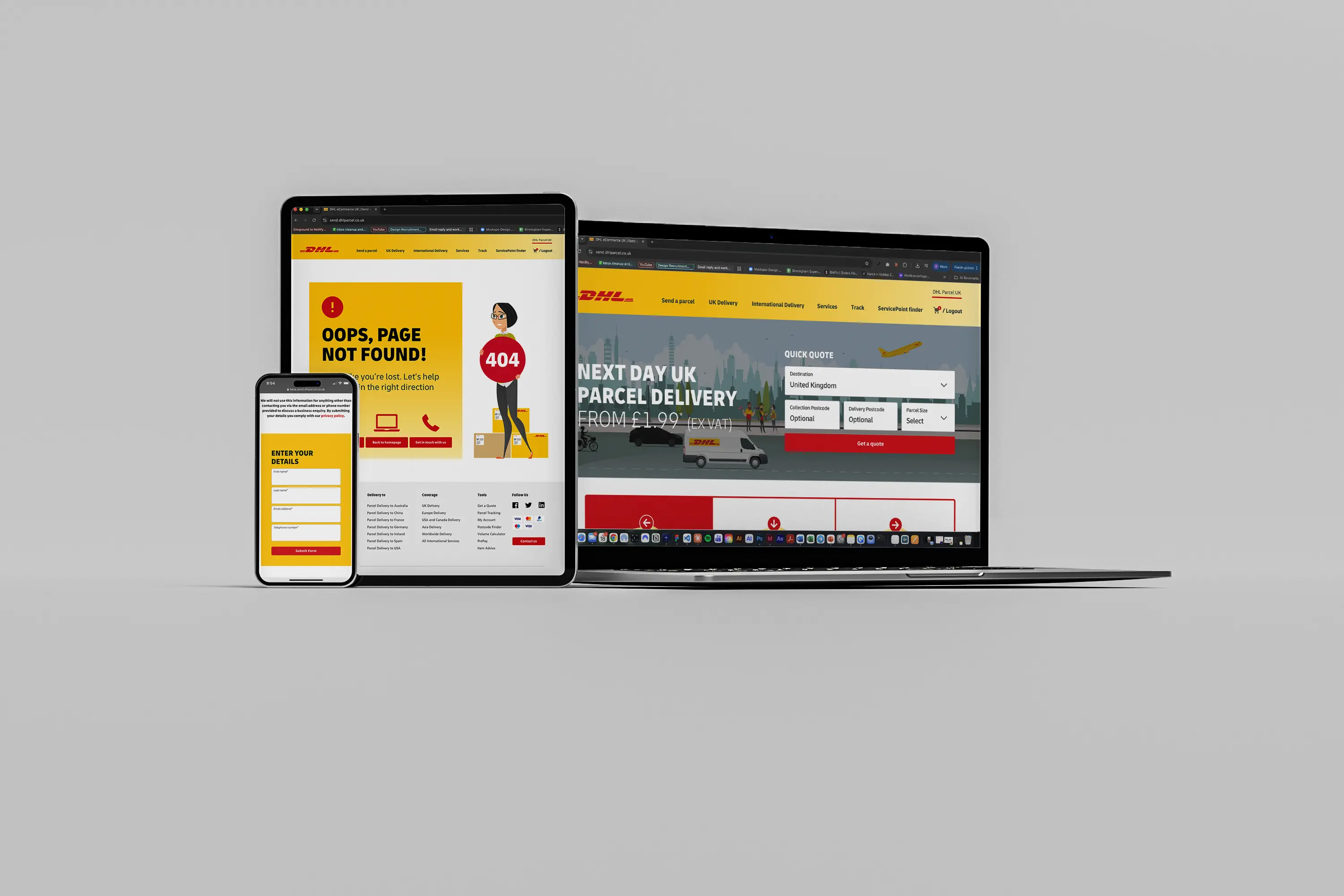
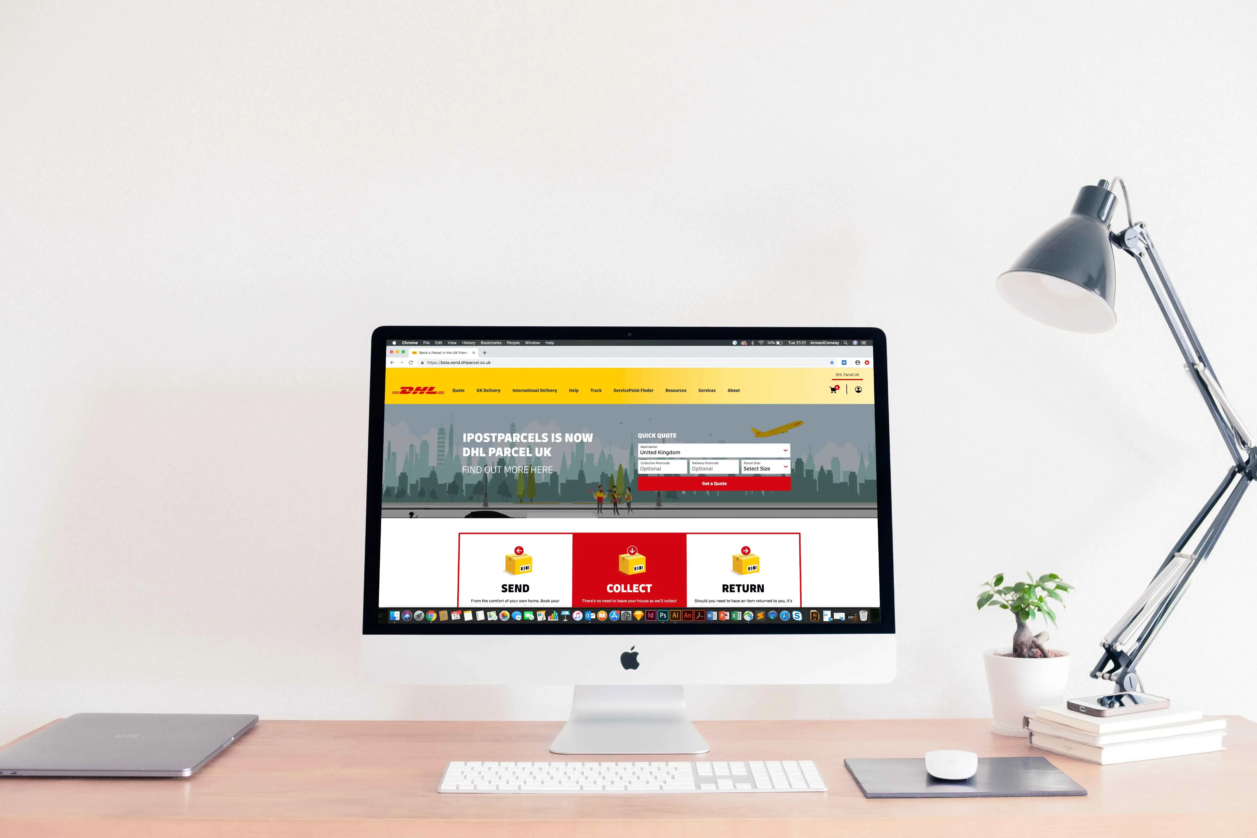
The redesigned iPostParcels experience delivered a 48% increase in lead generation immediately after launch, rising to 62% within six months. The project centred on simplifying the customer journey through clearer information architecture, stronger visual hierarchy and more intuitive interfaces, making it easier for customers to understand the service and complete key actions.
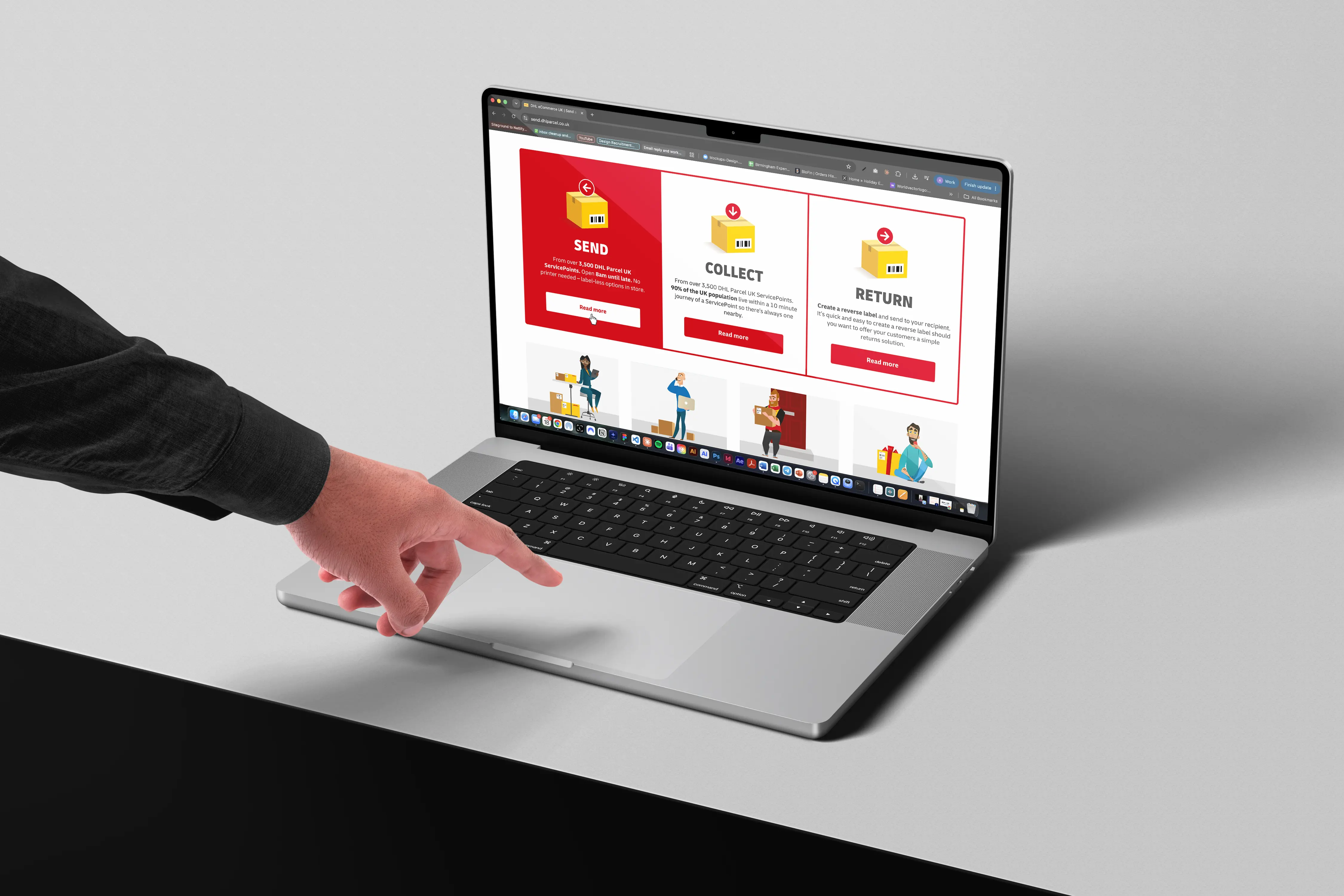
01 — The Challenge
A global brand. A journey that needed to catch up.
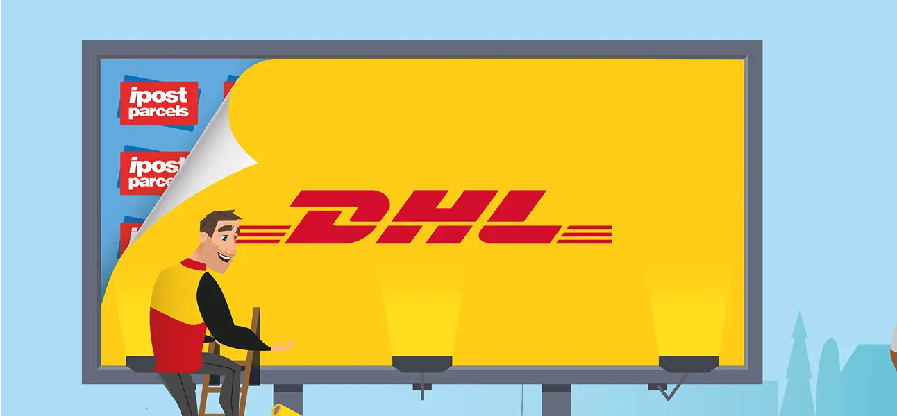
The problemThe site was inheriting DHL's identity, but DHL's visual language was built for business shippers, detailed in-situ photography documenting the logistics of a parcel's journey. Applied to a consumer audience, that language felt corporate and cold. The people using this site weren't logistics buyers; they were ordinary senders posting a gift or a return a few times a year. The experience needed to sit unmistakably within DHL while feeling nothing like the B2B proposition.
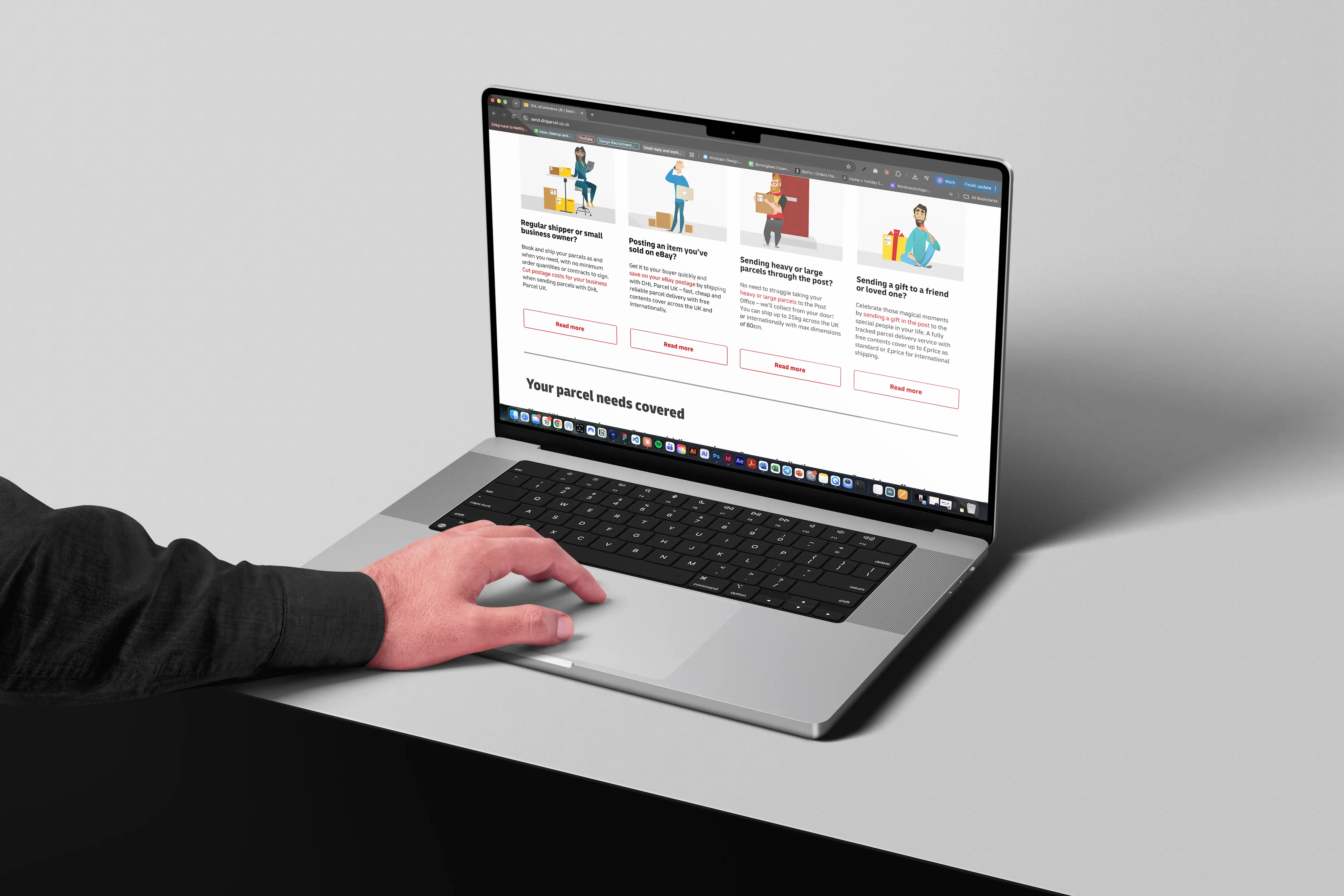
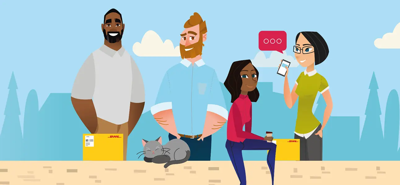
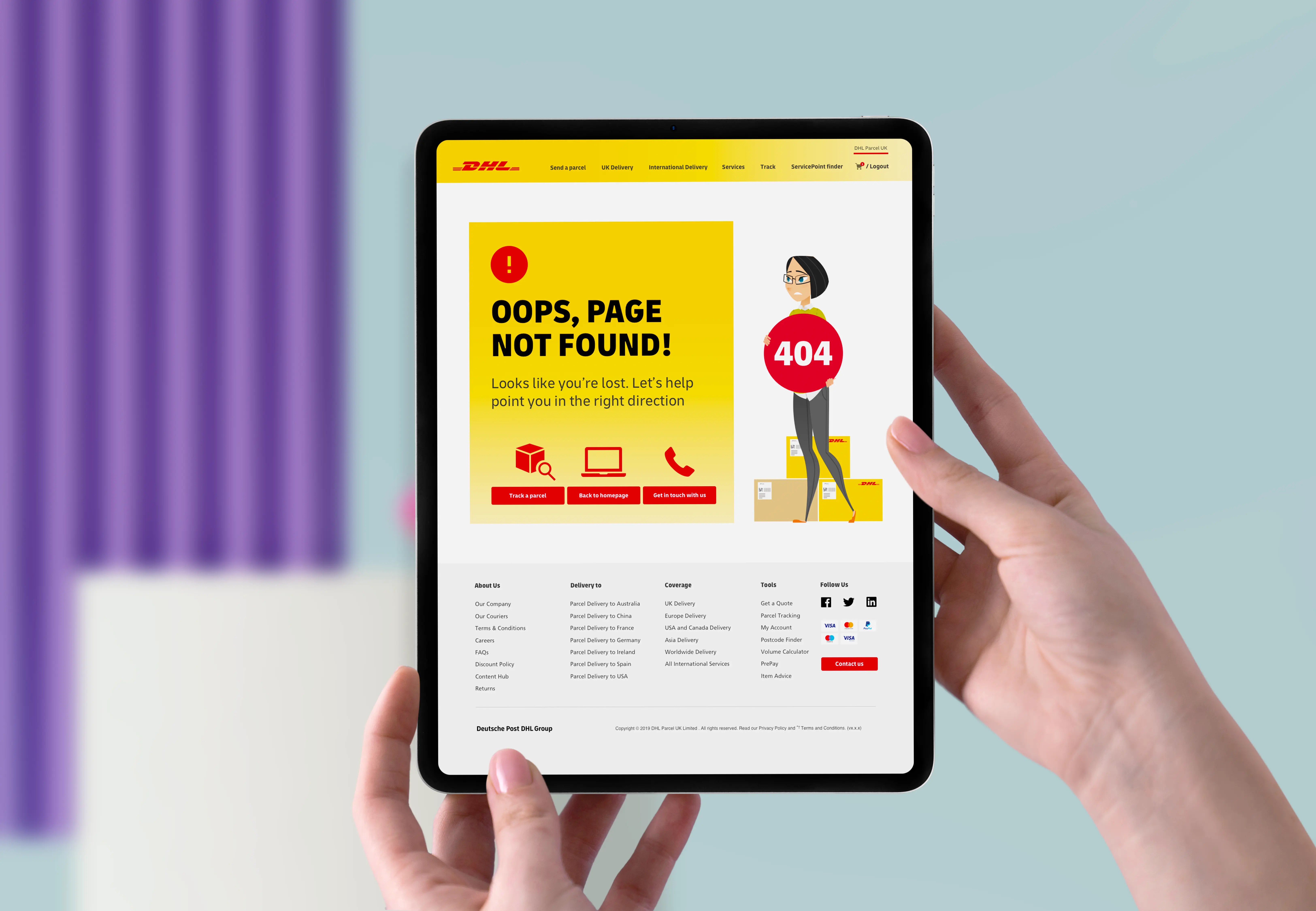
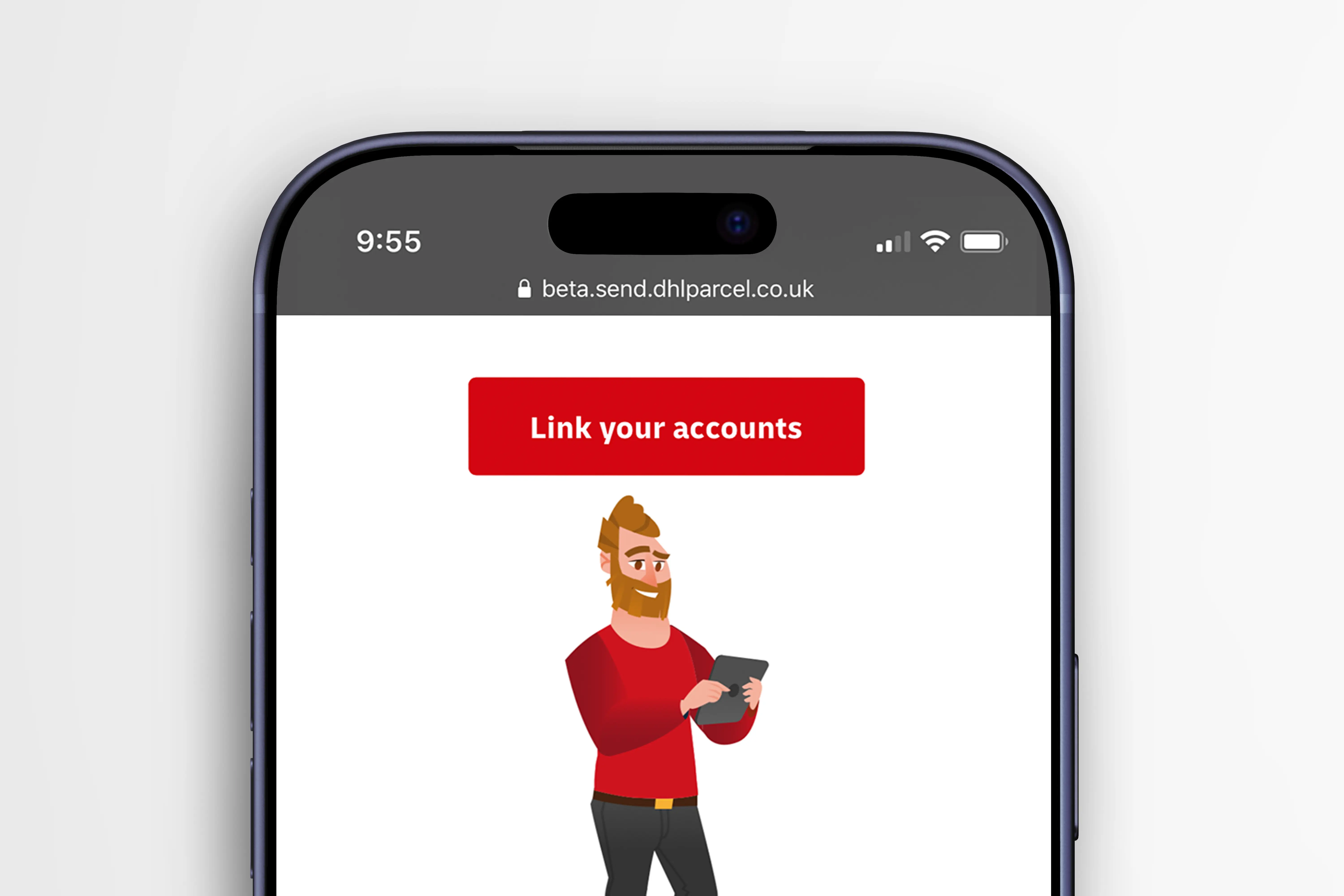
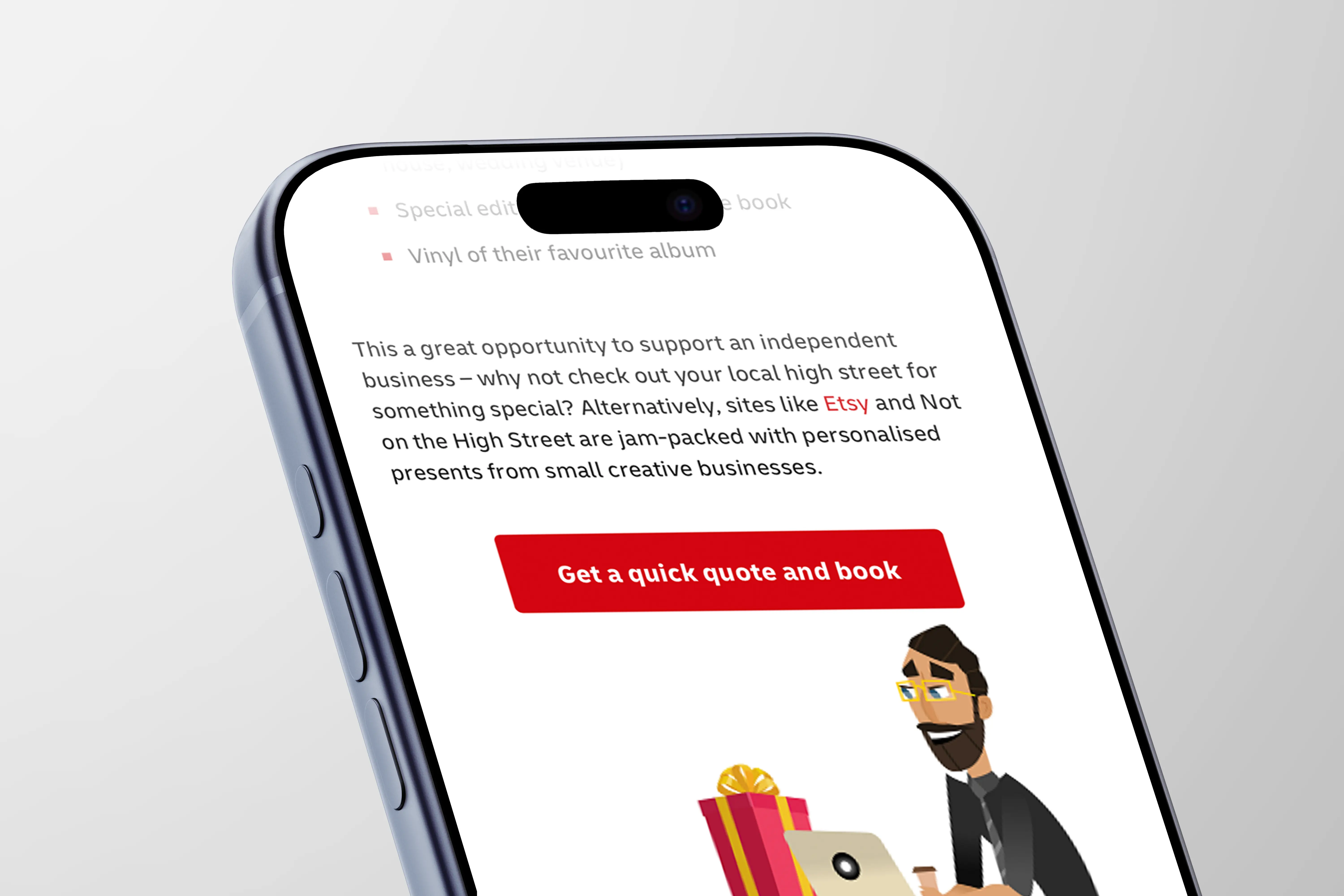
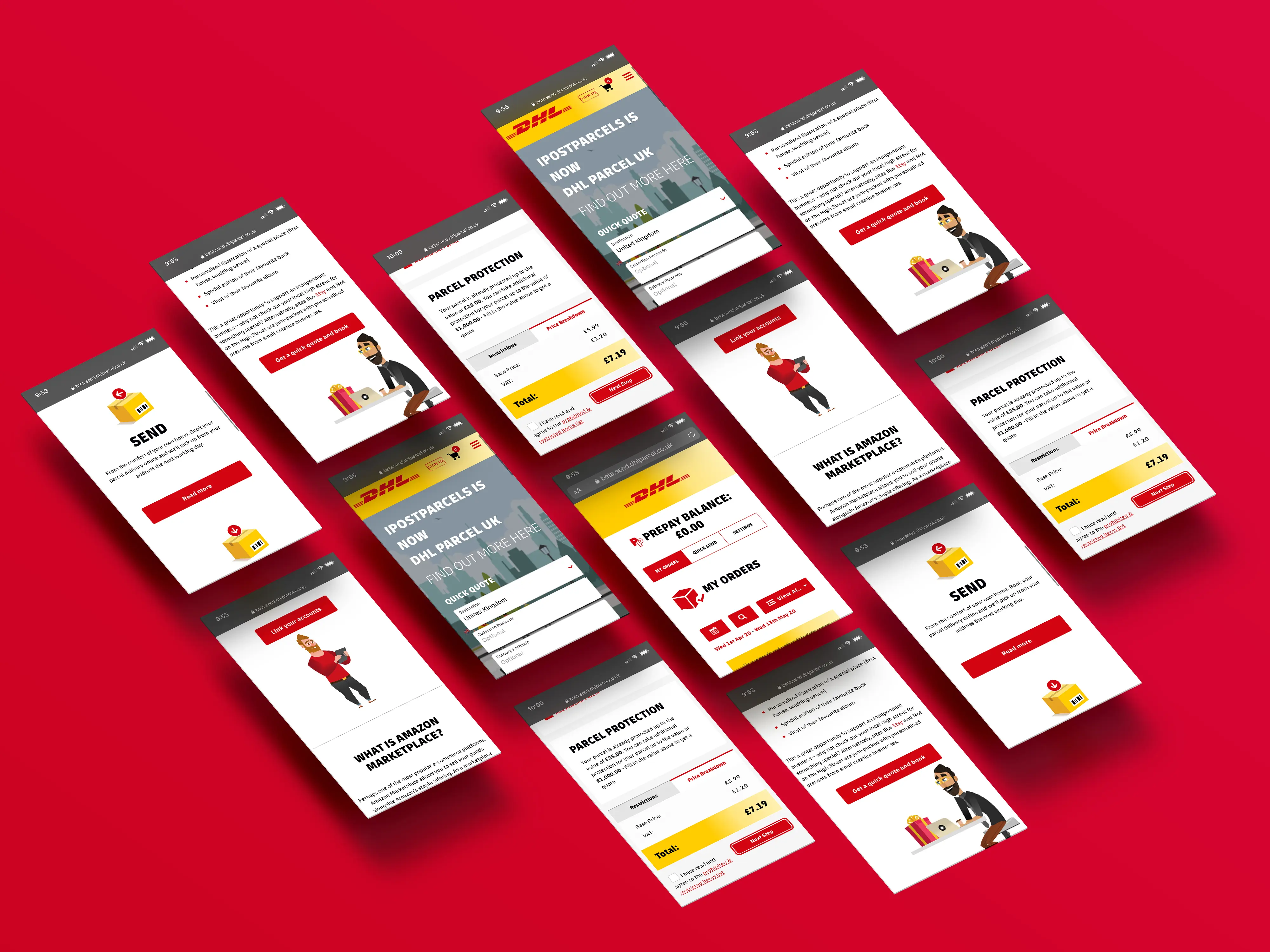
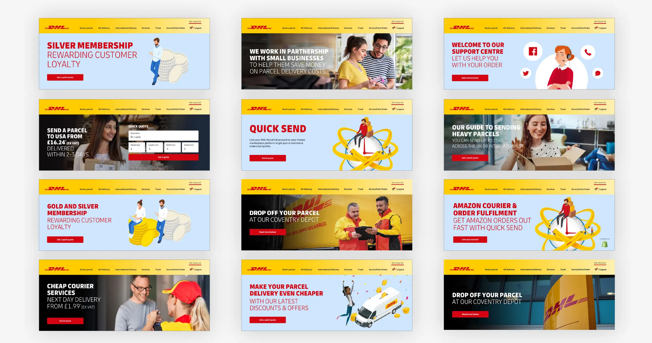
The decisionRather than reuse DHL's photography, I built the parcel journey out of illustration. It kept the recognisable red and yellow, so the brand link was never in doubt, but replaced the corporate tone with something lighter and more human and gave the illustrations a functional job, explaining each stage of sending without leaning on extra copy.
The benefitA single decision solved two problems at once: it drew a clear line between Send DHL Parcel (B2C) and DHL Parcel UK (B2B), and it made an occasional, personal task feel approachable rather than industrial matching the way this audience actually thinks about sending a parcel.
02 — The Insight
“They didn't arrive wanting to explore a logistics company. They arrived because they needed to send something.”
03 — The Strategy
From a rebrand to a task-focused experience.
PRINCIPLE 01
Make the next action obvious
PRINCIPLE 02
Explain without overwhelming
PRINCIPLE 03
Build confidence as the journey progresses
04 — Content & UX Decisions
The decisions I made and why.
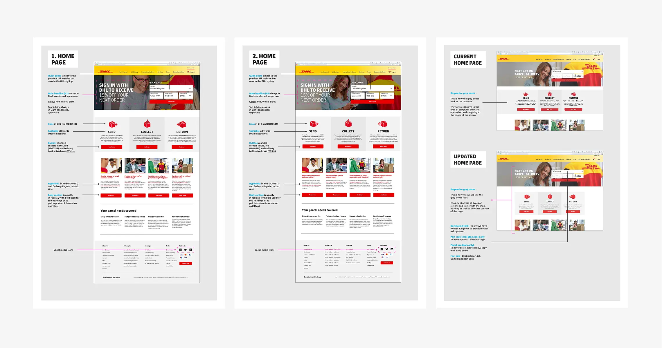
Each block below is one decision. Text stays short (problem → decision → benefit); the annotated mockup does the heavy lifting.
Information hierarchy
Put the reason customers came first.
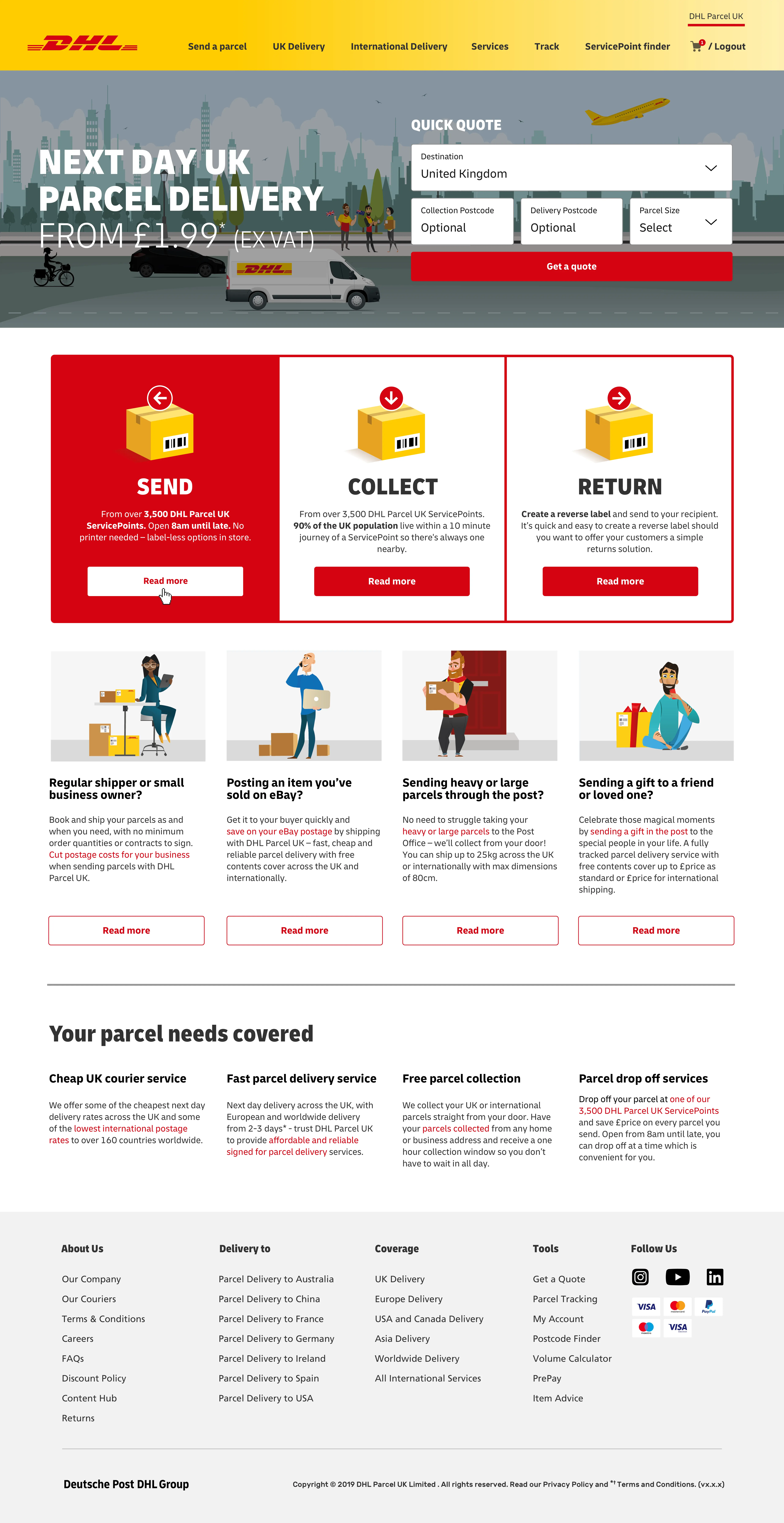
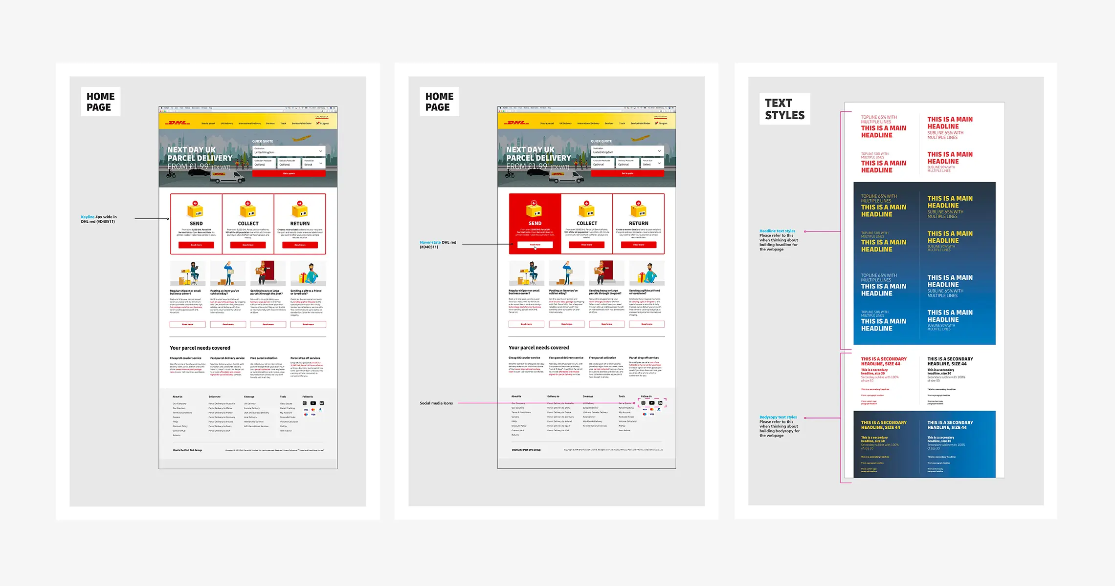
The original experience prioritised services and customer types over customer intent. Research showed that most visitors weren't looking to explore, they simply wanted to send a parcel. I restructured the information hierarchy around that core task, elevating the quote journey while moving secondary content further down the page to support rather than compete with the primary action.
To reinforce this shift, I introduced a more approachable illustration style that clearly differentiated the B2C experience from DHL's corporate services. Every design decision aimed to reduce friction, improve clarity and guide customers towards one primary task and one obvious next step.
Website Navigation
Reduce the effort to find the right thing.
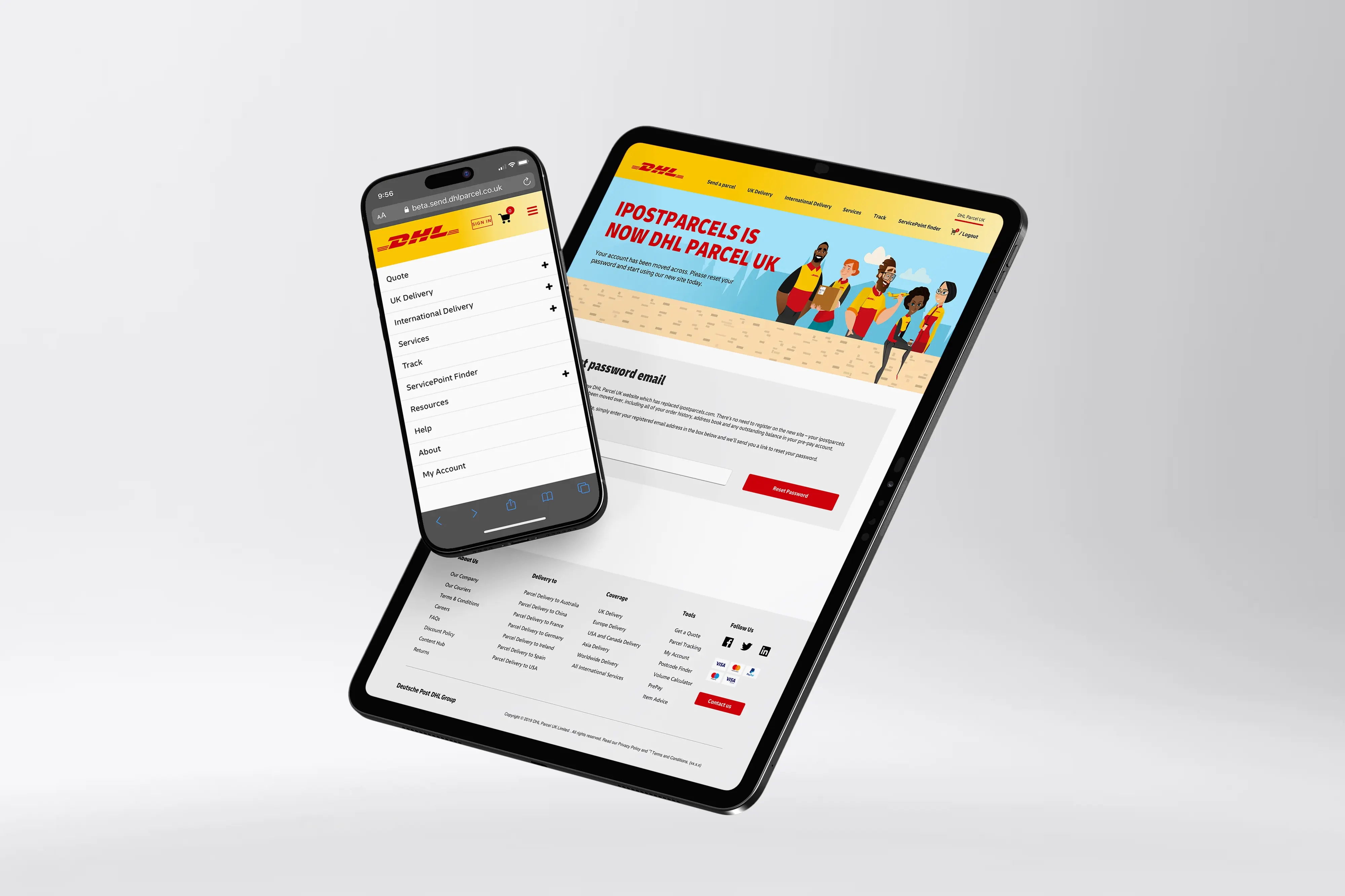
Navigation should answer customer questions, not reflect internal business structures. Rather than organising the experience around DHL product names, I restructured it around the tasks people actually wanted to complete. Familiar, action-led labels like Send a Parcel, Track, Help and Account reduced cognitive effort and made the next step immediately obvious.
To support this, the quote entry point remained persistent across the experience, ensuring the site's primary task was never more than a click away. Every navigation decision reinforced speed, clarity and confidence.
Forms & the transactional journey
Reduce uncertainty at the highest-friction moment.
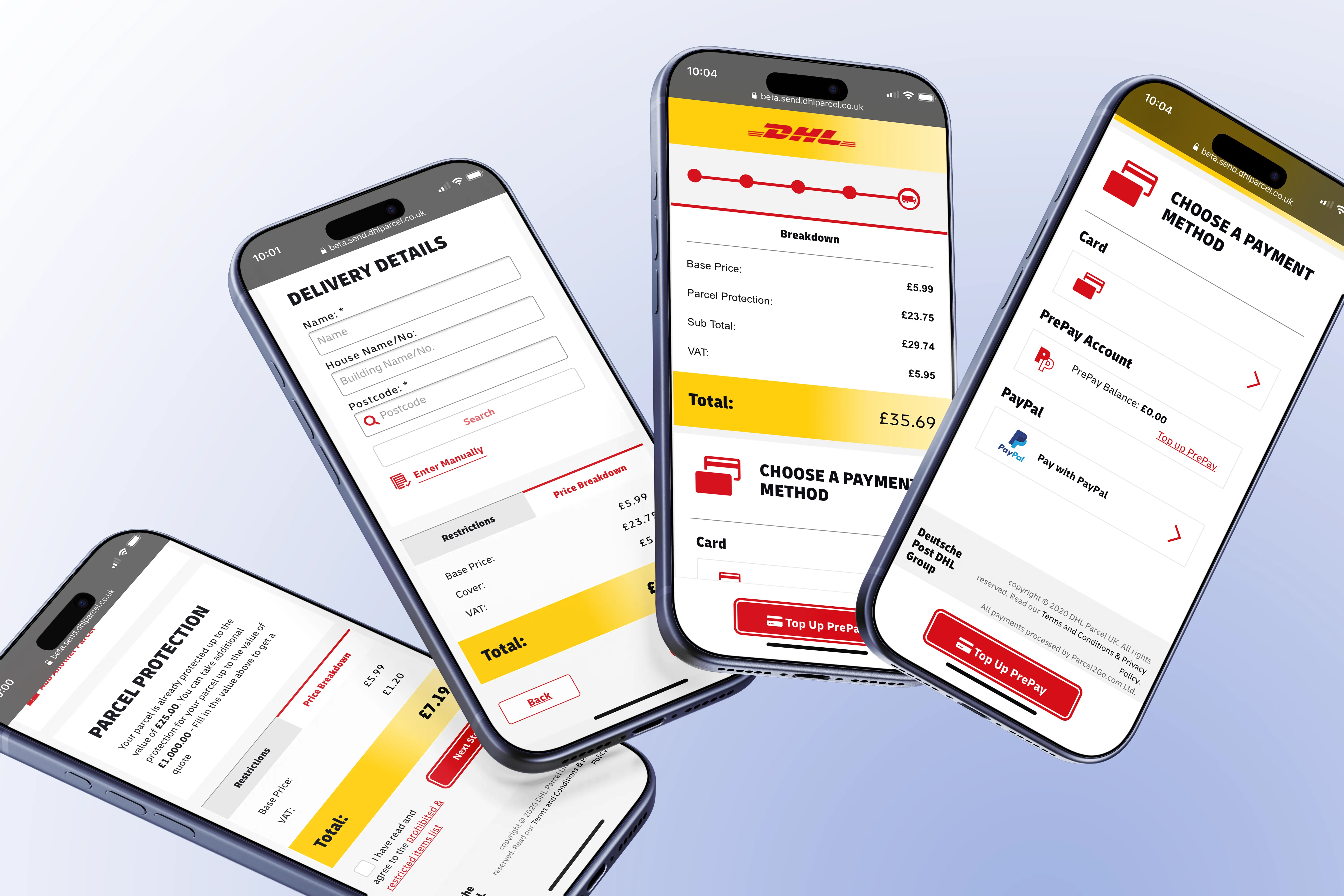
Completing a shipment is the most demanding part of the experience, so the forms were designed to guide customers rather than simply collect information. Information is introduced progressively, revealing only what's needed at each stage, while related inputs are grouped together to reduce cognitive load and make longer forms feel more manageable.
Clear progress indicators, price breakdowns and contextual feedback continually reinforce what has been completed, what happens next and how each decision affects the journey. By treating forms as part of the overall experience, not just a collection of inputs, the booking process feels simpler, more transparent and easier to complete with confidence.
Treat the form as experience, not just input.Support content
Help when it's needed. Never in the way.
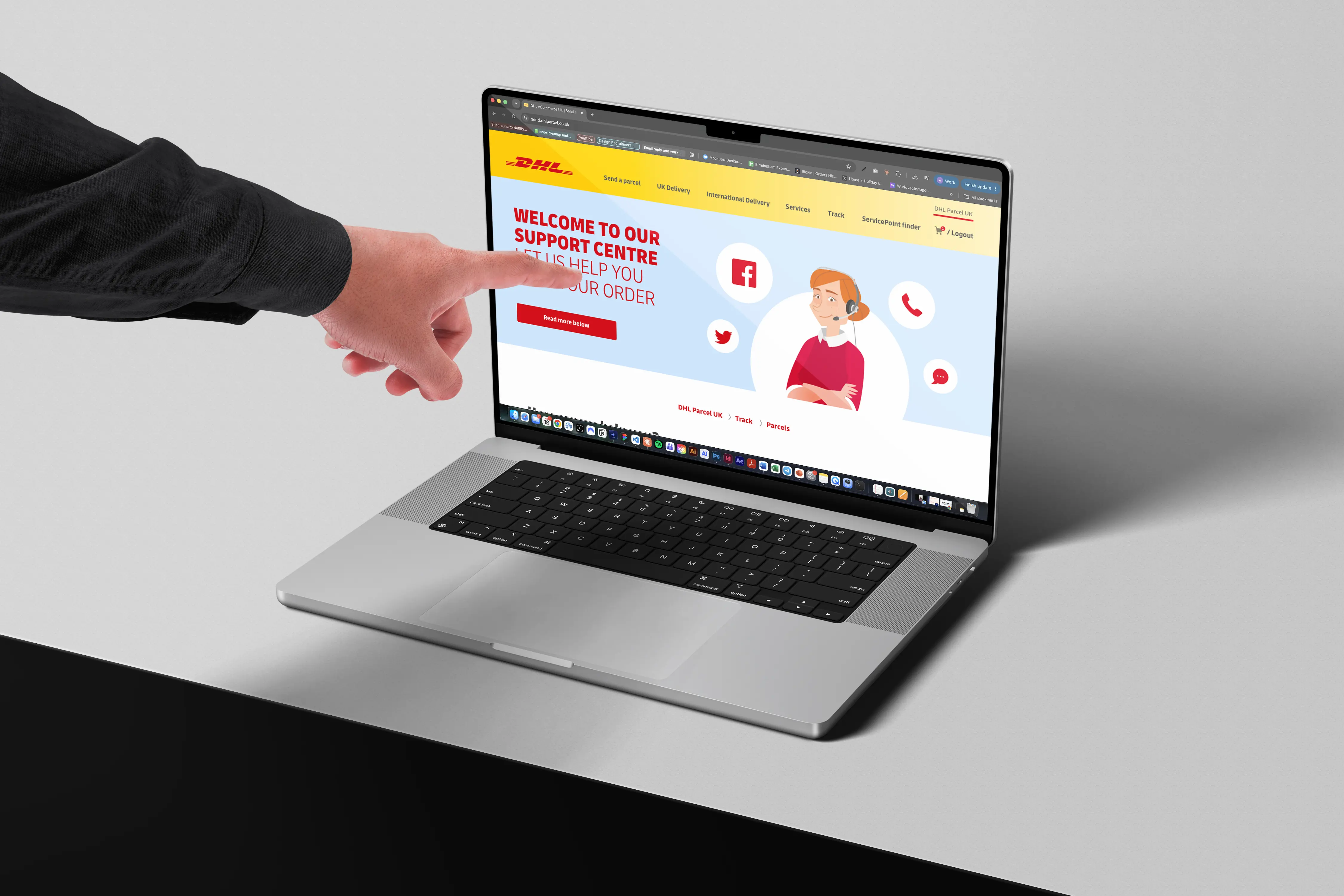
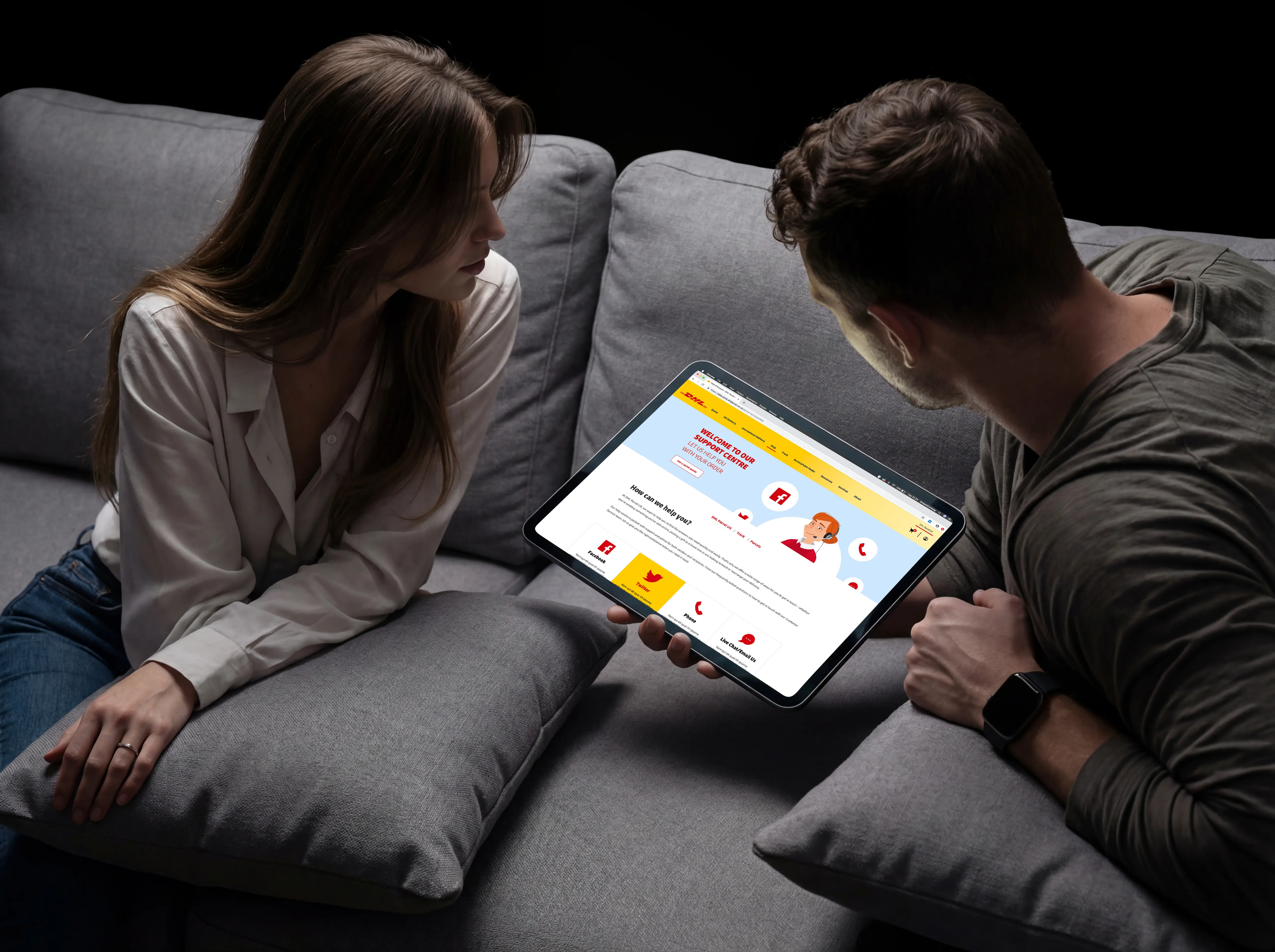
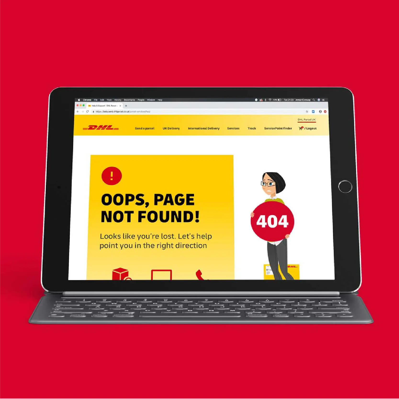
Customers rarely visit a help centre to explore—they arrive with a specific question they want answered quickly. Rather than organising support around DHL's internal teams, I structured the experience around customer intent, using plain language, familiar categories and the most frequently asked questions to reduce the time taken to find an answer.
Support remains closely connected to the core journey through persistent access to tracking, contact options and self-service tools, ensuring help is always available without competing with the primary task of sending a parcel.
05 — Visual Language
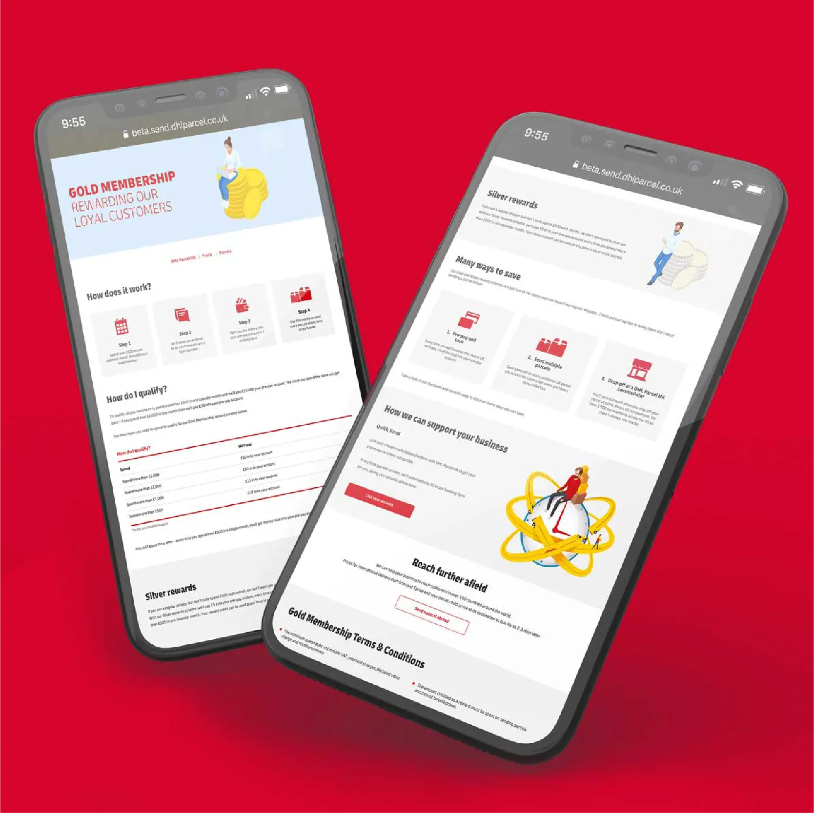
Bringing DHL recognition into a warmer B2C experience.
06 — Iteration
Launch was the beginning, not the end.
07 — Outcome
A clearer experience. A measurable commercial impact.
+48%
leads following launch
+62%
within six months