Branding & Art Direction
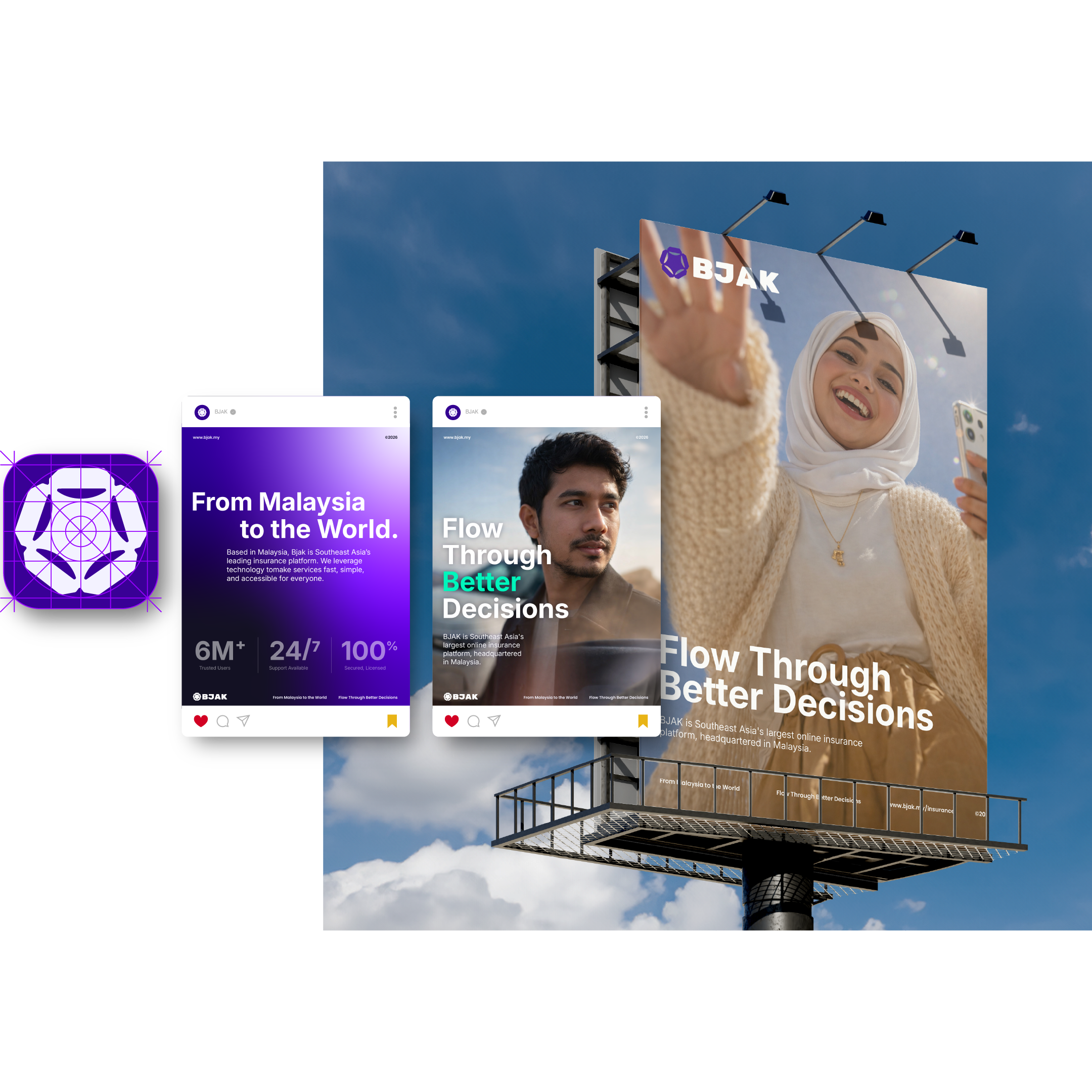
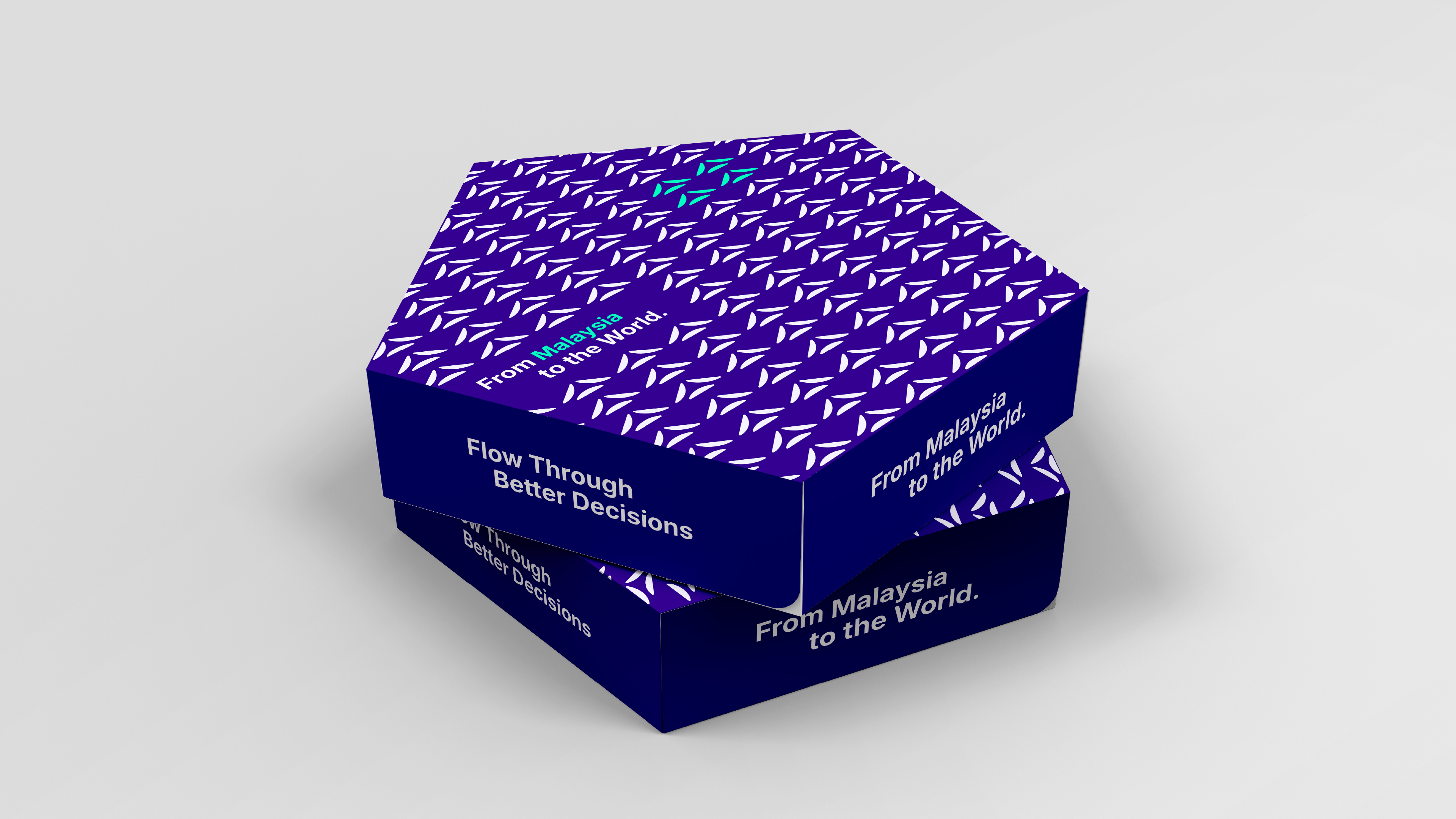
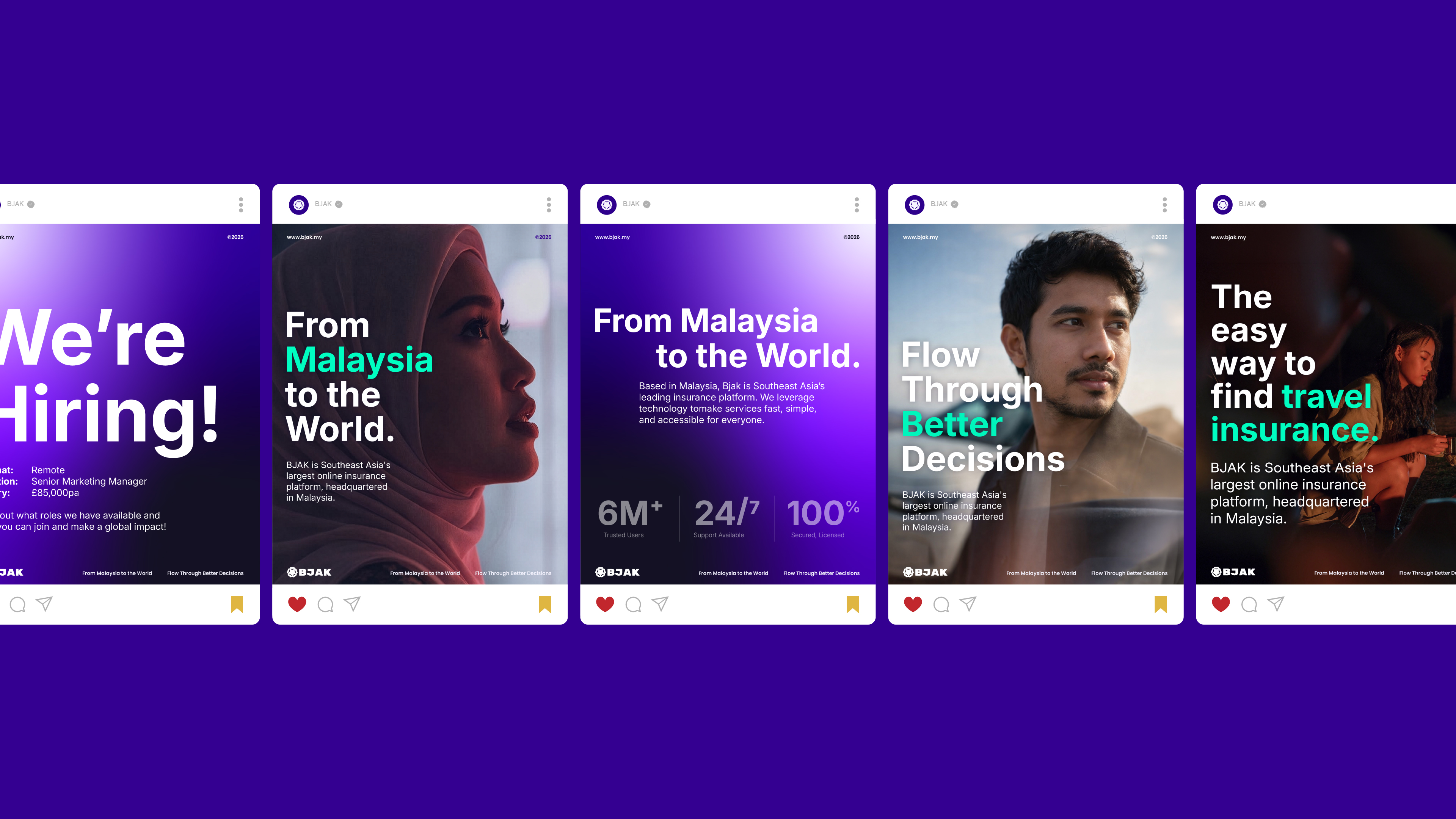
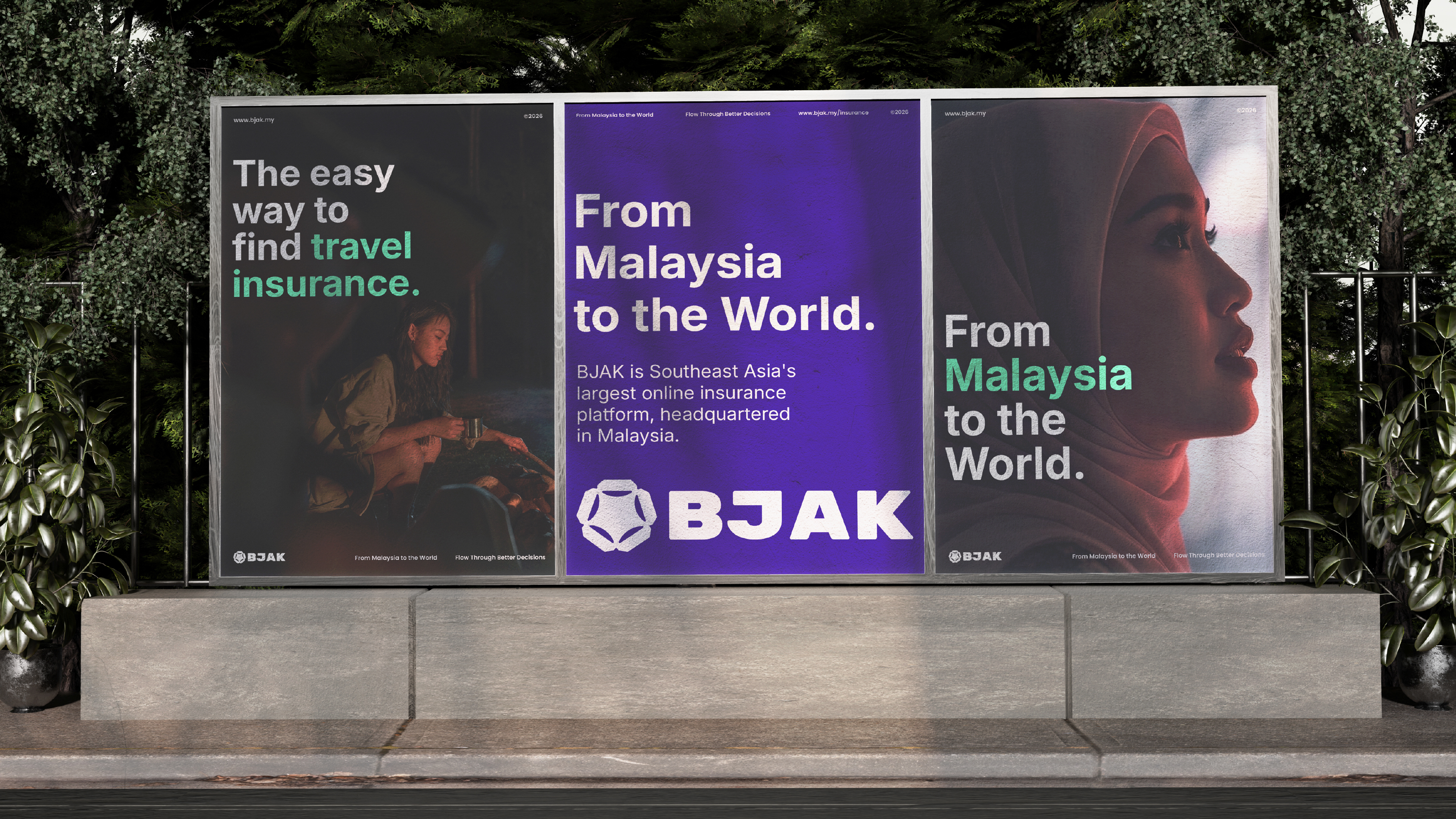
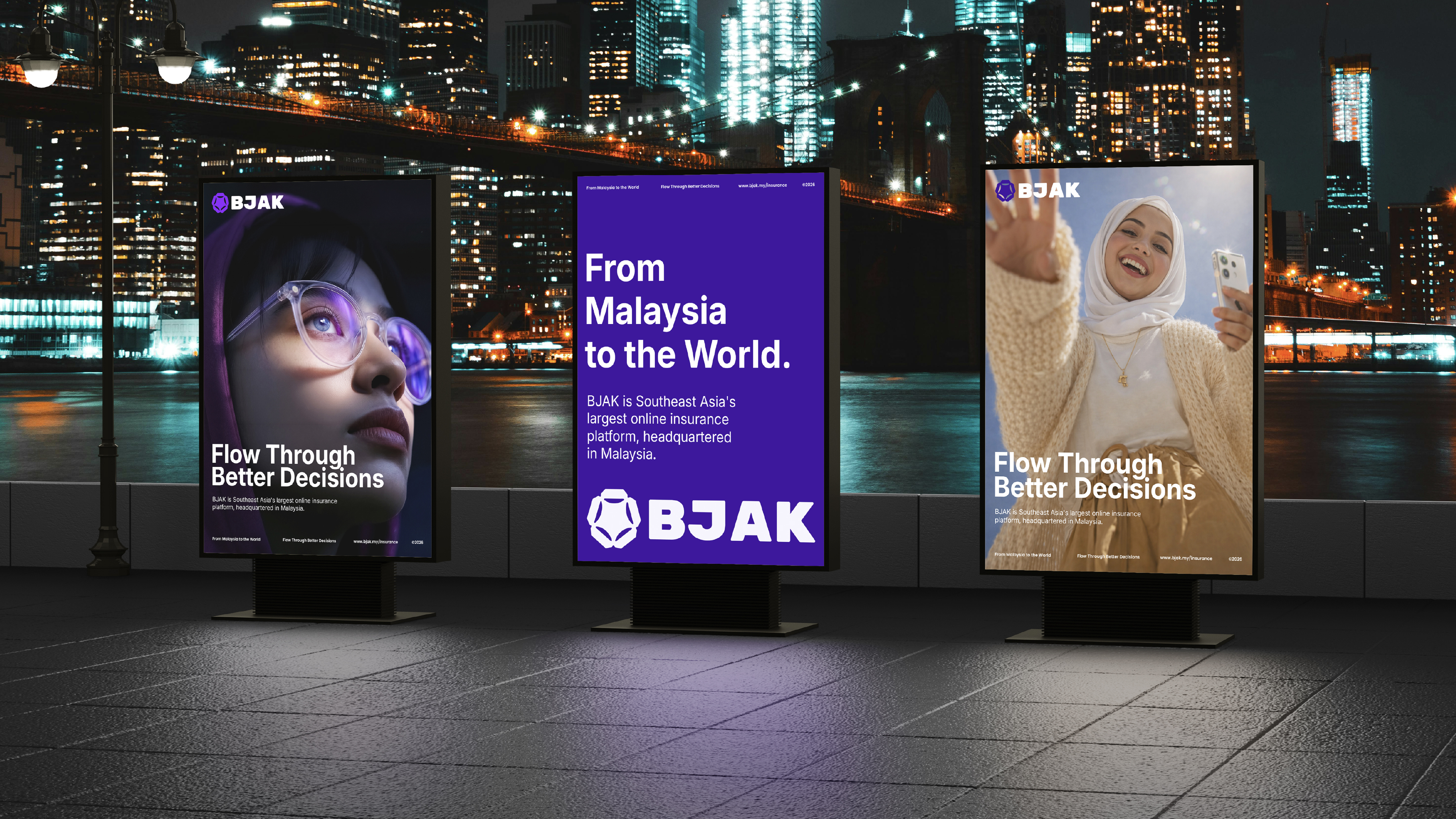
BJAK, From
Malaysia to
the World.
The development of the BJAK brand identity was guided by a combination of cultural, psychological, and functional research, ensuring the visual system reflects both the company's origins and its role within a contemporary digital landscape.
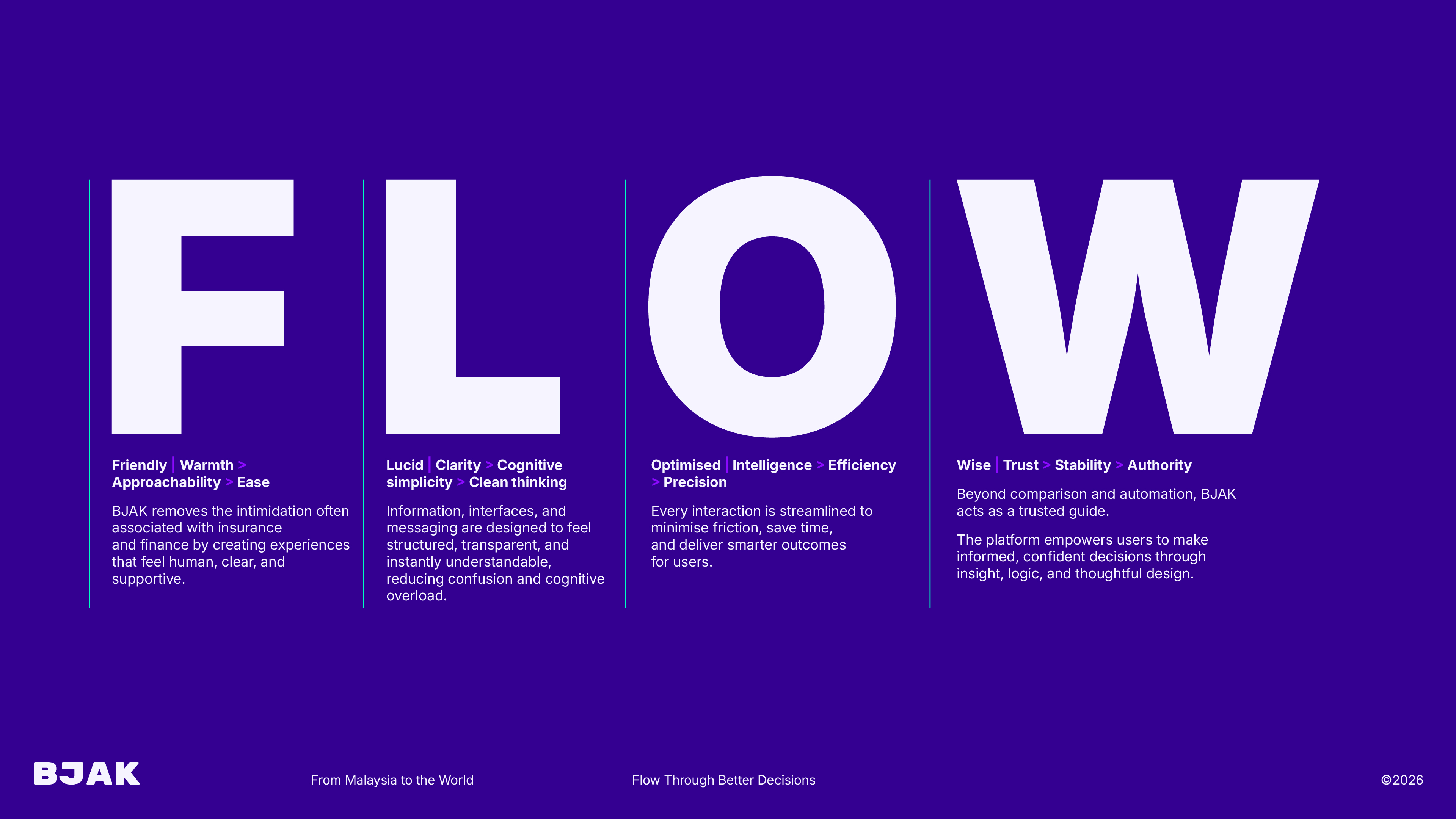
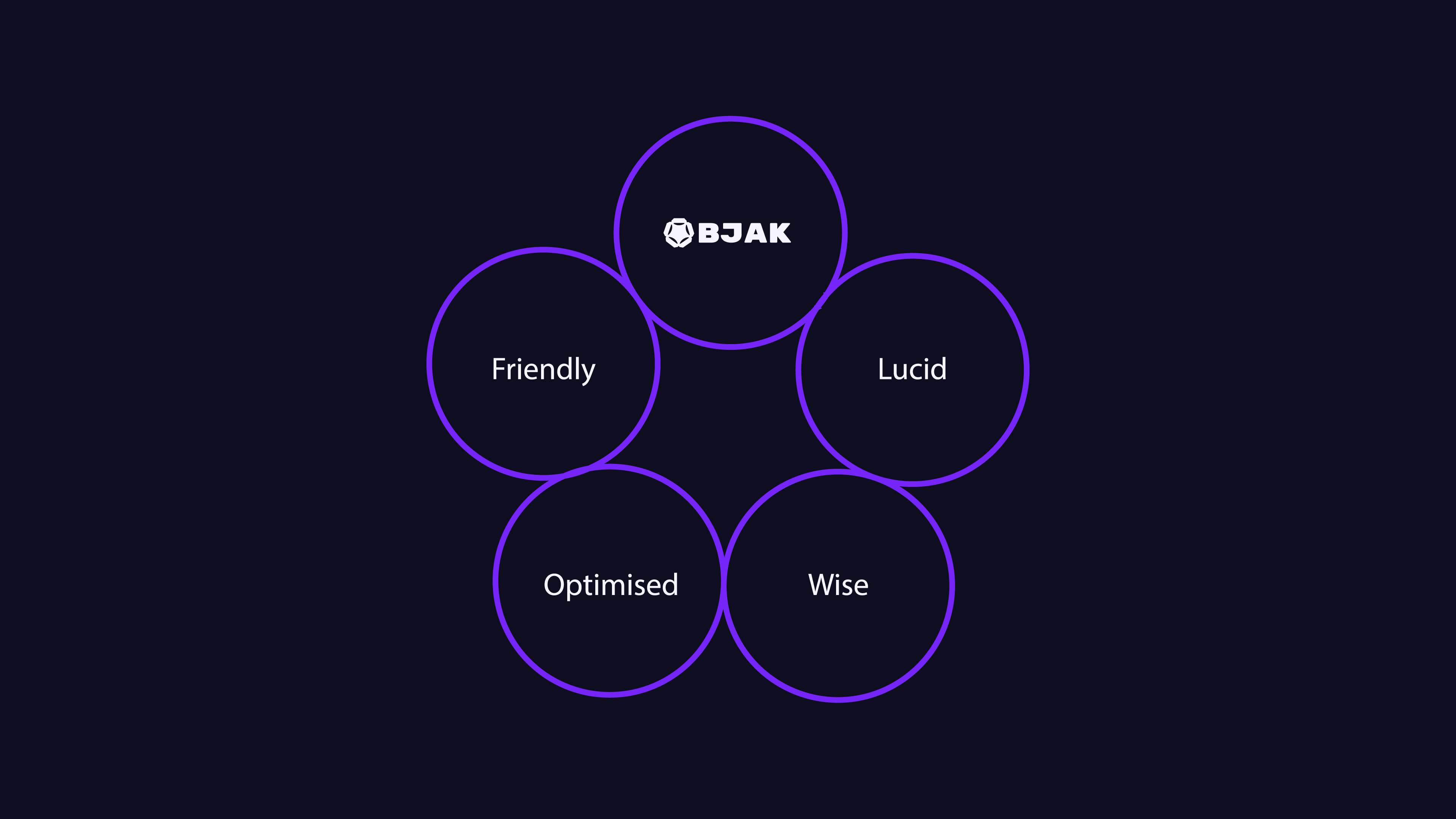
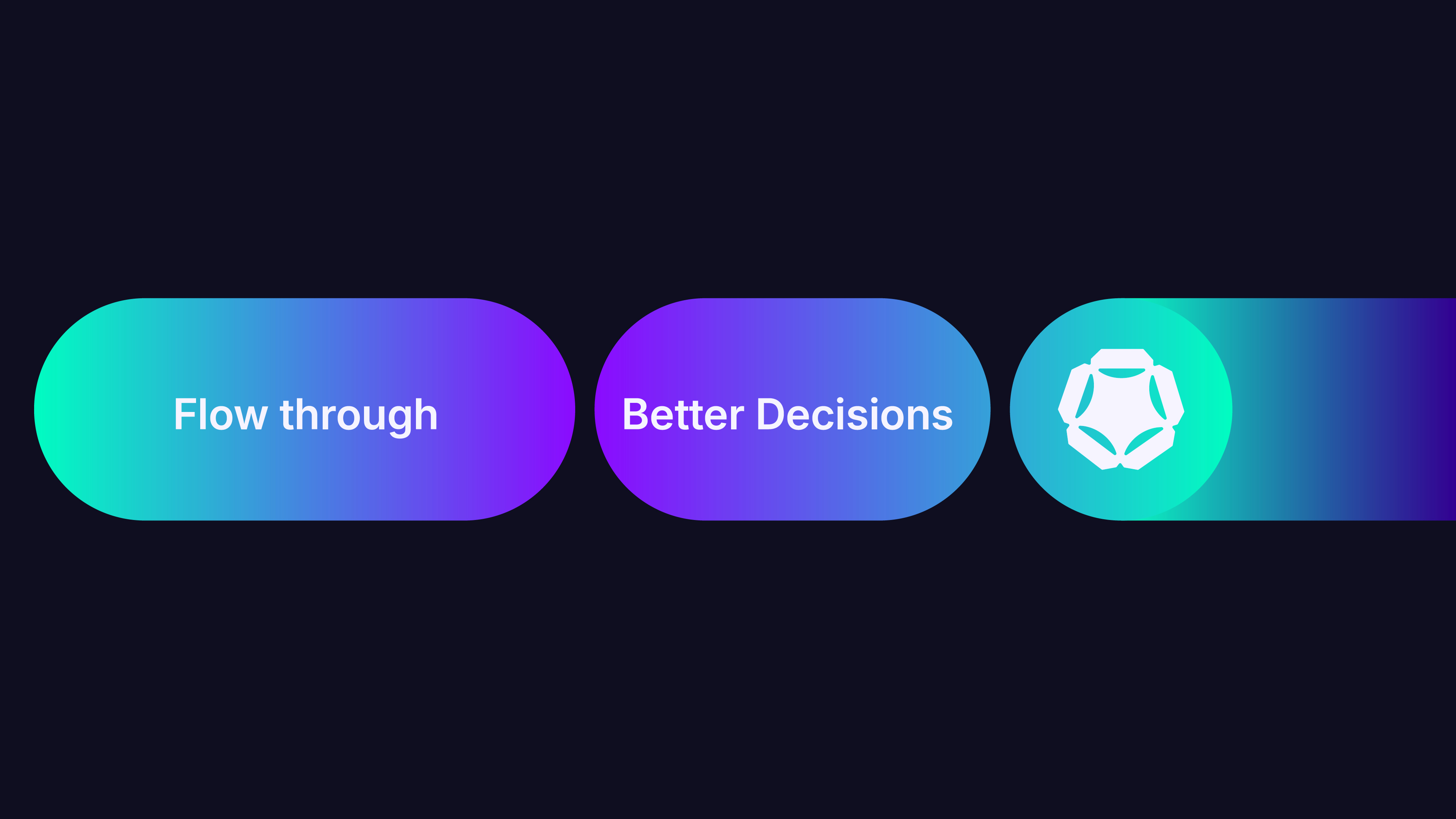
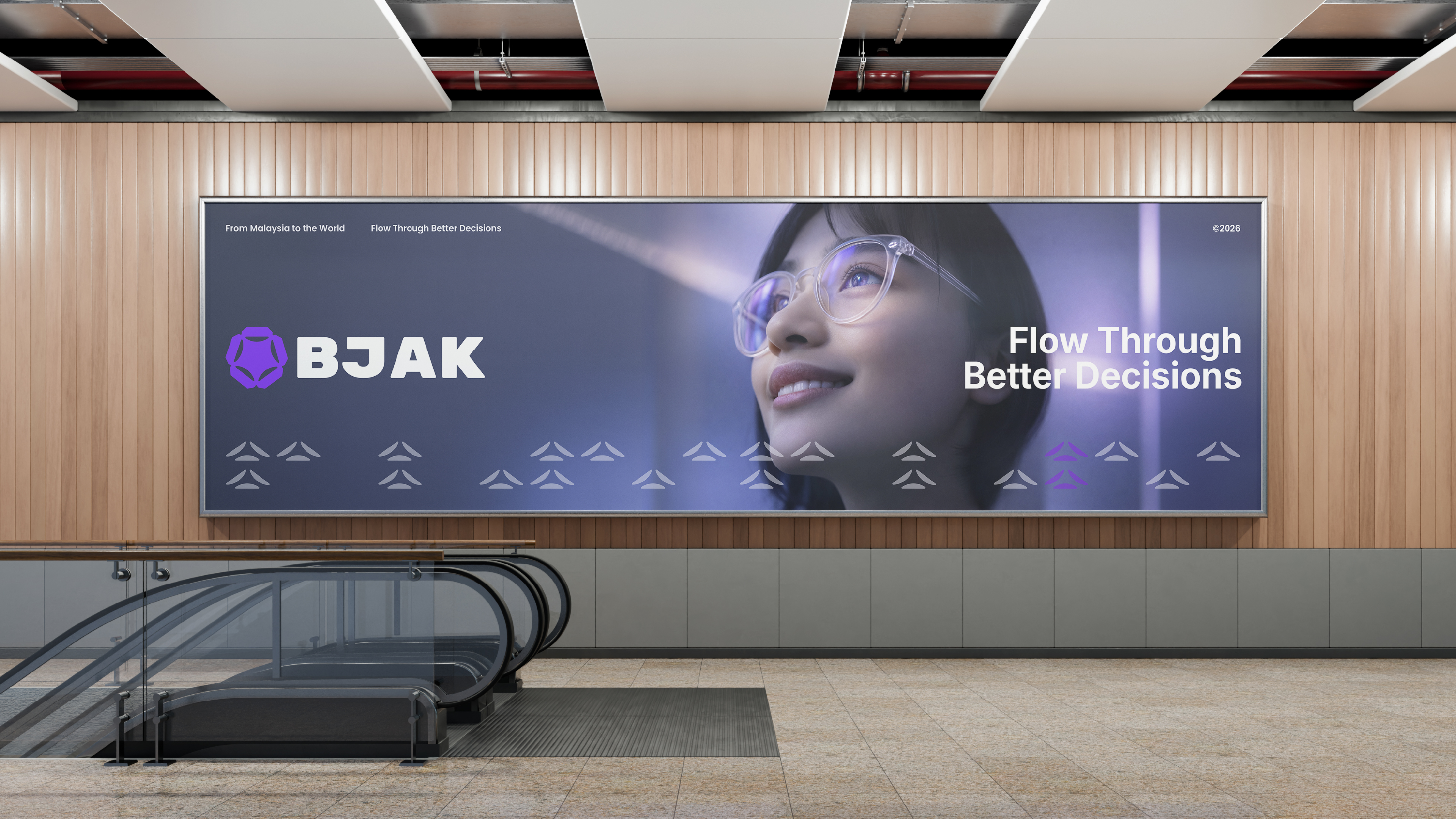
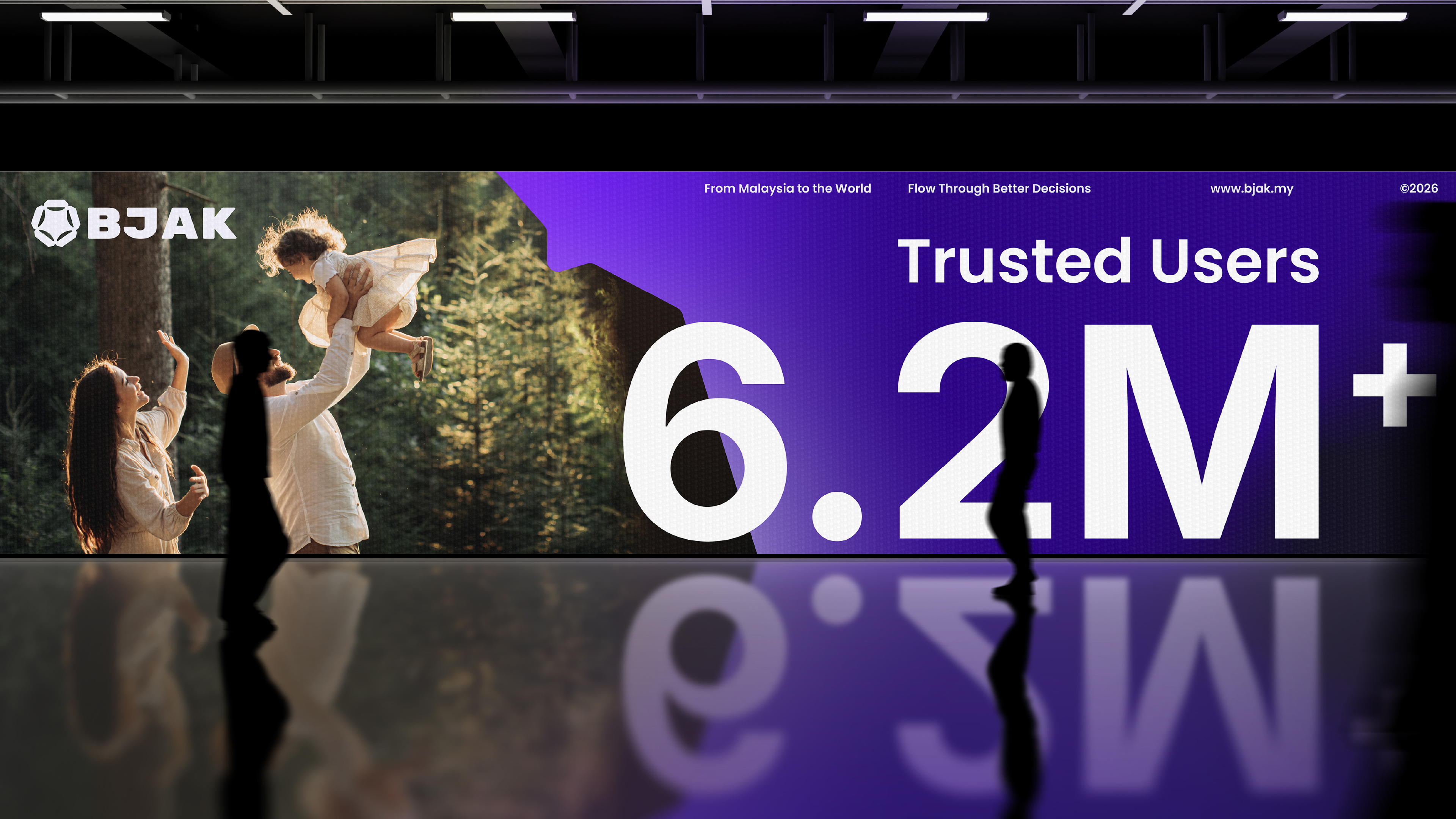
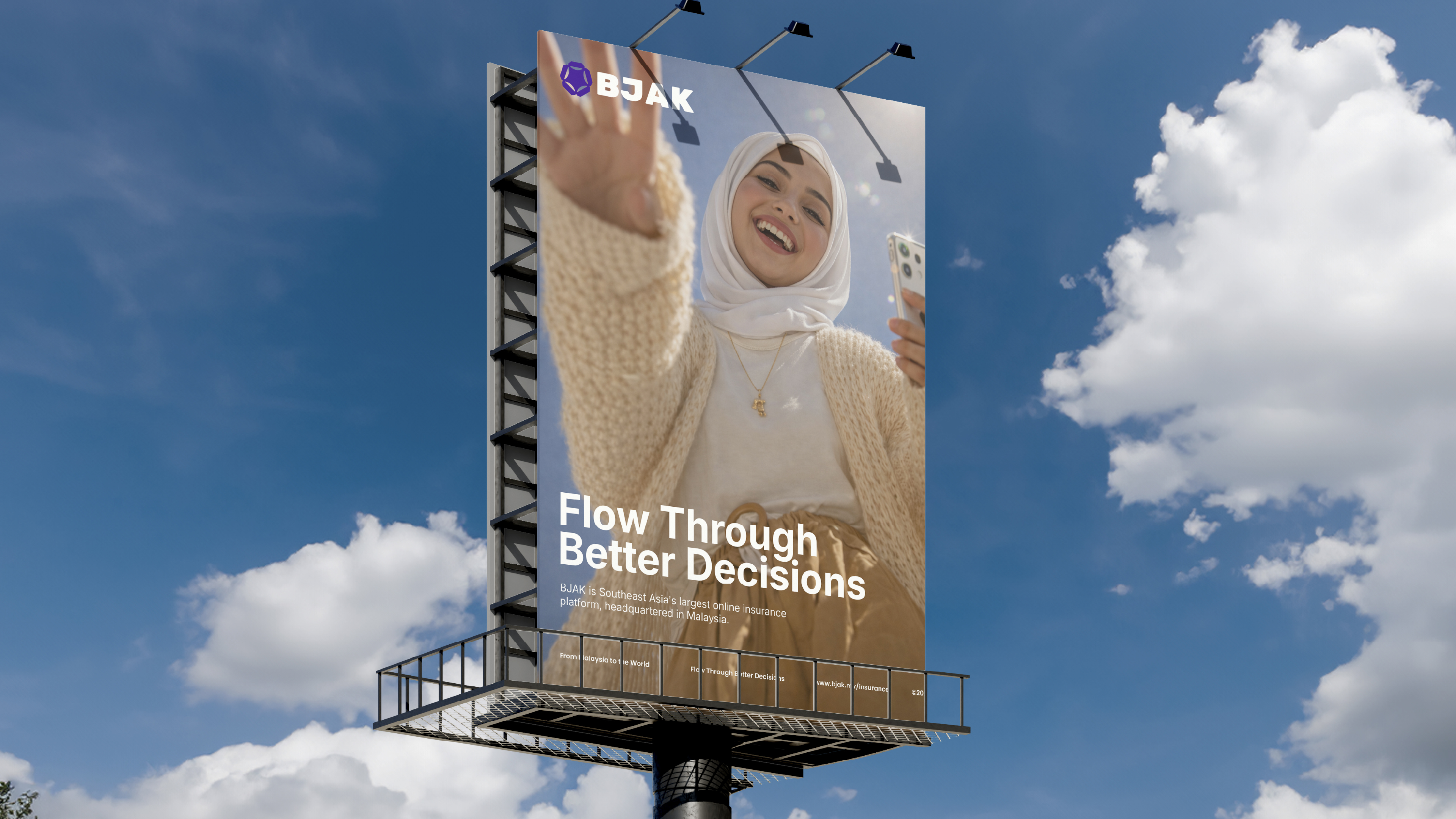
At a strategic level, the brand was positioned around the principles of Friendly, Lucid, Optimised, and Wise (FLOW), attributes that define BJAK's desired relationship with users.
01. Research & Conceptual Foundations
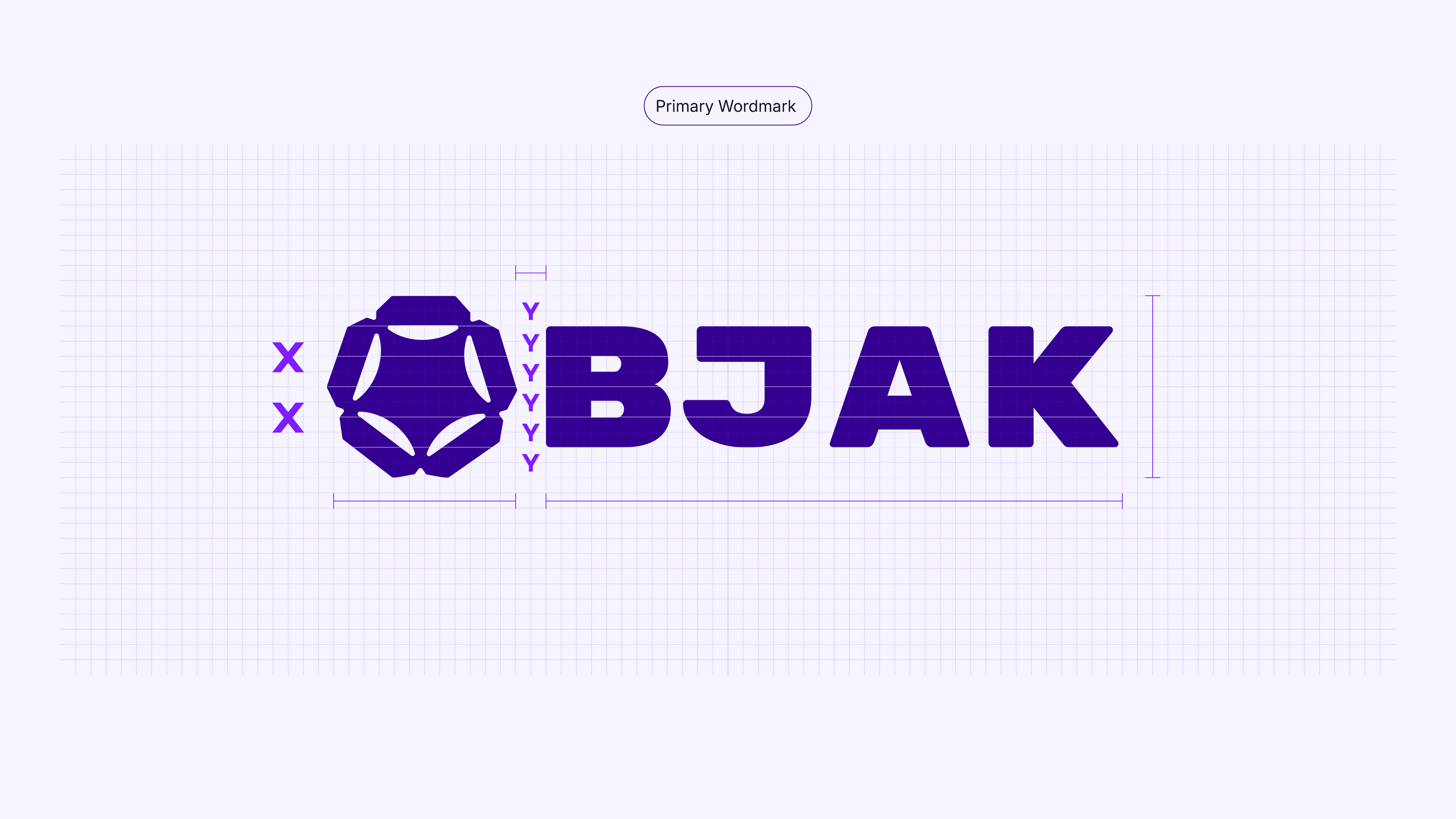
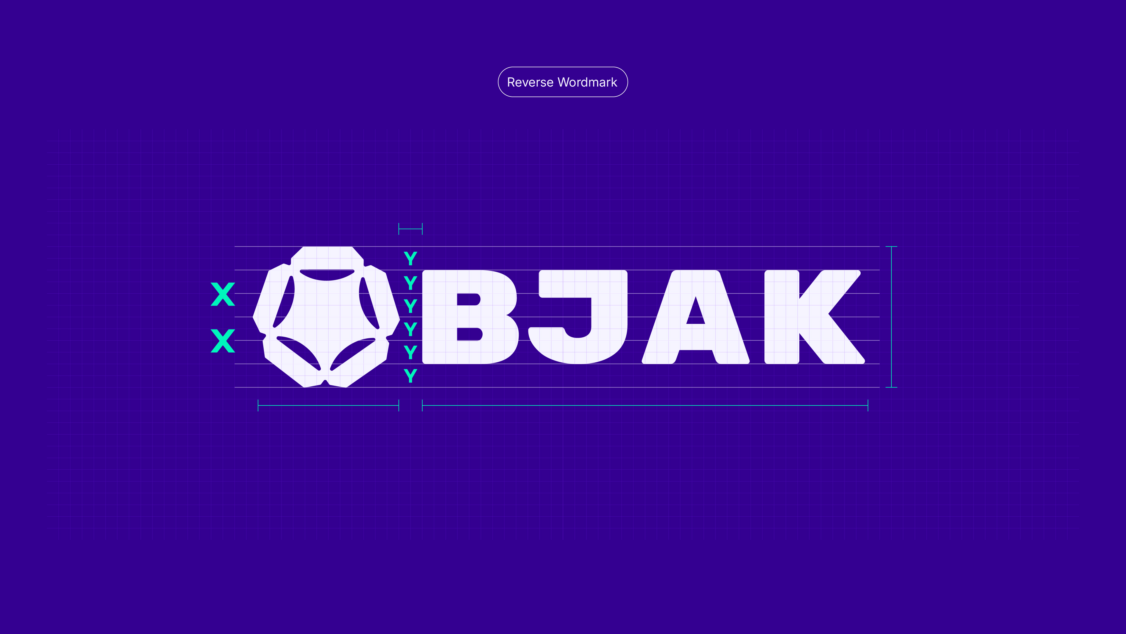
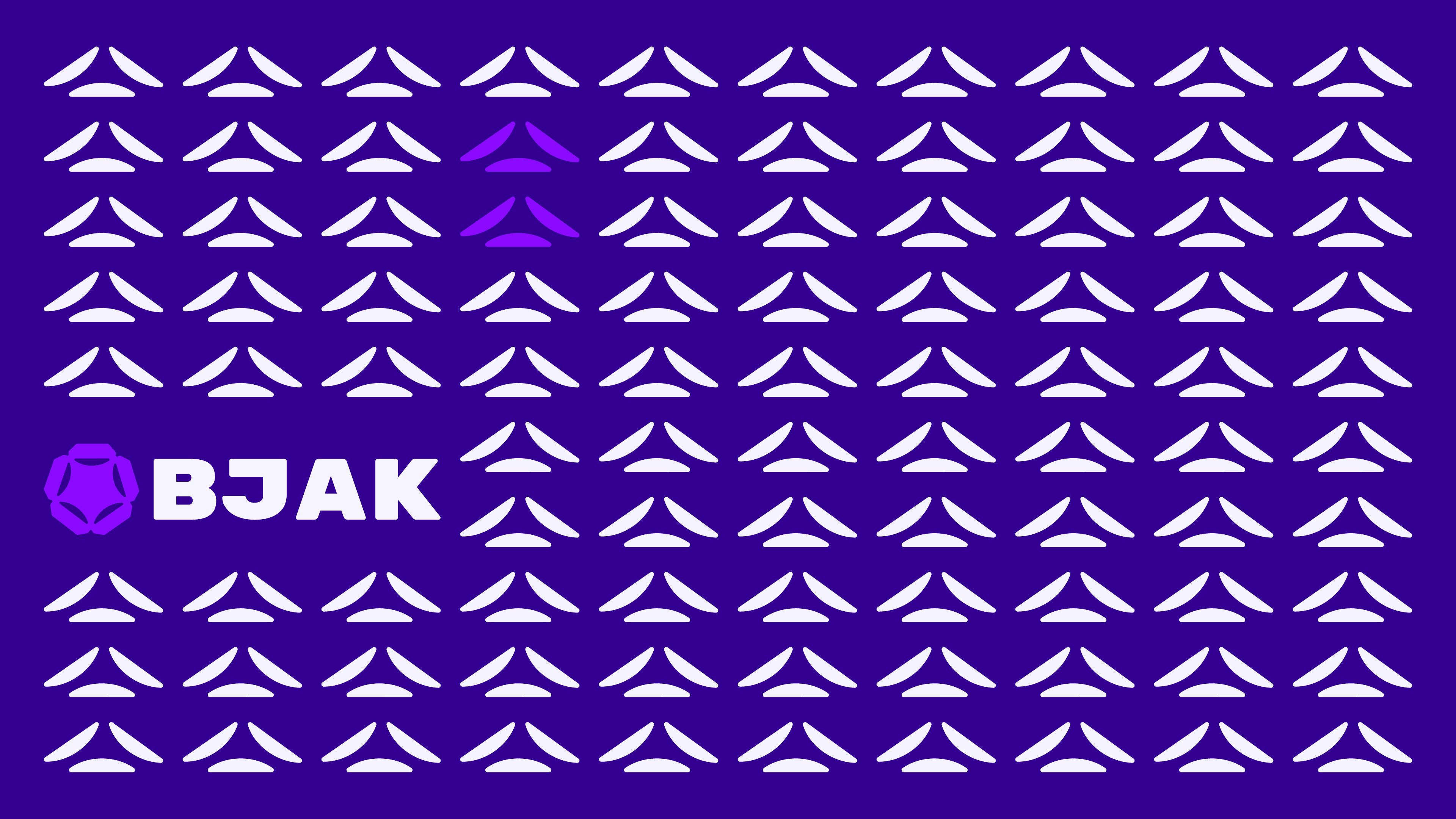
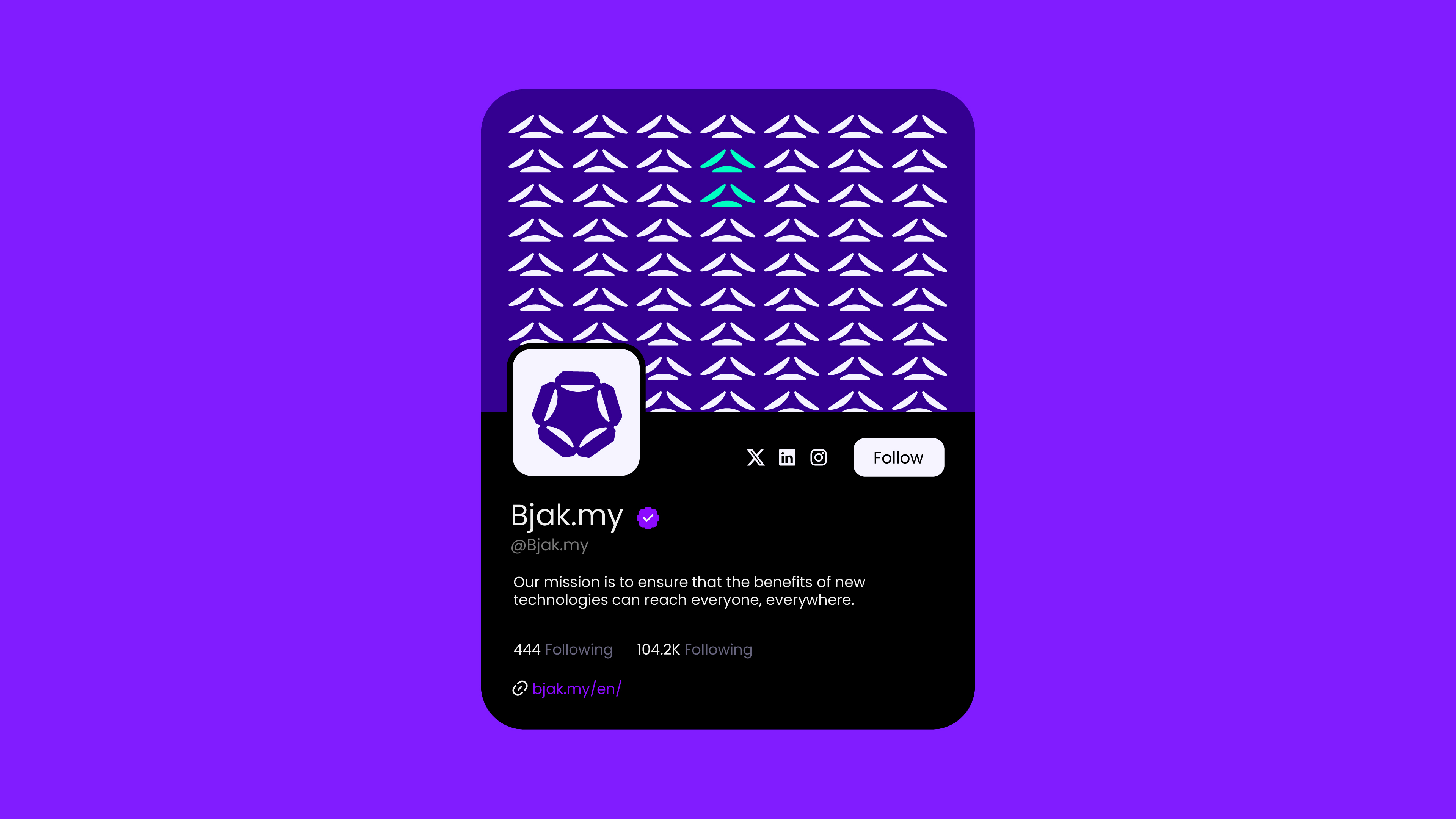
Logomark &
Wordmark
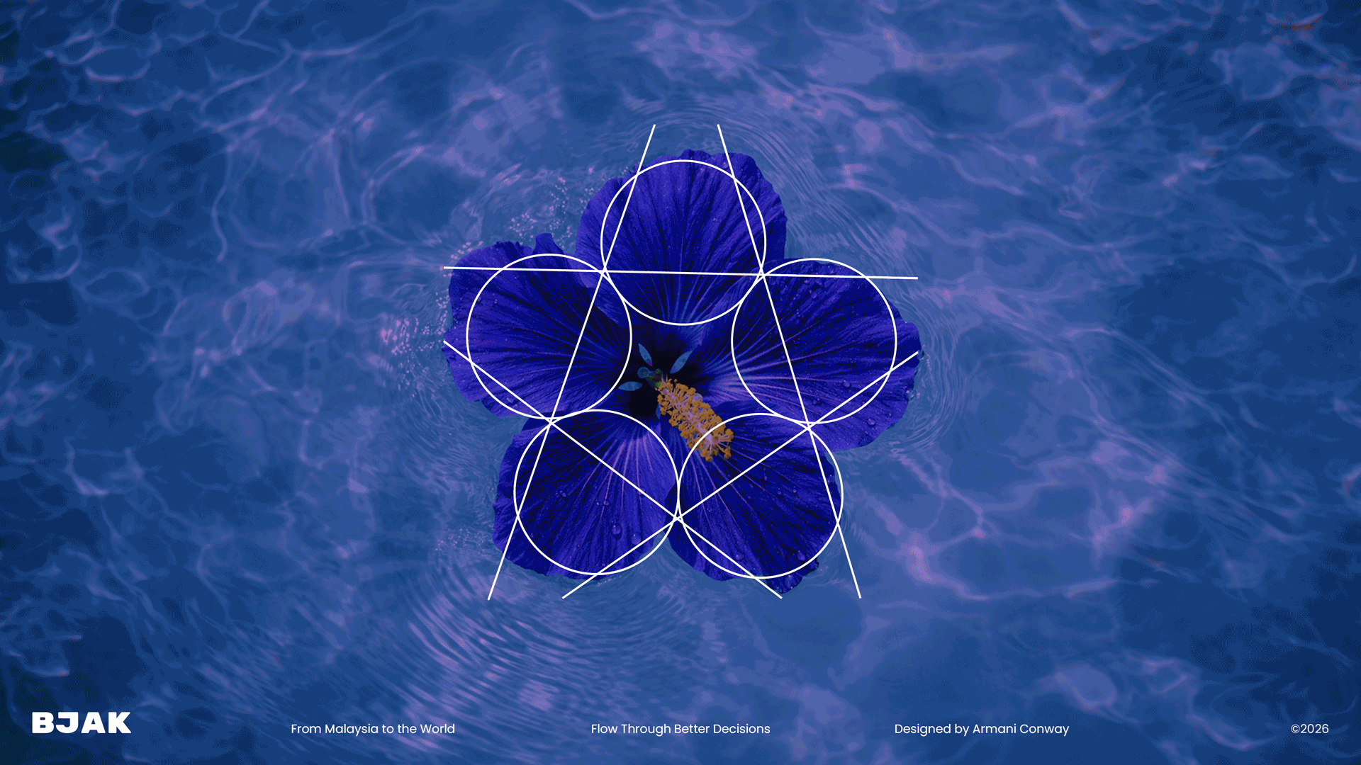
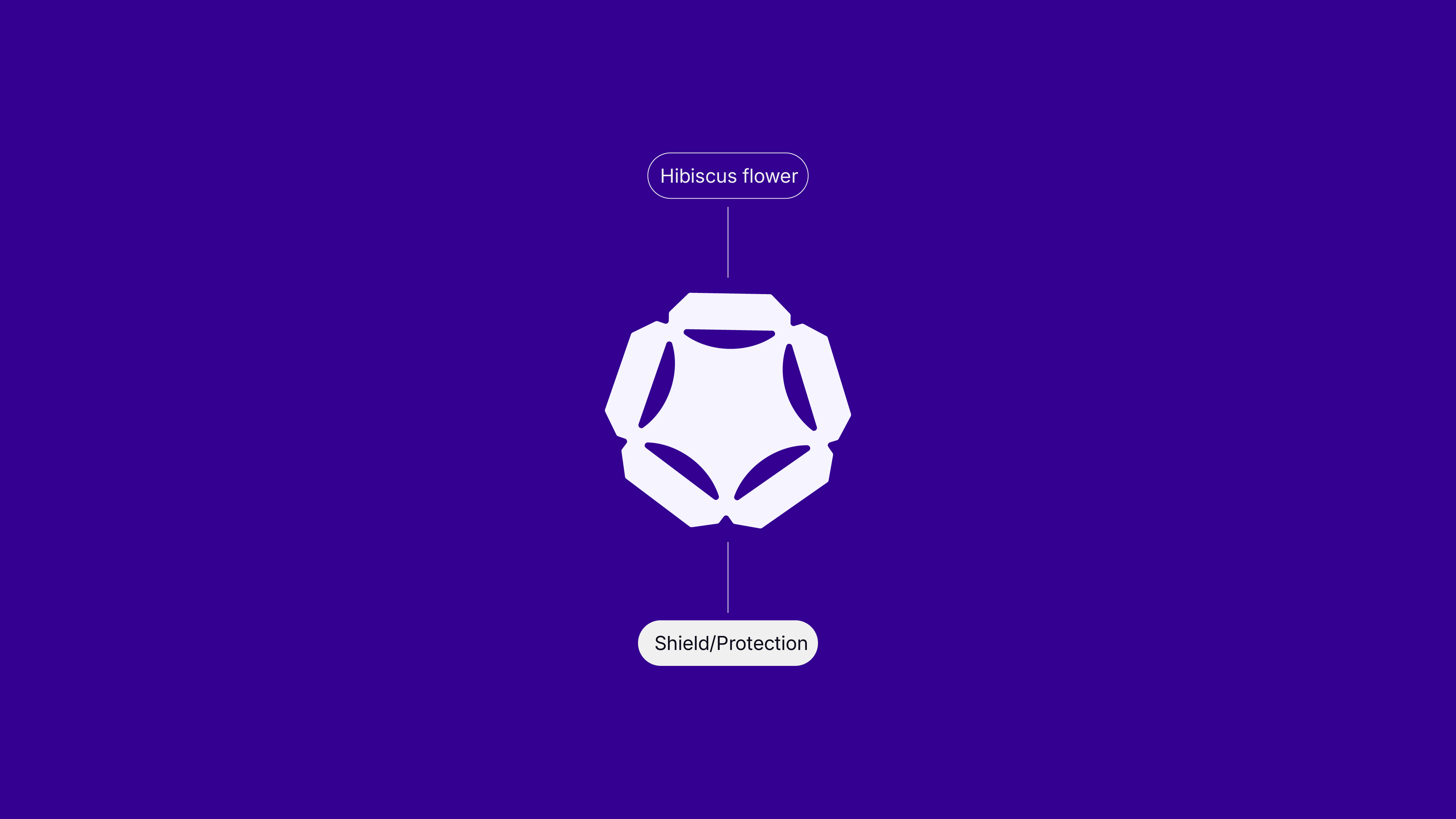
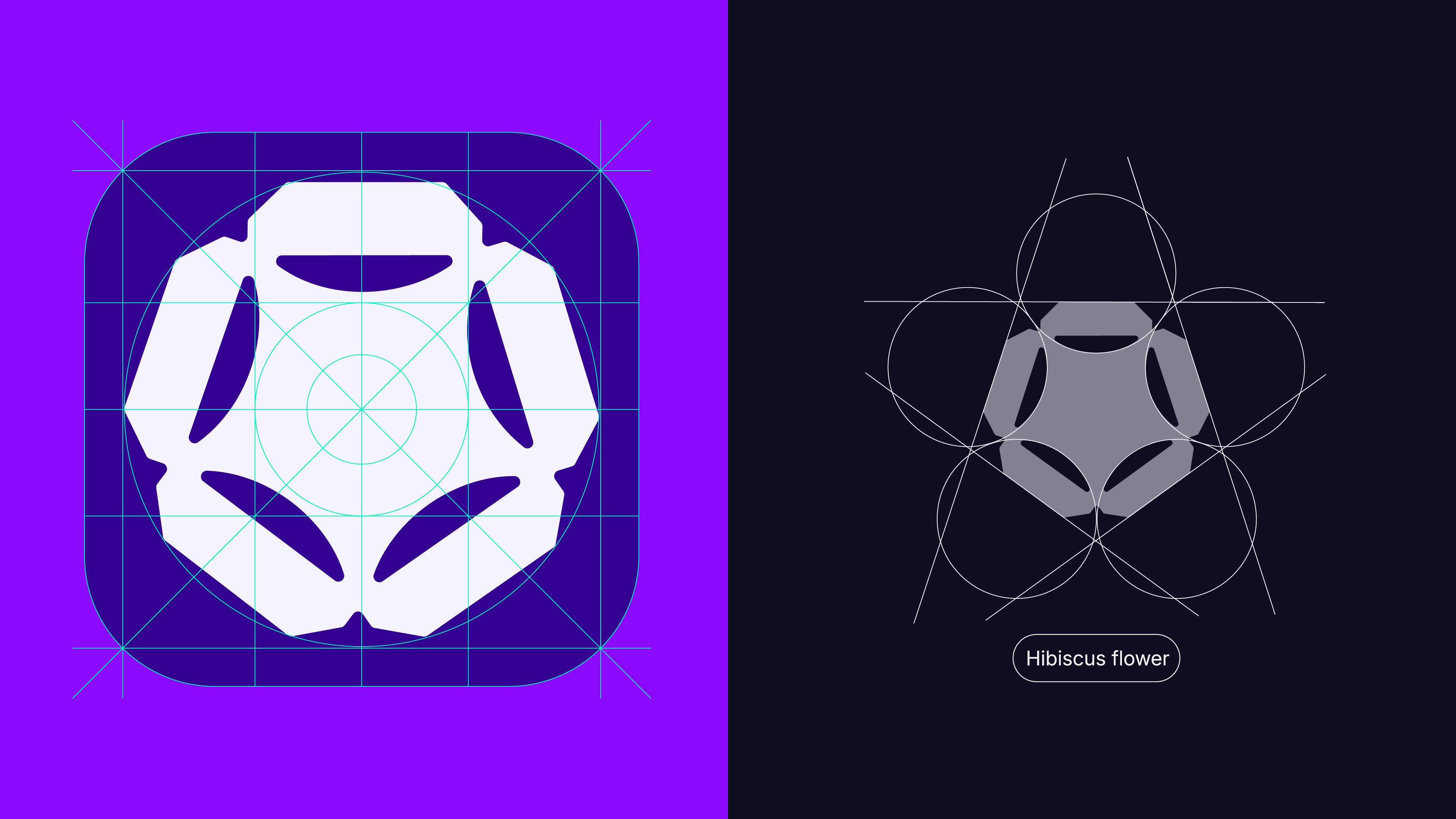
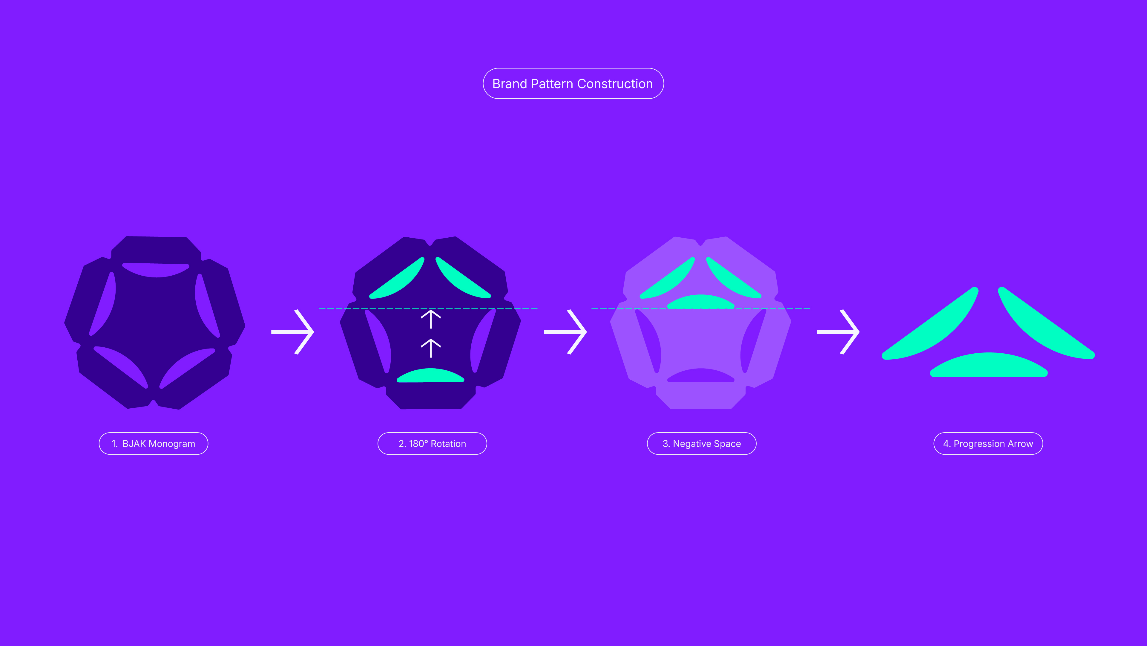
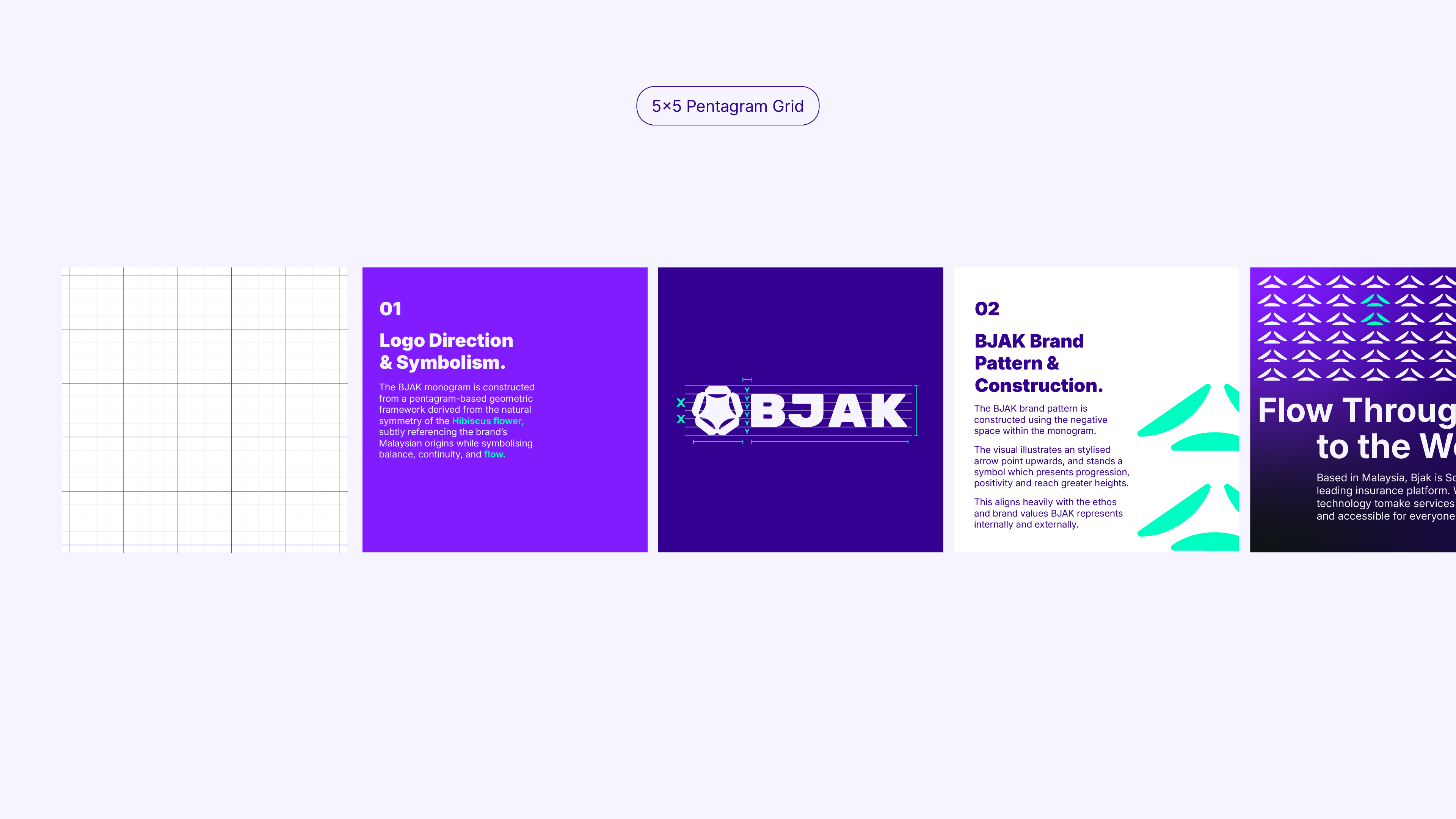
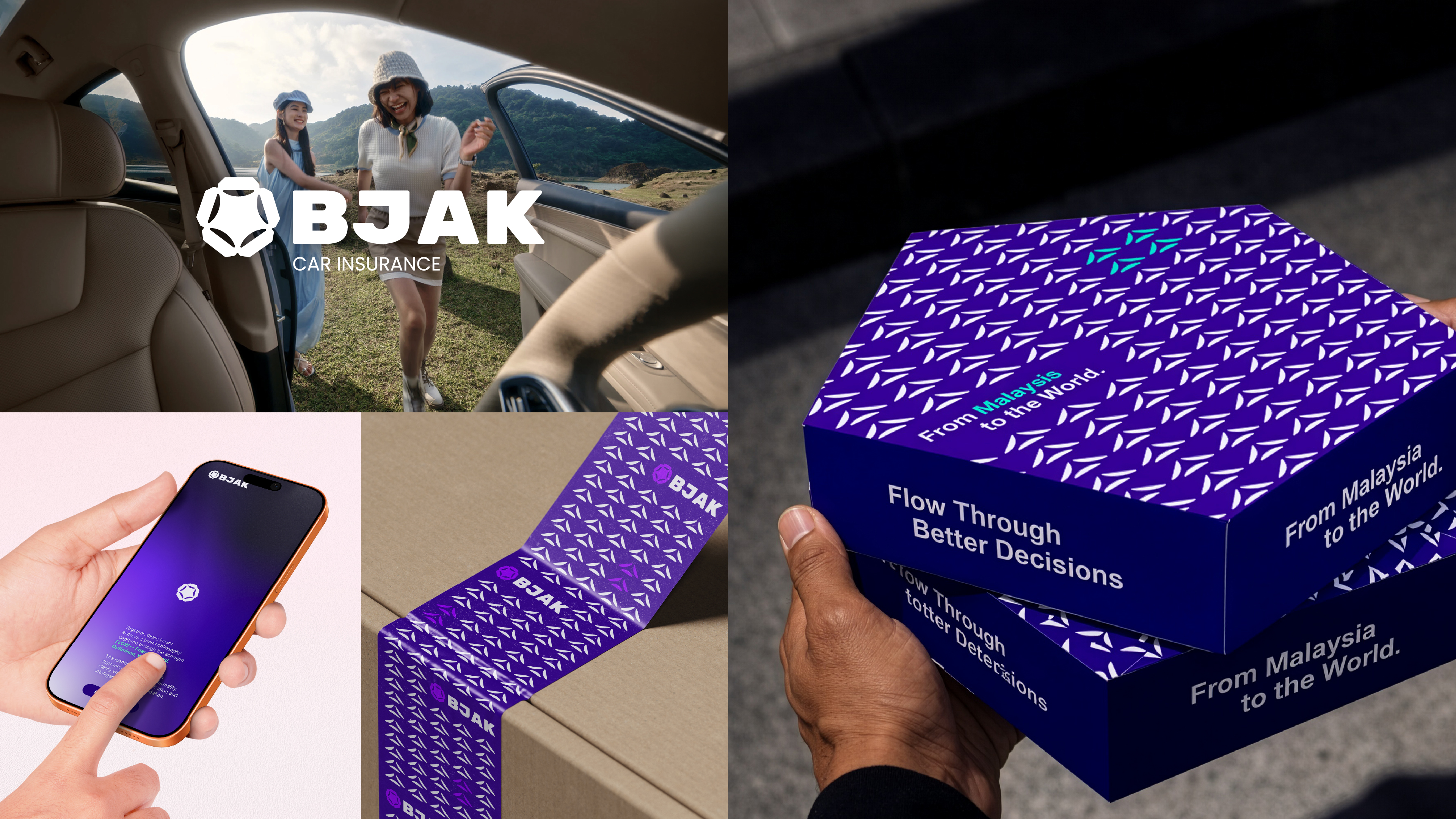
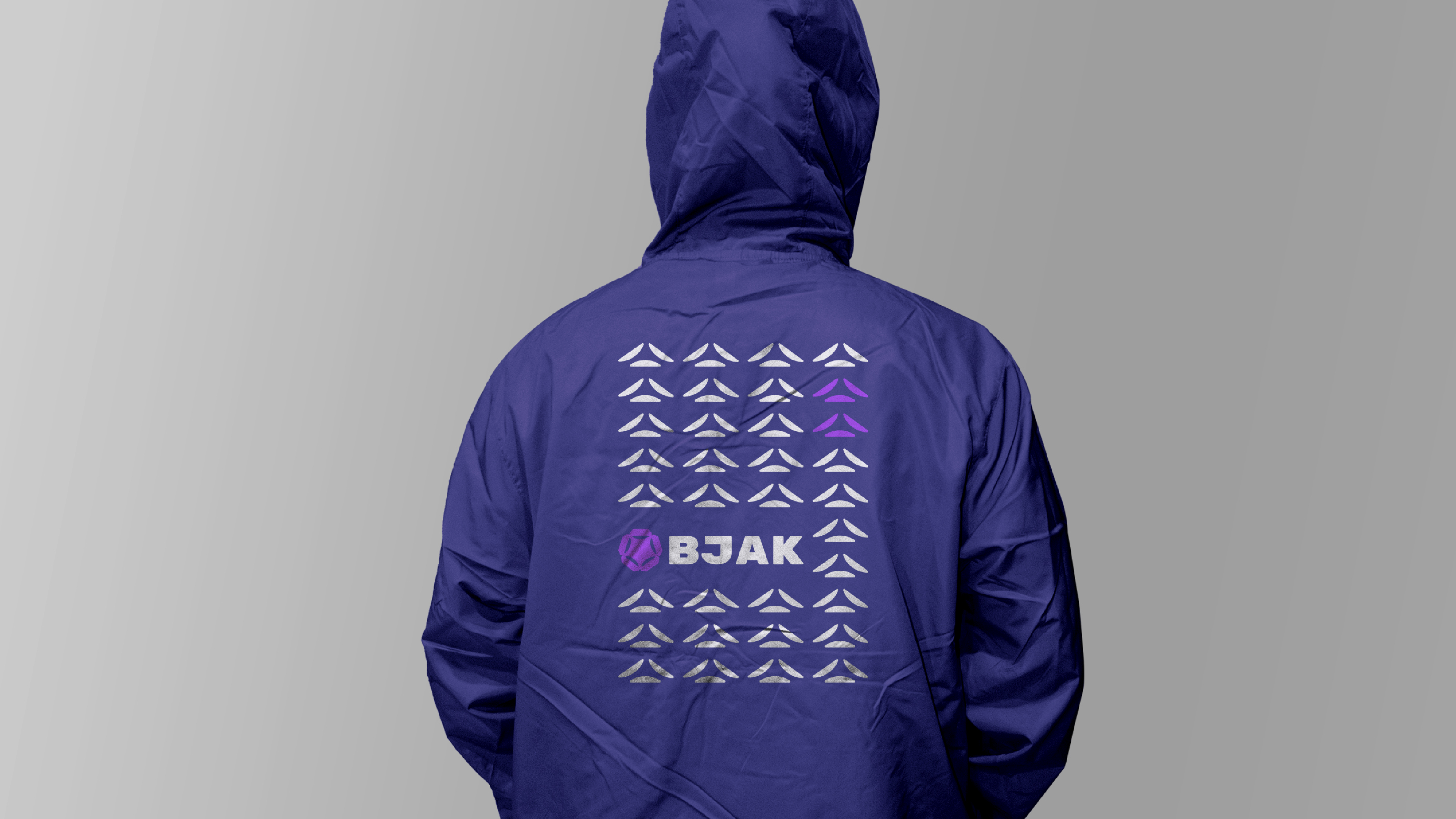
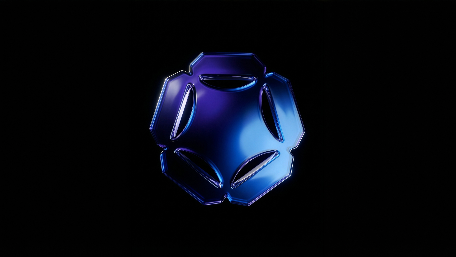
The BJAK monogram is constructed from a pentagram-based geometric framework derived from the natural symmetry of the Hibiscus flower, subtly referencing the brand's Malaysian origins while symbolising balance, continuity, and flow.
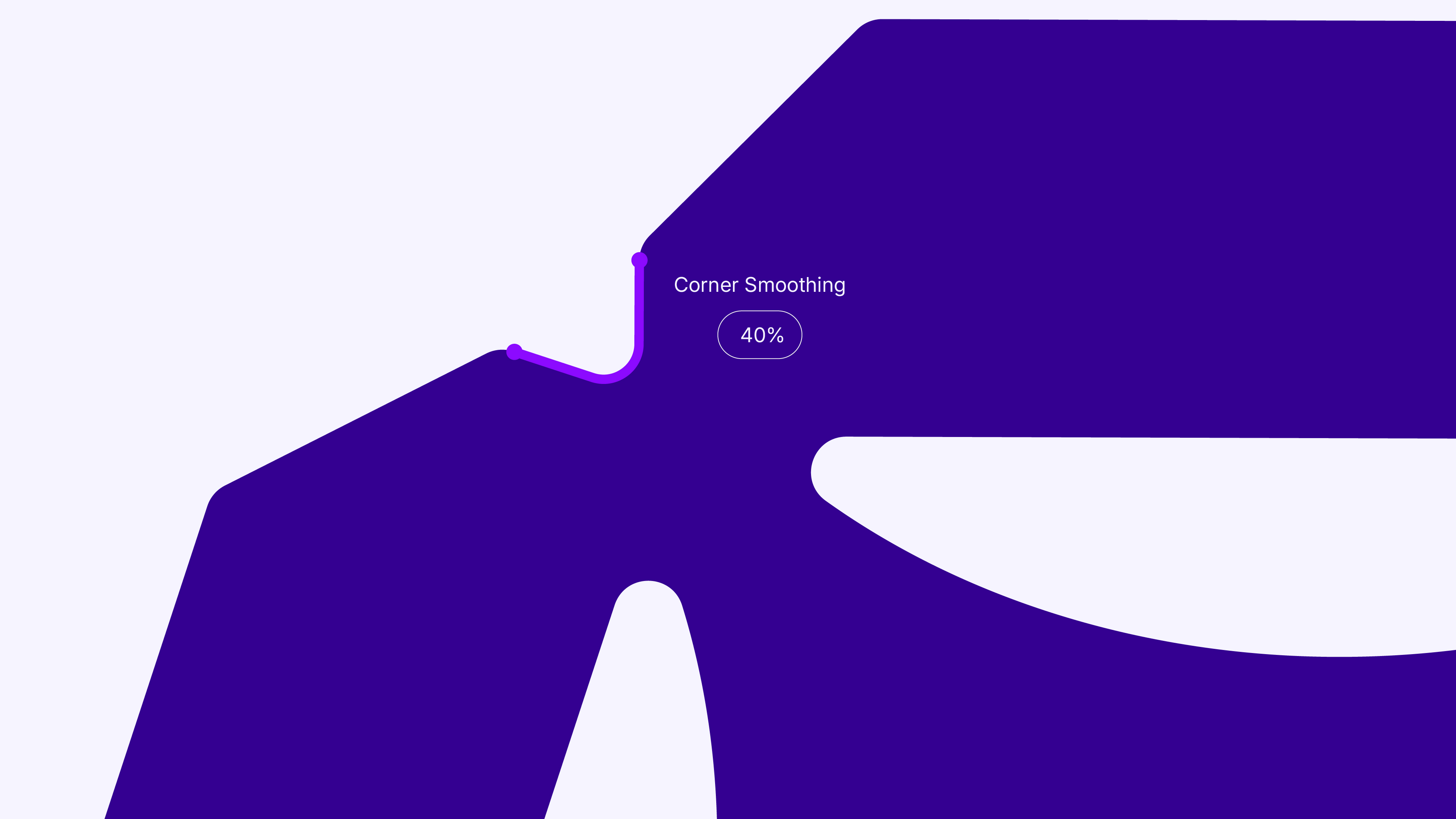
Its structured geometry produces a shield-like silhouette, implying protection and stability without relying on literal or cliché metaphors. The interplay between disciplined form and soft internal curves reflects the brand's philosophy of intelligent systems delivered with human-centred ease.
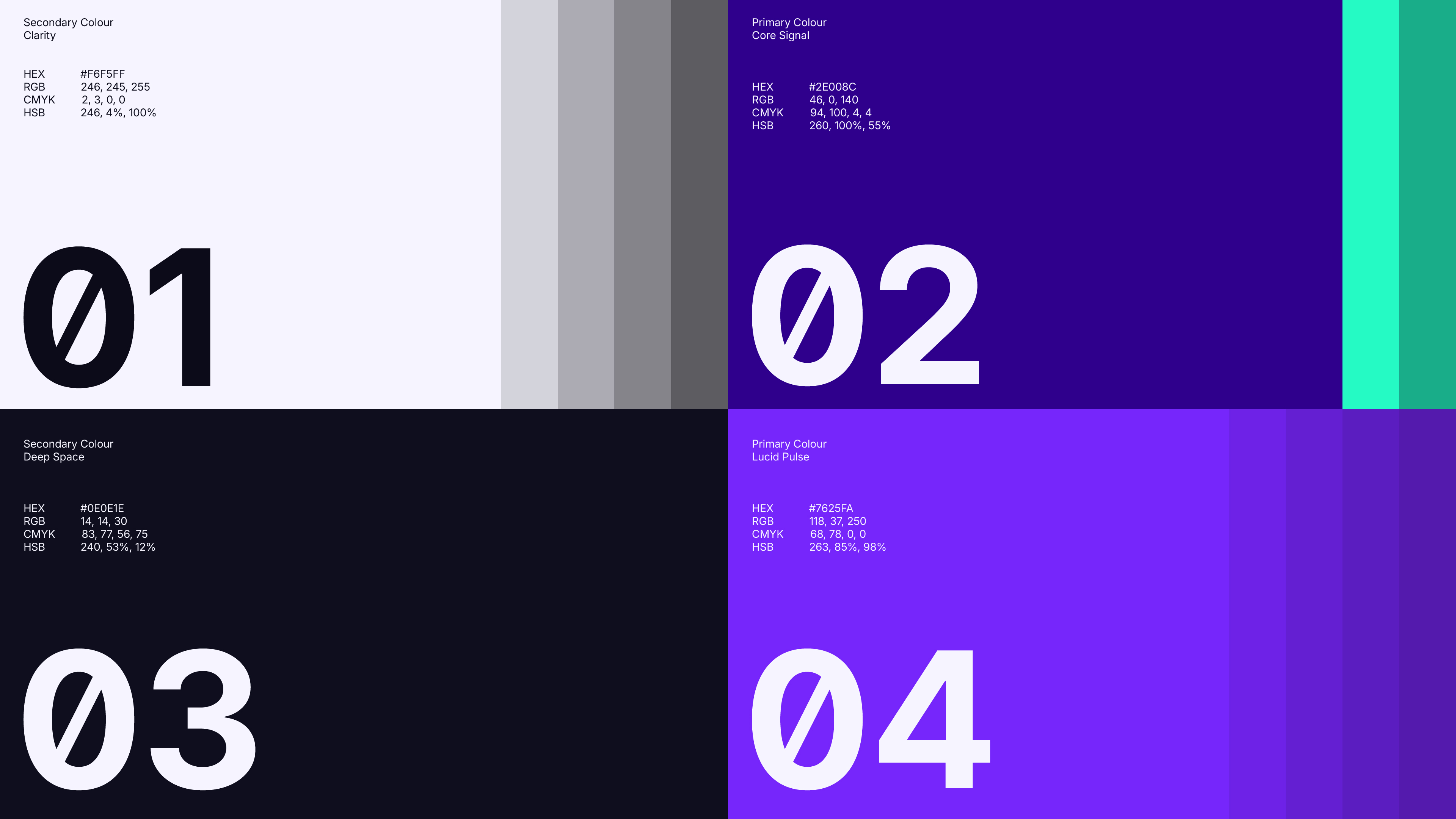
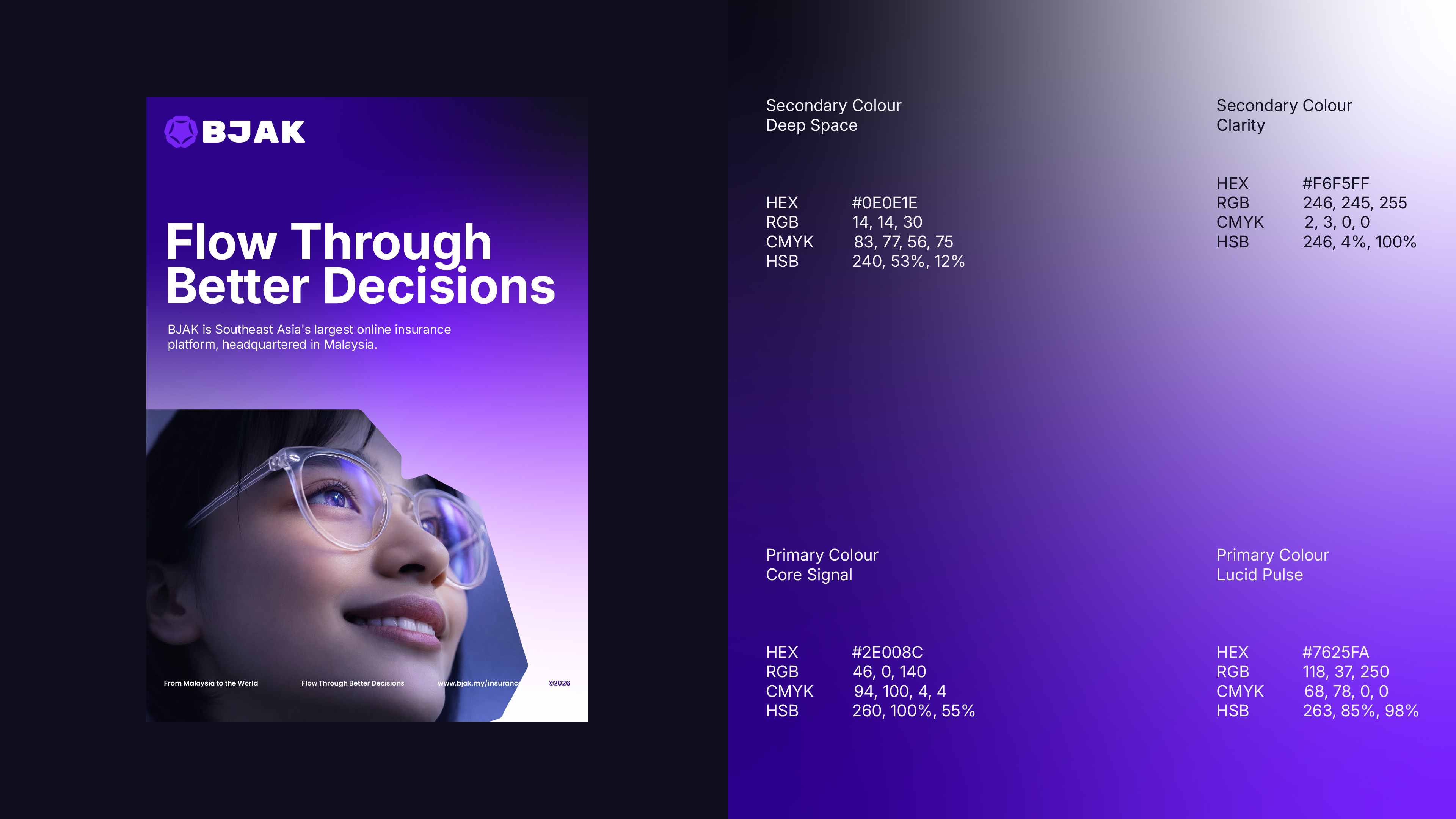
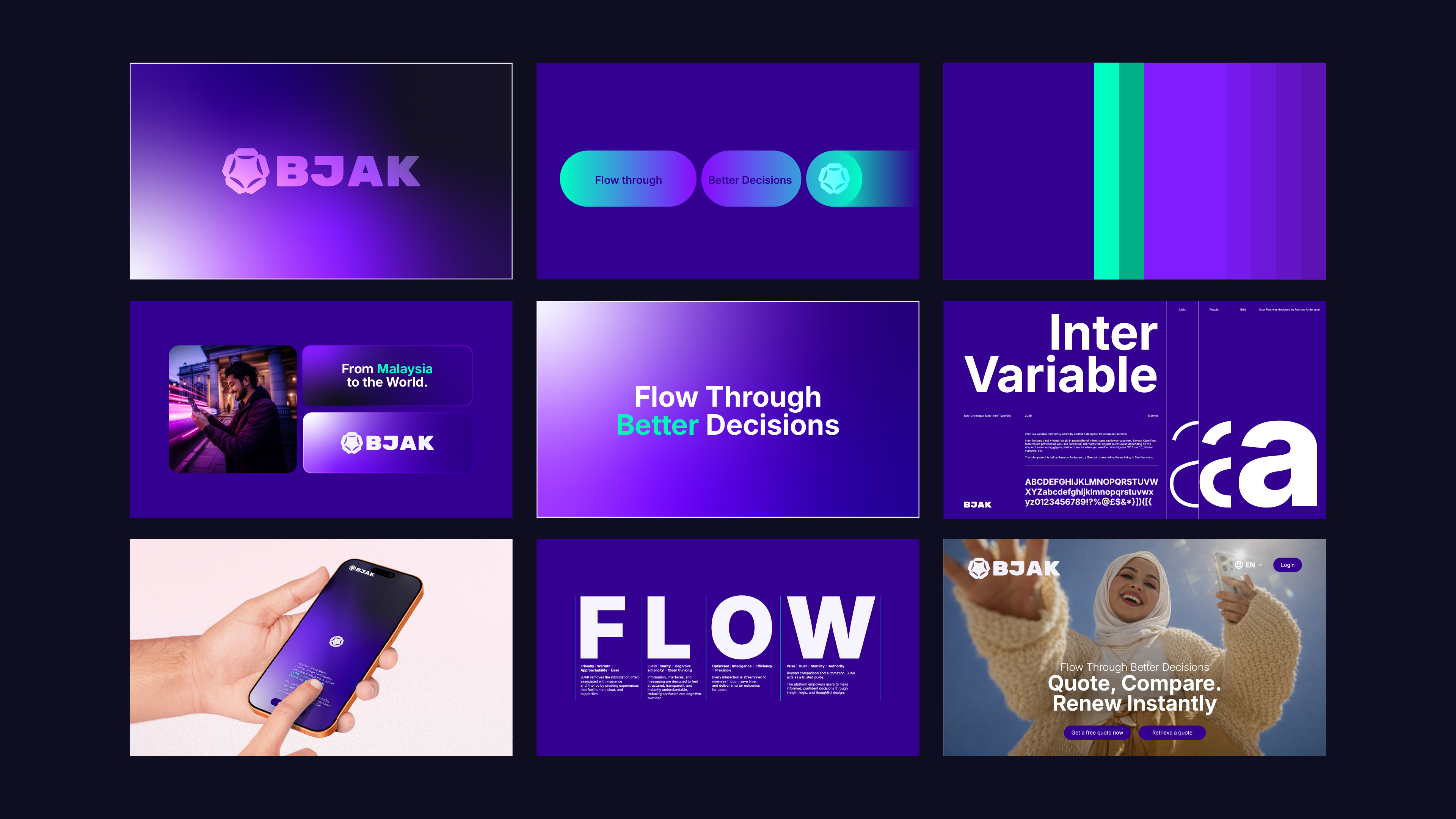
02. Colour Psychology & Typography
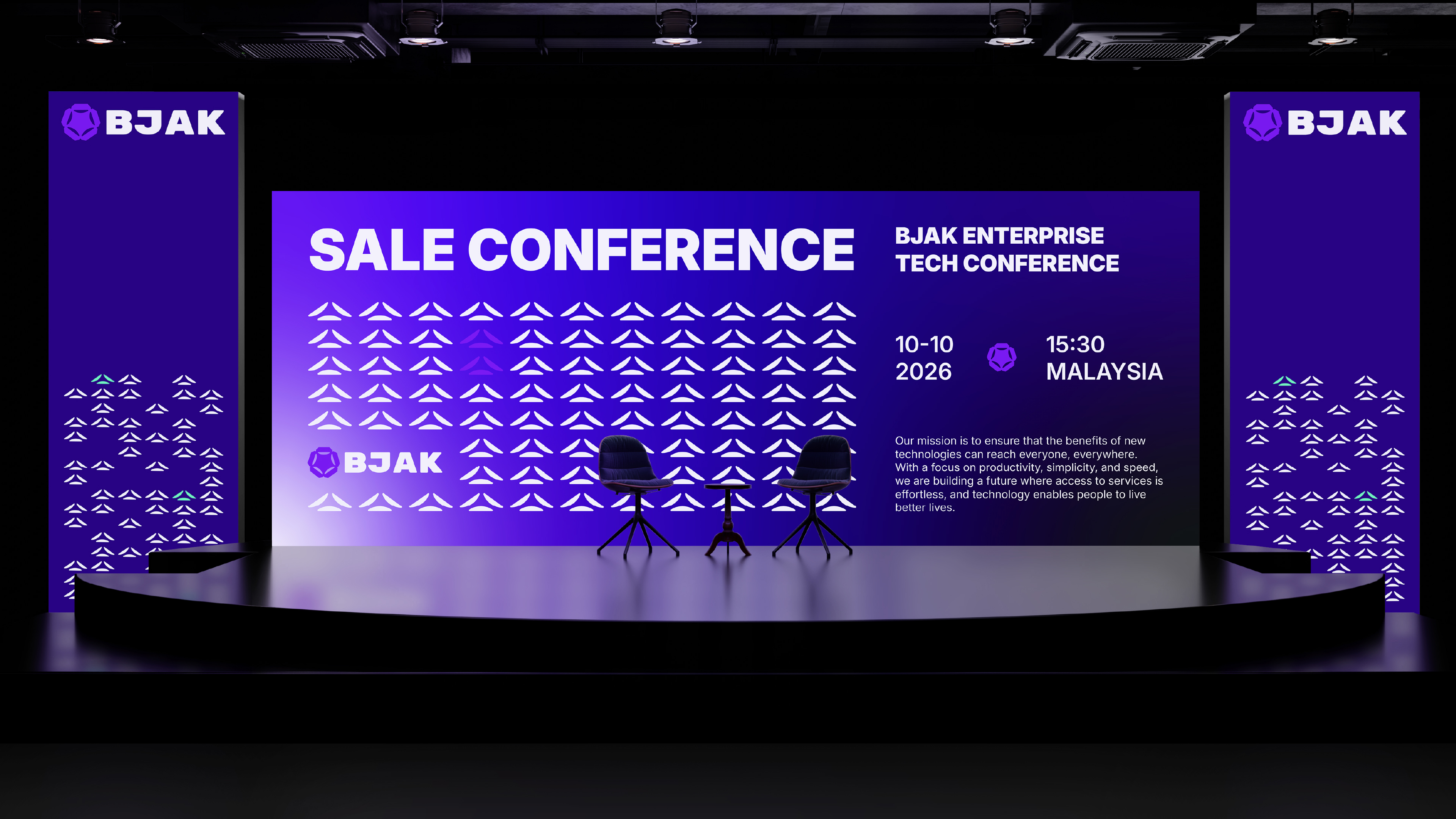
Modern Indigo
& Digital
Purple
Intelligent + Futuristic + Wise
Blue/Indigo: Stability + Depth + Trust
Purple: Intelligence / Technology / Premium thinking
Indigo feels progressive, not just a corporate boring blue, and carries a strong fintech association (Nubank, Stripe spectrum, etc.)
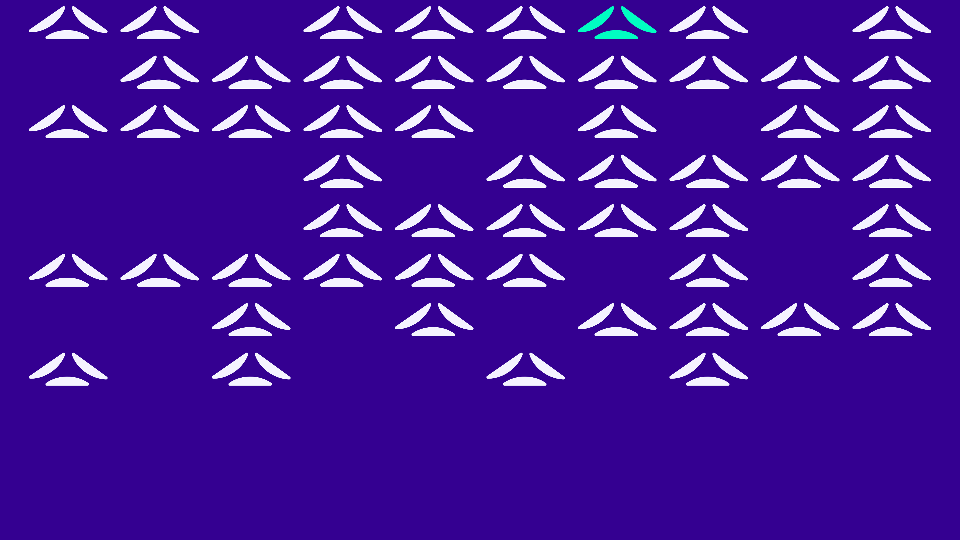


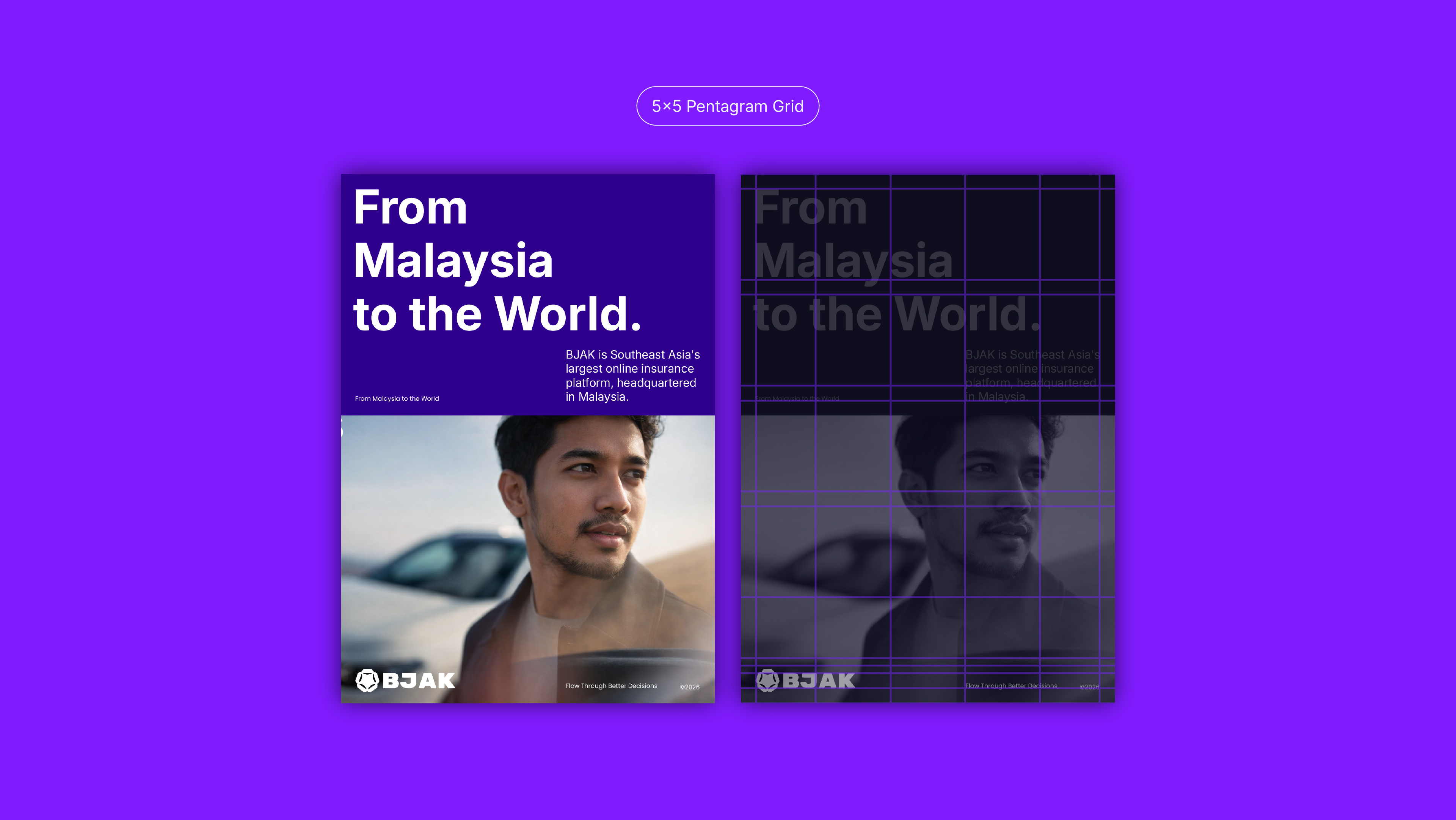
03. Pentagram 5×5 Layout Grid
The 5×5 Layout Grid
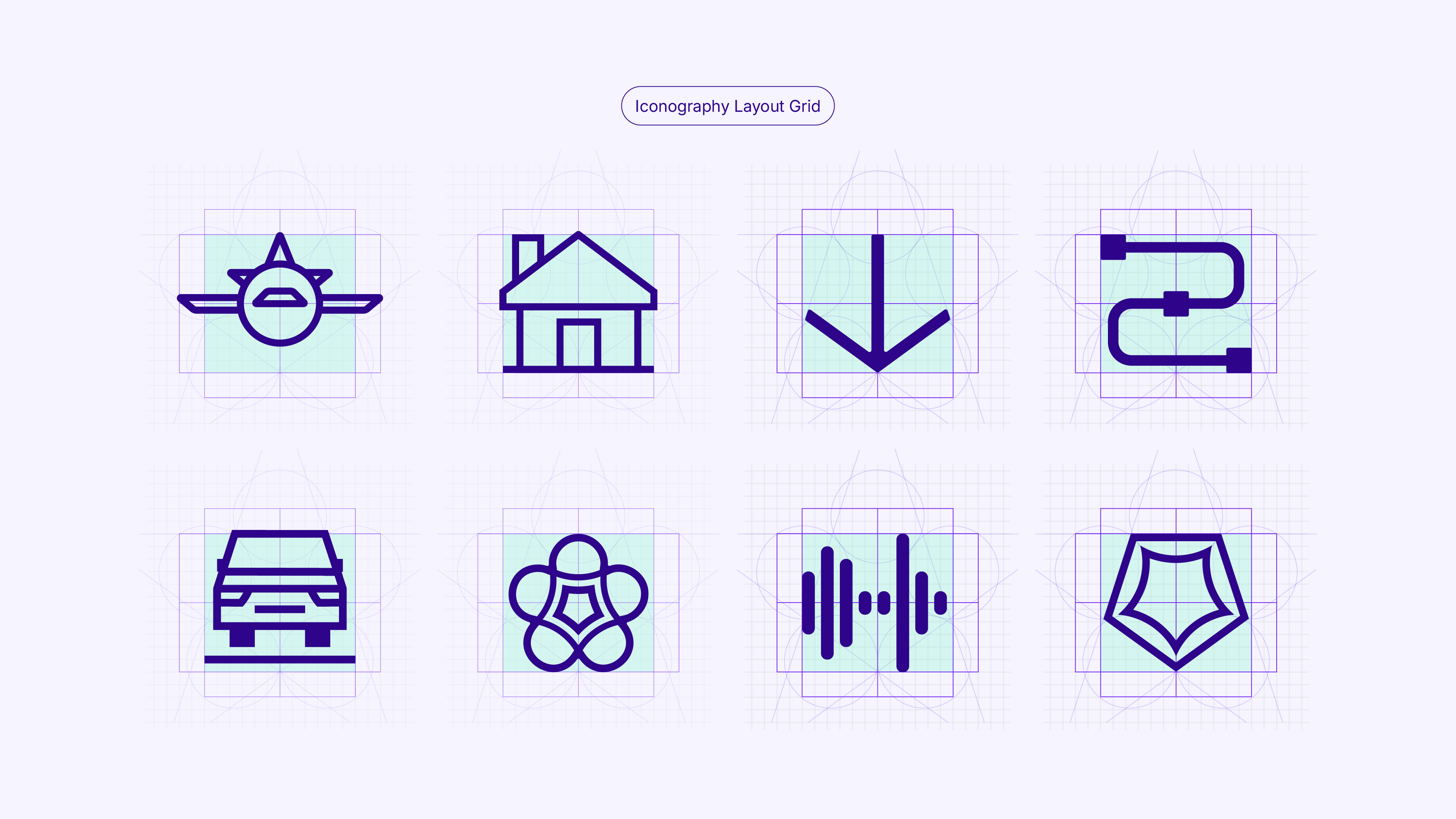
The 5×5 layout grid serves as the structural foundation of the brand, largely invisible yet subtly shaping how the identity is perceived. All text, graphic elements, and logo alignments are organised according to this grid. The number five is intentionally derived from the brand's core geometry: the five petals and the five-sided pentagram used in the logo's construction.
When additional precision or flexibility is required, each grid section can be subdivided into five, providing greater control while maintaining visual harmony and proportional consistency across all brand applications.
04. Brand's Essence & Emotional Appeal
Brand's Essence &
Emotional Appeal
The brand identity has been designed to be perceived as a seamless fusion of intelligence, clarity, and human-centred ease, reflecting the company's role in simplifying complex financial and insurance decisions.
Rooted in research and cultural context, the visual system draws subtle inspiration from Southeast Asian geometric textile patterns. A heritage language defined by structure, balance, and repetition.
Rather than functioning as decorative reference, these influences inform the identity's underlying logic, reinforcing ideas of precision, interconnected systems, and engineered harmony.


05. Outcome
At the symbolic core of the brand lies an abstracted interpretation of the hibiscus flower. Malaysia's national symbol and a quiet nod to BJAK's origins.
Together, these layers express a brand philosophy captured through the acronym FLOW: Friendly, Lucid, Optimised, Wise. The identity communicates approachability without informality, clarity without oversimplification and intelligence without intimidation.
Every element from colour psychology to graphic systems and photographic direction is meant to reinforce a sense of guided movement, cognitive ease and quiet confidence.
The result is a brand that feels progressive yet reassuring, technologically sophisticated yet inherently human. BJAK is positioned not as a disruptive force, but as an intelligent system designed to remove friction, enabling users to flow effortlessly toward better decisions.