Brand Identity & Art Direction
BISCA Brand
Identity.
The Birmingham Institute for Sustainability & Climate Action (BISCA) is the University of Birmingham's central hub for connecting researchers, partners, policymakers, and global stakeholders to drive climate action and improve livelihoods. The institute exists to accelerate collaboration and bridge academia with real-world environmental impact.
Climate action is no longer an abstract academic conversation. It demands communication that is legible, collaborative, and culturally accessible across disciplines and audiences.
Climate action is no longer an abstract academic conversation. It demands communication that is legible, collaborative, and culturally accessible across disciplines and audiences.
BISCA challenged the traditional corporate or institutional norms often found in sustainability branding and instead sought an identity that communicates action, human connection, and shared progress.
Rather than defaulting to a purely "green" narrative or research-heavy tone, the brand positions sustainability as dynamic, optimistic, and solution-focused. BISCA sees the future not as a problem to be studied, but as a collaborative project to be built.
This audience mix required clarity without condescension, professionalism without rigidity, and optimism without naïveté.

02. Building the Identity System
Visual System &
Brand Language.
This audience mix required clarity without condescension, professionalism without rigidity, and optimism without naïveté. The strategy positioned BISCA as a connector between disciplines, institutions, and research and action.
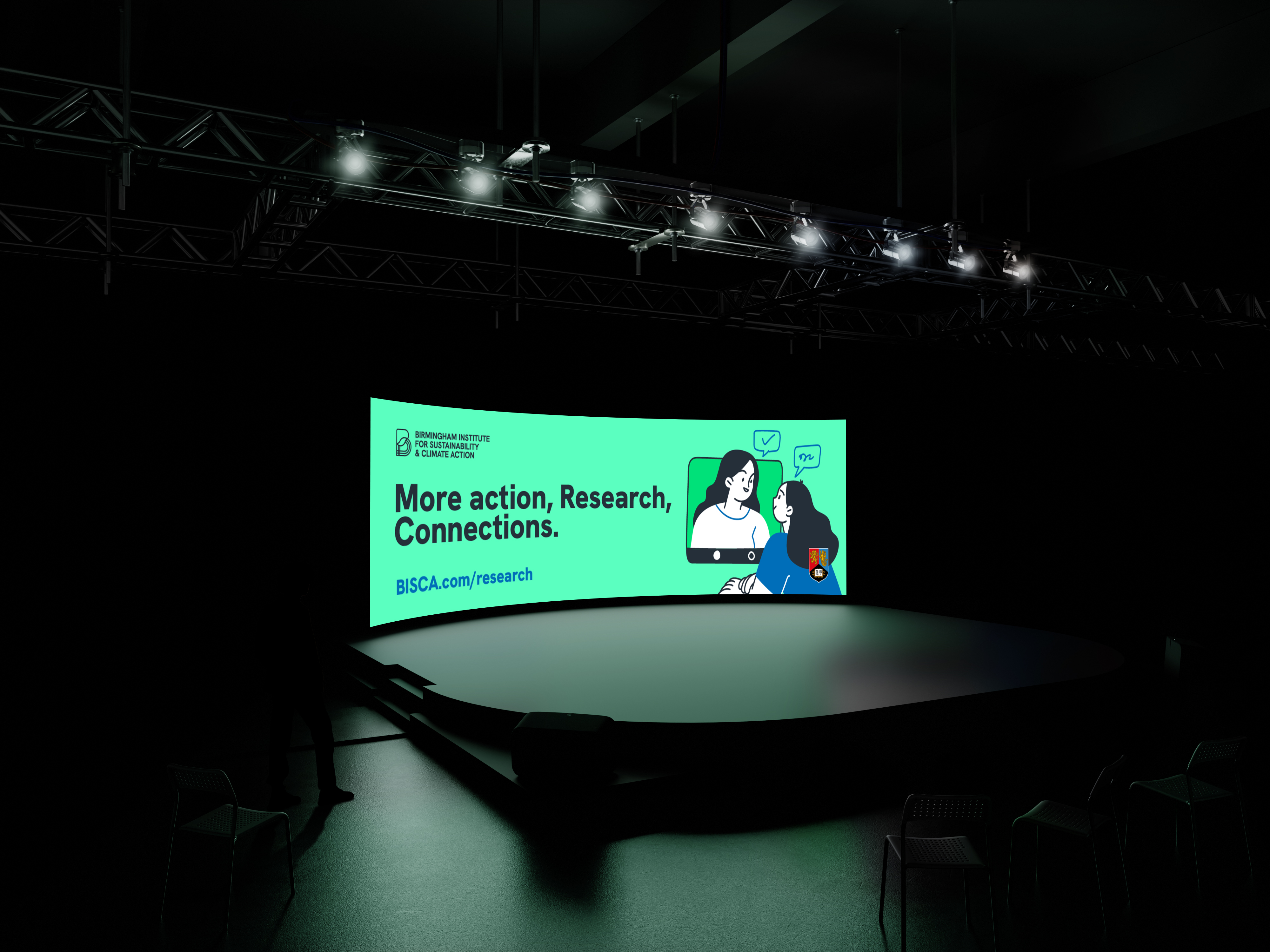
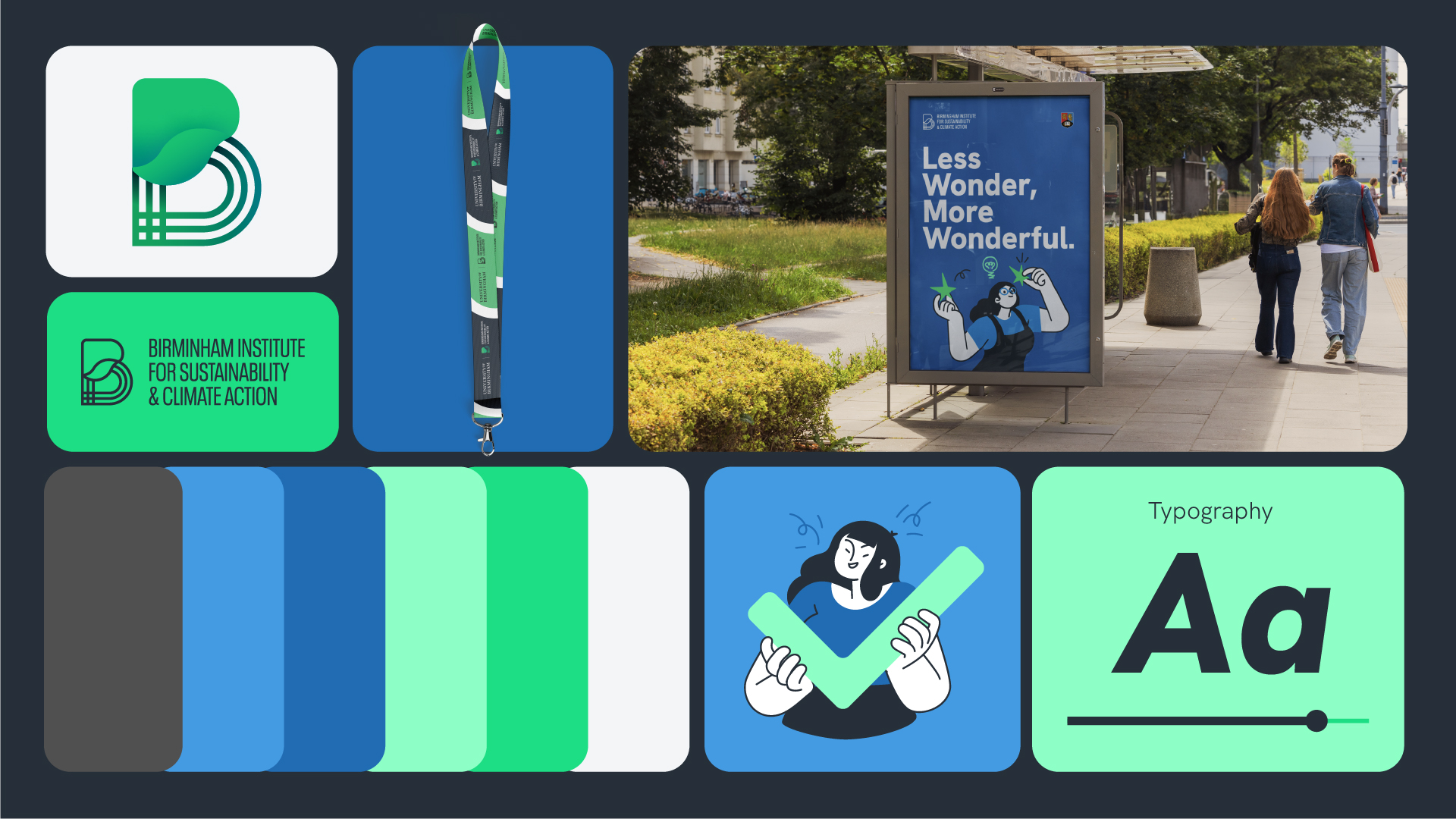
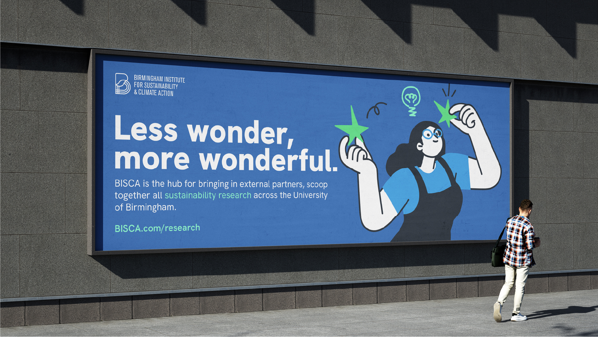
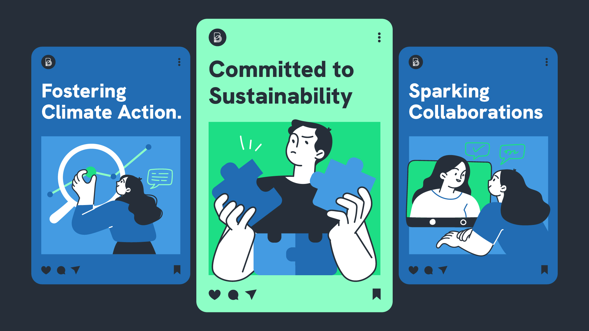
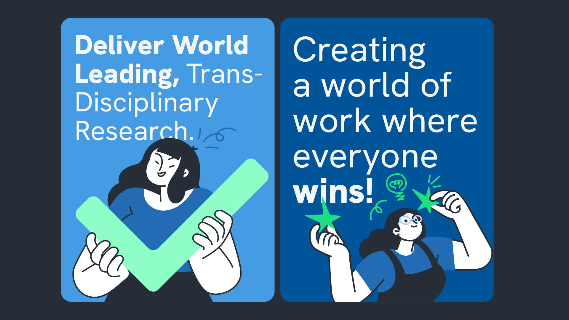
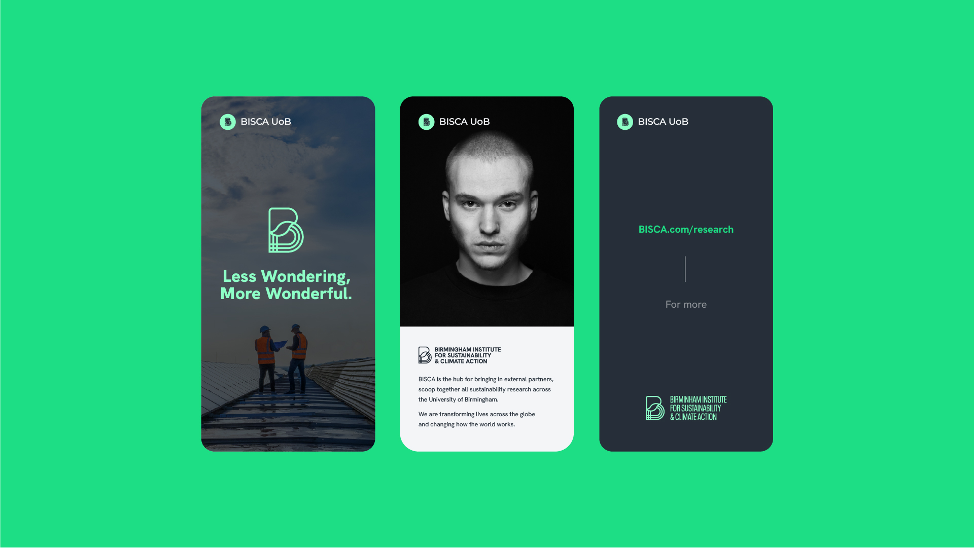
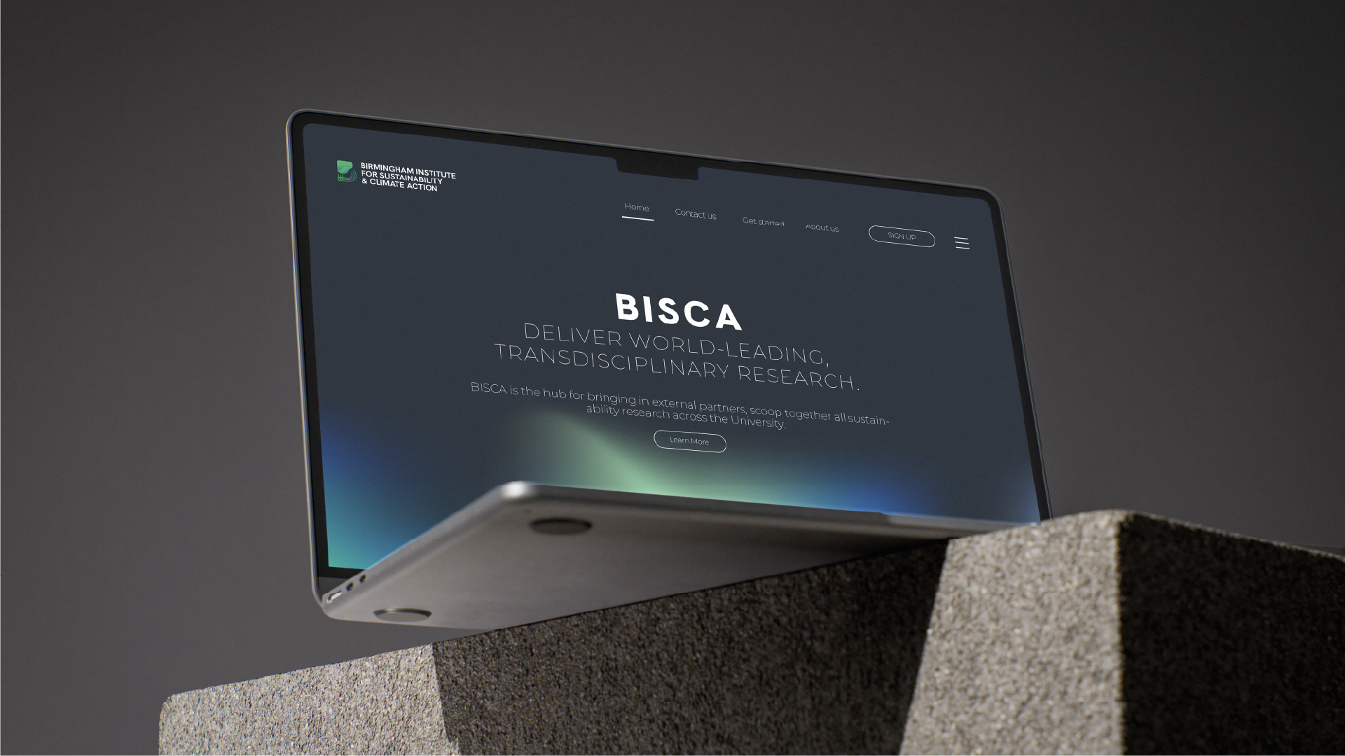
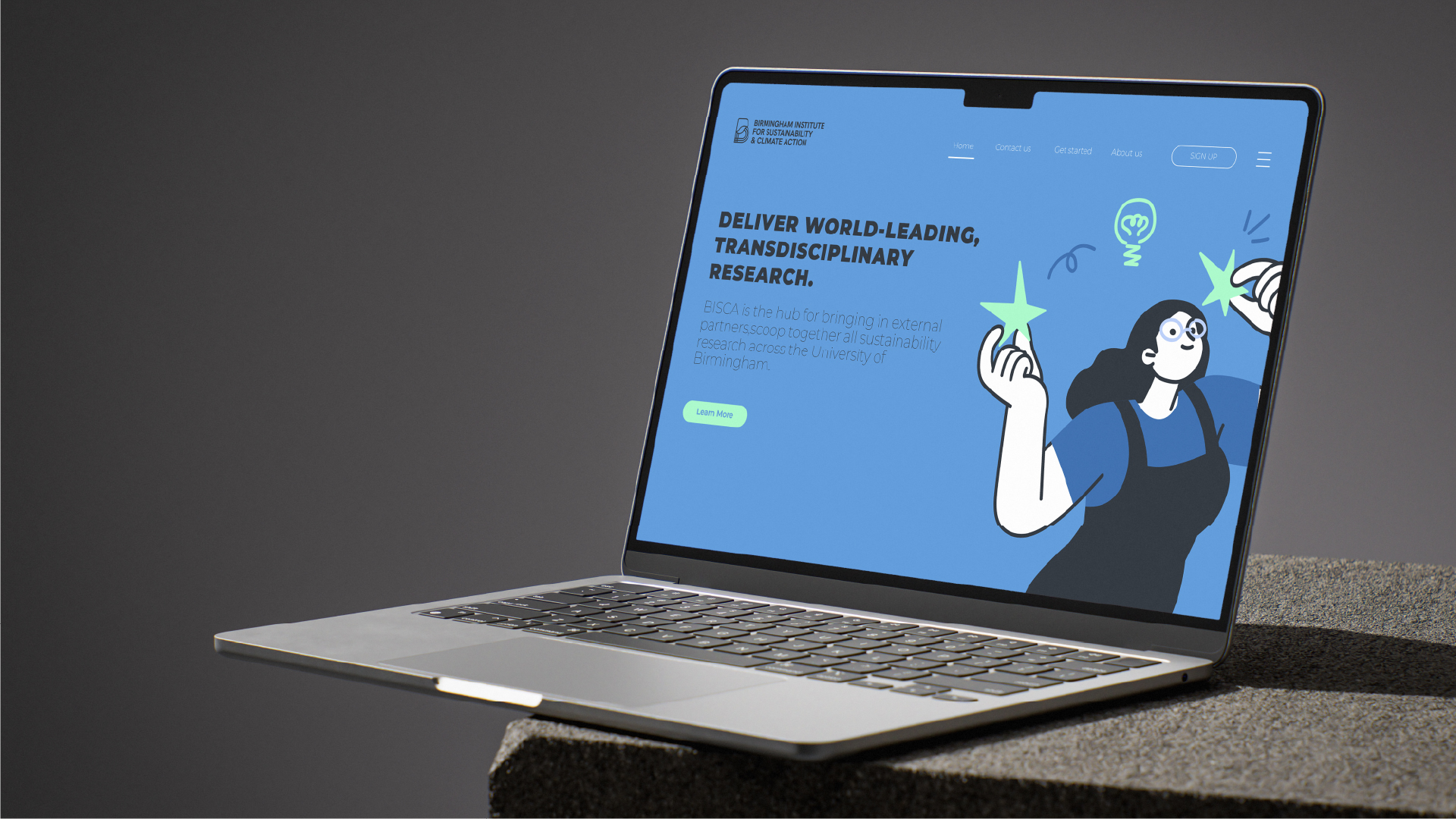
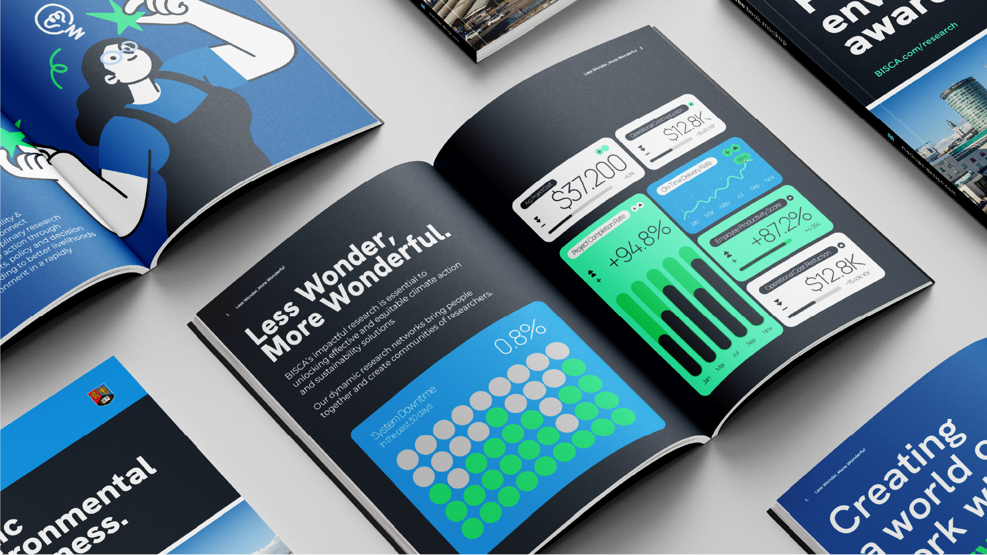
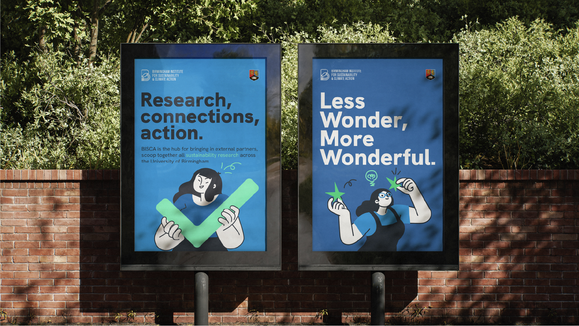
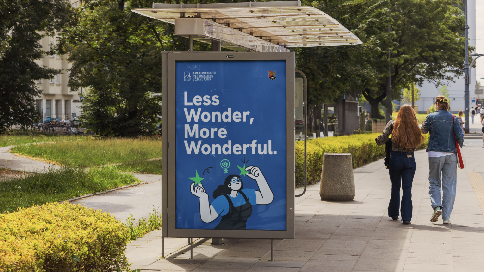
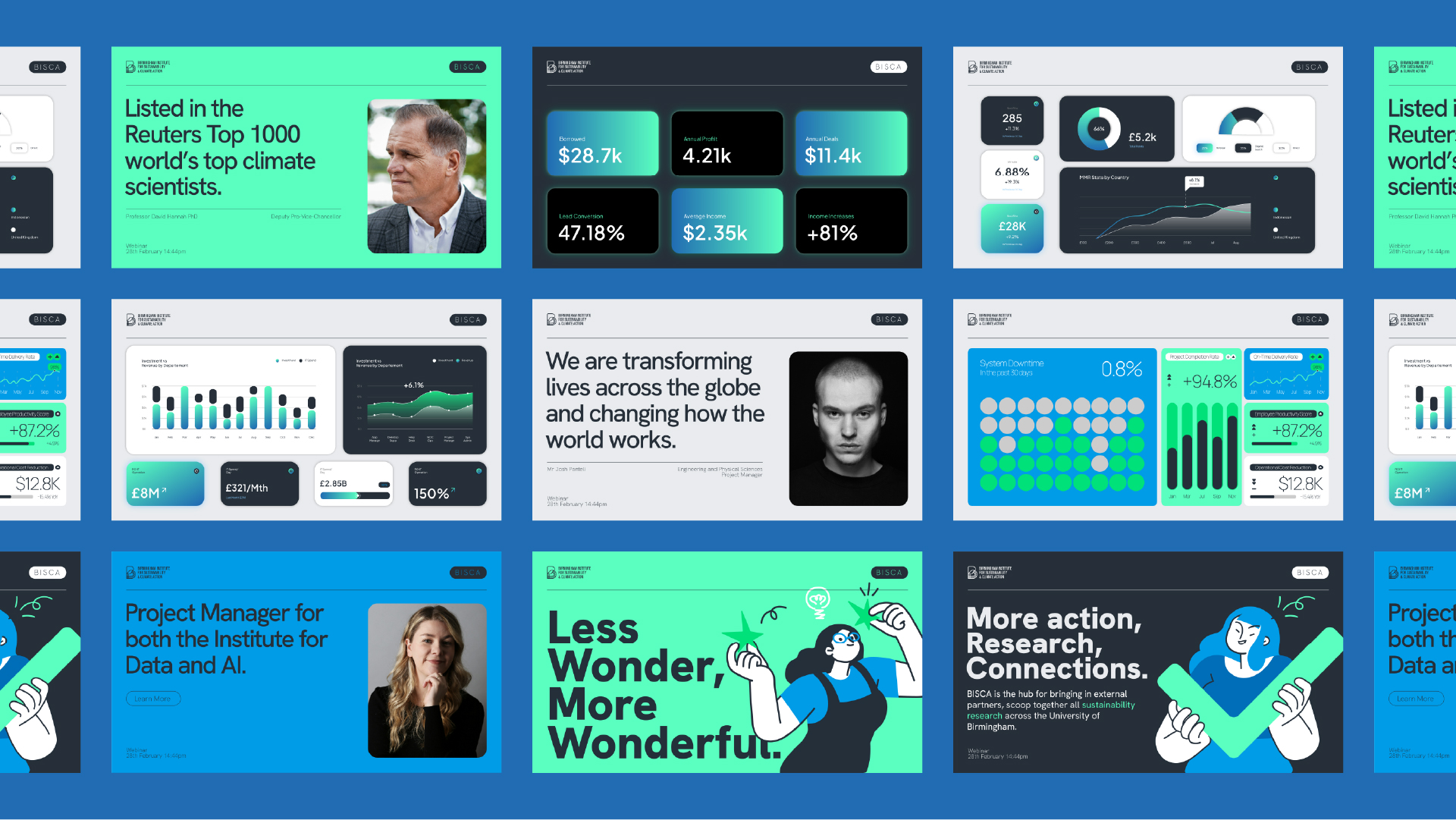
Visual Language: The identity system blends illustration, typography, and colour to soften the academic tone and invite participation. The use of illustration and colour blocks establish personality and accessibility within an otherwise serious subject area.
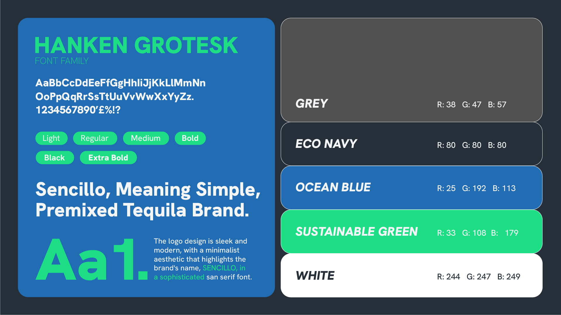
Colour Palette: The palette uses a combination of Sustainable Green, Ocean Blue, Eco Navy, Neutral Greys and White. These colours balance environmental cues with modern digital usability, signalling trust and innovation rather than cliché "eco branding."
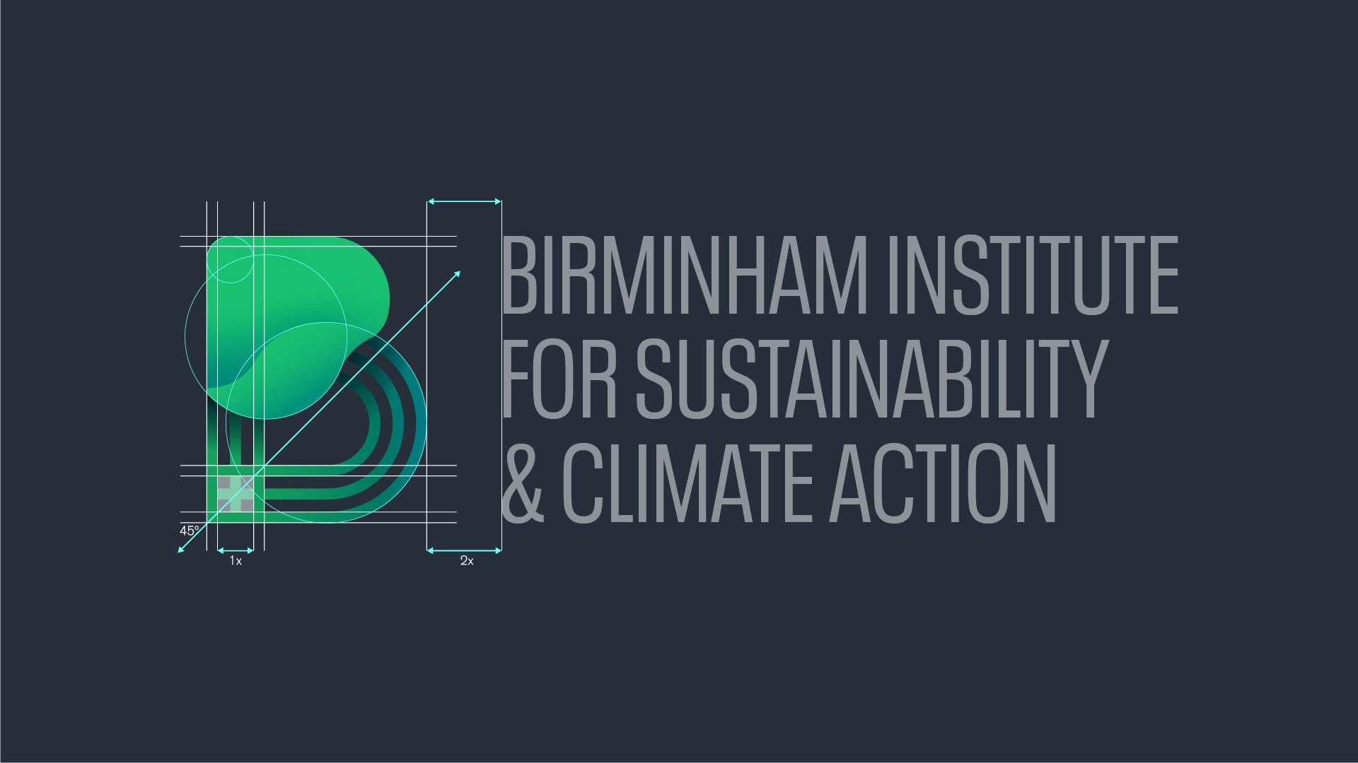
Typography: Type is set in Hanken Grotesk, a geometric sans serif family with strong academic clarity and contemporary warmth.
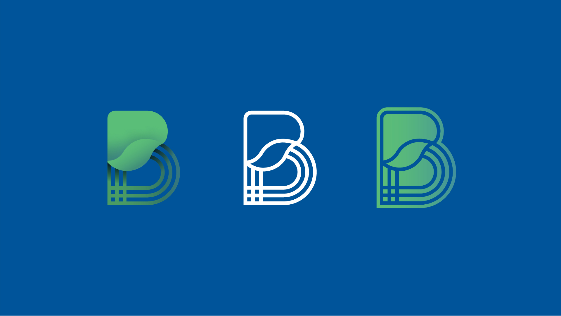
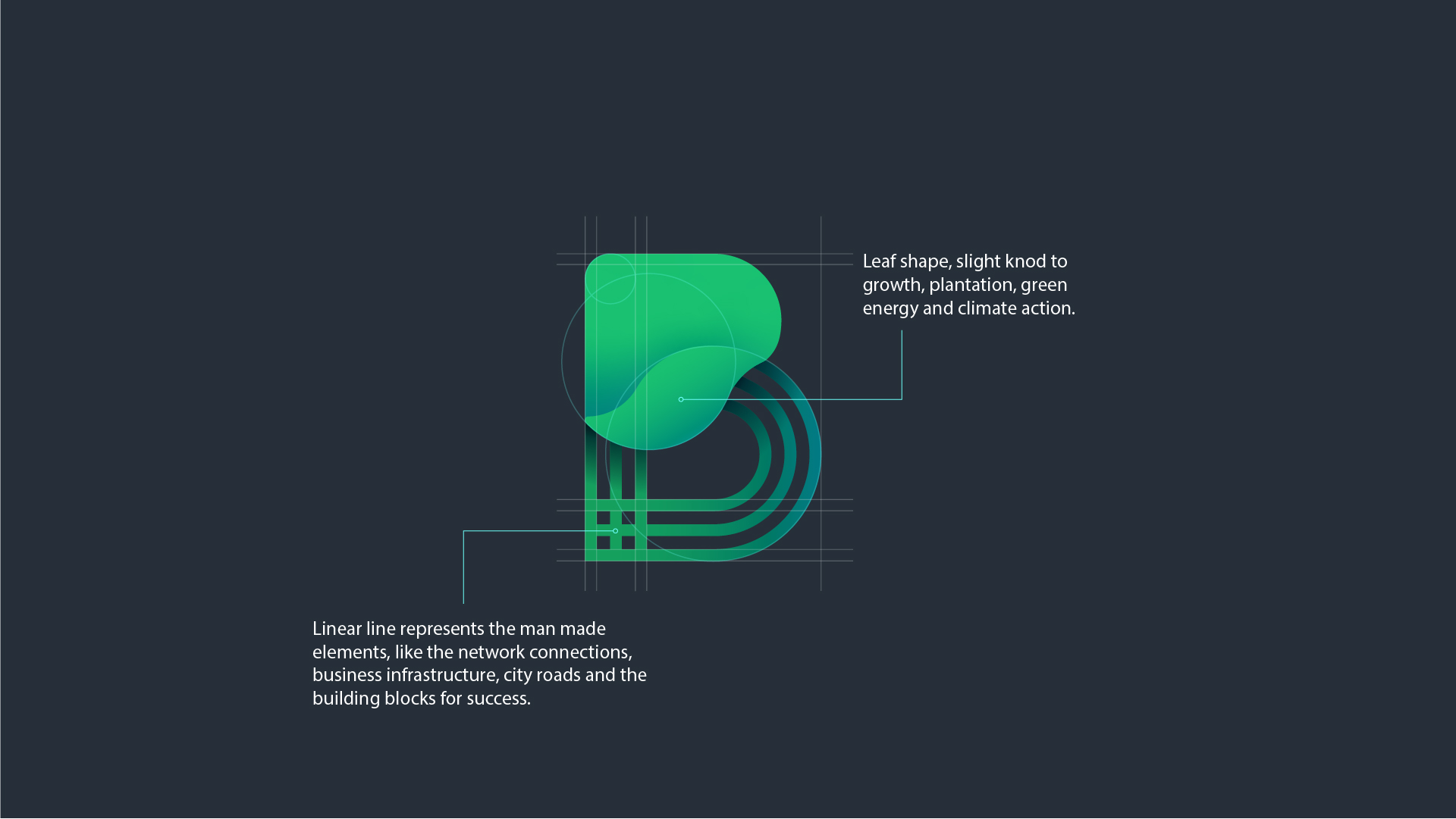
Symbol & Motif: The logomark combines two symbolic components:
- leaf-like form representing growth, climate, and environmental stewardship
- linear grid representing infrastructure, systems, networks, and human-made pathways
03. Approach
Messaging &
Design Philosophy.
The design approach prioritised:
- accessibility across audience literacy levels
- visual optimism to counter climate fatigue
- action-oriented language to signal progress
- cross-format flexibility for university-scale use
The brand frames sustainability as collaboration at scale, rather than a singular academic pursuit.

04. The Result
The
Result.
BISCA emerges as a recognisable and distinctive research institute identity within the University and broader sustainability ecosystem. It communicates science without alienation, progress without sensationalism, and climate action without despair.
The result is a brand that feels:
- academic but not elitist
- institutional but not corporate
- environmental but not stereotyped
- action-driven but not alarmist
Visually and verbally, BISCA establishes a platform capable of evolving alongside climate discourse and the future research landscape.